 React
React iOS
iOS Android
 Flutter
 Angular
 JavaScript
 Unity
Unity Unreal
 Node
Node Python
 Ruby
Ruby PHP
PHP Java
Java .NET
.NET Go
Go REST
RESTimport { Channel, WithComponents } from "stream-chat-react";
const customReactionOptions = {
quick: {
arrow_down: {
Component: () => <>⬇️</>,
name: "Down vote",
},
arrow_up: {
Component: () => <>⬆️</>,
name: "Up vote",
},
},
extended: {
arrow_down: {
Component: () => <>⬇️</>,
name: "Down vote",
},
arrow_up: {
Component: () => <>⬆️</>,
name: "Up vote",
},
fire: {
Component: () => <>🔥</>,
name: "Fire",
},
},
};
export const WrappedChannel = ({ children }) => (
<WithComponents overrides={{ reactionOptions: customReactionOptions }}>
<Channel>{children}</Channel>
</WithComponents>
);This is beta documentation for Stream Chat React SDK v14. For the latest stable version, see the latest version (v13)
.
Reactions Customization
This example shows how to customize the SDK reaction surfaces for a channel subtree.
Best Practices
- Keep custom reactions aligned with your product’s interaction model.
- Register shared reaction options through
WithComponentsso the selector and list stay in sync. - Prefer the
{ quick, extended }shape when you need different sets for the compact selector and expanded picker. - Keep custom reaction handlers permission-aware and idempotent.
- Test custom reactions in both channel and thread message lists.
Shared Reaction Options
reactionOptions lives in ComponentContext, so the usual override path is WithComponents.
MessageReactions reads reactionOptions from ComponentContext. Keep reaction-option customization in WithComponents so ReactionSelector, MessageReactions, and MessageReactionsDetail stay aligned.
Override The Default Reaction Surfaces
Use WithComponents to replace ReactionSelector, MessageReactions, or MessageReactionsDetail.
import {
  Channel,
  MessageReactions,
  MessageReactionsDetail,
  ReactionSelector,
  WithComponents,
} from "stream-chat-react";

const CustomReactionSelector = (props) => <ReactionSelector {...props} />;

const CustomMessageReactions = (props) => (
  <MessageReactions {...props} visualStyle="segmented" />
);

const CustomMessageReactionsDetail = (props) => (
  <MessageReactionsDetail {...props} />
);

export const WrappedChannel = ({ children }) => (
  <WithComponents
    overrides={{
      MessageReactionsDetail: CustomMessageReactionsDetail,
      ReactionSelector: CustomReactionSelector,
      MessageReactions: CustomMessageReactions,
    }}
  >
    <Channel>{children}</Channel>
  </WithComponents>
);
When you customize the detail view, keep the current all-reactions behavior in mind:
selectedReactionType={null}means "show all reactions"- clicking the active reaction filter again should reset it back to
null - when no reaction type is selected, the default detail view can show the emoji for each user row
If you want the default loading skeleton in a custom detail surface, reuse the exported loading indicator:
import { MessageReactionsDetailLoadingIndicator } from "stream-chat-react";
const CustomReactionsDetailLoadingState = () => (
<MessageReactionsDetailLoadingIndicator />
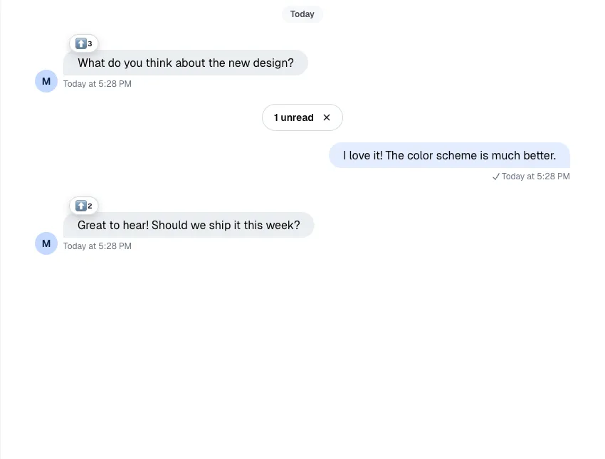
);Here's the difference between the two visualStyle options for MessageReactions:
| Clustered | Segmented |
|---|---|
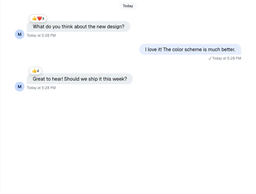 |  |
Custom Reaction Handler
If you want to change behavior without replacing the whole selector UI, wrap ReactionSelector and override handleReaction.
import { useCallback } from "react";
import {
  Channel,
  ReactionSelector,
  WithComponents,
  useChannelStateContext,
  useMessageContext,
} from "stream-chat-react";

const CustomReactionSelector = (props) => {
  const {
    message: { id: messageId, own_reactions: ownReactions = [] },
  } = useMessageContext("CustomReactionSelector");
  const { channel } = useChannelStateContext("CustomReactionSelector");

  const handleReaction = useCallback(
    async (reactionType, event) => {
      console.log({ event });

      const hasReactedWithType = ownReactions.some(
        (reaction) => reaction.type === reactionType,
      );

      if (hasReactedWithType) {
        await channel.deleteReaction(messageId, reactionType);
        return;
      }

      await channel.sendReaction(messageId, { type: reactionType });
    },
    [channel, messageId, ownReactions],
  );

  return <ReactionSelector {...props} handleReaction={handleReaction} />;
};

export const WrappedChannel = ({ children }) => (
  <WithComponents overrides={{ ReactionSelector: CustomReactionSelector }}>
    <Channel>{children}</Channel>
  </WithComponents>
);
Read More
The reference page for the current reaction surfaces lives here: