 React
React iOS
iOS Android
 Flutter
 Angular
 JavaScript
 Unity
Unity Unreal
 Node
Node Python
 Ruby
Ruby PHP
PHP Java
Java .NET
.NET Go
Go REST
RESTThis is beta documentation for Stream Chat React SDK v14. For the latest stable version, see the latest version (v13)
.
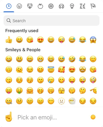
Emoji Picker
The SDK includes an EmojiPicker built on emoji-mart. It’s disabled by default. To enable it, install the emoji-mart packages, import EmojiPicker from stream-chat-react/emojis, and pass it to Channel. See the Basic Usage section.
Best Practices
- Enable the picker only when emoji usage is a core part of your UX.
- Keep popper options aligned with your app’s z-index and overflow rules.
- Set
closeOnEmojiSelectbased on input density and user flow. - Avoid heavy picker props that slow input responsiveness.
- Ensure emoji fonts render consistently across platforms.
Props
| Prop | Description | Type |
|---|---|---|
buttonClassName | Class name for the open/close button. Defaults to str-chat__emoji-picker-button. | string |
ButtonIconComponent | Icon component rendered inside the open/close button. Defaults to EmojiPickerIcon. | React.ComponentType |
closeOnEmojiSelect | Whether the picker closes after selecting an emoji. Defaults to false. | boolean |
pickerContainerClassName | Class name for the picker container. Defaults to str-chat__message-textarea-emoji-picker-container. | string |
pickerProps | Untyped properties forwarded to the emoji-mart Picker. | Partial<{ theme: 'auto' | 'light' | 'dark' } & Record<string, unknown>> |
popperOptions | React Popper options forwarded to the react-popper usePopper hook. | Partial<Options> |
wrapperClassName | Class name for the wrapper element. Defaults to str-chat__message-textarea-emoji-picker. | string |