 React
React iOS
iOS Android
 Flutter
 Angular
 JavaScript
 Unity
Unity Unreal
 Node
Node Python
 Ruby
Ruby PHP
PHP Java
Java .NET
.NET Go
Go REST
REST@Composable
private fun CustomAttachmentsPicker(
attachmentsPickerViewModel: AttachmentsPickerViewModel,
onAttachmentsSelected: (List<Attachment>) -> Unit,
onDismiss: () -> Unit,
) {
var shouldShowMenu by remember { mutableStateOf(true) }
var selectedMode by remember { mutableStateOf<AttachmentPickerMode?>(null) }
Box( // Gray overlay
modifier = Modifier
.fillMaxSize()
.background(ChatTheme.colors.backgroundCoreScrim)
.clickable(
onClick = onDismiss,
indication = null,
interactionSource = remember { MutableInteractionSource() },
),
) {
Card(
modifier = Modifier
.heightIn(max = 350.dp)
.align(Alignment.BottomCenter)
.clickable(
indication = null,
onClick = {},
interactionSource = remember { MutableInteractionSource() },
),
shape = RoundedCornerShape(topStart = 16.dp, topEnd = 16.dp),
) {
Box(modifier = Modifier.padding(vertical = 24.dp)) {
if (shouldShowMenu) {
// Show the menu with Gallery, Files, Camera options
AttachmentsTypeMenu(
onClick = { mode ->
selectedMode = mode
shouldShowMenu = false
},
)
} else {
// Show the selected mode's content with back and submit buttons
Column(
modifier = Modifier.padding(horizontal = 8.dp),
) {
AttachmentsPickerToolbar(
onBackClick = {
shouldShowMenu = true
selectedMode = null
},
isSubmitEnabled = attachmentsPickerViewModel.attachments.any { it.isSelected },
onSubmitClick = {
onAttachmentsSelected(
attachmentsPickerViewModel.getAttachmentsFromMetadata(
attachmentsPickerViewModel.attachments
.filter { it.isSelected }
.map { it.attachmentMetaData },
),
)
},
)
// Render the default attachment picker content for the selected mode
selectedMode?.let { mode ->
ChatTheme.componentFactory.AttachmentPickerContent(
params = AttachmentPickerContentParams(
pickerMode = mode,
commands = emptyList(),
attachments = attachmentsPickerViewModel.attachments,
onLoadAttachments = {},
onUrisSelected = {},
actions = AttachmentPickerActions.pickerDefaults(
attachmentsPickerViewModel = attachmentsPickerViewModel,
).copy(onDismiss = onDismiss),
onAttachmentsSubmitted = {
onAttachmentsSelected(
attachmentsPickerViewModel.getAttachmentsFromMetadata(it),
)
},
),
)
}
}
}
}
}
}
}This is beta documentation for Stream Chat Android SDK v7. For the latest stable version, see the latest version (v6)
.
Custom Attachments Picker
The AttachmentsPicker component allows users to pick media, files or capture media attachments. You can find more info about it here.
By default, it looks like below:
| Default - Images tab selected | Default - Files tab selected |
|---|---|
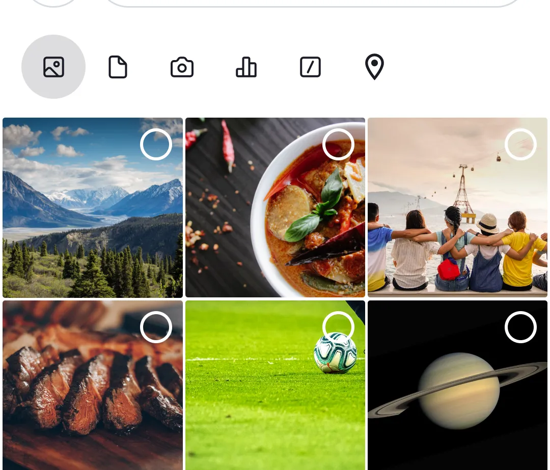 | 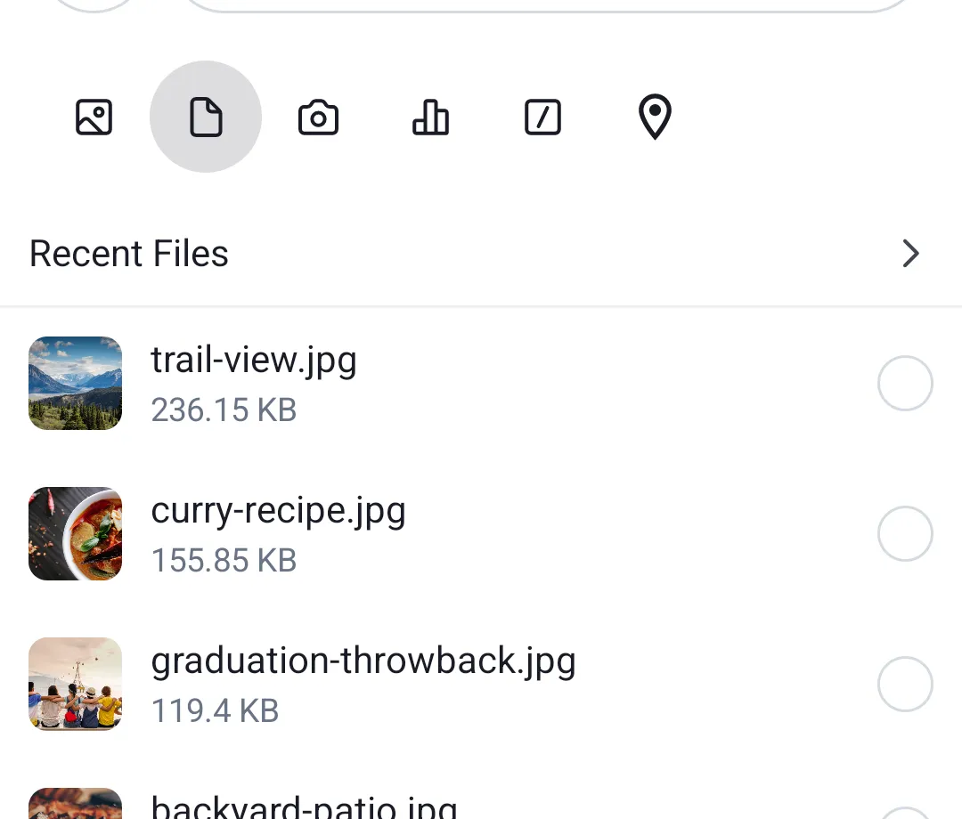 |
When we're done, our custom attachments picker will look like this:
| Custom - Attachment type menu | Custom - File picker with Back and Submit |
|---|---|
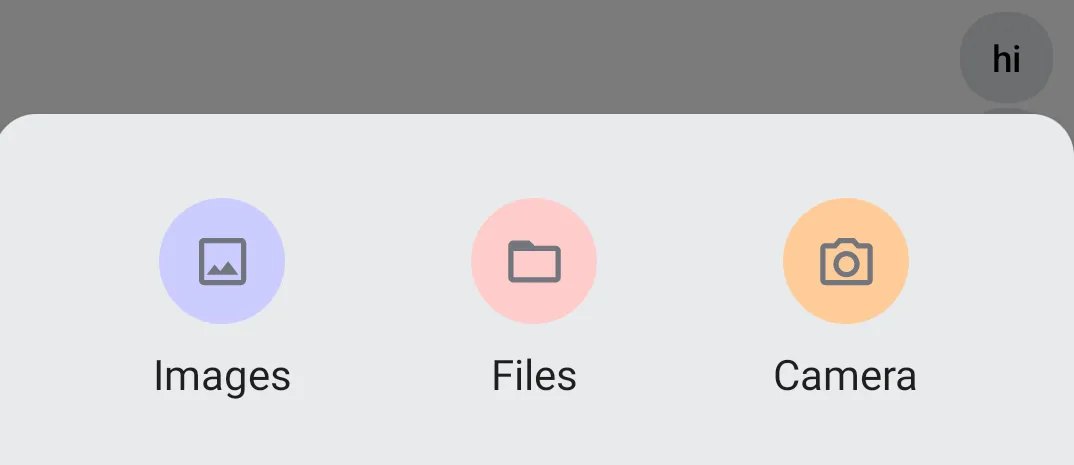 | 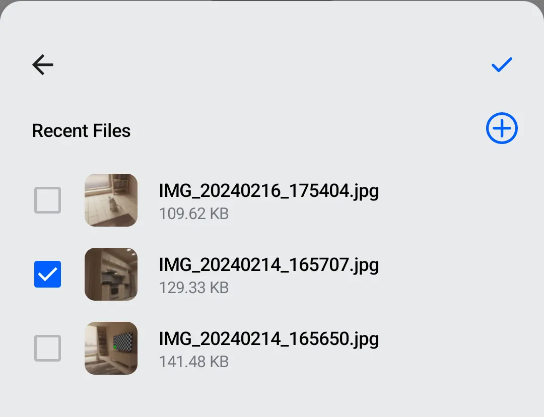 |
Although the AttachmentsPicker can be customized extensively via ChatComponentFactory overrides, as you can read here, for this example we'll create our own component. We'll use the AttachmentsPickerViewModel from the SDK to manage picker state and the available AttachmentPickerMode definitions to identify attachment types.
Main Composable
Let's define the main composable for our custom attachment picker. Notice that it expects an AttachmentsPickerViewModel, which is part of our SDK. The available attachment modes are sourced from ChatTheme.config.attachmentPicker.modes, which provides the configured modes (Gallery, Files, Camera, etc.).
Attachment Type Menu
The attachment type menu (Gallery, Files, Camera) is drawn by a simple composable that shows a menu item for each configured AttachmentPickerMode.
@Composable
private fun AttachmentsTypeMenu(
    onClick: (AttachmentPickerMode) -> Unit,
) {
    val modes = ChatTheme.config.attachmentPicker.modes
    Row(
        modifier = Modifier.fillMaxWidth(),
        horizontalArrangement = Arrangement.SpaceEvenly,
        verticalAlignment = Alignment.CenterVertically,
    ) {
        modes.forEach { mode ->
            AttachmentsTypeMenuItem(
                mode = mode,
                onClick = onClick,
            )
        }
    }
}
Each menu item is represented by a circle with a label underneath. So we need a Column, a circle-shaped Box with a certain background color, and a Text.
@Composable
private fun AttachmentsTypeMenuItem(
    mode: AttachmentPickerMode,
    onClick: (AttachmentPickerMode) -> Unit,
) {
    val backgroundColor: Color
    val label: String
    val icon: ImageVector

    when (mode) {
        is GalleryPickerMode -> {
            backgroundColor = Color(0xFFCCCCFF)
            label = "Images"
            icon = Icons.Default.Image
        }
        is FilePickerMode -> {
            backgroundColor = Color(0xFFFFCCCC)
            label = "Files"
            icon = Icons.Default.Description
        }
        is CameraPickerMode -> {
            backgroundColor = Color(0xFFFFCC99)
            label = "Camera"
            icon = Icons.Default.CameraAlt
        }
        else -> {
            backgroundColor = Color.LightGray
            label = "Other"
            icon = Icons.Default.MoreHoriz
        }
    }

    Column(
        modifier = Modifier.clickable { onClick(mode) },
        horizontalAlignment = Alignment.CenterHorizontally,
    ) {
        Box(
            modifier = Modifier
                .padding(8.dp)
                .size(48.dp)
                .background(backgroundColor, shape = CircleShape),
            contentAlignment = Alignment.Center,
        ) {
            Icon(
                imageVector = icon,
                contentDescription = label,
            )
        }
        Text(text = label)
    }
}
Picker Toolbar
Above each picker, we draw a toolbar with Back and Submit buttons. Back navigates to the menu and Submit attaches the selected file to the message contents.
@Composable
private fun AttachmentsPickerToolbar(
    onBackClick: () -> Unit,
    isSubmitEnabled: Boolean,
    onSubmitClick: () -> Unit,
) {
    Row(
        modifier = Modifier.fillMaxWidth(),
        horizontalArrangement = Arrangement.SpaceBetween
    ) {
        IconButton(onClick = onBackClick) {
            Icon(
                painter = painterResource(id = R.drawable.ic_back),
                contentDescription = "Back",
                modifier = Modifier.size(24.dp),
            )
        }
        IconButton(
            enabled = isSubmitEnabled,
            onClick = onSubmitClick
        ) {
            Icon(
                painter = painterResource(id = R.drawable.ic_check),
                contentDescription = "Submit Attachments",
                modifier = Modifier.size(24.dp),
                tint = if (isSubmitEnabled) {
                    ChatTheme.colors.accentPrimary
                } else {
                    ChatTheme.colors.textSecondary
                },
            )
        }
    }
}
Usage
We'll place our custom attachments picker in a screen that contains other components, like a header, a messages list and a message composer. We'll also use the BackHandler standard component.
In order to show the attachments picker, we'll use an isShowingAttachments flag. We'll wrap all components in a Box, so that the attachments picker appears on top of other content.
fun CustomScreen(cid: String, onBackClick: () -> Unit = {}) {
    val viewModelFactory = ChannelViewModelFactory(LocalContext.current, channelId = cid)
    val listViewModel = viewModel(modelClass = MessageListViewModel::class.java, factory = viewModelFactory)
    val composerViewModel = viewModel(modelClass = MessageComposerViewModel::class.java, factory = viewModelFactory)
    val attachmentsPickerViewModel = viewModel(modelClass = AttachmentsPickerViewModel::class.java, factory = viewModelFactory)

    val isShowingAttachments = attachmentsPickerViewModel.isPickerVisible

    val backAction = remember(composerViewModel, attachmentsPickerViewModel) {
        {
            // First close the attachments picker, if visible, then call onBackClick
            when {
                attachmentsPickerViewModel.isPickerVisible -> {
                    attachmentsPickerViewModel.setPickerVisible(false)
                }
                else -> onBackClick()
            }
        }
    }
    BackHandler(enabled = true, onBack = backAction) // Standard SDK component

    Box(modifier = Modifier.fillMaxSize(), contentAlignment = Alignment.BottomCenter) {
        // Screen content
        Scaffold(
            topBar = {
                // ChannelHeader
            },
            bottomBar = {
                // MessageComposer
            },
            content = {
                // MessageList
            }
        )

        // Attachments picker
        if (isShowingAttachments) {
            CustomAttachmentsPicker(
                attachmentsPickerViewModel = attachmentsPickerViewModel,
                onAttachmentsSelected = { attachments ->
                    attachmentsPickerViewModel.setPickerVisible(false)
                    composerViewModel.addAttachments(attachments)
                },
                onDismiss = {
                    attachmentsPickerViewModel.setPickerVisible(false)
                }
            )
        }
    }
}
More Resources
If you want to learn how to use our Compose UI Components, see this page.
Also, check the other pages in this Cookbook to find out how to create custom versions of our components.