 React
React iOS
iOS Android
 Flutter
 Angular
 JavaScript
 Unity
Unity Unreal
 Node
Node Python
 Ruby
Ruby PHP
PHP Java
Java .NET
.NET Go
Go REST
REST// The state if we need to show the picker or not
val isPickerVisible = attachmentsPickerViewModel.isPickerVisible
if (isPickerVisible) {
AttachmentPicker( // Add the picker to your UI
attachmentsPickerViewModel = attachmentsPickerViewModel,
modifier = Modifier
.align(Alignment.BottomCenter)
.height(350.dp),
)
}This is beta documentation for Stream Chat Android SDK v7. For the latest stable version, see the latest version (v6)
.
Attachments Picker
The AttachmentPicker component allows users to pick media, file or capture media attachments to send to the chat. The picker is a bound component that loads all the data and prepares it for the user.
Internally, it sets up the following components:
- Picker options: The header in the picker that shows different types of attachment options people can choose from; media, files or media capture, as well as the Confirm selection button.
- Image picker: Shows a gallery of images to choose from the device.
- File picker: Shows a list of files on the device to choose from. Also allows the user to open the file browser and pick more files from the system.
- Media capture: Shows the media capture option to the user and opens a media capture
Activity.
The picker also handles required permissions for browsing files and capturing images.
Let's see how to use it.
Usage
If you're using screen components, like the ChannelScreen, you don't have to do any setup for the AttachmentPicker. If you're building custom screens, you can add the AttachmentPicker to the rest of your UI:
Because the AttachmentPicker is a bound component, you should rely on the AttachmentsPickerViewModel's state, to know if you should show the picker or not. To make sure the picker is shown only when it should be, wrap the component call in an if statement.
This renders the following UI:
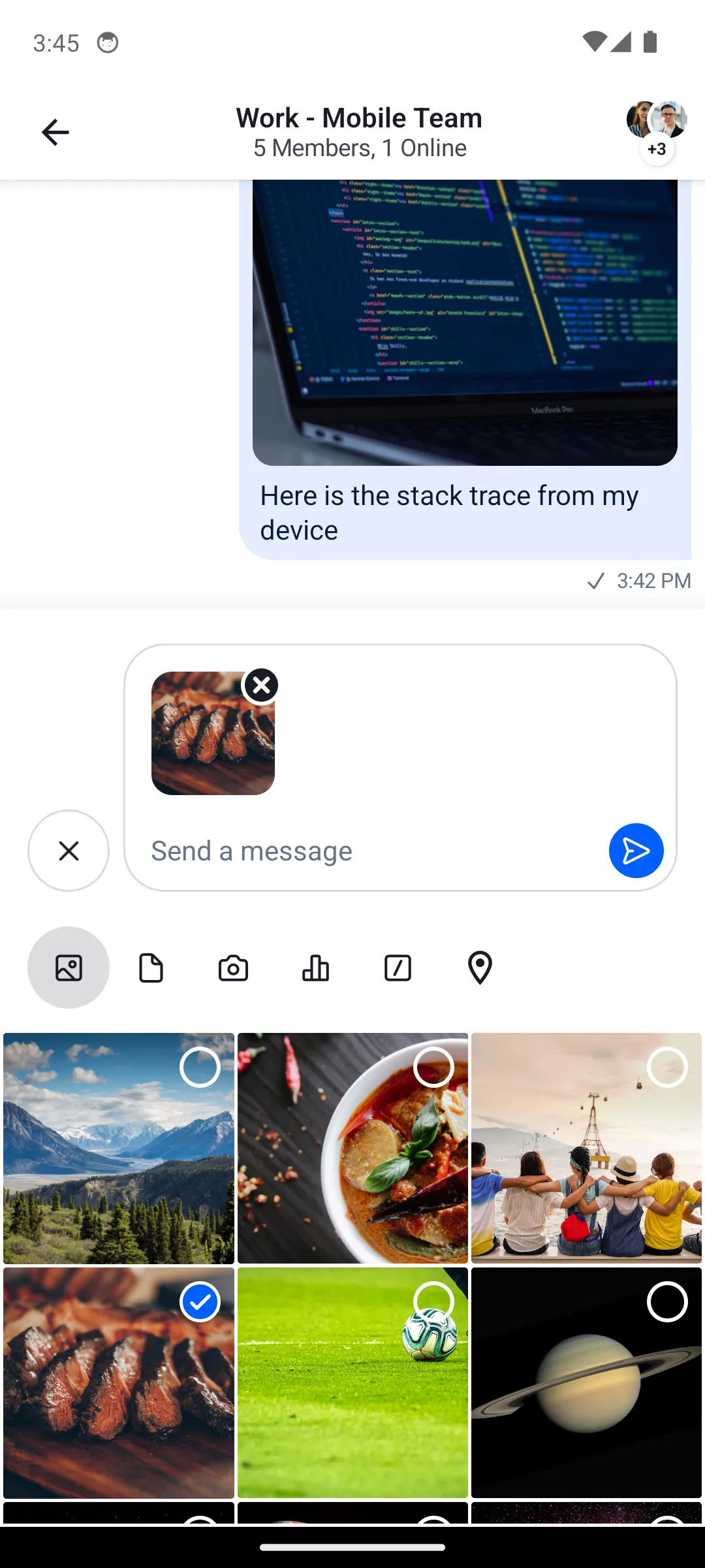
The picker lets users choose from different types of attachments when sending messages.
Handling Actions
The AttachmentPicker uses the AttachmentPickerActions data class to consolidate all action handlers:
@Composable
fun AttachmentPicker(
    attachmentsPickerViewModel: AttachmentsPickerViewModel,
    modifier: Modifier = Modifier,
    messageMode: MessageMode = MessageMode.Normal,
    actions: AttachmentPickerActions = AttachmentPickerActions.pickerDefaults(attachmentsPickerViewModel),
)
The AttachmentPickerActions contains:
onAttachmentItemSelected: Called when a user toggles an attachment item in the picker grid.onAttachmentsSelected: Called when the user confirms the selection.onCreatePollClick: Called when the user taps the poll creation button.onCreatePoll: Called withCreatePollParamswhen a poll is created.onCreatePollDismissed: Called when poll creation is dismissed.onCommandSelected: Called when a slash command is selected.onDismiss: Called when the picker is dismissed.
By default, AttachmentPickerActions.pickerDefaults(viewModel) provides sensible defaults. To customize behavior, create your own AttachmentPickerActions:
AttachmentPicker(
    attachmentsPickerViewModel = attachmentsPickerViewModel,
    actions = AttachmentPickerActions(
        onAttachmentItemSelected = { /* handle item toggle */ },
        onAttachmentsSelected = { attachments ->
            attachmentsPickerViewModel.setPickerVisible(false)
            composerViewModel.addAttachments(attachments)
        },
        onCreatePollClick = { /* navigate to poll creation */ },
        onCreatePoll = { composerViewModel.createPoll(it) },
        onCreatePollDismissed = { /* dismiss poll creation */ },
        onCommandSelected = { composerViewModel.selectCommand(it) },
        onDismiss = { attachmentsPickerViewModel.setPickerVisible(false) },
    ),
)
For the most common case where you also need the MessageComposerViewModel, use AttachmentPickerActions.defaultActions(attachmentsPickerViewModel, composerViewModel) which wires up both view models automatically.
Customization
Configuration
The attachment picker behavior is configured via ChatUiConfig.attachmentPicker.
System picker
The SDK uses the system's native file/media picker by default (useSystemPicker = true). The system picker does not require any storage permissions — the OS handles access internally. No manifest changes needed.
In-app picker
If you prefer the SDK's built-in in-app gallery grid instead of the system picker, set useSystemPicker = false and add the required storage permissions to your AndroidManifest.xml:
<uses-permission android:name="android.permission.READ_MEDIA_IMAGES" />
<uses-permission android:name="android.permission.READ_MEDIA_VIDEO" />ChatTheme(
config = ChatUiConfig(
attachmentPicker = AttachmentPickerConfig(
useSystemPicker = false,
),
),
) {
// Rest of the UI
}Configuring available modes
The modes property controls which attachment types are available in the picker. The default includes all five modes:
ChatTheme(
    config = ChatUiConfig(
        attachmentPicker = AttachmentPickerConfig(
            modes = listOf(
                GalleryPickerMode(),
                FilePickerMode(),
                CameraPickerMode(),
                PollPickerMode(),
                CommandPickerMode,
            ),
        ),
    ),
) {
    // Rest of the UI
}
The order of modes determines the order of tabs in the picker. Remove any mode from the list to disable it.
Customizing the existing UI
You can customize the AttachmentPicker using the following parameters:
fun AttachmentPicker(
    attachmentsPickerViewModel: AttachmentsPickerViewModel,
    modifier: Modifier = Modifier,
    messageMode: MessageMode = MessageMode.Normal,
    actions: AttachmentPickerActions = ...,
)modifier: Allows you to customize the root content component of the picker and change its size, padding and more.messageMode: Defines the current message mode (e.g.,MessageMode.NormalorMessageMode.MessageThread). This can affect which attachment options are available in different contexts.actions: TheAttachmentPickerActionsinstance that handles all picker callbacks.
Providing a custom tab
To add a custom attachment picker tab, you need to:
- Define a custom
AttachmentPickerMode - Override
ChatComponentFactoryto render the tab icon and content - Include your mode in the
AttachmentPickerConfig
First, create your custom mode:
data object CustomPickerMode : AttachmentPickerModeThen, create a ChatComponentFactory that adds the custom tab icon and renders its content:
class CustomComponentFactory : ChatComponentFactory {

    @Composable
    override fun AttachmentTypePicker(params: AttachmentTypePickerParams) {
        // Render the default tabs, then add the custom tab via trailingContent
        super.AttachmentTypePicker(
            params.copy(trailingContent = {
                val isSelected = params.selectedMode is CustomPickerMode
                FilledIconToggleButton(
                    modifier = Modifier.size(48.dp),
                    checked = isSelected,
                    onCheckedChange = { params.onModeSelected(CustomPickerMode) },
                ) {
                    Icon(
                        imageVector = Icons.Default.List,
                        contentDescription = "Custom tab",
                    )
                }
            })
        )
    }

    @Composable
    override fun AttachmentPickerContent(params: AttachmentPickerContentParams) {
        if (params.pickerMode is CustomPickerMode) {
            // Your custom tab content
            Box(
                modifier = Modifier.fillMaxSize(),
                contentAlignment = Alignment.Center,
            ) {
                Text(
                    text = "Custom tab",
                    style = ChatTheme.typography.headingSmall,
                    color = ChatTheme.colors.textPrimary,
                )
            }
        } else {
            super.AttachmentPickerContent(params)
        }
    }
}
Submitting attachments
To submit attachments from your custom tab content, use the onAttachmentsSubmitted callback. This sends the attachments to the MessageComposer and dismisses the picker:
val selectedAttachment = AttachmentMetaData(
    type = "custom_type",
    title = "custom_title",
    extraData = hashMapOf(
        "custom_key" to "custom_value",
        // other custom data
    )
)
onAttachmentsSubmitted(listOf(selectedAttachment))
Replacing an existing tab with a custom one
To remove a default tab (e.g., camera) and add your custom one, configure the AttachmentPickerConfig modes:
ChatTheme(
    config = ChatUiConfig(
        attachmentPicker = AttachmentPickerConfig(
            modes = listOf(
                GalleryPickerMode(),
                FilePickerMode(),
                // CameraPickerMode() removed
                PollPickerMode(),
                // Custom mode added
            ),
        ),
    ),
    componentFactory = CustomComponentFactory(),
) {
    // ...
}
The media capture option is removed and the custom tab is visible:
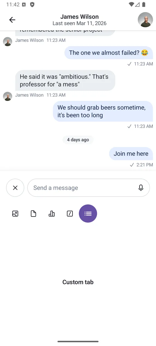
This example is simple, but you can create custom tabs that handle audio recordings, location sharing, calendar invites and much more.