 React
React iOS
iOS Android
 Flutter
 Angular
 JavaScript
 Unity
Unity Unreal
 Node
Node Python
 Ruby
Ruby PHP
PHP Java
Java .NET
.NET Go
Go REST
RESTimport { Text } from "react-native";
import { ReactionData } from "stream-chat-react-native";
const supportedReactions: ReactionData[] = [
{ type: "happy", Icon: () => <Text>😄</Text> },
{ type: "sad", Icon: () => <Text>😦</Text> },
{ type: "love", Icon: () => <Text>❤️</Text> },
{ type: "angry", Icon: () => <Text>😠</Text> },
{ type: "haha", Icon: () => <Text>😆</Text> },
];
<Channel supportedReactions={supportedReactions}>
{/* Underlying MessageList and MessageComposer components */}
</Channel>;This is beta documentation for Stream Chat React Native SDK v9. For the latest stable version, see the latest version (v8)
.
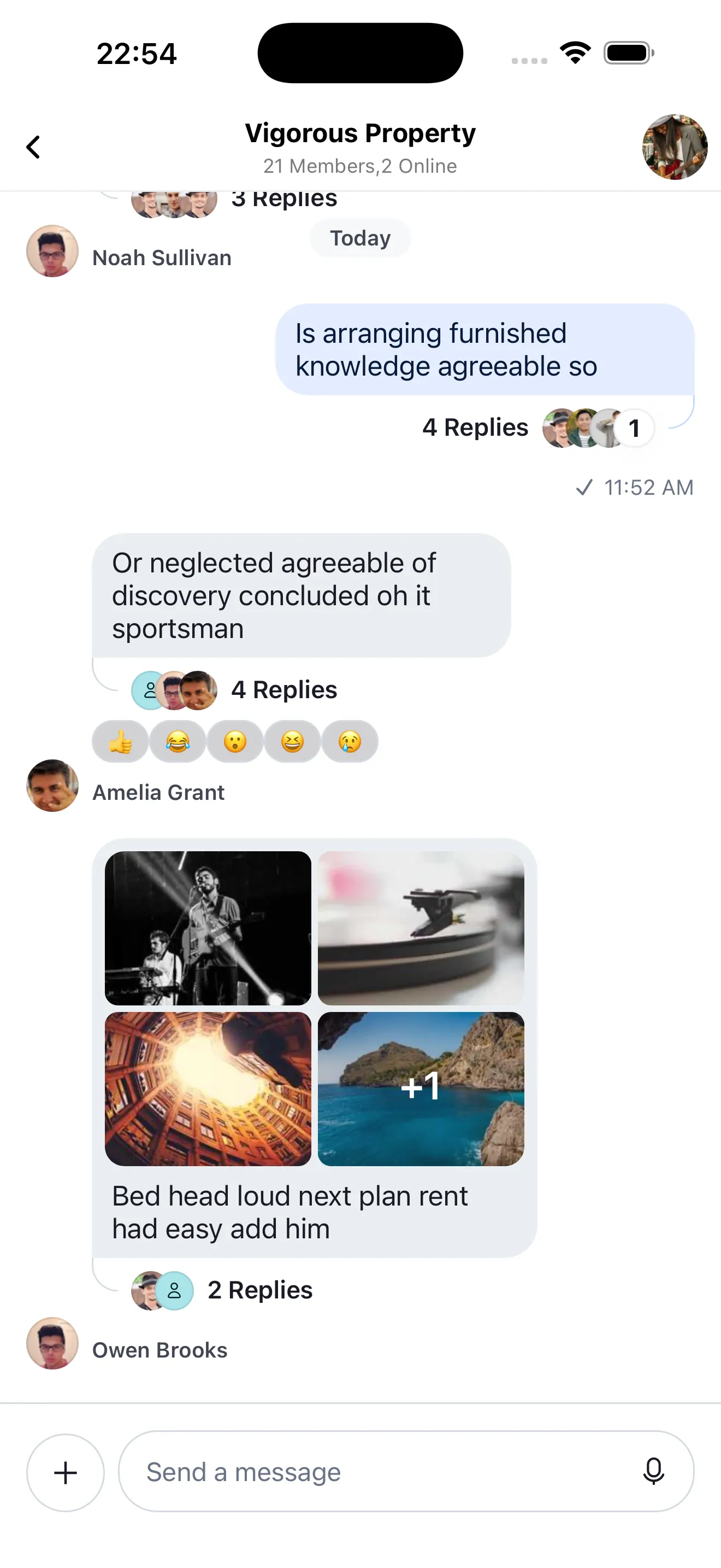
Customize Message Reactions
Message reactions are a key part of chat apps. The SDK includes built-in support.
Best Practices
- Keep reaction sets small and familiar to reduce UI clutter.
- Use
supportedReactionsto keep server and client reaction types aligned. - Choose a single
reactionListPositionto avoid shifting layouts. - Respect
enforceUniqueReactionto simplify downstream analytics. - Reuse
useMessageContexthandlers to keep overlay and press behavior consistent.
Supported Reaction types
You can customize the supported types of reactions for your application using the supportedReactions prop of the Channel component.
It expects an array of objects with Icon and type. Use ReactionData for type safety.
Example:
Reaction List Position and Style
Reactions can render at the top or bottom using reactionListPosition on Channel.
You can also control the visual style with reactionListType.
reactionListPosition:top|bottomreactionListType:clustered|segmented
For bottom-aligned reactions, segmented usually produces a more natural layout.
<Channel reactionListPosition="bottom" reactionListType="segmented">
  {/* Underlying MessageList and MessageComposer components */}
</Channel>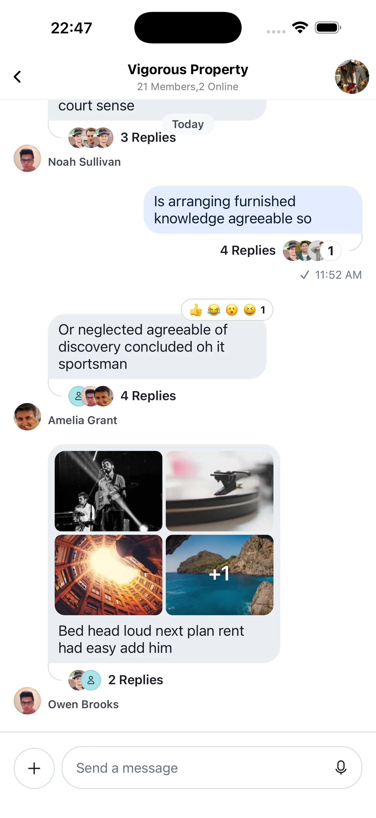 | 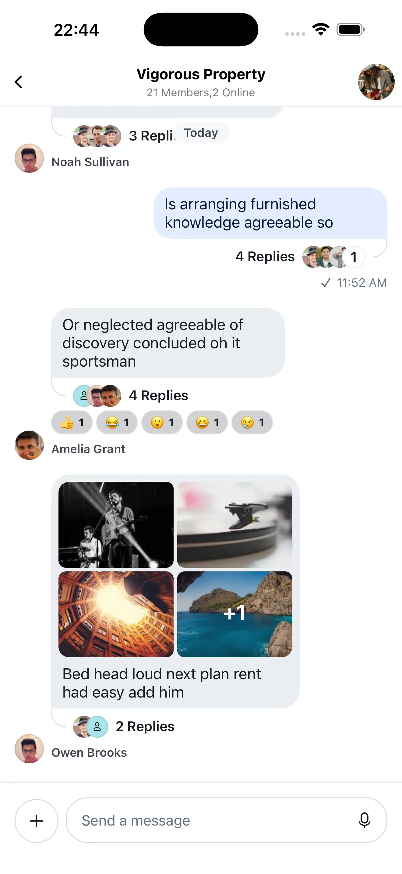 |
| Top Reactions | Bottom Reactions |
Enforce unique reactions
You can enforce a single reaction per user per message.
To do this, you can enable the enforceUniqueReaction prop in the Channel component.
<Channel enforceUniqueReaction>
  {/* Underlying MessageList and MessageComposer components */}
</Channel>
Customizing message Reaction List components
When a message has reactions, you can customize:
ReactionListTopReactionListBottom
By passing custom UI via Channel props:
import { StyleSheet, View } from "react-native";
import {
Channel,
ReactionListItemWrapper,
useMessageContext,
} from "stream-chat-react-native";
const CustomReactionListBottomComponent = () => {
const {
handleReaction,
onPress,
onLongPress,
onPressIn,
preventPress,
reactions,
showReactionsOverlay,
} = useMessageContext();
return (
<View style={styles.container}>
{reactions?.map((reaction) => {
const { type, Icon } = reaction;
return (
<ReactionListItemWrapper
disabled={preventPress}
key={type}
onLongPress={(event) => {
onLongPress?.({
defaultHandler: () => {
showReactionsOverlay(type);
},
emitter: "reactionList",
event,
});
}}
onPress={(event) => {
onPress?.({
defaultHandler: () => {
if (handleReaction) {
void handleReaction(type);
}
},
emitter: "reactionList",
event,
});
}}
selected={reaction.own}
>
{Icon ? <Icon /> : null}
</ReactionListItemWrapper>
);
})}
</View>
);
};
const ChannelScreen = () => {
return (
<Channel
reactionListPosition="bottom"
ReactionListBottom={CustomReactionListBottomComponent}
>
{/* Underlying MessageList and MessageComposer components */}
</Channel>
);
};
const styles = StyleSheet.create({
container: {
borderRadius: 4,
flexDirection: "row",
marginVertical: 2,
},
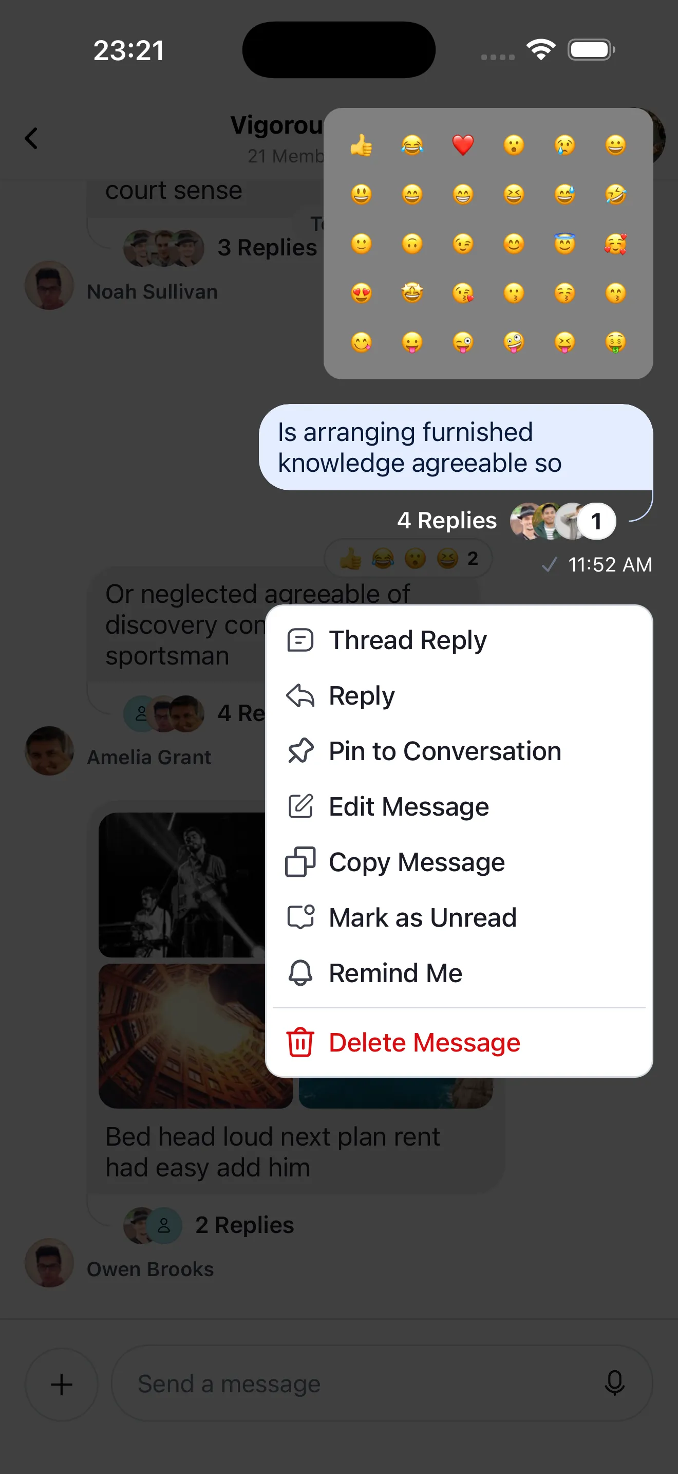
});Customizing Reaction Picker component
Customize the reaction picker via MessageReactionPicker on Channel.
If you fully replace it, you own the reaction selection and overlay dismiss behavior. As a note, make sure to use scheduleActionOnClose for any and all actions that affect the underlying MessageList's layout as it will make sure they're executed after the closing animations of the context menu are finished.
import { useMemo, useCallback } from "react";
import { FlatList, Pressable, StyleSheet, View } from "react-native";
import {
  Channel,
  MessageReactionPickerProps,
  ReactionData,
  scheduleActionOnClose,
  useMessagesContext,
  useMessageContext,
} from "stream-chat-react-native";

const CustomMessageReactionPicker = () => {
  const { supportedReactions } = useMessagesContext();
  const { dismissOverlay, handleReaction } = useMessageContext();

  const renderItem = useCallback(
    ({ item }: { item: ReactionData }) => {
      return (
        <Pressable
          onPress={() => {
            dismissOverlay();
            if (handleReaction) {
              scheduleActionOnClose(() => handleReaction(item.type));
            }
          }}
          style={styles.reactionButton}
        >
          {item.Icon ? <item.Icon /> : null}
        </Pressable>
      );
    },
    [dismissOverlay, handleReaction],
  );

  const reactionData = useMemo(
    () => supportedReactions?.slice(0, 30) ?? [],
    [supportedReactions],
  );

  return (
    <View style={styles.container}>
      <FlatList
        columnWrapperStyle={styles.row}
        data={reactionData}
        keyExtractor={(item) => item.type}
        numColumns={6}
        renderItem={renderItem}
      />
    </View>
  );
};

const ChannelScreen = () => {
  return (
    <Channel MessageReactionPicker={CustomMessageReactionPicker}>
      {/* Underlying MessageList and MessageComposer components */}
    </Channel>
  );
};

const styles = StyleSheet.create({
  container: {
    padding: 8,
    marginBottom: 8,
    backgroundColor: "grey",
    borderRadius: 12,
  },
  row: {
    justifyContent: "space-evenly",
  },
  reactionButton: {
    padding: 8,
  },
});
Customizing Message Reactions by user list component
We display the list of the reactions reacted by users in the channel in the MessageUserReactions component and each of the item in the list using the MessageUserReactionsItem and the avatar using the MessageUserReactionsAvatar component.
import { useMemo, useCallback } from "react";
import { FlatList, StyleSheet, Text, View } from "react-native";
import { ReactionSortBase } from "stream-chat";
import {
  MessageUserReactionsAvatar,
  Reaction,
  useFetchReactions,
  useMessageContext,
  useMessagesContext,
} from "stream-chat-react-native";

const CustomMessageUserReactions = () => {
  const { message } = useMessageContext();
  const { supportedReactions } = useMessagesContext();
  const reactionSort: ReactionSortBase = {
    created_at: -1,
  };

  const { reactions: fetchedReactions } = useFetchReactions({
    message,
    sort: reactionSort,
  });

  const reactions = useMemo(
    () =>
      fetchedReactions.map((reaction) => ({
        id: `${reaction.user?.id}-${reaction.type}-${String(reaction.created_at ?? "unknown")}`,
        image: reaction.user?.image,
        name: reaction.user?.name,
        type: reaction.type,
      })) as Reaction[],
    [fetchedReactions],
  );

  const renderItem = useCallback(
    ({ item }: { item: Reaction }) => {
      const Icon = supportedReactions?.find(
        (supportedReaction) => supportedReaction.type === item.type,
      )?.Icon;
      return (
        <View style={styles.container}>
          <MessageUserReactionsAvatar reaction={item} />
          <Text style={styles.text}>{item.name}</Text>
          <View style={styles.icon}>{Icon && <Icon />}</View>
        </View>
      );
    },
    [supportedReactions],
  );

  return (
    <FlatList
      data={reactions}
      keyExtractor={(item) => item.id}
      renderItem={renderItem}
    />
  );
};

const styles = StyleSheet.create({
  container: {
    flexDirection: "row",
    flexWrap: "wrap",
    marginHorizontal: 16,
    alignItems: "center",
    marginVertical: 8,
  },
  icon: {
    position: "absolute",
    right: 0,
  },
  text: {
    marginHorizontal: 16,
  },
});
Similarly, you can customize the MessageUserReactionsItem and MessageUserReactionsAvatar component.
On this page: