 React
React iOS
iOS Android
 Flutter
 Angular
 JavaScript
 Unity
Unity Unreal
 Node
Node Python
 Ruby
Ruby PHP
PHP Java
Java .NET
.NET Go
Go REST
RESTnpm install stream-chat-angular ngx-float-ui@18
yarn add stream-chat-angular stream-chat @ngx-translate/core angular-mentions ngx-float-ui@18 @floating-ui/domThis is documentation for
Stream Chat Angular SDK v5, which is nolonger actively maintained. For up-to-date documentation, see the latest version (v7)
.
Upgrade from v4
Highlights
- New message menu and message edit UIs to improve usability
- Provide more CSS customization options for the avatar and icon components (to avoid providing a custom component for even basic customization)
- Drop support for Angular 12-14 and theme-v1
Want to see it all in action? Check out the demo application or try it out in your own application using the instructions below.
Get started
npm install stream-chat-angular ngx-float-ui@17

# or
yarn add stream-chat-angular stream-chat @ngx-translate/core angular-mentions ngx-float-ui@17 @floating-ui/dom
npm install stream-chat-angular ngx-float-ui@16
# or
yarn add stream-chat-angular stream-chat @ngx-translate/core angular-mentions ngx-float-ui@16 @floating-ui/domnpm install stream-chat-angular @ngx-translate/core@14 ngx-float-ui@15
# or
yarn add stream-chat-angular stream-chat @ngx-translate/core@14 angular-mentions ngx-float-ui@15 @floating-ui/domBreaking changes
Angular version support
Angular versions 12-14 are no longer supported. You can use the Angular update guide to update your application.
Theme v1 is removed
Theme-v1 was deprecated in version 4. Most customers already use theme-v2 which used to be imported from this path:
@import "stream-chat-angular/src/assets/styles/v2/scss/index.scss";From version 5 this path should be used:
@import "stream-chat-angular/src/assets/styles/scss/index.scss";

// or if you're using CSS
@import "stream-chat-angular/src/assets/styles/css/index.css";
In case you run into an SCSS issue related to icons, you should extend the stylesheet import like this:
@use "stream-chat-angular/src/assets/styles/scss/variables" with (
  $assetsPath: "../node_modules/stream-chat-angular/src/assets/assets"
);
@import "stream-chat-angular/src/assets/styles/scss/index.scss";
If Angular can't find the stylesheet, you should include node_modules in your angular.json in the build.options section:
"stylePreprocessorOptions": {
  "includePaths": ["./node_modules"]
}
No futher action is required for customers who were already using theme-v2.
Customers who used to use theme-v1 now need to use theme-v2. Updating from theme-v1 to theme-v2 will require to rewrite your custom CSS code as the new theme has a new variable system, and all the components were restructured. To help you get started please refer our theming guide.
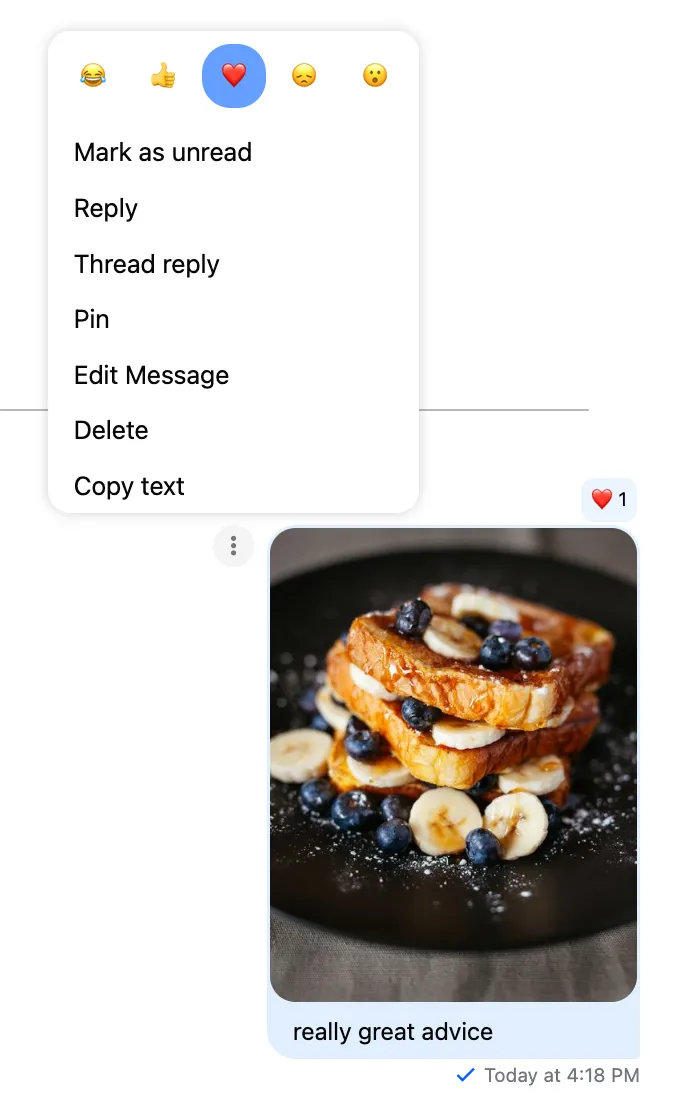
New message menu UI
The old message menu UI caused usability issues on mobile devices. The new UI address these issues, and adds some other improvements as well.
With the new UI these component-level changes are introduced:
- The
MessageListComponentno longer supports themessageOptionsTriggerparameter as this was a workaround for mobile UX problems. On desktop devices the message menu will be triggered by hovering anywhere in the message area. On mobile devices the message menu will be triggered by a longpress insde the message bubble area. - The
MessageReactionsComponentwas split into two components. TheMessageReactionsComponentis only responsible for displaying the existing reactions, and with that theisSelectorOpeninput andisSelectorOpenChangeoutput was removed. TheMessageReactionsSelectoris a new component, that's responsible for adding/removing message reactions.
New message edit UI
The modal-based edit message UI is replaced with a more modern approach: the message will be edited inside the main/thread message input.
These are the component-level changes related to this feature:
- The
EditMessageFormcomponent has been removed - The
editMessageFormTemplate$andmessageInputTemplate$have been removed from theCustomTemplatesService
If you don't want to have this UI, you can set the watchForMessageToEdit input to false on the MessageInputComponent:
<stream-message-input [watchForMessageToEdit]="false"></stream-message-input>The stream-message-input still has all inputs/outputs you need to create a custom message edit UI:
<stream-message-input
  [watchForMessageToEdit]="false"
  [displaySendButton]="false"
  [message]="messageToEdit"
  [sendMessage$]="sendMessage$Input"
  (messageUpdate)="messageUpdateHandler()"
></stream-message-input>
Signature change for custom channel list event handlers
The channelListSetter's signature changed for the following custom event handlers of the ChannelService:
customNewMessageNotificationHandlercustomAddedToChannelNotificationHandlercustomRemovedFromChannelNotificationHandlercustomChannelDeletedHandlercustomChannelUpdatedHandlercustomChannelTruncatedHandlercustomChannelHiddenHandlercustomChannelVisibleHandlercustomNewMessageHandler
If you're adding a new channel to the list from these handlers, you need to make sure to provide a watched channel.
Example code:
private async customEventHandler(
  clientEvent: ClientEvent,
  channelListSetter: (channels: Channel<DefaultStreamChatGenerics>[]) => void
) {
  const channelResponse = clientEvent!.event!.channel!;
  // Change 1: create a channel from `ChannelResponse`
  const newChanel = this.chatService.chatClient.channel(
    channelResponse.type,
    channelResponse.id
  );
  try {
    // Change 2: call .watch() before adding it to the channel list
    await newChanel.watch();
    const existingChannels = this.channelService.channels;
    channelListSetter([newChanel, ...existingChannels]);
  } catch (error) {
    console.error('Failed to watch channel', error);
  }
}
If you need more information, we have a channel list guide you can check out.
Removed deprecated features
MessageListComponent
- No longer accepts the
customMessageActionsinput. You can use theMessageActionsServicefor configuring custom message actions.
MessageComponent
- No longer accepts the
customActionsinput. You can use theMessageActionsServicefor configuring custom message actions.
MessageActionsBoxComponent
- No longer accepts the
isOpeninput. TheMessagecomponent will take care of hiding/showing the action box component. - The
customActionsinput has been removed. You can use theMessageActionsServicefor configuring custom message actions. - The
displayedActionsCountoutput has been removed. Moving forward theMessageActionsServicewill be able to provide this information. - The
isEditingoutput has been removed. Moving forward theMessageActionsServicewill be able to provide this information.
messageActionsBoxTemplate$
- No longer accepts the
isOpeninput. TheMessagecomponent will take care of hiding/showing the action box component. - The
customActionsinput has been removed. You can use theMessageActionsServicefor configuring custom message actions. - The
displayedActionsCountChangeHandlerinput has been removed. Moving forward theMessageActionsServicewill be able to provide this information.
ImageLoadService
The ImageLoadService is now removed. It's no longer required since the SDK uses a more advanced image sizing method.
ChannelListToggleService
The ChannelListToggleService is now removed as it was only used in theme-v1. For theme-v2 please refer to the responsive layout guide.
Channel query error handling
In previous versions if an error occured during channel load, the channelService.channels$ Observable emitted an error, which would close the stream. Users would have to reload the page to be able to reinitialize the ChannelService. This isn't a sensible default behavior. From version 5 the channels$ Observable will never emit an error, the channel query result can be observed using the channelService.channelQueryState$. With this change the options.keepAliveChannels$OnError is no longer necessary, and has been removed.
Type changes
- Event handlers with
Functiontype are changed to() => void - Event handlers with
anyreturn types are changed tovoidreturn type - The action handler signature of (custom) message actions was changed from
(message: StreamMessage, isMine: boolean) => voidto(message: StreamMessage, extraParams: MessageActionHandlerExtraParams) => void. TheisMineflag is part of theMessageActionHandlerExtraParamsobject. - The
MessageActionBoxItemContextis changed,isMineis removed, andparams: MessageActionHandlerExtraParamsis added. TheisMineflag is part of theMessageActionHandlerExtraParamsobject.
Default reactions
To better align with other SDKs, the default reaction set has been changed: the angry reaction is removed. You can provide your own reaction set using the MessageReactionsService
Component customization
Avatar
To allow better customization for avatar, the size input has been removed, and was replaced with the --str-chat__avatar-size CSS variable.
With this change the size input is no longer supported on the AvatarPlaceholderComponent, AvatarComponent, and the avatarTemplate$.
Icon
In previous versions it was hard to customize icon size and color from CSS, and using custom icons required overriding the built-in icon component. To solve these issues stream-chat-angular@5 introduces a better customization system for icons.
Please refer to the theming guide that explains how to customize icons.
With this change the size input is no longer necessary and has been removed from the the IconPlaceholderComponent, IconComponent, and the iconTemplate$.
The icon names have also been consolidated, so if you're using a custom icon component, you need to update it accordingly:
| Previous name | Change |
|---|---|
action-icon | Renamed to action |
delivered-icon | Renamed to delivered |
read-icon | Renamed to read |
reaction-icon | Renamed to reaction |
connection-error | Removed, it was only used in theme-v1 |
send | Unchanged |
file-upload | Removed, it was only used in theme-v1 |
retry | Unchanged |
close | Unchanged |
file | Removed, it was only used in theme-v1 |
audio-file | Unchanged |
reply | Removed, it was only used in theme-v1 |
close-no-outline | Removed, use close instead |
reply-in-thread | Unchanged |
arrow-left | Unchanged |
arrow-right | Unchanged |
menu | Removed, it was only used in theme-v1 |
arrow-up | Unchanged |
arrow-down | Unchanged |
chat-bubble | Unchanged |
attach | Unchanged |
unspecified-filetype | Unchanged |
download | Unchanged |
error | Unchanged |
play | Unchanged |
pause | Unchanged |
Loading indicator
To allow better customization for loading indicator, the size input has been removed, and was replaced with the --str-chat__loading-indicator-size CSS variable.
With this change the size input is no longer supported on the LoadingIndicatorPlaceholderComponent, LoadingIndicatorComponent, and the loadingIndicatorTemplate$. The loadingIndicatorTemplate$ now accepts TemplateRef<void> instead of TemplateRef<LoadingIndicatorContext>
Channel invites
Keeping track of pending channel invites is no longer automatic. If you're using channel invites and want to enable this behavior you need to initialize the ChatClientService with the following flag:
this.chatService.init("<API key>", "<user>", "<token provider>", {
  trackPendingChannelInvites: true,
});
Other changes
Unused packages
The ngx-popperjs package is no longer used, so you can remove the related packages from your package.json file:
@popperjs/corengx-popperjs
On this page: