// stream-chat-angular@5
@import "stream-chat-angular/src/assets/styles/scss/index.scss";

// stream-chat-angular@4
@import "stream-chat-angular/src/assets/styles/v2/scss/index.scss";Introduction
Importing the stylesheet
If you're using SCSS:
If you're using CSS:
// stream-chat-angular@5
@import "stream-chat-angular/src/assets/styles/css/index.css";

// stream-chat-angular@4
@import "stream-chat-angular/src/assets/styles/v2/css/index.css";
Customization
Our theming system has various customization options allowing for both smaller and large-scale UI changes. This document guides you through the different customization options.
CSS variables
CSS variables are the easiest way to customize the theme. The variables are organized into two layers:
- global
- component
Global variables
You can use global variables to apply changes to the whole chat UI (as opposed to changing the design of individual components).
The full list of global variables can be found in our global variables guide.
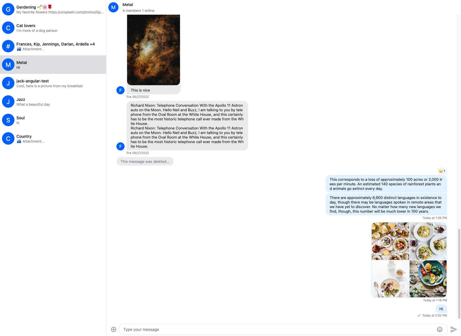
Here is the default chat UI:
Here is how you can customize global variables:
.str-chat {
  --str-chat__primary-color: #009688;
  --str-chat__active-primary-color: #004d40;
  --str-chat__surface-color: #f5f5f5;
  --str-chat__secondary-surface-color: #fafafa;
  --str-chat__primary-surface-color: #e0f2f1;
  --str-chat__primary-surface-color-low-emphasis: #edf7f7;
  --str-chat__border-radius-circle: 6px;
}
Here is the result:
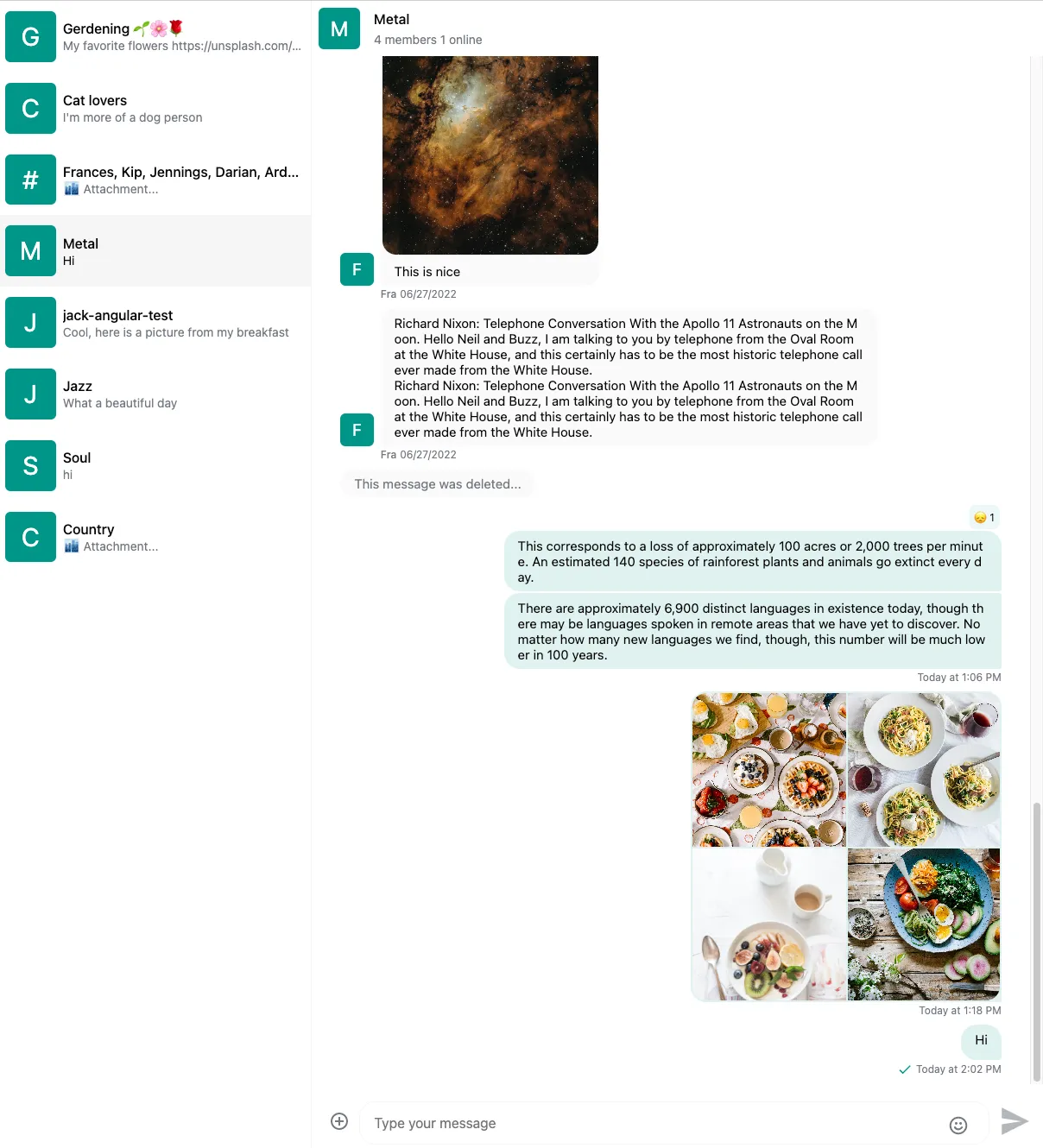
The str-chat class is applied to the channel list and channel component, all CSS variables are declared on this level, if you don't use those components in your chat application you'll have apply this class manually.
Component variables
You can use component layer variables to change the design of individual components. The full list of component variables can be found in our component variables guide.
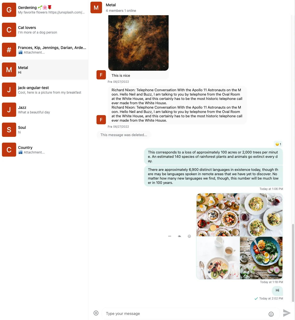
In the above example we set the avatar background color by setting the --str-chat__primary-color variable which also sets the color of other UI elements. If we want to change the background color only for the avatar component we can use the --str-chat__avatar-background-color variable:
.str-chat {
  --str-chat__primary-color: #009688;
  --str-chat__active-primary-color: #004d40;
  --str-chat__surface-color: #f5f5f5;
  --str-chat__secondary-surface-color: #fafafa;
  --str-chat__primary-surface-color: #e0f2f1;
  --str-chat__primary-surface-color-low-emphasis: #edf7f7;
  --str-chat__border-radius-circle: 6px;
  --str-chat__avatar-background-color: #bf360c; // Only changes the background color of the avatar component
}
Here is the result:
Component variables don't inherit. Let's see an example of this.
Here is the message component without custom color:
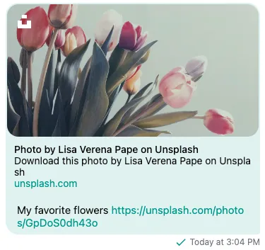
Setting custom text color inside message bubble:
.str-chat {
  --str-chat__primary-color: #009688;
  --str-chat__active-primary-color: #004d40;
  --str-chat__surface-color: #f5f5f5;
  --str-chat__secondary-surface-color: #fafafa;
  --str-chat__primary-surface-color: #e0f2f1;
  --str-chat__primary-surface-color-low-emphasis: #edf7f7;
  --str-chat__border-radius-circle: 6px;
  --str-chat__avatar-background-color: #bf360c;
  --str-chat__message-bubble-color: #00695c; // Custom text color only for the message bubble
}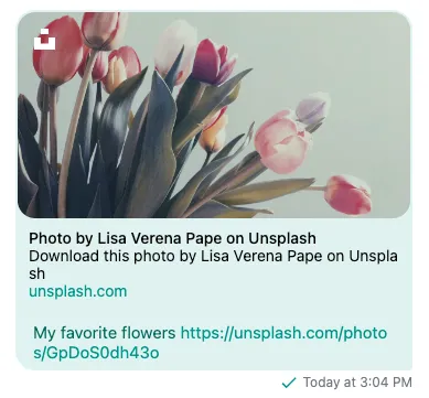
We can see that setting the text color of the message bubble won't change the color of the link attachments.
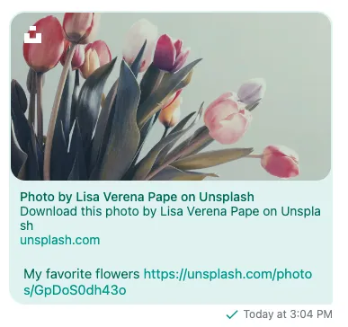
To solve this we also have to set the text color for the link attachment component:
.str-chat {
  --str-chat__primary-color: #009688;
  --str-chat__active-primary-color: #004d40;
  --str-chat__surface-color: #f5f5f5;
  --str-chat__secondary-surface-color: #fafafa;
  --str-chat__primary-surface-color: #e0f2f1;
  --str-chat__primary-surface-color-low-emphasis: #edf7f7;
  --str-chat__border-radius-circle: 6px;
  --str-chat__avatar-background-color: #bf360c;
  --str-chat__message-bubble-color: #00695c;
  --str-chat__card-attachment-color: #00695c; // Setting text color of link attachments
}
Custom icons
From CSS
Starting from stream-chat-angular@5 it's possible to customize icons from CSS.
Here is an example using the Google Material Icon library to override the send icon:
// Import the icon library you want to use
@import url("https://fonts.googleapis.com/css2?family=Material+Symbols+Outlined:opsz,wght,FILL,GRAD@20..48,100..700,0..1,-50..200");

// Override the send icon
.str-chat__icon--send::before {
  font-family: "Material Symbols Outlined";
  content: "\e163";
}
It's also possible to use image files for icons:
.str-chat__icon--send {
  &::before {
    display: none;
  }
  // Link to your image file, or encode the image inline
  content: url("data:image/svg+xml;base64,PHN2ZyB4bWxucz0iaHR0cDovL3d3dy53My5vcmcvMjAwMC9zdmciIGhlaWdodD0iMjQiIHZpZXdCb3g9IjAgLTk2MCA5NjAgOTYwIiB3aWR0aD0iMjQiPjxwYXRoIGQ9Ik0xMjAtMTYwdi02NDBsNzYwIDMyMC03NjAgMzIwWm04MC0xMjAgNDc0LTIwMC00NzQtMjAwdjE0MGwyNDAgNjAtMjQwIDYwdjE0MFptMCAwdi00MDAgNDAwWiIvPjwvc3ZnPg==");
}
The full list of icons used by the SDK can be found here.
You can also change the size and color of the icons:
.str-chat__icon--attach {
  --str-chat-icon-color: green; // Only works for font icons
  --str-chat-icon-height: 60px;
}
From HTML template
If you're using stream-chat-angular@4 or an older version, or CSS customizations are not enough, you can completely replace the built-in icon component with your own using the CustomTemplatesService.
You can find a working example in the customization sample app.
If the default rules set by the stream-chat-angular stylesheets not enough to set the size and color of your custom icons, you can rely on the --str-chat-icon-color, --str-chat-icon-height and --str-chat-icon-width variables:
.my-custom-send-icon {
  svg {
    height: var(--str-chat-icon-height);
    width: var(--str-chat-icon-width);

    path {
      fill: var(--str-chat-icon-color);
    }
  }
}
CSS overrides
If you'd like to add customizations that are not supported by CSS variables, you can override parts of the default CSS:
// Provide your overrides after the stream-chat-angular stylesheet imports
.str-chat__channel-preview-messenger--last-message {
  font-weight: 500;
}
Just make sure that you add the customization rules after the stylesheet import.
If you're using SCSS it's also possible to import component stylesheets separately (instead of our bundled stylesheet):
// stream-chat-angular@5
// Use default theme for channel list and channel preview components
@import "stream-chat-angular/src/assets/styles/scss/ChannelList/ChannelList-layout.scss";
@import "stream-chat-angular/src/assets/styles/scss/ChannelList/ChannelList-theme.scss";
@import "stream-chat-angular/src/assets/styles/scss/ChannelPreview/ChannelPreview-layout.scss";
@import "stream-chat-angular/src/assets/styles/scss/ChannelPreview/ChannelPreview-theme.scss";

// stream-chat-angular@4
// Use default theme for channel list and channel preview components
@import "stream-chat-angular/src/assets/styles/v2/scss/ChannelList/ChannelList-layout.scss";
@import "stream-chat-angular/src/assets/styles/v2/scss/ChannelList/ChannelList-theme.scss";
@import "stream-chat-angular/src/assets/styles/v2/scss/ChannelPreview/ChannelPreview-layout.scss";
@import "stream-chat-angular/src/assets/styles/v2/scss/ChannelPreview/ChannelPreview-theme.scss";
.str-chat__avatar {
// Custom CSS for avatar component
}Apply your own look and feel
If you want to create a truly custom look and feel, it can be exhausting to override the default styling. In that case, it's possible only to apply layout rules from the default theme.
Here is how you can import the layout stylesheet:
// stream-chat-angular@5
@import "stream-chat-angular/src/assets/styles/scss/index.layout.scss";

// stream-chat-angular@4
@import "stream-chat-angular/src/assets/styles/v2/scss/index.layout.scss";
or if you're using CSS:
// stream-chat-angular@5
@import "stream-chat-angular/src/assets/styles/css/index.layout.css";

// stream-chat-angular@4
@import "stream-chat-angular/src/assets/styles/v2/css/index.layout.css";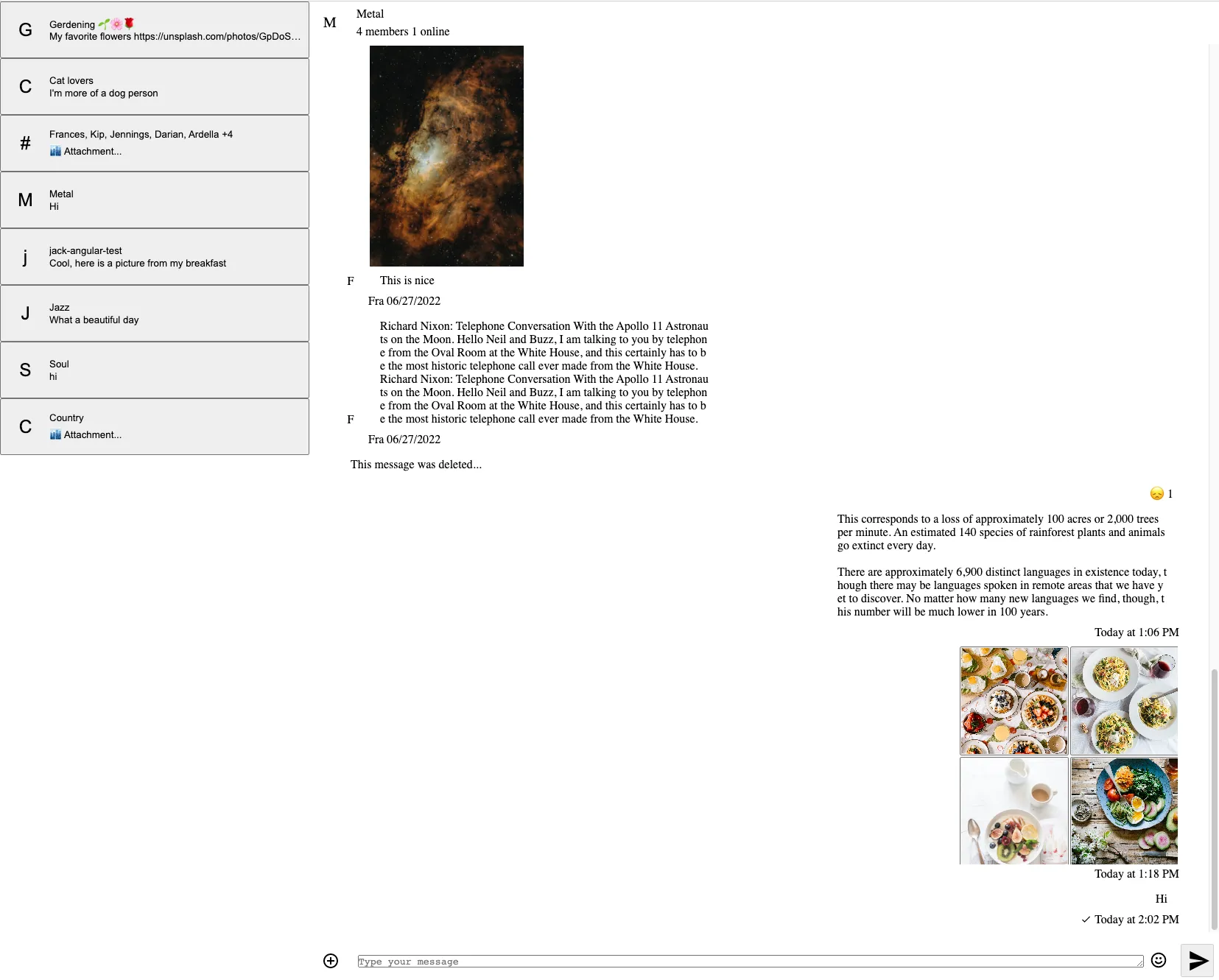
The result will be a minimalistic UI without
- coloring
- fonts
- borders
- shadows
Please note that if you're only using the layout rules, you can only use the layout CSS variables.
Dark and light themes
The default theme has dark and light variants. Here is how you can switch between the different themes:
Use the ThemeService:
import { ThemeService } from 'stream-chat-angular';

constructor(themeService: ThemeService) {
  themeService.theme$.next('dark'); // or light
}
Here is what the dark theme looks like:
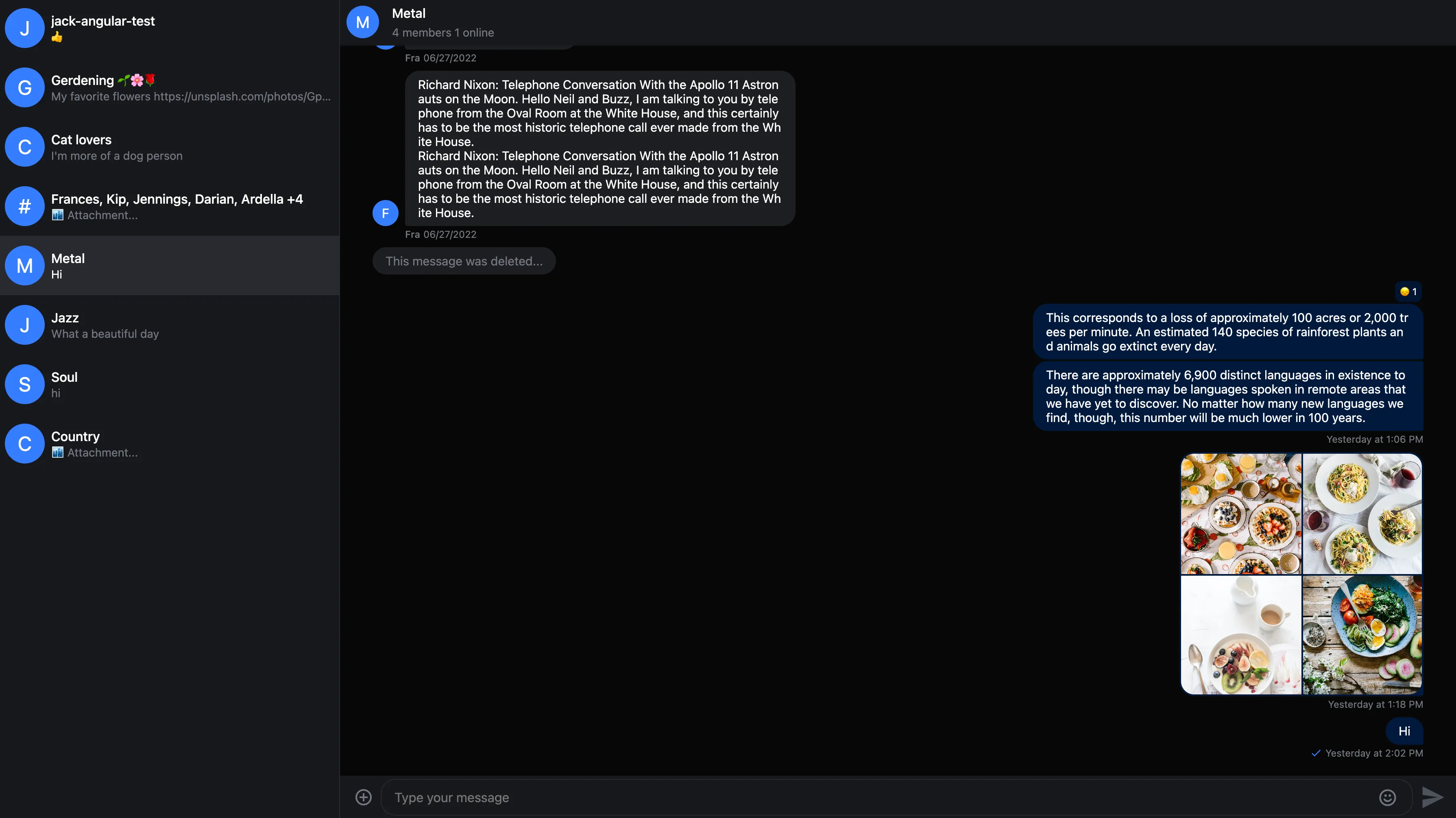
The str-chat__theme-dark/str-chat__theme-light class is applied to the channel list and channel components, these classes are responsible for switching between the dark and light theme color combinations, if you don't use those components in your chat application you'll have apply the theme classes manually.
Here is how you can provide different color configurations for the dark and light themes:
.str-chat {
  --str-chat__border-radius-circle: 6px;
}

.str-chat__theme-light {
  --str-chat__primary-color: #009688;
  --str-chat__active-primary-color: #004d40;
  --str-chat__surface-color: #f5f5f5;
  --str-chat__secondary-surface-color: #fafafa;
  --str-chat__primary-surface-color: #e0f2f1;
  --str-chat__primary-surface-color-low-emphasis: #edf7f7;
  --str-chat__avatar-background-color: #bf360c;
}

.str-chat__theme-dark {
  --str-chat__primary-color: #26a69a;
  --str-chat__active-primary-color: #00796b;
  --str-chat__surface-color: #424242;
  --str-chat__secondary-surface-color: #212121;
  --str-chat__primary-surface-color: #00695c;
  --str-chat__primary-surface-color-low-emphasis: #004d40;
  --str-chat__avatar-background-color: #ff7043;
}
Here is the custom dark theme:
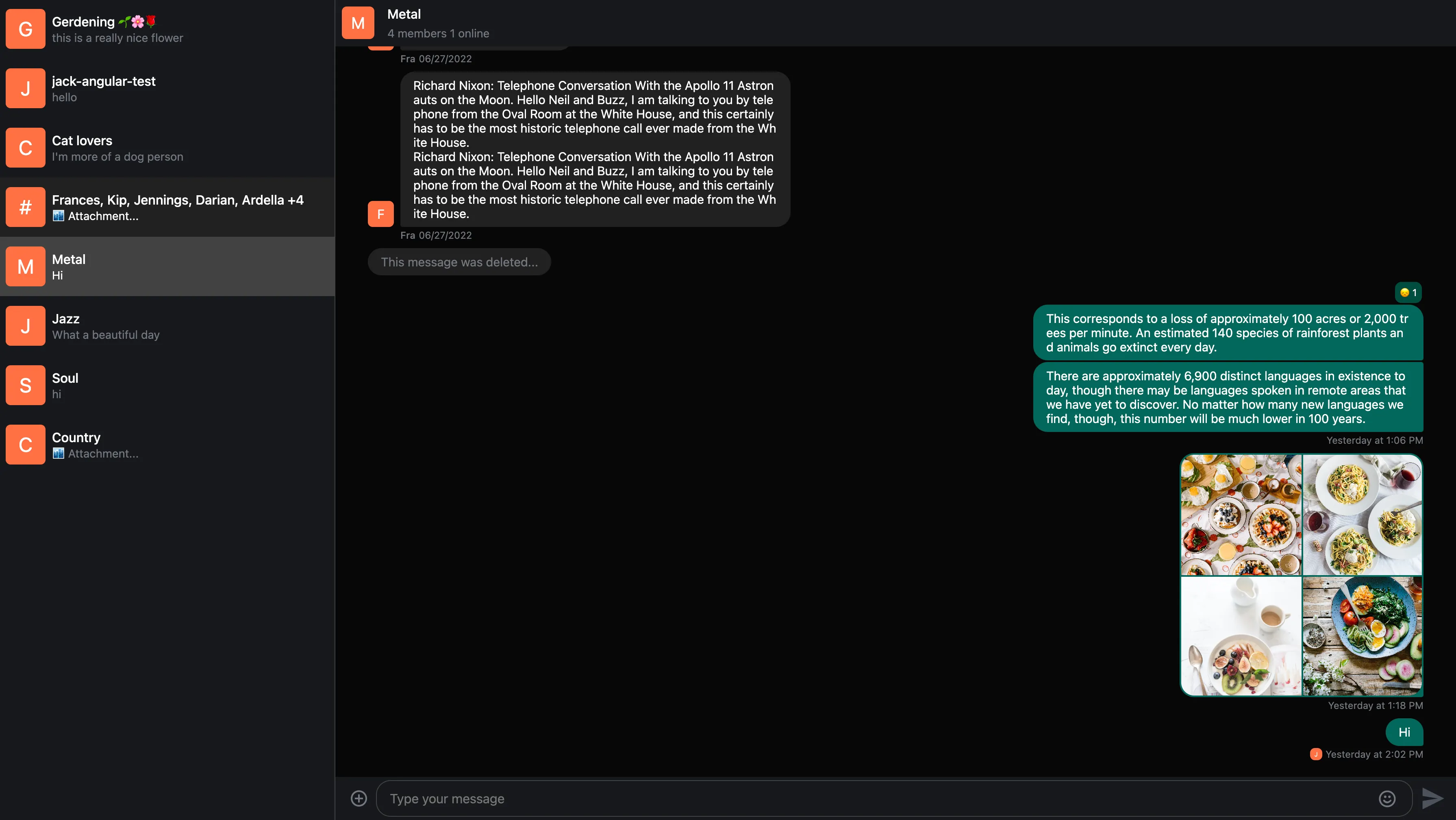
Creating your own theme
It's possible to extend the existing themes with your own themes.
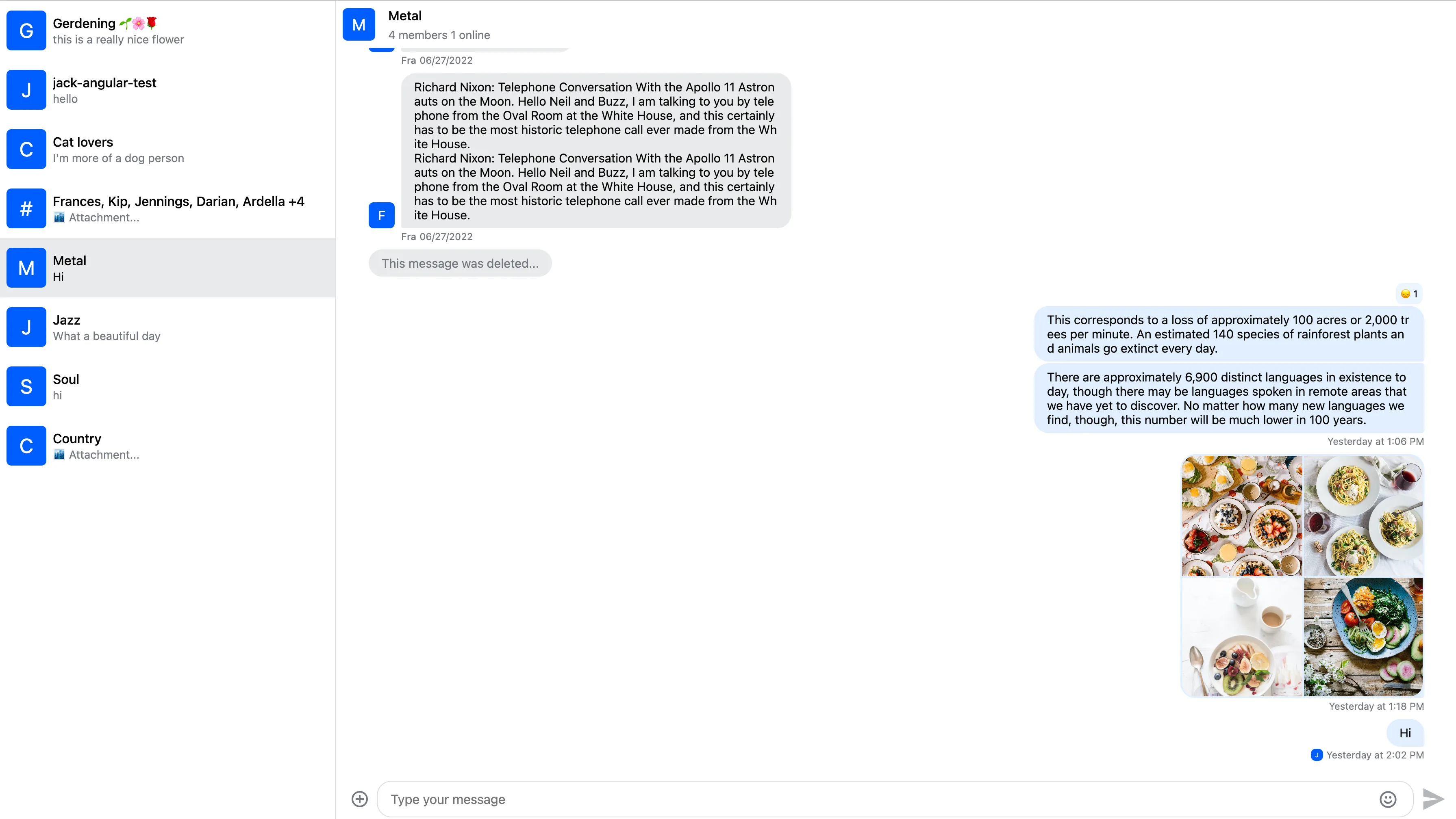
Here is an example creating 'round' and 'square' themes:
// Make sure to use the proper naming convention: str-chat__theme-<your theme>
.str-chat__theme-round {
  // You can use the predefined theme and component layer variables
  --str-chat__border-radius-circle: 999px;
}

.str-chat__theme-square {
  --str-chat__border-radius-circle: 6px;
}
Set the theme using the ThemeService:
import { ThemeService } from 'stream-chat-angular';

constructor(themeService: ThemeService) {
  themeService.theme$.next('square');
}
RTL support
The layout was built with RTL support in mind. You can use the RTL layout by providing the dir attribute in your HTML:
<html dir="rtl">
  <!-- ... -->
</html>
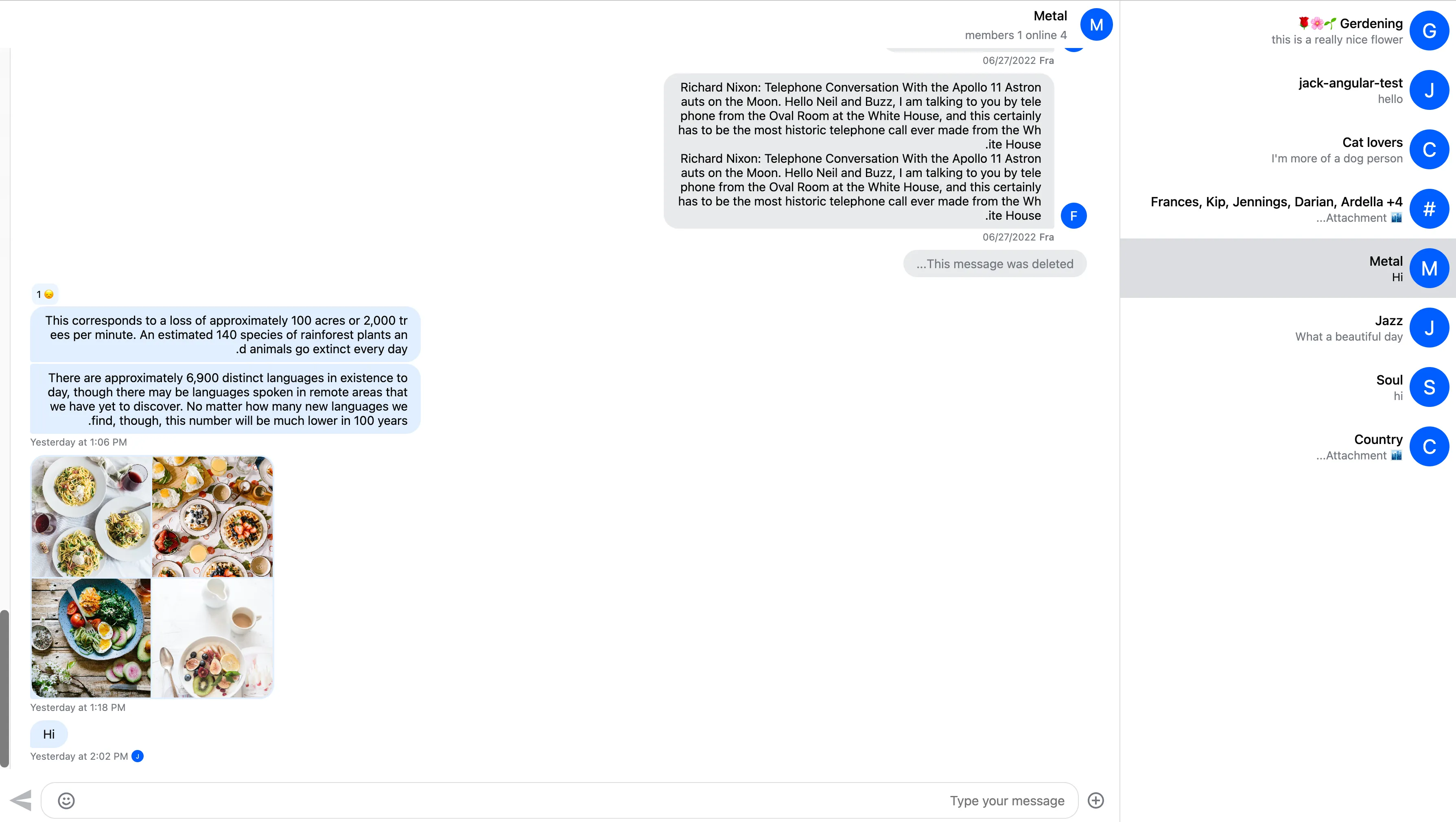
Here is the result:
