 React
React iOS
iOS Android
 Flutter
 Angular
 JavaScript
 Unity
Unity Unreal
 Node
Node Python
 Ruby
Ruby PHP
PHP Java
Java .NET
.NET Go
Go REST
RESTval defaultActions = AttachmentPickerActions.defaultActions(
attachmentsPickerViewModel = attachmentsPickerViewModel,
composerViewModel = composerViewModel,
)
AttachmentPicker(
attachmentsPickerViewModel = attachmentsPickerViewModel,
actions = defaultActions.copy(
onCreatePollClick = { /* navigate to poll creation screen */ },
onCreatePollDismissed = { /* handle poll creation dismissed */ },
),
)This is beta documentation for Stream Chat Android SDK v7. For the latest stable version, see the latest version (v6)
.
Polls
Stream Chat's Compose SDK includes the capability to create polls within your chat application. Polls are an effective tool for enhancing user interaction and engagement, providing a dynamic way to gather opinions and feedback.
Polls are disabled by default. To enable them, go to the Stream dashboard for your app and enable the Polls flag for your channel type. Once enabled, a "Polls" icon appears in the attachment picker.
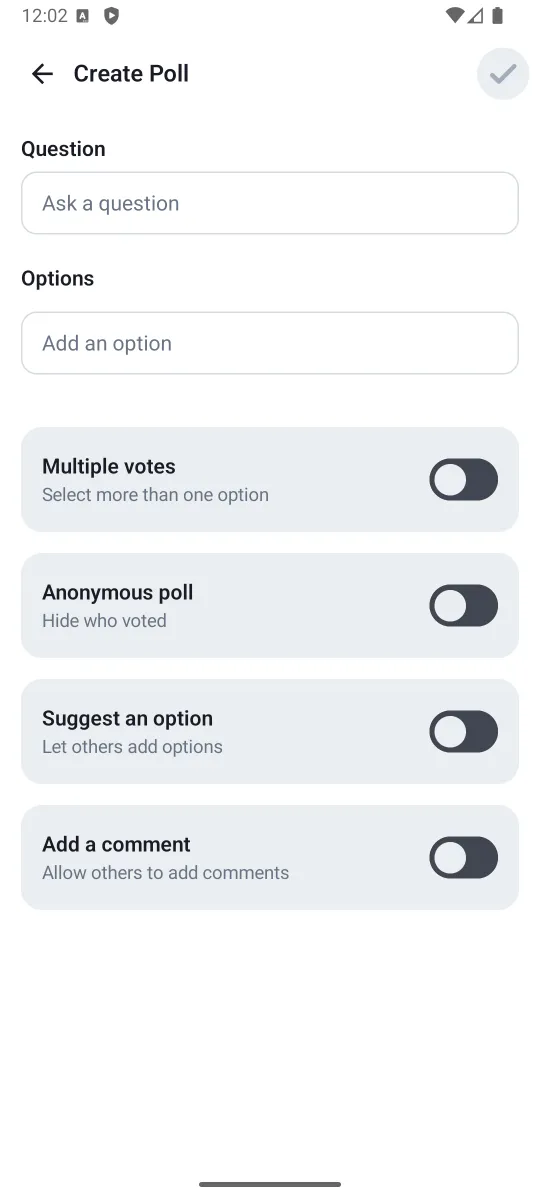
Poll Creation
When you tap the "Polls" icon, a new screen for creating polls will be shown. On this screen, you can configure the poll title, the options, as well as several other settings, such as the maximum number of votes, whether the poll is anonymous, and whether it allows comments.
If you are using the high-level ChannelScreen component, the poll creation is already handled for you. However, if you are implementing your own message composer with the AttachmentPicker component, you need to handle the poll creation action yourself via AttachmentPickerActions:
Standalone Poll Creation Screen
If you want to integrate the poll creation screen without using the AttachmentPicker component, you can use the standalone CreatePollScreen composable:
@Composable
fun CreatePollScreen(
    onBack: () -> Unit,
    onCreatePoll: (CreatePollParams) -> Unit,
)onBack— called when the user presses the back button and the poll creation should be canceled.onCreatePoll— called when the user completes the poll creation. Use theCreatePollParamswithMessageComposerViewModel.createPollorChatClient.sendPoll.
Custom Poll Creation Screen
You can swap the whole poll creation view by creating a custom ChatComponentFactory and overriding the AttachmentPickerContent method:
class CustomPollComponentFactory : ChatComponentFactory {

    @Composable
    override fun AttachmentPickerContent(params: AttachmentPickerContentParams) {
        if (params.pickerMode is PollPickerMode) {
            // Your custom poll creation screen implementation
        } else {
            super.AttachmentPickerContent(params)
        }
    }
}
Then provide your custom factory to ChatTheme:
ChatTheme(
    componentFactory = CustomPollComponentFactory(),
) {
    ChannelScreen(/* ... */)
}
Poll Configuration
You can configure which poll creation toggles are visible and their default values through ChatTheme.config.polls:
ChatTheme(
    config = ChatUiConfig(
        polls = PollsConfig(
            multipleVotes = PollFeatureConfig(configurable = true, defaultValue = false),
            maxVotesPerPerson = PollFeatureConfig(configurable = true, defaultValue = false),
            anonymousPoll = PollFeatureConfig(configurable = false, defaultValue = false),
            suggestAnOption = PollFeatureConfig(configurable = true, defaultValue = false),
            allowComments = PollFeatureConfig(configurable = false, defaultValue = false),
        ),
    ),
) {
    ChannelScreen(/* ... */)
}
Each PollFeatureConfig has two properties:
configurable: Whether the toggle appears in the poll creation UI. Whenfalse, the toggle is hidden.defaultValue: The initial state of the toggle when creating a new poll.
For example, to always enable anonymous polls without showing the toggle to users:
PollsConfig(
    anonymousPoll = PollFeatureConfig(configurable = false, defaultValue = true),
)
The CreatePollScreen reads its configuration from ChatTheme.config.polls — you don't need to pass configuration directly to the screen.
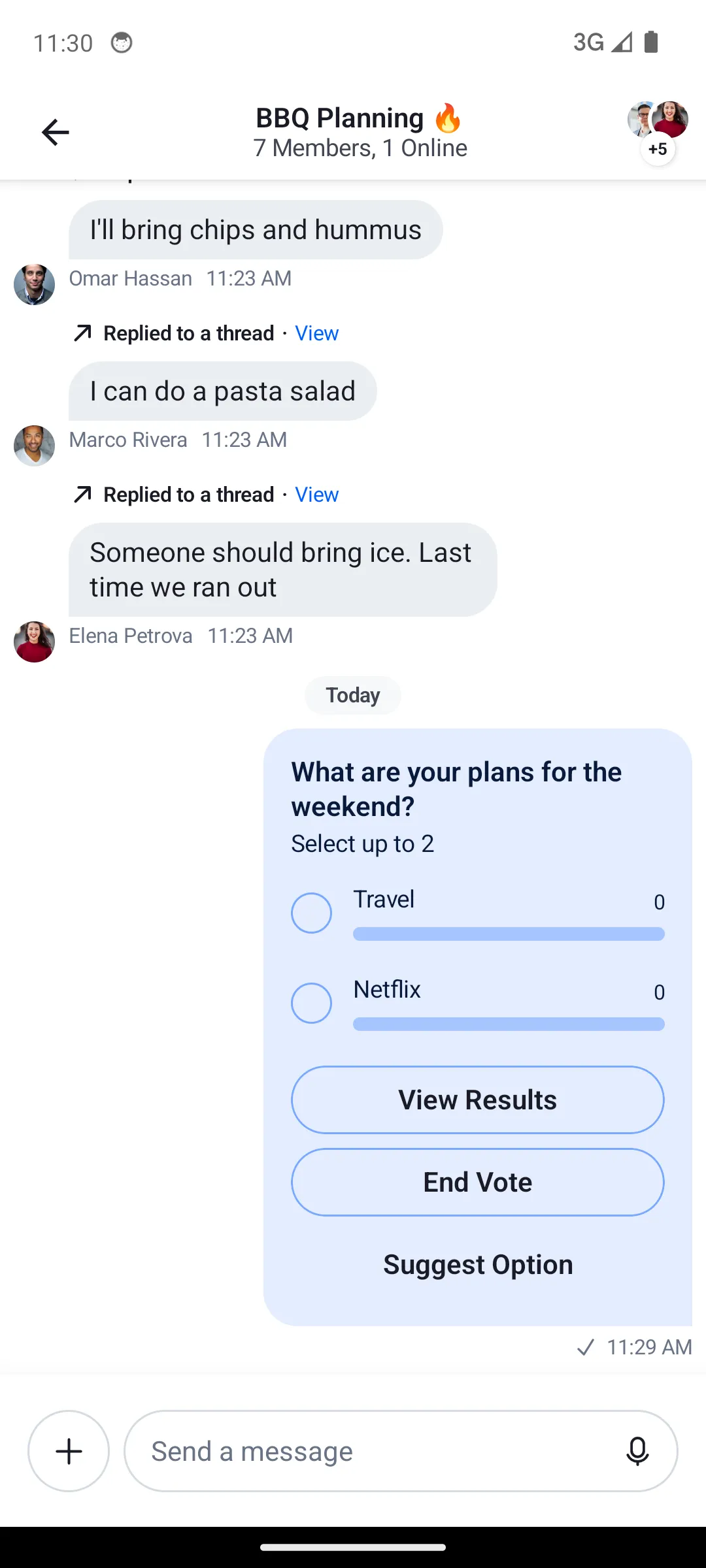
PollMessageContent
When a message contains a poll, the optional poll property inside Message will have a value of type Poll. In those cases, the PollMessageContent will be shown.
Poll attachments have the same behavior as other types of messages - you can send reactions, reply, delete them or pin them.
The PollMessageContent composable accepts the following parameters:
| Parameter | Type | Description |
|---|---|---|
modifier | Modifier | Modifier for styling |
messageItem | MessageItemState | The message item containing the poll |
onCastVote | (Message, Poll, Option) -> Unit | Called when user votes for an option |
onRemoveVote | (Message, Poll, Vote) -> Unit | Called when user removes their vote |
selectPoll | (Message, Poll, PollSelectionType) -> Unit | Called when user selects poll actions (view results, view answers, more options) |
onAddAnswer | (Message, Poll, String) -> Unit | Called when user adds a text answer/comment |
onClosePoll | (String) -> Unit | Called when poll owner closes the poll |
onAddPollOption | (Poll, String) -> Unit | Called when user suggests a new option |
onLongItemClick | (Message) -> Unit | Called on long press |
Poll Results and Answers
The SDK provides dialogs for viewing poll results and answers. If you are using the high-level ChannelScreen component, these dialogs are already implemented for you.
For custom message list implementations, use the PollDialogs component which encapsulates all poll dialogs:
val viewModelFactory = ChannelViewModelFactory(
    context = context,
    channelId = channelId,
)
val messageListViewModel = viewModel(MessageListViewModel::class.java, factory = viewModelFactory)

PollDialogs(
    listViewModel = messageListViewModel,
    showAnonymousAvatar = showAnonymousAvatar,
)
The individual dialogs are also available for direct use:
PollMoreOptionsDialog— shows all options when a poll has more than 10.PollViewResultDialog— displays vote counts and winner indicator.PollAnswersDialog— shows text answers/comments with the ability to add or edit.
Polls API
In addition to the Compose SDK components, the Stream Chat Android Low-Level Client provides various methods to manage polls programmatically. You can find all the available operations in the Polls API.