 React
React iOS
iOS Android
 Flutter
 Angular
 JavaScript
 Unity
Unity Unreal
 Node
Node Python
 Ruby
Ruby PHP
PHP Java
Java .NET
.NET Go
Go REST
REST@Composable
fun MyCustomUi() {
Scaffold(
modifier = Modifier.fillMaxSize(),
bottomBar = { // 1 - Add the composer as a bottom bar
MessageComposer(
modifier = Modifier // 2 - customize the component
.fillMaxWidth()
.wrapContentHeight(),
viewModel = composerViewModel, // 3 - provide ViewModel
// 4 - customize actions
onAttachmentsClick = { attachmentsPickerViewModel.setPickerVisible(true) },
onCancelAction = {
listViewModel.dismissAllMessageActions()
composerViewModel.dismissMessageActions()
}
)
}
) {
// 5 - the rest of your UI
...
}
}This is beta documentation for Stream Chat Android SDK v7. For the latest stable version, see the latest version (v6)
.
MessageComposer
The MessageComposer is arguably one of the most important components when building the Chat experience. It allows users to participate in the chat by sending messages and attachments.
There are two versions of the composer that we provide:
- Bound: This version relies on a
ViewModelto set up all of its operations, like sending, editing and replying to a message, as well as handling UI state when the user performs different message actions. - Stateless: This is a stateless version of the composer which doesn't know about
ViewModels or business logic. It exposes several actions and customization options that let you override the behavior and UI of the component.
The bound version of the composer uses the stateless composer internally. That way, when providing the same state to either component, the behavior remains the same.
Additionally, we cannot provide a default ViewModel, as it requires the channelId to send data, so you'll have to build an instance yourself.
Let's see how to integrate the MessageComposer in your UI.
Usage
The easiest way to use the MessageComposer is by combining it with the rest of our components, like so:
Since it doesn't make sense to use the MessageComposer as a standalone component, this example shows how to add it in a Scaffold, along with the rest of your UI.
In this example, you took the following steps:
- Step 1: You set up the
MessageComposeras abottomBarof aScaffold. This way you dedicate space on the screen to it, while fitting in the rest of your content. - Step 2: You customize the
MessageComposerusing a set ofModifiers to make it fill the parent width and wrap its height. - Step 3: You pass in the
ViewModelto bind the composer to. This helps it load all the info it needs to show various states. - Step 4: You customize some of the actions of the composer to propagate them to other parts of your business logic.
- Step 5: You can set up the rest of your UI in the
Scaffoldbody, which could host any of our other components or your custom UI.
Notice how our components allow you to customize the UI to suit your needs by combining them with your custom UI or our other components.
You can also customize the behavior of our components to update the rest of your UI state accordingly.
Here's how it looks when combined with the rest of our messages components:
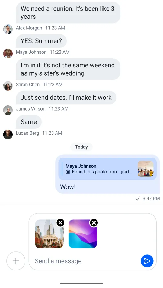
The composer shows attachments in the input area, a label, integrations on the left side, and the send button on the right side.
Next, you'll want to handle and customize the actions of the MessageComposer.
Handling Actions
The composer offers these actions you can customize, as per the signature:
@Composable
fun MessageComposer(
    viewModel: MessageComposerViewModel,
    modifier: Modifier = Modifier,
    isAttachmentPickerVisible: Boolean = false,
    onSendMessage: (Message) -> Unit = { viewModel.sendMessage(it) },
    onAttachmentsClick: () -> Unit = {},
    onValueChange: (String) -> Unit = { viewModel.setMessageInput(it) },
    onAttachmentRemoved: (Attachment) -> Unit = { viewModel.removeAttachment(it) },
    onCancelAction: () -> Unit = { viewModel.dismissMessageActions() },
    onLinkPreviewClick: ((LinkPreview) -> Unit)? = null,
    onCancelLinkPreviewClick: (() -> Unit)? = { viewModel.cancelLinkPreview() },
    onUserSelected: (User) -> Unit = { viewModel.selectMention(it) },
    onCommandSelected: (Command) -> Unit = { viewModel.selectCommand(it) },
    onAlsoSendToChannelChange: (Boolean) -> Unit = viewModel::setAlsoSendToChannel,
    onActiveCommandDismiss: () -> Unit = viewModel::clearActiveCommand,
    recordingActions: AudioRecordingActions = AudioRecordingActions.defaultActions(viewModel),
    input: @Composable RowScope.(MessageComposerState) -> Unit = { ... },
)viewModel: TheMessageComposerViewModelto bind the composer to.isAttachmentPickerVisible: Whether the attachment picker is currently visible. Used to adjust the composer UI accordingly.onSendMessage: Handler used when the user taps on the Send button.onAttachmentsClick: Handler used when the user taps on the default attachments integration.onValueChange: Handler used that exposes text value changes in the composer.onAttachmentRemoved: Handler used when the user removes an attachment from selected attachments, in the input area.onCancelAction: Handler used when the user cancels the current message action, usuallyEditorReplyactions.onLinkPreviewClick: Handler used when the user taps on a link preview in the composer header. Passnullto disable link preview clicks.onCancelLinkPreviewClick: Handler used when the user taps the cancel button on a link preview. Passnullto hide the cancel button.onUserSelected: Handler used when the user selects a mention suggestion.onCommandSelected: Handler used when the user selects an instant command.onAlsoSendToChannelChange: Handler used when the user toggles the checkbox for sending messages from thread to channels.onActiveCommandDismiss: Handler used when the user dismisses the active command chip.recordingActions: Defines audio recording actions. UseAudioRecordingActions.defaultActions(viewModel)for the default implementation orAudioRecordingActions.Noneto disable.input: Slot that represents the core input area. By default delegates toChatComponentFactory.MessageComposerInput().
As you can see, most of these actions update the state in the MessageComposerViewModel, or are empty, by default.
To customize these actions, simply pass in a lambda function for each one when building your custom UI with our MessageComposer, like in the example above.
Handling Typing Updates
Typing updates should be sent sparingly as a way of saving valuable API calls. Luckily, we offer such behavior out of the box.
MessageComposerViewModel contains MessageComposerController, which in turn uses DefaultTypingUpdatesBuffer in order to intelligently make start and stop typing API calls.
If you want to implement your own buffering mechanism you can pass in an implementation of the TypingUpdatesBuffer interface instead:
composerViewModel.setTypingUpdatesBuffer(
    // Your custom implementation of TypingUpdatesBuffer
)
Customization
The MessageComposer exposes an input slot parameter for replacing the entire input area with a custom composable. For more granular customization, override the individual parts through ChatComponentFactory:
Composer-level:
MessageComposer()— Controls the overall composer rendering.MessageComposerLeadingContent()— The leading integrations (attachments button).MessageComposerTrailingContent()— The trailing content (send button, audio recording controls).MessageComposerEditIndicator()— The edit indicator shown when editing a message.MessageComposerLinkPreview()— The link preview in the composer.
Input-level:
MessageComposerInput()— The full input area (text field, attachments, label).MessageComposerInputCenterContent()— The text input field and label.MessageComposerInputTrailingContent()— The trailing content inside the input (send button, recording controls).MessageComposerInputLeadingContent()— The leading content inside the input (active command chip).MessageComposerInputCenterBottomContent()— The "Also send to channel" checkbox in threads.
See the Component Factory page for details on overriding these methods.
Here's an example that replaces the default label and adds a custom send button inside the input:
class CustomComposerFactory(
    private val delegate: ChatComponentFactory = object : ChatComponentFactory {},
) : ChatComponentFactory by delegate {

    @Composable
    override fun MessageComposerInputCenterContent(
        params: MessageComposerInputCenterContentParams,
    ) {
        // Custom label with an icon when the input is empty
        if (params.state.inputValue.isEmpty()) {
            Row(verticalAlignment = Alignment.CenterVertically) {
                Icon(imageVector = Icons.Default.Email, contentDescription = null)
                Text(
                    modifier = Modifier.padding(start = 4.dp),
                    text = "Type something",
                    color = ChatTheme.colors.textSecondary,
                )
            }
        }
        // Delegate to the default implementation for the actual text field
        delegate.MessageComposerInputCenterContent(params)
    }

    @Composable
    override fun MessageComposerInputTrailingContent(
        params: MessageComposerInputTrailingContentParams,
    ) {
        // Custom send button inside the input
        Icon(
            modifier = Modifier
                .size(24.dp)
                .clickable { params.onSendClick(params.state.inputValue, params.state.attachments) },
            painter = painterResource(id = R.drawable.stream_compose_ic_send),
            tint = ChatTheme.colors.accentPrimary,
            contentDescription = null,
        )
    }
}