The ChatComponentFactory is a factory which defines most of the stateless
low-level composable components, which are used as building blocks for the
high-level screen components and the bound components
(see Component Architecture).
The screen components, the bound components, and even the low-level components
which depend on different low-level components, use the ChatComponentFactory
to render specific components of the UI in a stateless manner.
By overriding the ChatComponentFactory, developers can easily customize or
override specific parts of the Chat UI, without the need to build their own
implementations from scratch. This enables a high degree of customization and
flexibility, allowing the Chat UI to be tailored to specific design requirements.
The ChatComponentFactory allows customization of most low-level components
used in different Chat screens. It provides the ability to customize common components globally,
as well as specific components in particular locations.
The ChatComponentFactory provides a way to customize the avatars which are
used in the Chat screens.
To customize avatars, override the corresponding ChatComponentFactory method:
class CustomChatComponentFactory : ChatComponentFactory { @Composable override fun ChannelAvatar(params: ChannelAvatarParams) { // Your implementation of the channel avatar // Access params.modifier, params.channel, params.currentUser, params.onClick }}
Method
Description
Used in
ChannelAvatar
Avatar for a channel: shows the channel image, the other member's avatar (DMs), or stacked member avatars for group channels.
Channel list items, channel header
UserAvatar
Avatar for a single user: shows their image or initials plus an online indicator.
Full header component shown in ChannelsScreen. Provides title, connection state, and user actions.
ChannelListHeaderLeadingContent
Leading slot — defaults to the current user's avatar.
ChannelListHeaderCenterContent
Center slot — defaults to the connection-state title.
ChannelListHeaderTrailingContent
Trailing slot — defaults to the custom action button.
If you are not using the high-level screen component ChannelsScreen, you can
still use the ChannelListHeader component independently from the
ChatComponentFactory, and customize its leading/center/trailing content
directly by passing your own content for the
leadingContent/centerContent/trailingContent slots as described in
Channel List Header.
Full channel row. Provides channel item state, click/long-click callbacks.
ChannelItemLeadingContent
Leading slot — defaults to the channel avatar.
ChannelItemCenterContent
Center slot — defaults to channel name and last message preview.
ChannelItemTrailingContent
Trailing slot — defaults to the last message timestamp.
If you are using the bound ChannelList component instead of the high-level
ChannelsScreen, you can also directly customize the channel items by
providing a custom implementation for the channelContent slot (more details in the
Channel List
documentation).
Full header for ChannelScreen. Provides channel, connection state, typing users, and actions.
ChannelHeaderLeadingContent
Leading slot — defaults to the back button.
ChannelHeaderCenterContent
Center slot — defaults to channel name and member count subtitle.
ChannelHeaderTrailingContent
Trailing slot — defaults to the channel avatar.
You can also customize the ChannelHeader from the ChannelScreen by
passing your implementation in the topBarContent slot. If you are using the
ChannelHeader component independently, customize its slots directly as described in
Channel Header.
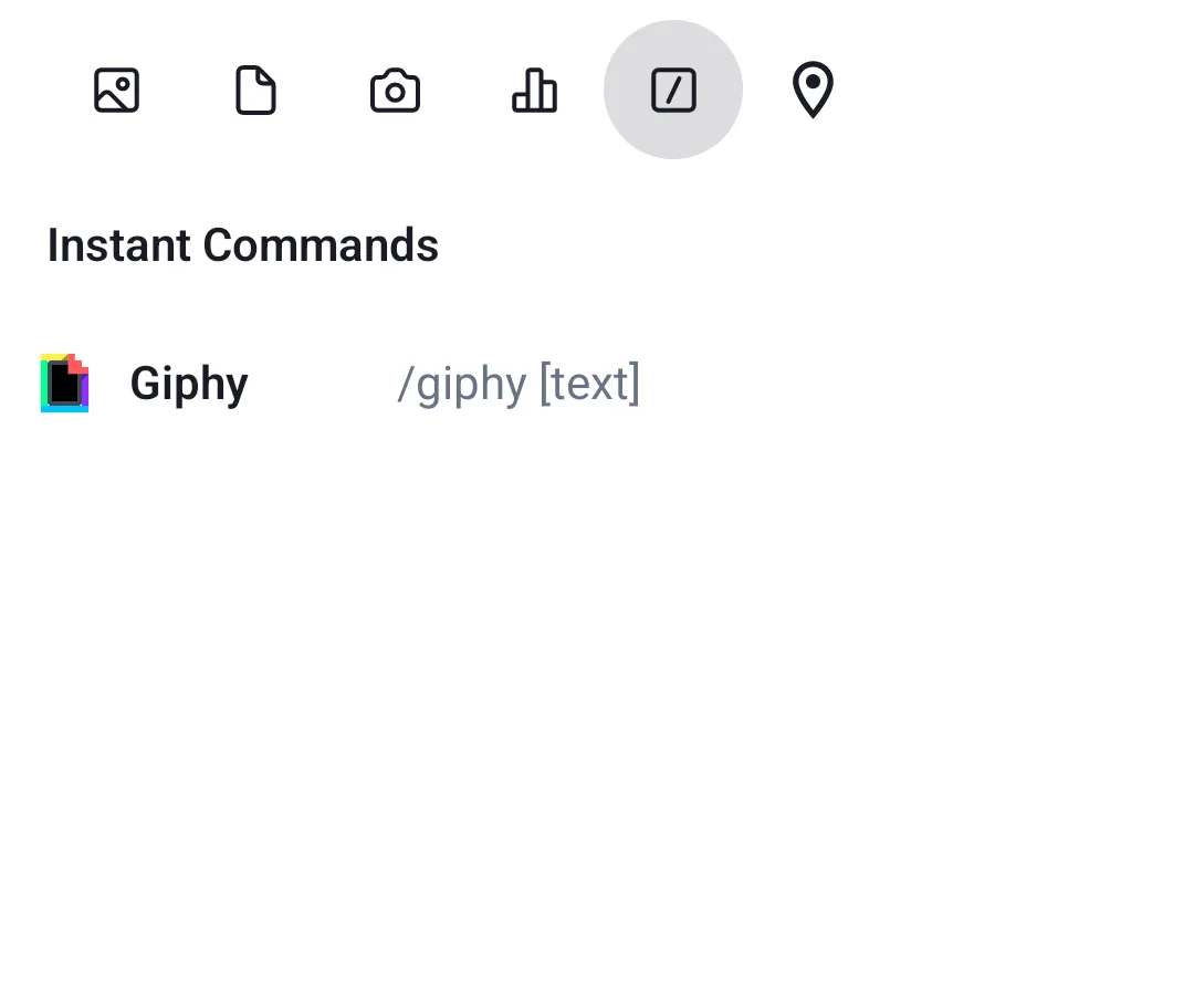
Leading slot of a command item — defaults to command icon.
MessageComposerCommandSuggestionItemCenterContent
Center slot of a command item — defaults to name and usage example.
MessageComposerLinkPreview
Link preview content within the composer header.
MessageComposerEditIndicator
Edit indicator shown when editing a message.
MessageComposerQuotedMessage
Quoted message preview shown in the composer when replying.
Commands popup
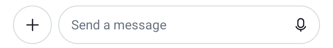
If you are using the bound/stateless component MessageComposer directly
instead of the ChannelScreen, you can also customize most components by
passing custom implementations in the specific slots. More details in the
Message Composer docs.
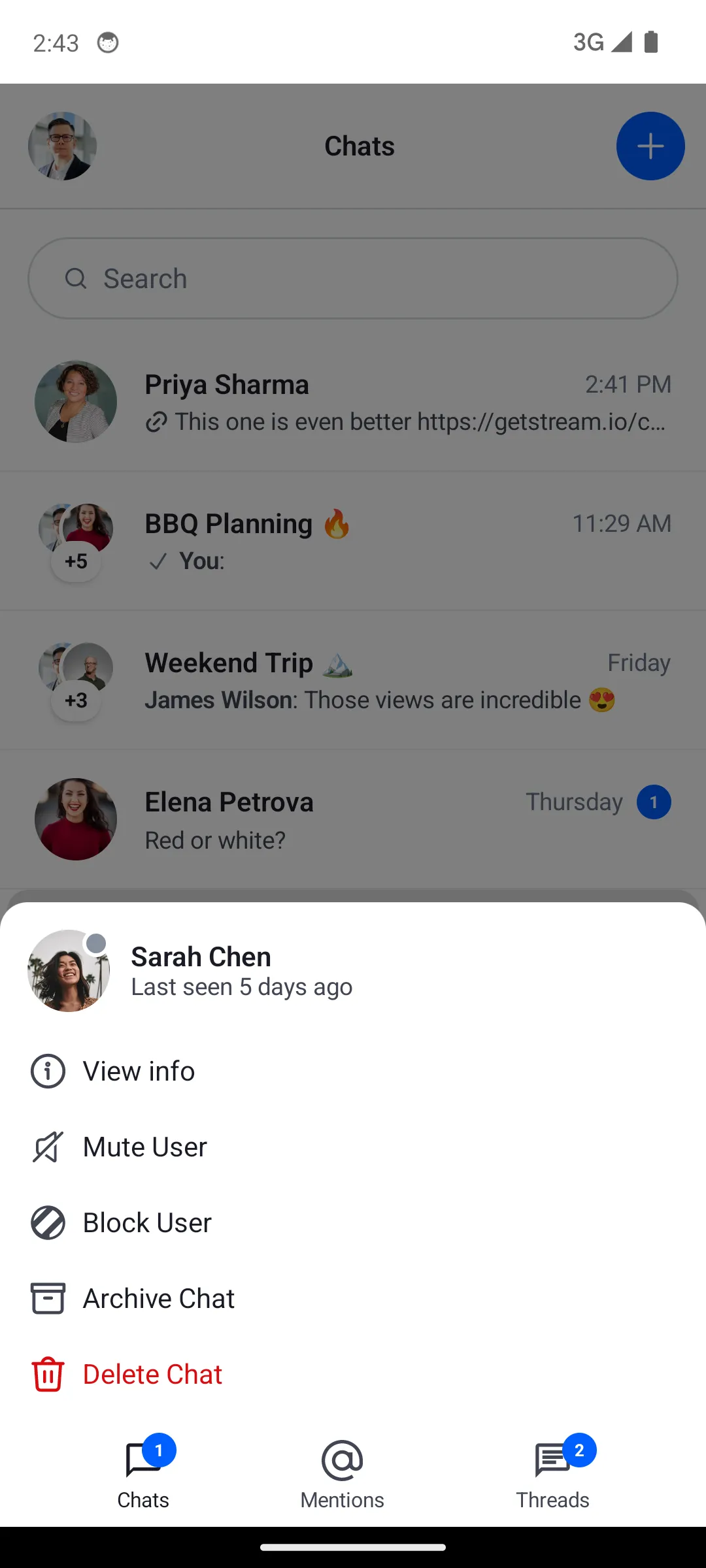
Full channel options menu. Provides channel, current user, actions list, and dismiss callback.
ChannelMenuHeaderContent
Header section of the channel menu.
ChannelMenuOptions
Options list section of the channel menu.
ChannelOptionsItem
Single option row in the channel menu.
ChannelOptionsItemLeadingIcon
Icon shown at the start of a channel option row.
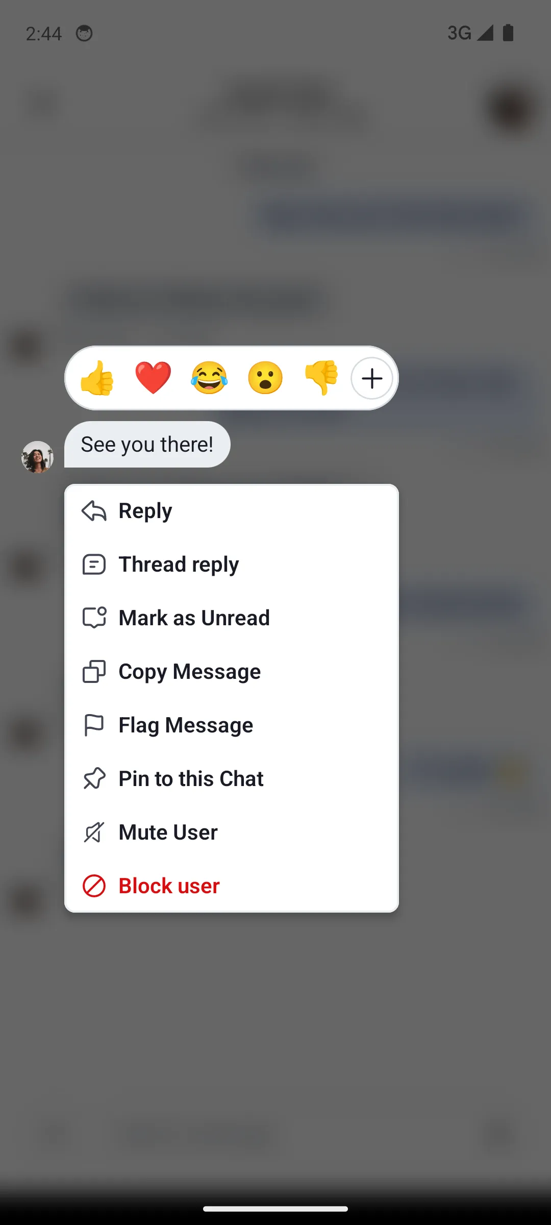
Message menu
Message menu
Method
Description
MessageMenu
Full message options menu. Provides message, options list, capabilities, and action callbacks.
MessageMenuHeaderContent
Header section of the message menu (shows reaction picker).
MessageMenuOptions
Options list section of the message menu.
MessageMenuOptionsItem
Single option row in the message menu.
Shared menu item
MenuOptionItem is shared by both the channel and message menus. Override it once to apply the same change to both menus — for example, to remove leading icons from all option rows.
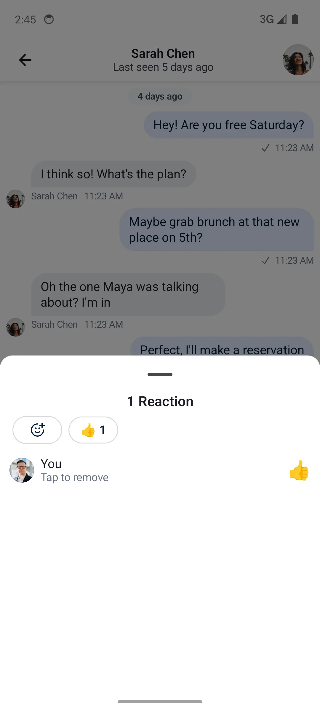
Reactions menu
Reactions menu
Method
Description
ReactionsMenu
Full reactions menu shown when tapping the reaction icon on a message.
ReactionsMenuContent
Content of the reactions menu.
ReactionMenuOptionItem
Single reaction option in the picker row.
MessageReactionPicker
Extended reactions picker opened by tapping "Show more".
You can compose multiple factories together. This is useful when you want to customize
a specific UI component deep in a composable hierarchy, without overriding an entire factory:
ChatTheme( componentFactory = MyCustomChatComponentFactory()) { val currentComponentFactory = LocalComponentFactory.current val myCustomMessageFooterStatusIndicator = remember { object : ChatComponentFactory by currentComponentFactory { @Composable override fun MessageFooterStatusIndicator(params: MessageFooterStatusIndicatorParams) { MyAwesomeMessageReadStatusIndicator() } } } CompositionLocalProvider(LocalComponentFactory provides myCustomMessageFooterStatusIndicator) { MessageList() }}
Some factory methods are extensions of a scope (e.g. LazyItemScope). Calling super directly
does not compile in that case. Use a delegate and the with operator to forward the call:
 React
React iOS
iOS Android
 Flutter
 Angular
 JavaScript
 Unity
Unity Unreal
 Node
Node Python
 Ruby
Ruby PHP
PHP Java
Java .NET
.NET Go
Go REST
REST