 React
React iOS
iOS Android
 Flutter
 Angular
 JavaScript
 Unity
Unity Unreal
 Node
Node Python
 Ruby
Ruby PHP
PHP Java
Java .NET
.NET Go
Go REST
RESToverride fun onCreate(savedInstanceState: Bundle?) {
super.onCreate(savedInstanceState)
setContent {
ChatTheme {
ChannelScreen(
viewModelFactory = ChannelViewModelFactory(
context = this,
channelId = "messaging:123",
messageLimit = 30
),
onBackPressed = { finish() },
onHeaderTitleClick = {}
)
}
}
}This is beta documentation for Stream Chat Android SDK v7. For the latest stable version, see the latest version (v6)
.
Theming
The ChatTheme component is a wrapper that you should use as the root of all Compose UI Components. It's used to provide the default properties that help us style the application, such as:
isInDarkMode: Flag that determines if the application should be themed in light or dark mode.config: AChatUiConfiginstance that holds feature flags grouped by area (translation, message list, composer, channel list, media gallery, attachment picker). See ChatUiConfig.colors: Defines a palette of colors we support in the app viaStreamDesign.Colors. These are applied to all components and provide us with a dark/light mode by default, but can be used to override the design system completely.typography: Used for all text elements viaStreamDesign.Typography, to apply different text styles to each component. Can be used to change the typography completely.rippleConfiguration: Defines the appearance of click ripples. Can be used to override the ripple colors used in light and dark modes.componentFactory: Defines the component factory which renders the low-level composable components. Can be used to globally override specific components from the SDK screens or the high-level components. See: Component Factory.attachmentPreviewHandlers: Used to provide previews for all supported attachment types. If you do not wish to use the default previews, you can customize this.reactionResolver: Used to map reaction types to emoji characters. You can use the default resolver that supports 240+ emoji mappings, or provide a custom one. See ReactionResolver.reactionOptionsTheme: Used to define the appearance of the reaction option list in the selected message menu. For theming the message option list in the same menu, seemessageOptionsThemebelow.messagePreviewIconFactory: Used to create a preview icon for the given message type.dateFormatter: Used to define the timestamp formatting in the app. You can use the default formatting, or customize it to your needs.durationFormatter: Used to define the DurationFormatter in the app. You can use the default formatting, or customize it to your needs.channelNameFormatter: Used to define the channel name formatting in the app. You can use the default implementation, or customize it according to your needs.messagePreviewFormatter: Used to define the message preview formatting in the app. You can use the default implementation, or customize the display of message previews according to your needs.messageTextFormatter: Used to format the message text displayed in the message list. See MessageTextFormatter.searchResultNameFormatter: Used to format names in search results.imageLoaderFactory: Used to create Coil image loader instances. You can use the default image loader factory, or provide a custom one.messageAlignmentProvider: Used to provide an alignment for a particular message. You can use the default implementation which aligns the messages of the current user to end, or customize it according to your needs.messageOptionsTheme: Used to define the appearance of the message option list in the selected message menu. For theming the reaction option list in the same menu, seereactionOptionsThemeabove.channelOptionsTheme: Used to define the appearance of the channel option list in the selected channel menu.streamCdnImageResizing: Configuration for Stream CDN image resizing to optimize image loading.streamMediaRecorder: Used to record audio and video attachments.
If any of these properties are not provided to our Compose UI Components due to not being wrapped inside of ChatTheme, you'll get an exception saying that the required properties are missing.
Let's see how to use the ChatTheme and how to customize the UI within.
Using ChatTheme
To use the ChatTheme, simply wrap your UI content with it, like in the following example:
The ChatTheme provides default implementations for all its styling properties. That way, you can keep using our default color palette, typography, attachment factories and reaction types.
All you have to do is pass in the UI content you want to show, within its trailing lambda. This snippet above will produce the following UI. You'll also notice that if you switch to the dark theme in your system UI, the app will re-draw accordingly.
| Light theme | Dark theme |
|---|---|
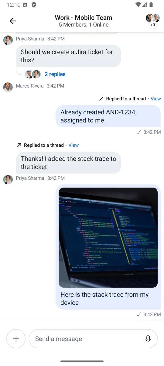 | 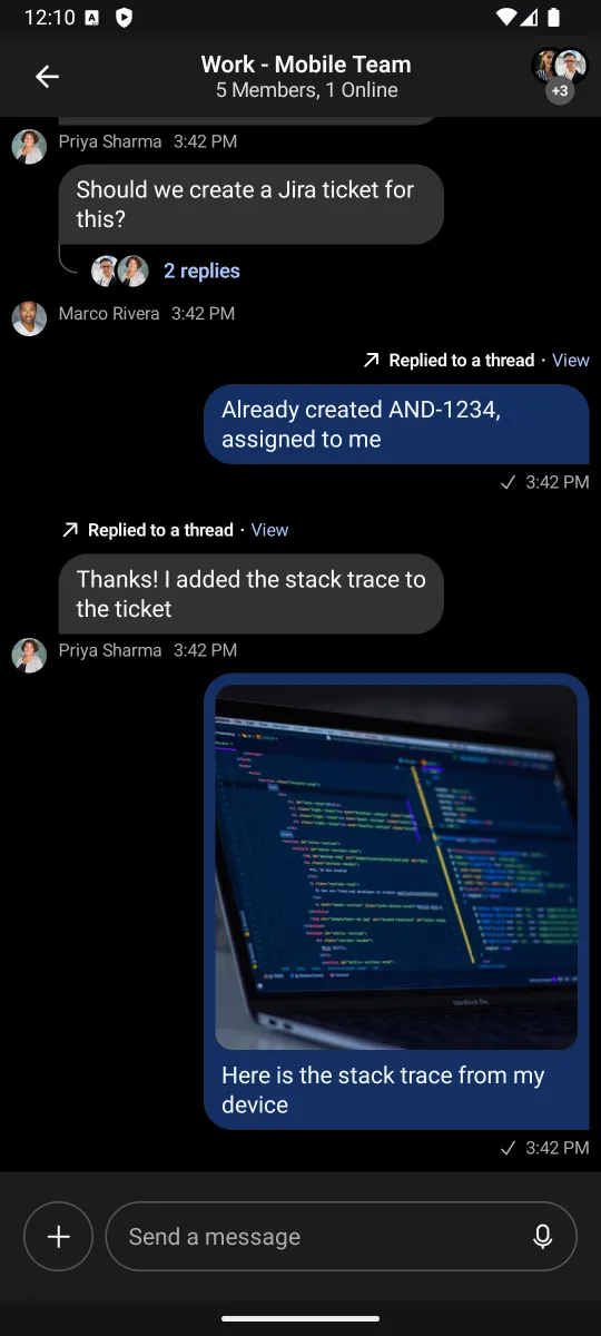 |
Let's see how to customize the theme.
Customization
To customize the ChatTheme, simply override any of the default properties by passing in your custom design style, like so:
setContent {
    ChatTheme(
        colors = StreamDesign.Colors.default().copy(
            accentPrimary = Color(0xFF6B5CE7),
            textPrimary = Color(0xFF1A1A2E),
        )
    ) {
        ChannelScreen(
            viewModelFactory = ChannelViewModelFactory(
                context = this,
                channelId = "messaging:123",
            ),
            onBackPressed = { finish() },
            onHeaderTitleClick = {}
        )
    }
}
In the snippet above, we customized the colors to use a different accent and text color. These colors propagate to all child components automatically.
Let's see what each property exposes and what the values are used for.
StreamDesign.Colors
StreamDesign.Colors defines all the colors used across the SDK. The color system is organized into semantic groups:
- Accent colors:
accentPrimary,accentError,accentSuccess,accentNeutral,accentBlack - Background colors:
backgroundCoreSurface,backgroundCoreSurfaceSubtle,backgroundCoreSurfaceStrong,backgroundCoreDisabled,backgroundCoreInverse - Elevation colors:
backgroundElevationElevation0throughbackgroundElevationElevation4 - Border colors:
borderCoreDefault,borderCoreStrong,borderCoreSubtle,borderUtilitySelected,borderUtilityDisabled - Text colors:
textPrimary,textSecondary,textTertiary,textDisabled,textOnAccent,textInverse - Brand colors:
brand50throughbrand900(11 intensity levels) - Avatar palette: 5 background/text color pairs (
avatarPaletteBg1-5,avatarPaletteText1-5) plus placeholders - Chat-specific colors:
chatBgIncoming,chatBgAttachmentIncoming,chatBgAttachmentOutgoing,chatReplyIndicatorIncoming,chatReplyIndicatorOutgoing, etc.
Use StreamDesign.Colors.default() for light mode or StreamDesign.Colors.defaultDark() for dark mode. The ChatTheme automatically picks the right one based on isInDarkMode.
You can find the definitions of all 67 color properties in the class documentation.
StreamDesign.Typography
StreamDesign.Typography defines the text styles used across the SDK:
| Property | Usage |
|---|---|
bodyDefault | Standard body text |
bodyEmphasis | Bold body text |
captionDefault | Small descriptive text |
captionEmphasis | Bold small text |
headingExtraSmall | Smallest heading |
headingSmall | Small heading |
headingMedium | Medium heading |
headingLarge | Large heading |
metadataDefault | Metadata text (timestamps, etc.) |
metadataEmphasis | Bold metadata text |
numericMedium | Numeric displays (medium) |
numericLarge | Numeric displays (large) |
numericExtraLarge | Numeric displays (extra large) |
Use StreamDesign.Typography.default() for the default styles. You can pass a custom FontFamily to apply your own font:
ChatTheme(
    typography = StreamDesign.Typography.default(fontFamily = FontFamily(Font(R.font.my_custom_font)))
) {
    // Your UI content
}
StreamRippleConfiguration
Defines the appearance of click ripples.
You can find out more about it by reading the class documentation.
You can easily customize the ripple colors in light and dark modes by overriding ChatTheme.rippleConfiguration with your own custom StreamRippleConfiguration.
ChatUiConfig
ChatUiConfig consolidates feature flags that were previously individual parameters on ChatTheme. It groups configuration by feature area:
ChatTheme(
    config = ChatUiConfig(
        translation = TranslationConfig(
            enabled = true,               // Automatic message translation (enabled by default)
            showOriginalEnabled = true,    // Show option to see original text (enabled by default)
        ),
        messageList = MessageListConfig(
            readCountEnabled = true,        // Show read receipts count
            videoThumbnailsEnabled = true,  // Show video thumbnails
        ),
        composer = ComposerConfig(
            audioRecordingEnabled = true,        // Voice message recording (enabled by default)
            audioRecordingSendOnComplete = false, // Attach recording for manual send (disabled by default)
            linkPreviewEnabled = false,          // Show link previews in composer
            floatingStyleEnabled = false,        // Use floating composer style
        ),
        channelList = ChannelListConfig(
            swipeActionsEnabled = true,          // Enable swipe-to-action on channels
        ),
        mediaGallery = MediaGalleryConfig(
            isShareVisible = true,
            isGalleryVisible = true,
        ),
        attachmentPicker = AttachmentPickerConfig(
            useSystemPicker = true,              // Use native OS pickers
            modes = listOf(                      // Available picker modes
                GalleryPickerMode(),
                FilePickerMode(),
                CameraPickerMode(),
                PollPickerMode(),
                CommandPickerMode,
            ),
        ),
    ),
) {
    // Your UI content
}
AttachmentPreviewHandler
AttachmentPreviewHandler.defaultAttachmentHandlers() provides default handlers for media, document and URL attachments.
If you want you can take a look at the class documentation.
You can customize file previews by creating your own list of AttachmentPreviewHandlers and overriding ChatTheme.attachmentPreviewHandlers with it.
ReactionResolver
Used for defining reactions the user can add to messages. ReactionResolver.defaultResolver() provides 240+ emoji mappings with 5 default quick-access reactions (like, love, haha, wow, sad).
Reactions are emoji-based. To customize the available reactions:
val customResolver = DefaultReactionResolver(
    emojiMapping = linkedMapOf(
        "like" to "\uD83D\uDC4D",
        "love" to "\u2764\uFE0F",
        "fire" to "\uD83D\uDD25",
        "party" to "\uD83C\uDF89",
    ),
    defaultReactions = listOf("like", "love", "fire"),
)

ChatTheme(reactionResolver = customResolver) {
    // Your UI content
}
ReactionOptionsTheme
Defines the appearance of the reaction option list in the selected message menu. Allows you to show/hide options through the areReactionOptionsVisible parameter.
See the class documentation for more details.
DateFormatter
Used for formatting various times and dates such as the timestamp you see when a message is displayed. The default date formatter in ChatTheme is Stream's DefaultDateFormatter.
You can find out more about it by reading the class documentation.
The date formatter can be customized by overriding ChatTheme.dateFormatter with your own implementation of DateFormatter.
ChatTheme(
    dateFormatter = object : DateFormatter {
        private val dateFormat: DateFormat = SimpleDateFormat("dd/MM/yyyy")
        private val timeFormat: DateFormat = SimpleDateFormat("HH:mm")

        override fun formatDate(date: Date?): String {
            date ?: return ""
            return dateFormat.format(date)
        }

        override fun formatTime(date: Date?): String {
            date ?: return ""
            return timeFormat.format(date)
        }

        override fun formatRelativeTime(date: Date?): String {
            date ?: return ""
            return DateUtils.getRelativeDateTimeString(
                applicationContext,
                date.time,
                DateUtils.MINUTE_IN_MILLIS,
                DateUtils.WEEK_IN_MILLIS,
                0
            ).toString()
        }
    }
) {
    // Your UI content
}
TimeProvider
Used for providing the current time. The default time provider is TimeProvider.DEFAULT.
You can find out more about it by reading the class documentation.
The time provider can be customized by overriding ChatTheme.timeProvider with your own implementation of TimeProvider.
ChatTheme(
    timeProvider = object : TimeProvider {
        override fun invoke(): Long {
            // Return the current time in milliseconds
            // System.currentTimeMillis() is the default implementation
            // You can use your own implementation here which can be synchronized with a server
            // to avoid local clock tampering
            return System.currentTimeMillis()
        }
    }
) {
    // Your UI content
}
DurationFormatter
Used for formatting durations, such as the time elapsed since an audio playing was started.
The default duration formatter in ChatTheme formats durations in "hh:mm" format.
You can find out more about it by reading the class documentation.
The duration formatter can be customized by overriding ChatTheme.durationFormatter with your own implementation of DurationFormatter.
ChatTheme(
    durationFormatter = object : DurationFormatter {
        override fun format(durationInMillis: Int): String {
            // Your custom duration formatting logic
        }
    }
) {
    // Your UI content
}
ChannelNameFormatter
Used for formatting channel names. The default channel name formatter is Stream's DefaultChannelNameFormatter.
You can find out more about it by reading the class documentation.
The channel name formatter is customizable by overriding ChatTheme.channelNameFormatter with your own instance of ChannelNameFormatter.
MessagePreviewFormatter
Used for formatting the preview message in ChannelItem. The default message preview formatter is Stream's DefaultMessagePreviewFormatter.
You can find out more about it by reading the class documentation.
The message preview formatter can be customized by overriding ChatTheme.messagePreviewFormatter with your own implementation of MessagePreviewFormatter
ChatTheme(
    messagePreviewFormatter = object : MessagePreviewFormatter {
        override fun formatMessageTitle(message: Message): AnnotatedString {
            return buildAnnotatedString { append(message.user.name) }
        }
        override fun formatMessagePreview(
            message: Message,
            currentUser: User?,
            isDirectMessaging: Boolean,
        ): AnnotatedString {
            return buildAnnotatedString {
                append(message.text)
                // add your custom styling here
            }
        }
        override fun formatDraftMessagePreview(draftMessage: DraftMessage): AnnotatedString {
            return buildAnnotatedString { append(draftMessage.message.text) }
        }
    }
) {
    // Your UI content
}
MessageTextFormatter
Used for formatting the message text in MessageText component. The default message text formatter is Stream's DefaultMessageTextFormatter.
You can find out more about it by reading the class documentation.
The message text formatter can be customized by overriding ChatTheme.messageTextFormatter with your own implementation of MessageTextFormatter
ChatTheme(
    messageTextFormatter = object : MessageTextFormatter {
        override fun format(message: Message, currentUser: User?): AnnotatedString {
            return buildAnnotatedString {
                append(message.text)
                // Your custom styling here
            }
        }
    }
) {
    // Your UI content
}
StreamCoilImageLoaderFactory
StreamCoilImageLoaderFactory.defaultFactory() provides the default factory that creates new Coil ImageLoader instances.
You can find out more about it by reading the class documentation.
You can easily customize how the images are loaded by passing your own implementation of StreamCoilImageLoaderFactory to ChatTheme or by using the default factory to provide an ImageLoader and calling loader.newBuilder() to expand or override its behavior.
MessageAlignmentProvider
Used for aligning messages. The default message alignment provider is DefaultMessageAlignmentProvider which will align your own messages to end while aligning the messages of others to start.
You can find out more about it by reading the class documentation.
As with all of the other ChatTheme properties, you can easily customize how the messages are aligned by overriding ChatTheme.messageAlignmentProvider with your own implementation of MessageAlignmentProvider.
MessageOptionsTheme
Defines the appearance of the message option list in the selected message menu. Allows you to show/hide options through the optionVisibility parameter.
See the class documentation for more details.
ChannelOptionsTheme
Defines the appearance of the channel option list in the selected channel menu.
See the class documentation for more details.
StreamCdnImageResizing
Configures Stream CDN image resizing to optimize image loading and reduce bandwidth.
ChatTheme(
    streamCdnImageResizing = StreamCdnImageResizing.defaultStreamCdnImageResizing()
) {
    // Your UI content
}
Accessing Theme Properties
All theme properties can be accessed anywhere within the ChatTheme scope using the ChatTheme object:
ChatTheme {
    val colors = ChatTheme.colors              // StreamDesign.Colors
    val typography = ChatTheme.typography       // StreamDesign.Typography
    val config = ChatTheme.config              // ChatUiConfig
    val factory = ChatTheme.componentFactory   // ChatComponentFactory

    // Use in your composables
    Text(
        text = "Hello",
        style = ChatTheme.typography.bodyDefault,
        color = ChatTheme.colors.textPrimary,
    )
}
The ChatUiConfig is also available via the LocalChatUiConfig composition local:
val config = LocalChatUiConfig.current
val isLinkPreviewEnabled = config.composer.linkPreviewEnabledOn this page:
- Using ChatTheme
- Customization
- StreamDesign.Colors
- StreamDesign.Typography
- StreamRippleConfiguration
- ChatUiConfig
- AttachmentPreviewHandler
- ReactionResolver
- ReactionOptionsTheme
- DateFormatter
- TimeProvider
- DurationFormatter
- ChannelNameFormatter
- MessagePreviewFormatter
- MessageTextFormatter
- StreamCoilImageLoaderFactory
- MessageAlignmentProvider
- MessageOptionsTheme
- ChannelOptionsTheme
- StreamCdnImageResizing
- Accessing Theme Properties