 React
React iOS
iOS Android
 Flutter
 Angular
 JavaScript
 Unity
Unity Unreal
 Node
Node Python
 Ruby
Ruby PHP
PHP Java
Java .NET
.NET Go
Go REST
RESTobject CustomChatComponentFactory : ChatComponentFactory {
@Composable
override fun CustomAttachmentContent(params: CustomAttachmentContentParams) {
// Render custom attachments in the message list
if (params.state.message.attachments.any { it.type == "date" }) {
DateAttachmentContent(params.state, params.modifier)
}
}
@Composable
override fun MessageComposerAttachments(params: MessageComposerAttachmentsParams) {
// Render custom attachment previews in the message composer
val (dateAttachments, otherAttachments) = params.attachments.partition { it.type == "date" }
Column(modifier = params.modifier) {
if (dateAttachments.isNotEmpty()) {
DateAttachmentPreviewContent(
modifier = Modifier.fillMaxWidth().wrapContentHeight(),
attachments = dateAttachments,
onAttachmentRemoved = params.onAttachmentRemoved,
)
}
if (otherAttachments.isNotEmpty()) {
super.MessageComposerAttachments(
params = params.copy(
modifier = Modifier.fillMaxWidth().wrapContentHeight(),
attachments = otherAttachments,
),
)
}
}
}
}This is beta documentation for Stream Chat Android SDK v7. For the latest stable version, see the latest version (v6)
.
Custom Attachments
Introduction
By default Stream Chat supports several built-in attachment types like image, video, file and Giphy. Apart from that, you can also add your own types of attachments such as location, contact, audio, sticker, etc.
In this guide, we will demonstrate how to build a date sharing feature. Chat users will be able to pick a date from the calendar, preview their selection in the message composer and see the sent attachment within a message in the message list.
This involves doing the following steps:
- Implementing a custom
ChatComponentFactorythat renders date attachments in both the message list and the composer. - Building a custom message composer that lets users pick dates.
In this guide, we'll show only the main points concerning custom attachments. Smaller parts will be omitted for the sake of being concise.
You can find the full code from this guide on GitHub. To check the final result, clone the repository, select the stream-chat-android-ui-guides module in Android Studio, and run the module.
Custom Attachments via ChatComponentFactory
Custom attachment rendering is handled through ChatComponentFactory overrides. The SDK automatically routes unknown attachment types to the CustomAttachmentContent method, and composer previews go through MessageComposerAttachments.
To add a custom attachment type, create a ChatComponentFactory that overrides the relevant methods:
The key methods are:
CustomAttachmentContent: Renders attachments of unknown types in the message list. The SDK calls this for any attachment that doesn't match built-in types (image, video, file, audio, link, giphy).MessageComposerAttachments: Renders attachment previews in the message composer before sending. Callsuperfor non-custom attachments to keep the default behavior.
Then provide your factory to ChatTheme:
ChatTheme(componentFactory = CustomChatComponentFactory) {
    // Chat components
}
Sending Date Attachments
To begin with, you'll need a custom message composer with a button to pick dates. You can use the onAttachmentsClick parameter of MessageComposer to show a date picker instead of the default attachment picker:
@Composable
fun CustomMessageComposer(
    viewModel: MessageComposerViewModel,
    onDateSelected: (Long) -> Unit,
) {
    val activity = LocalContext.current as AppCompatActivity

    MessageComposer(
        modifier = Modifier
            .fillMaxWidth()
            .wrapContentHeight(),
        viewModel = viewModel,
        onAttachmentsClick = {
            MaterialDatePicker.Builder
                .datePicker()
                .build()
                .apply {
                    show(activity.supportFragmentManager, null)
                    addOnPositiveButtonClickListener {
                        onDateSelected(it)
                    }
                }
        },
    )
}
Next, you'll need a custom messages screen that makes use of the composer that you've created above:
@Composable
fun CustomChannelScreen(
    channelId: String,
    onBackPressed: () -> Unit = {}
) {
    val factory = ChannelViewModelFactory(
        context = LocalContext.current,
        channelId = channelId,
    )

    val composerViewModel = viewModel(MessageComposerViewModel::class.java, factory = factory)

    // Other declarations

    Box(modifier = Modifier.fillMaxSize()) {
        Scaffold(
            modifier = Modifier.fillMaxSize(),
            topBar = {
                // Channel header
            },
            bottomBar = {
                // 1
                CustomMessageComposer(
                    viewModel = composerViewModel,
                    onDateSelected = { date ->
                        // 2
                        val payload = SimpleDateFormat("MMMM dd, yyyy").format(Date(date))
                        val attachment = Attachment(
                            type = "date",
                            fallback = payload,
                            extraData = mutableMapOf("payload" to payload)
                        )

                        // 3
                        composerViewModel.addAttachments(listOf(attachment))
                    }
                )
            }
        ) {
            // Message list setup - available in the full code sample
        }
    }
}
The full source code of the CustomChannelScreen component is available here.
In the snippet above, you:
- Make use of the newly created custom message composer in our messages screen, setting it inside the
bottomBar. - Create a custom attachment of type
datecarrying the selected date as a payload. - Submit the attachment with the selected date to the message composer.
Now you can send a custom attachment of type date to the chat. The resulting UI will look like this:
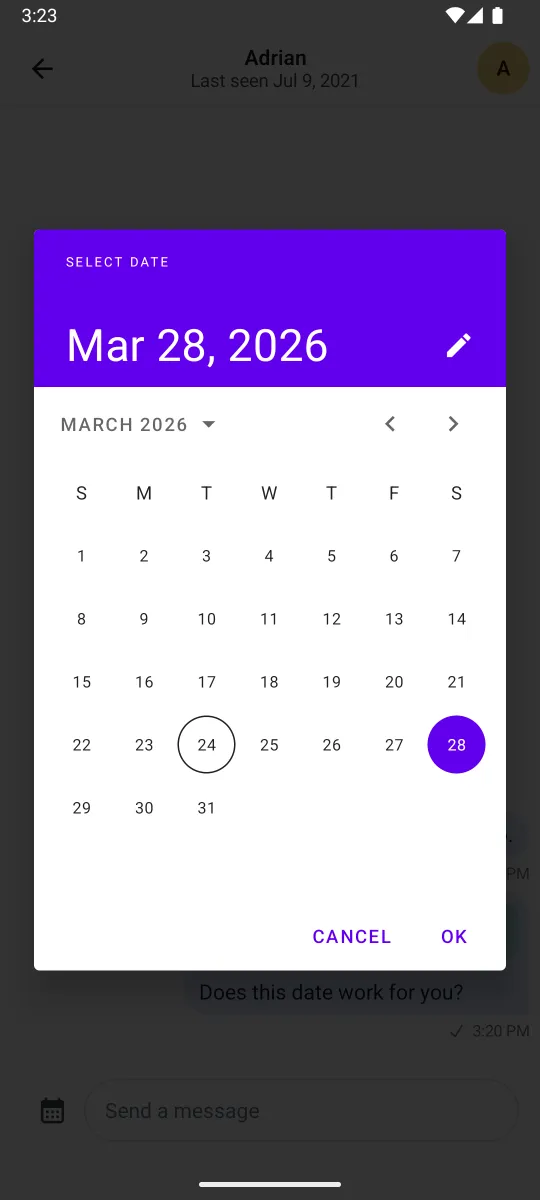 |
|---|
Now that you've set up the DatePicker and the custom composer, you need to build the UI components that render the date attachment.
Rendering Date Attachments
Let's create the composable that renders date attachments in the message list:
@Composable
fun DateAttachmentContent(
    attachmentState: AttachmentState,
    modifier: Modifier = Modifier,
) {
    val attachment = attachmentState.message.attachments.first { it.type == "date" }
    val formattedDate = attachment.extraData["payload"].toString()

    Column(
        modifier = modifier
            .fillMaxWidth()
            .padding(8.dp)
            .clip(RoundedCornerShape(12.dp))
            .background(ChatTheme.colors.accentSuccess.copy(alpha = 0.2f))
            .padding(12.dp),
    ) {
        Row(
            horizontalArrangement = Arrangement.spacedBy(8.dp),
            verticalAlignment = Alignment.CenterVertically,
        ) {
            Icon(
                modifier = Modifier.size(16.dp),
                painter = painterResource(id = R.drawable.ic_calendar),
                contentDescription = null,
                tint = ChatTheme.colors.textPrimary,
            )

            Text(
                text = formattedDate,
                style = ChatTheme.typography.bodyDefault,
                maxLines = 1,
                color = ChatTheme.colors.textPrimary,
            )
        }
    }
}
Then, create a component for the message composer preview:
@Composable
fun DateAttachmentPreviewContent(
    attachments: List<Attachment>,
    onAttachmentRemoved: (Attachment) -> Unit,
    modifier: Modifier = Modifier,
) {
    val attachment = attachments.first { it.type == "date" }
    val formattedDate = attachment.extraData["payload"].toString()

    Box(
        modifier = modifier
            .padding(horizontal = 8.dp)
            .wrapContentHeight()
            .clip(RoundedCornerShape(16.dp))
            .background(color = ChatTheme.colors.accentSuccess.copy(alpha = 0.2f)),
    ) {
        Row(
            modifier = Modifier
                .align(Alignment.CenterStart)
                .padding(start = 16.dp, top = 16.dp, bottom = 16.dp, end = 32.dp),
            horizontalArrangement = Arrangement.spacedBy(8.dp),
            verticalAlignment = Alignment.CenterVertically,
        ) {
            Icon(
                modifier = Modifier.size(16.dp),
                painter = painterResource(id = R.drawable.ic_calendar),
                contentDescription = null,
                tint = ChatTheme.colors.textPrimary,
            )

            Text(
                text = formattedDate,
                style = ChatTheme.typography.bodyDefault,
                maxLines = 1,
                color = ChatTheme.colors.textPrimary,
            )
        }

        ComposerCancelIcon(
            modifier = Modifier
                .align(Alignment.TopEnd)
                .padding(4.dp),
            onClick = { onAttachmentRemoved(attachment) },
        )
    }
}
What's important here is how you're able to fetch the custom attachment data, using attachment.extraData["payload"]. You can format the data in any way you want here, which makes our attachments very powerful.
Date attachments should now be correctly rendered in the message composer and in the message list like on the screenshot below:
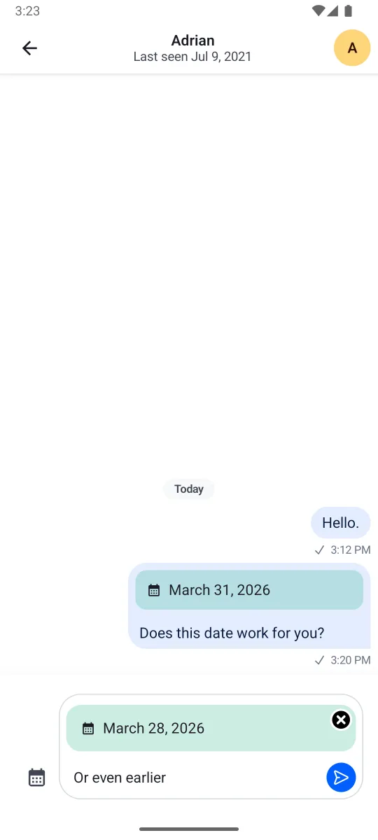 |
|---|
With just a few lines of code, you're able to render any custom UI within the MessageComposer and MessageList components of our SDK. This gives the ability to build powerful features without having to change our default components, you just need a custom ChatComponentFactory.
Quoted Messages
Stream SDK supports quoting or replying to messages, even if they contain attachments. These quoted messages are shown inside the message bubble above the text you wrote when quoting, which is a common pattern in various chat services.
 |
|---|
First, create a shared composable for rendering the quoted date attachment:
@Composable
fun QuotedDateAttachmentContent(
    message: Message,
    modifier: Modifier = Modifier,
) {
    val attachment = message.attachments.first { it.type == "date" }
    val formattedDate = attachment.extraData["payload"].toString()

    Column(
        modifier = modifier
            .padding(8.dp)
            .background(ChatTheme.colors.accentSuccess.copy(alpha = 0.2f), RoundedCornerShape(12.dp))
            .padding(12.dp),
    ) {
        Row(
            horizontalArrangement = Arrangement.spacedBy(8.dp),
            verticalAlignment = Alignment.CenterVertically,
        ) {
            Icon(
                modifier = Modifier.size(16.dp),
                painter = painterResource(id = R.drawable.ic_calendar),
                contentDescription = null,
                tint = ChatTheme.colors.textPrimary,
            )

            Text(
                text = formattedDate,
                style = ChatTheme.typography.bodyDefault,
                maxLines = 1,
                color = ChatTheme.colors.textPrimary,
            )
        }

        if (message.text.isNotBlank()) {
            Text(
                text = message.text,
                style = ChatTheme.typography.bodyDefault,
                maxLines = 2,
                color = ChatTheme.colors.textSecondary,
            )
        }
    }
}
Then, override MessageQuotedContent and MessageComposerQuotedMessage in your ChatComponentFactory to use this shared composable:
object CustomChatComponentFactory : ChatComponentFactory {

    @Composable
    override fun MessageQuotedContent(params: MessageQuotedContentParams) {
        val quotedMessage = params.message
        if (quotedMessage.attachments.any { it.type == "date" }) {
            QuotedDateAttachmentContent(
                message = quotedMessage,
                modifier = params.modifier,
            )
        } else {
            super.MessageQuotedContent(params)
        }
    }

    @Composable
    override fun MessageComposerQuotedMessage(params: MessageComposerQuotedMessageParams) {
        val quotedMessage = params.quotedMessage
        if (quotedMessage.attachments.any { it.type == "date" }) {
            Box(modifier = params.modifier.padding(horizontal = 8.dp)) {
                QuotedDateAttachmentContent(message = quotedMessage)

                ComposerCancelIcon(
                    modifier = Modifier
                        .align(Alignment.TopEnd)
                        .offset(x = 4.dp, y = (-4).dp),
                    onClick = params.onCancelClick,
                )
            }
        } else {
            super.MessageComposerQuotedMessage(params)
        }
    }
}
The result will look like this:
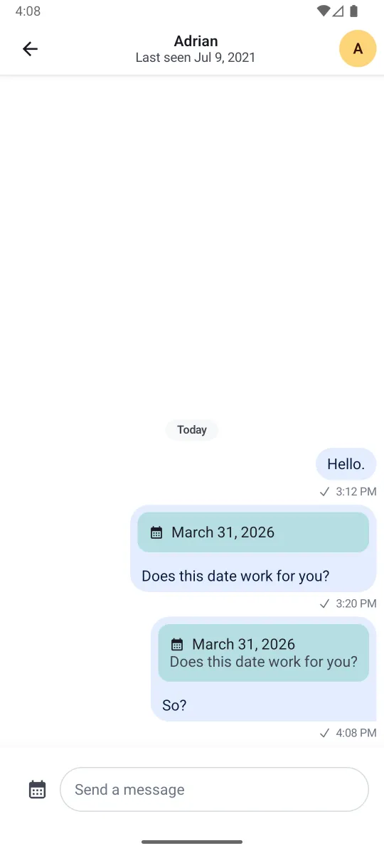 |
|---|
If you don't override quoted content rendering, custom attachment types will fall back to showing a generic attachment summary in quoted messages.