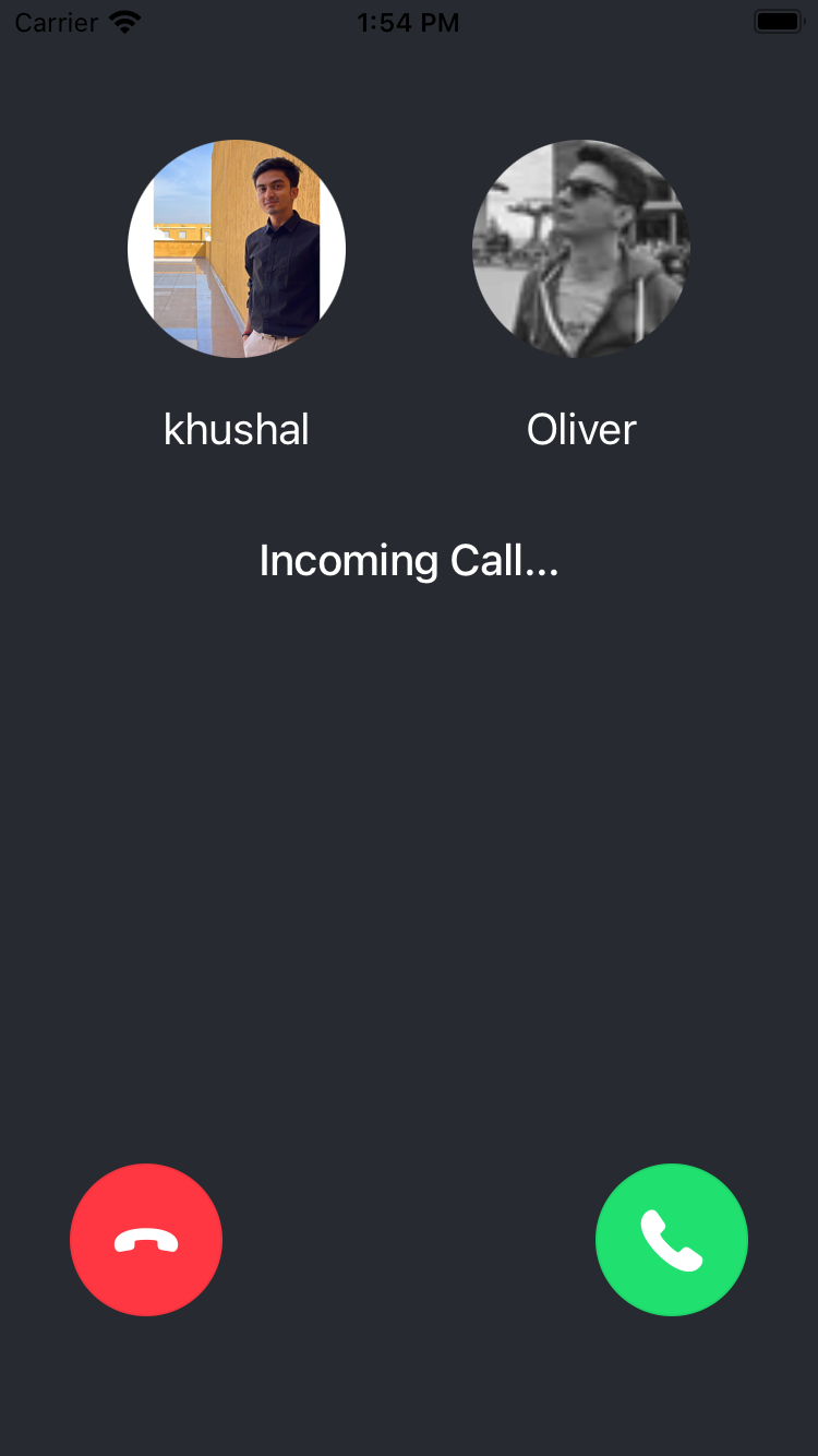
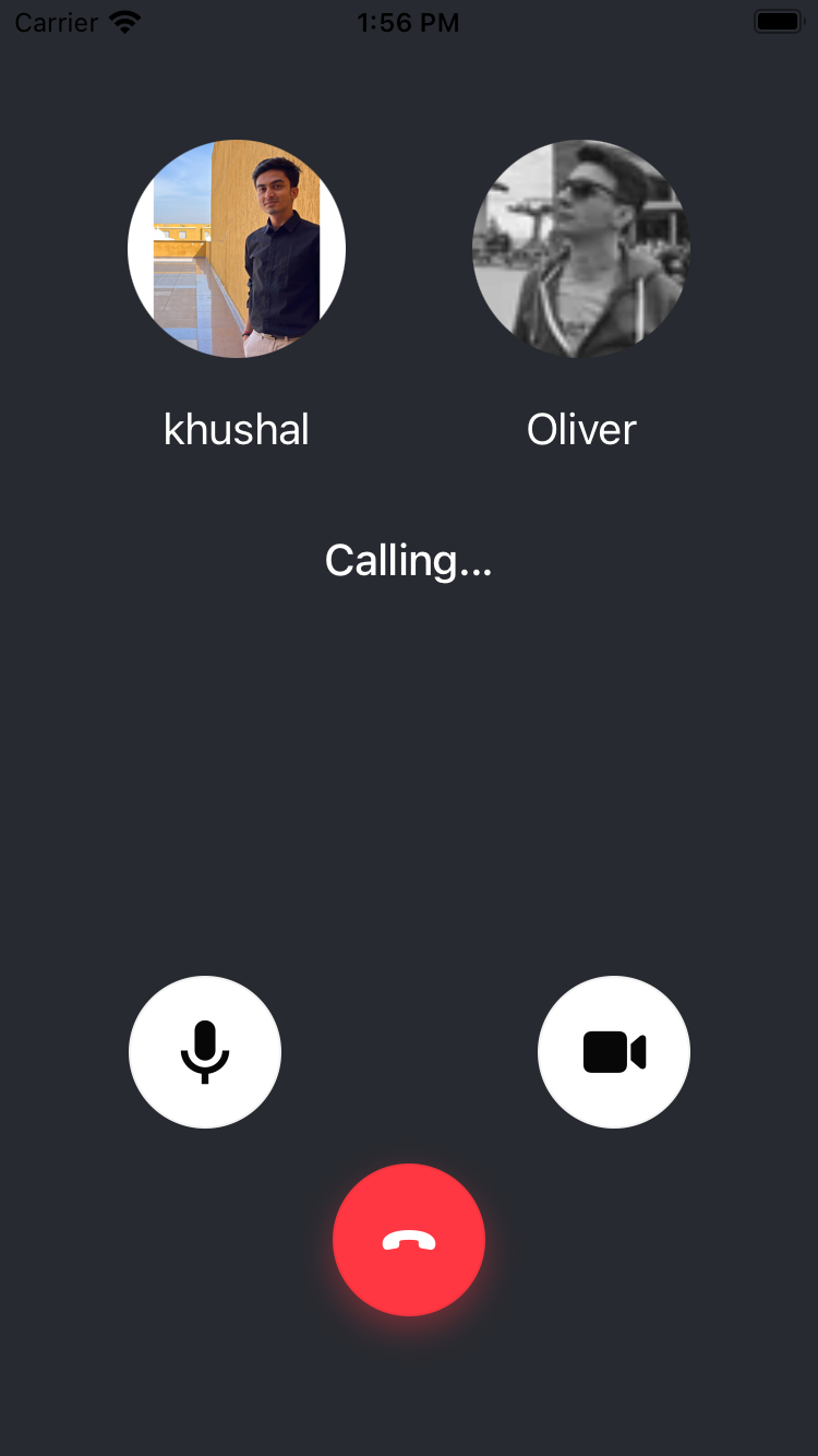
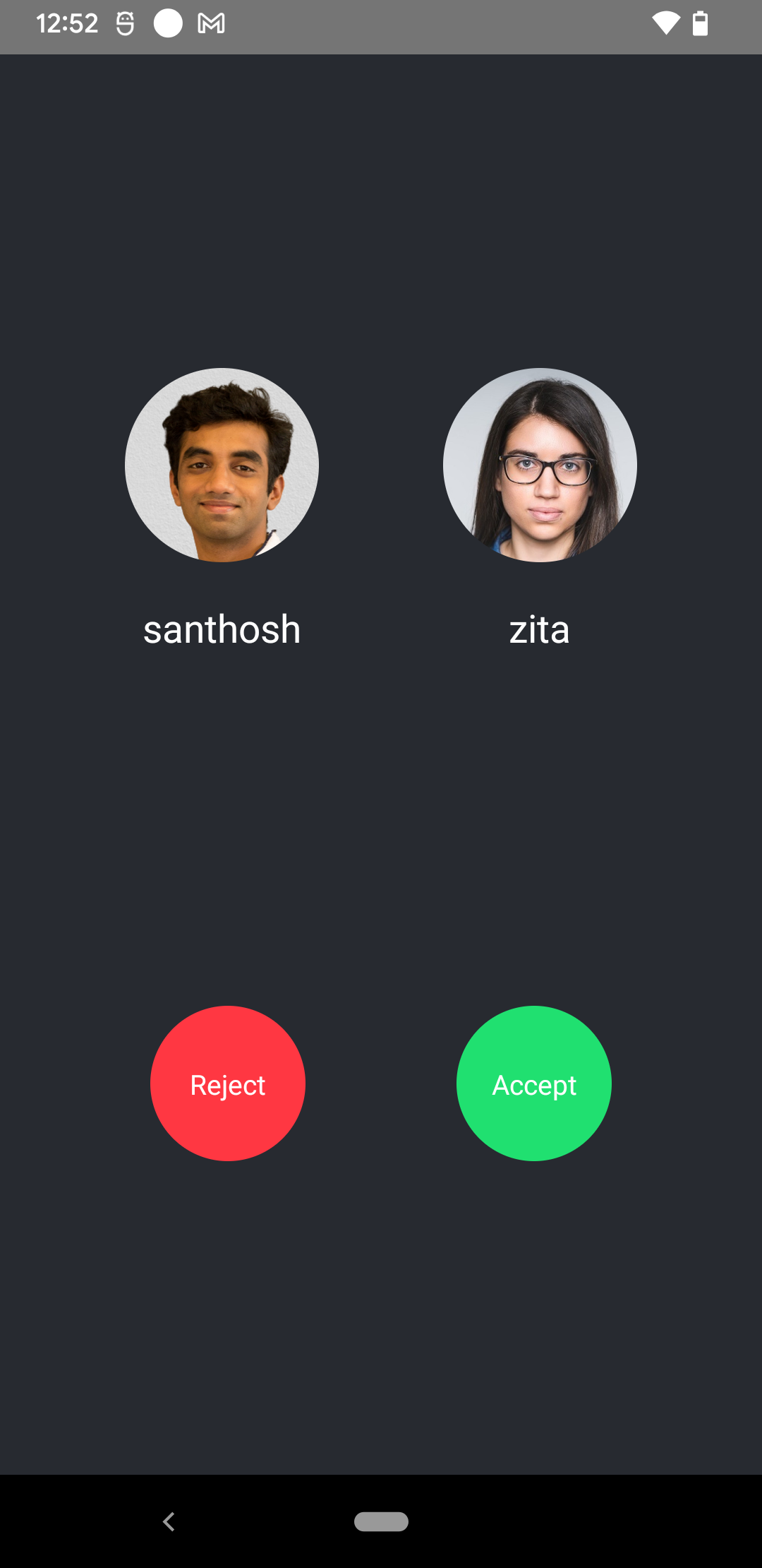
Incoming & Outgoing Call Component
The incoming and outgoing call components are responsible for showing the call preview before the call is finally joined.
Incoming call is shown to participant who is being called, while the Outgoing call is shown to participant who is calling someone.
While showing an Incoming call component to the callee, the following UI elements ideally be present, but not necessarily the same:
- User info of the participant calling them.
- Accept and reject call button.
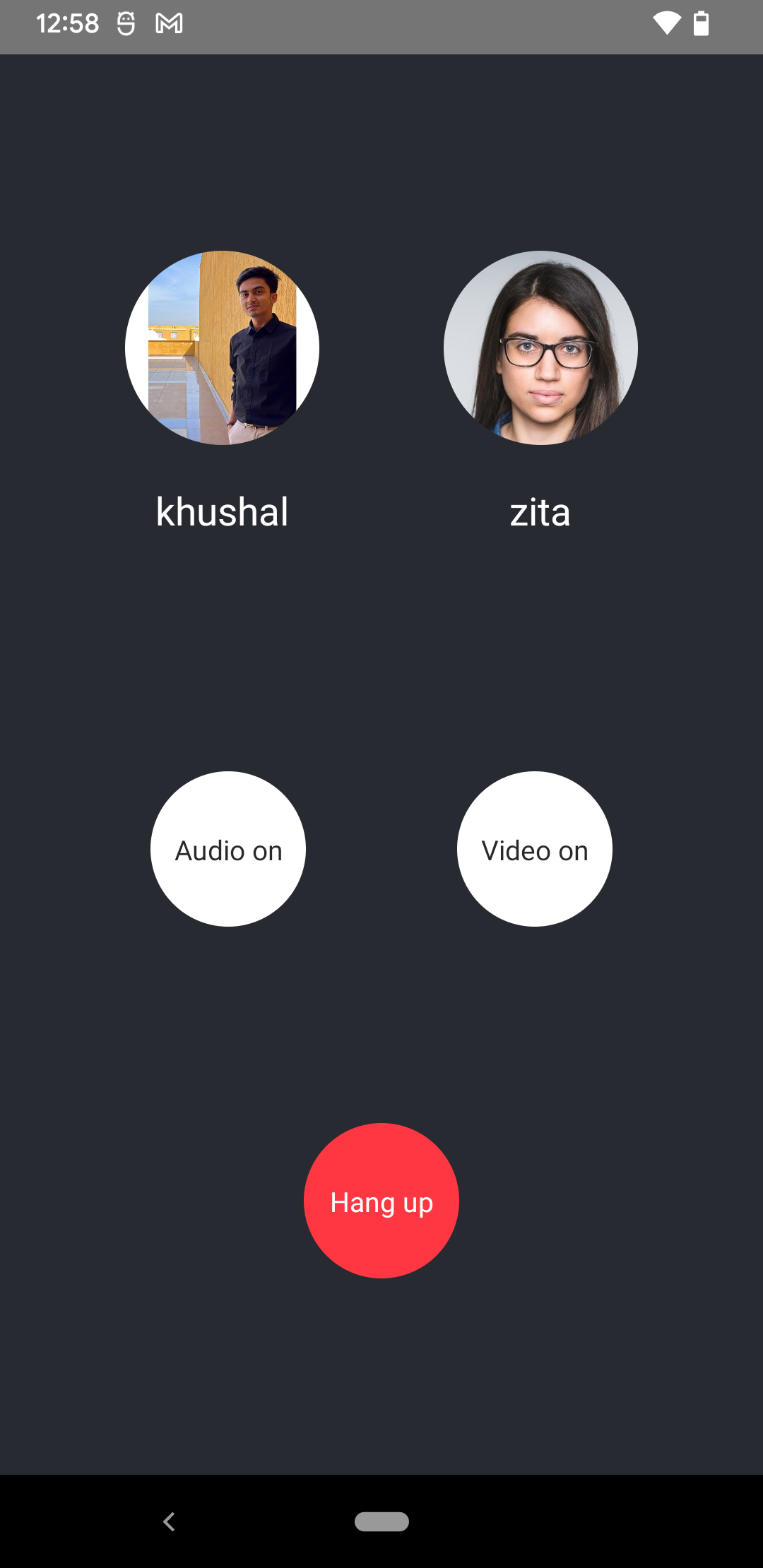
Similarly, the Outgoing call component should show the following UI elements:
- User info of the participants being called.
- Hang up call button.
- Optional: Audio/Video mute/unmute status button.
The approach to visualise the components will differ from application to application. Therefore, in this guide, we will focus only on the principles of building components and plugging them with right data sources.
User Info
We can show the user info such as image, name, or additional details of the user within the Incoming/Outgoing call component. To do so we can use the useCallMembers hook to get the list of members for whom the call was initiated.
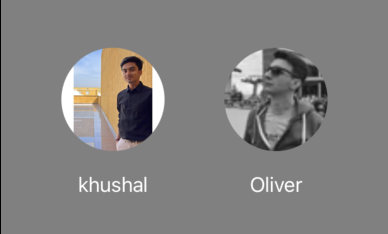
useCallMembers also includes the member info of the connected user. So, in most cases that needs to be extracted before showing it in the preview.
import React from 'react';
import {
  useCallMembers,
  useConnectedUser,
  UserResponse,
} from '@stream-io/video-react-native-sdk';
import { Image, StyleSheet, Text, View } from 'react-native';

export const UserInfoComponent = () => {
  const connectedUser = useConnectedUser();
  const members = useCallMembers();

  const membersToShow: UserResponse[] = (members || [])
    .map(({ user }) => user)
    .filter((user) => user.id !== connectedUser?.id);

  return (
    <View style={styles.container}>
      <View style={styles.userInfo}>
        {membersToShow.map((memberToShow) => {
          return (
            <View key={memberToShow.id}>
              <Image
                style={styles.avatar}
                source={{
                  uri: memberToShow.image,
                }}
              />
              <Text style={styles.title}>{memberToShow.name}</Text>
            </View>
          );
        })}
      </View>
    </View>
  );
};

const styles = StyleSheet.create({
  userInfo: {
    flexDirection: 'row',
    justifyContent: 'space-evenly',
  },
  title: {
    fontSize: 20,
    color: 'white',
    marginVertical: 20,
    textAlign: 'center',
  },
  avatar: {
    height: 100,
    width: 100,
    borderRadius: 50,
  },
});
Media Stream Management
To control audio or video mute status in the Lobby, you can use the useCameraState and useMicrophoneState hooks from the useCallStateHooks, that orchestrates the local state of the device within the SDK and handles streaming of the media effectively.

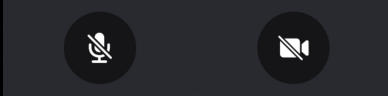
We can go through the usage through the following example:
import React from 'react';
import { Pressable, View, Text, StyleSheet } from 'react-native';
import { useCallStateHooks } from '@stream-io/video-react-native-sdk';

export const MediaStreamButtonGroup = () => {
  const { useMicrophoneState, useCameraState } = useCallStateHooks();
  const { isMute: microphoneMuted } = useMicrophoneState();
  const { isMute: cameraMuted } = useCameraState();

  const audioButtonStyles = [
    styles.button,
    {
      backgroundColor: microphoneStatus === 'disabled' ? '#080707dd' : 'white',
    },
  ];

  const videoButtonStyles = [
    styles.button,
    {
      backgroundColor: cameraStatus === 'disabled' ? '#080707dd' : 'white',
    },
  ];

  const audioButtonTextStyles = [
    styles.mediaButtonText,
    {
      color: microphoneStatus === 'disabled' ? 'white' : '#080707dd',
    },
  ];

  const videoButtonTextStyles = [
    styles.mediaButtonText,
    {
      color: cameraStatus === 'disabled' ? 'white' : '#080707dd',
    },
  ];

  const toggleAudioMuted = async () => {
    await call?.microphone.toggle();
  };

  const toggleVideoMuted = async () => {
    await call?.camera.toggle();
  };

  return (
    <View style={styles.buttonGroup}>
      <Pressable onPress={toggleAudioMuted} style={audioButtonStyles}>
        {!microphoneMuted ? (
          <Text style={audioButtonTextStyles}>Audio on</Text>
        ) : (
          <Text style={audioButtonTextStyles}>Audio off</Text>
        )}
      </Pressable>
      <Pressable onPress={toggleVideoMuted} style={videoButtonStyles}>
        {!cameraMuted ? (
          <Text style={videoButtonTextStyles}>Video on</Text>
        ) : (
          <Text style={videoButtonTextStyles}>Video off</Text>
        )}
      </Pressable>
    </View>
  );
};

const styles = StyleSheet.create({
  buttonGroup: {
    flexDirection: 'row',
    justifyContent: 'space-evenly',
  },
  button: {
    height: 80,
    width: 80,
    borderRadius: 40,
    justifyContent: 'center',
  },
  mediaButtonText: {
    textAlign: 'center',
  },
});
Incoming Call Component
Accept and Reject Call Button
We already talked about Accepting and Rejecting calls on our Core Concepts Joining & Creating Calls guide.
To build the buttons we would primarily need useCall hook, that gives us the call object that has all the necessary functions to accept or reject the call.

import React, { useCallback } from 'react';
import { Pressable, Text, View, StyleSheet } from 'react-native';
import {
  CallingState,
  useCall,
  useCallStateHooks,
} from '@stream-io/video-react-native-sdk';

export const IncomingCallButtonGroup = () => {
  const call = useCall();
  const { useCallCallingState } = useCallStateHooks();
  const callingState = useCallCallingState();

  const acceptCallHandler = useCallback(async () => {
    try {
      await call?.join();
    } catch (error) {
      console.log('Error accepting Call', error);
    }
  }, [call]);

  const rejectCallHandler = useCallback(async () => {
    try {
      if (callingState === CallingState.LEFT) {
        return;
      }
      await call?.leave({ reject: true });
    } catch (error) {
      console.log('Error rejecting Call', error);
    }
  }, [call, callingState]);

  return (
    <View style={styles.buttonGroup}>
      <Pressable
        style={[styles.button, styles.rejectButton]}
        onPress={rejectCallHandler}
      >
        <Text style={styles.callButtonText}>Reject</Text>
      </Pressable>
      <Pressable
        style={[styles.button, styles.acceptButton]}
        onPress={acceptCallHandler}
      >
        <Text style={styles.callButtonText}>Accept</Text>
      </Pressable>
    </View>
  );
};

const styles = StyleSheet.create({
  buttonGroup: {
    flexDirection: 'row',
    justifyContent: 'space-evenly',
  },
  button: {
    height: 80,
    width: 80,
    borderRadius: 40,
    justifyContent: 'center',
  },
  acceptButton: {
    backgroundColor: '#20E070',
  },
  rejectButton: {
    backgroundColor: '#FF3742',
  },
  callButtonText: {
    color: 'white',
    textAlign: 'center',
  },
});
Outgoing Call Component
Hangup call button
To hang up a call we can follow the Leave call concept from our Core Concepts Joining & Creating Calls guide.
To build the buttons we would primarily need useCall hook, that gives us the call object that has all the necessary function to hang up the call.

import React, { useCallback } from 'react';
import { Pressable, Text, View, StyleSheet } from 'react-native';
import {
  CallingState,
  useCall,
  useCallStateHooks,
} from '@stream-io/video-react-native-sdk';

export const OutgoingCallButtonGroup = () => {
  const call = useCall();
  const { useCallCallingState } = useCallStateHooks();
  const callingState = useCallCallingState();

  const hangupCallHandler = useCallback(async () => {
    try {
      if (callingState === CallingState.LEFT) {
        return;
      }
      await call?.leave();
    } catch (error) {
      console.log('Error rejecting Call', error);
    }
  }, [call, callingState]);

  return (
    <View style={styles.buttonGroup}>
      <Pressable
        style={[styles.button, styles.hangupButton]}
        onPress={hangupCallHandler}
      >
        <Text style={styles.callButtonText}>Hang up</Text>
      </Pressable>
    </View>
  );
};

const styles = StyleSheet.create({
  buttonGroup: {
    flexDirection: 'row',
    justifyContent: 'space-evenly',
  },
  button: {
    height: 80,
    width: 80,
    borderRadius: 40,
    justifyContent: 'center',
  },
  hangupButton: {
    backgroundColor: '#FF3742',
  },
  callButtonText: {
    color: 'white',
    textAlign: 'center',
  },
});
Assembling it all together
You can assemble the components into a single component as below or choose to pass the components in the respective customization props of the IncomingCall/OutgoingCall component.
import { StyleSheet, View } from 'react-native';

export const IncomingCallComponent = () => {
  return (
    <View style={[StyleSheet.absoluteFill, styles.container]}>
      <UserInfoComponent />
      <IncomingCallButtonGroup />
    </View>
  );
};

export const OutgoingCallComponent = () => {
  return (
    <View style={[StyleSheet.absoluteFill, styles.container]}>
      <UserInfoComponent />
      <MediaStreamButtonGroup />
      <OutgoingCallButtonGroup />
    </View>
  );
};

const styles = StyleSheet.create({
  container: {
    flex: 1,
    backgroundColor: '#272A30',
    justifyContent: 'space-evenly',
  },
});