 React
React iOS
iOS Android
 Flutter
 Angular
 JavaScript
 Unity
Unity Unreal
 Node
Node Python
 Ruby
Ruby PHP
PHP Java
Java .NET
.NET Go
Go REST
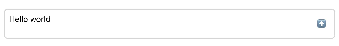
RESTconst CustomMessageInput = () => (
<div className="message-input">
<textarea value={"Hello world"} className="message-input__input" />
<button type="button" className="message-input__button">
⬆️
</button>
</div>
);This is documentation for
Stream Chat React SDK v12, which is nolonger actively maintained. For up-to-date documentation, see the latest version (v13)
.
Message Input UI
Message input is used for composing and editing messages. In this sense, it's a primary component that users interact with in a chat, so it's important to get it right.
Message input is a bit more complex than it might seem at first glance. Not just a text box with a "send" button, it has a lot of hidden features:
- Updating the typing status
- Uploading and previewing attachments
- Displaying link previews
- Auto-completing mentions, commands, emoji...
We will cover this features step by step. For now, let's start with the simplest markup possible:
.message-input {
  margin: 1rem;
}

.message-input:has(.message-input__input:focus) {
  border-color: #005fff;
}

.message-input__input {
  flex-grow: 1;
  border: 0;
  outline: 0;
  background: none;
  font: inherit;
  padding: 8px;
  resize: none;
}

.message-input__button {
  border: 1px solid transparent;
  outline: 0;
  background: none;
  font: inherit;
  border-radius: 4px;
  margin: 8px;
  padding: 8px;
  cursor: pointer;
}

.message-input__button:hover {
  background: #fafafa;
  border-color: #00000014;
}

.message-input__button:focus {
  border-color: #005fff;
}
Note that you should not render your custom message input directly, but instead pass it as a prop to
either Channel or
MessageInput component. That way,
you can be sure that your input is wrapped with the necessary context providers, most importantly
the MessageInputContext.
import {
  Chat,
  Channel,
  ChannelHeader,
  ChannelList,
  MessageList,
  Thread,
  Window,
  MessageInput,
} from "stream-chat-react";

export const App = () => (
  <Chat client={chatClient}>
    <ChannelList filters={filters} sort={sort} options={options} />
    <Channel>
      <Window>
        <ChannelHeader />
        <MessageList />
        <MessageInput Input={CustomMessageInput} />
      </Window>
      <Thread />
    </Channel>
  </Chat>
);
For now, our custom input doesn't do anything. The
MessageInputContext handles most of the
input-related state and actions, so instead of handling the state yourself, just use the provided
values and callbacks:
import { useMessageInputContext } from "stream-chat-react";

const CustomMessageInput = () => {
  const { text, handleChange, handleSubmit } = useMessageInputContext();

  return (
    <div className="message-input">
      <textarea
        value={text}
        className="message-input__input"
        onChange={handleChange}
        placeholder={"Type something..."}
      />
      <button
        type="button"
        className="message-input__button"
        onClick={handleSubmit}
      >
        ⬆️
      </button>
    </div>
  );
};
The great thing is that the handleChange callback not only updates the text value, but also
detects links (if URL enrichment is enabled), and updates your typing status.
And with the handleSubmit callback added to the "send" button, our basic implementation is
complete - try it out!
Uploading and Previewing Attachments
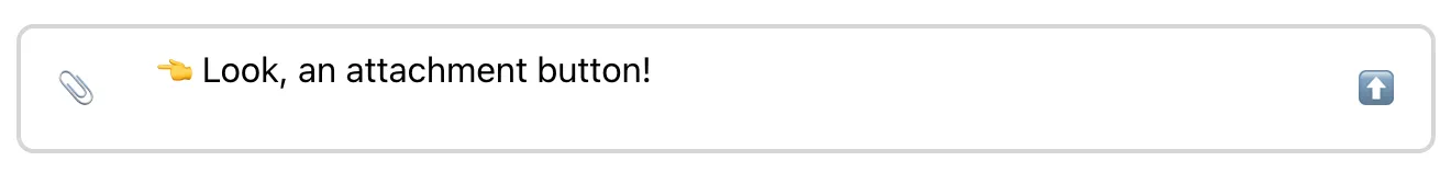
To support adding attachments to the message, we should start by adding a file input. And similar to
the "send" button, once a file is selected, we can use a callback provided in the
MessageInputContext to upload it as an
attachment:
import { useMessageInputContext } from "stream-chat-react";

const AttachmentUploadButton = () => {
  const { uploadNewFiles } = useMessageInputContext();

  function handleChange(e) {
    const files = e.currentTarget.files;

    if (files && files.length > 0) {
      uploadNewFiles(files);
      e.currentTarget.value = "";
    }
  }

  return (
    <label className="message-input__button">
      <input type="file" className="visually-hidden" onChange={handleChange} />
      📎
    </label>
  );
};
There are three cases when uploads should not be allowed:
- Uploads are disabled for the current channel. We should check the
isUploadEnabledvalue from theMessageInputContextto make sure. - The maximum number of message attachments has been reached. For this we should check the
maxFilesLeftvalue from theMessageInputContext. - The cool-down interval is active and user should not be permitted to send messages during this period. The remaining cooldown time can be determined by
cooldownRemainingvalue.
Let's add these three checks:
import { useMessageInputContext } from "stream-chat-react";

const AttachmentUploadButton = () => {
  const { cooldownRemaining, uploadNewFiles, isUploadEnabled, maxFilesLeft } =
    useMessageInputContext();

  function handleChange(e) {
    const files = e.currentTarget.files;

    if (files && files.length > 0) {
      uploadNewFiles(files);
    }
  }

  if (!isUploadEnabled || maxFilesLeft === 0 || cooldownRemaining) {
    return null;
  }

  return (
    <label className="message-input__button">
      <input type="file" className="visually-hidden" onChange={handleChange} />
      📎
    </label>
  );
};
Now we need a way to preview the added attachments. The SDK provides a ready-made component for
this:
AttachmentPreviewList.
Instead of importing it directly, you can grab it from the
ComponentContext, which is used throughout the
SDK to provide overridable UI components, and only fall back to the default implementation if it
hasn't been overridden:
import {
  useMessageInputContext,
  useComponentContext,
  AttachmentPreviewList as DefaultAttachmentPreviewList,
} from "stream-chat-react";

const CustomMessageInput = () => {
  const { text, handleChange, handleSubmit } = useMessageInputContext();
  const { AttachmentPreviewList = DefaultAttachmentPreviewList } =
    useComponentContext();

  return (
    <div className="message-input">
      <div className="message-input__composer">
        <AttachmentUploadButton />
        <textarea
          className="message-input__input"
          value={text}
          onChange={handleChange}
          placeholder={"Type something..."}
        />
        <button
          type="button"
          className="message-input__button"
          onClick={handleSubmit}
        >
          ⬆️
        </button>
      </div>
      <AttachmentPreviewList />
    </div>
  );
};
.message-input__composer {
display: flex;
align-items: center;
border: 2px solid #00000029;
border-radius: 8px;
}
.message-input__composer:has(.message-input__input:focus) {
border-color: #005fff;
}
.message-input__input {
flex-grow: 1;
border: 0;
outline: 0;
background: none;
font: inherit;
padding: 8px;
resize: none;
}
.message-input__button {
border: 1px solid transparent;
outline: 0;
background: none;
font: inherit;
border-radius: 4px;
margin: 8px;
padding: 8px;
cursor: pointer;
}
.message-input__button:hover {
background: #fafafa;
border-color: #00000014;
}
.message-input__button:focus,
.message-input__button:focus-within {
border-color: #005fff;
}
.visually-hidden {
width: 0;
height: 0;
pointer-events: none;
}The nice thing about this approach is that our custom message input is not tied to a particular implementation of the attachment preview component, and the preview component can be overridden at the Channel level and is called AttachmentPreviewList.
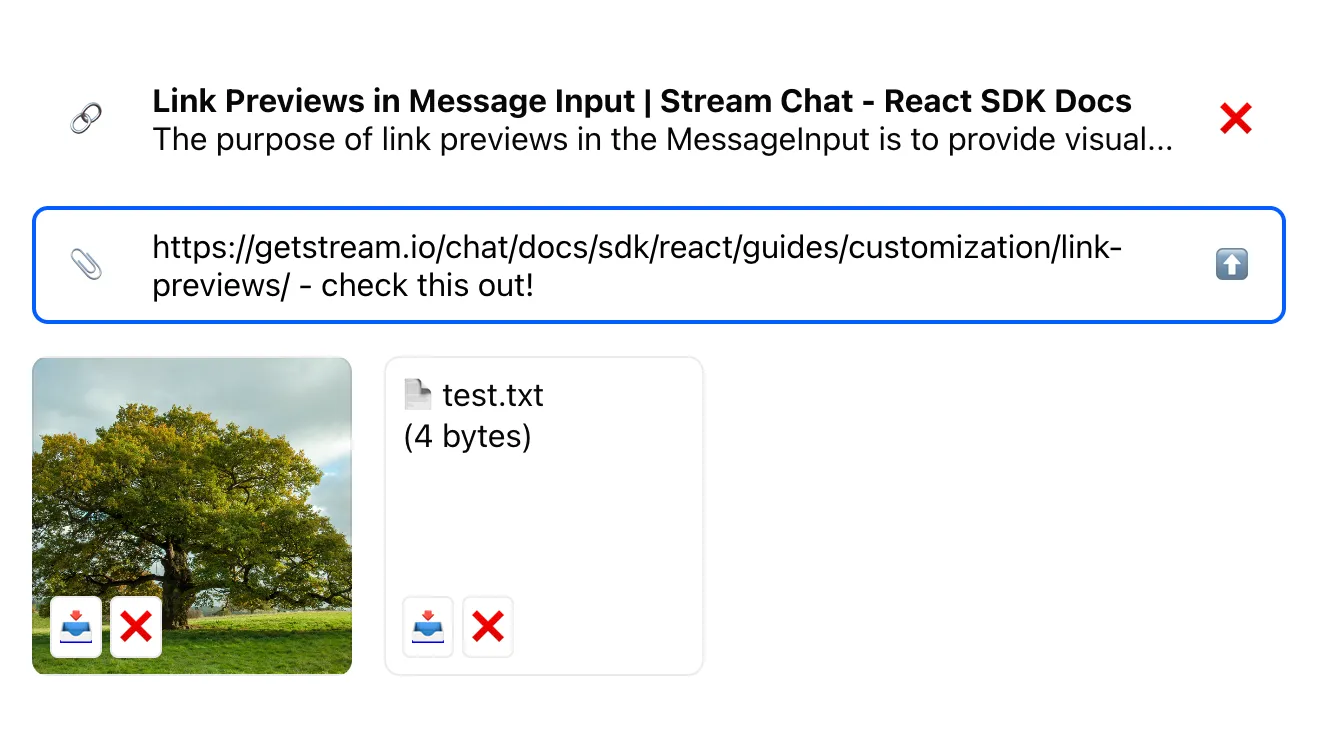
The AttachmentPreviewList should access attachments array from MessageInputContext do display attachment previews. The default AttachmentPreviewList component iterates over the attachments array and determines the corresponding component to display the given attachment type. By default, there are 5 types of attachment preview components:
AudioAttachmentPreviewFileAttachmentPreviewImageAttachmentPreviewVideoAttachmentPreviewVoiceRecordingPreview
Each of these five components can be overridden.If we have a custom component not represented by any of the above attachment types, we can override the UnsupportedAttachmentPreview as follows:
import {
  AttachmentPreviewList,
  useMessageInputContext,
} from "stream-chat-react";
import {
  CustomFileAttachmentPreview,
  CustomImageAttachmentPreview,
  // CustomAudioAttachmentPreview,
  // CustomUnsupportedAttachmentPreview,
  // CustomVideoAttachmentPreview,
  // CustomVoiceRecordingPreview,
} from "./AttachmentPreview";

const CustomAttachmentPreviewList = (props) => {
  return (
    <AttachmentPreviewList
      {...props}
      FileAttachmentPreview={CustomFileAttachmentPreview}
      ImageAttachmentPreview={CustomImageAttachmentPreview}
      // other possible preview customizations:
      // AudioAttachmentPreview={CustomAudioAttachmentPreview}
      // UnsupportedAttachmentPreview={CustomUnsupportedAttachmentPreview}
      // VideoAttachmentPreview={CustomVideoAttachmentPreview}
      // VoiceRecordingPreview={CustomVoiceRecordingPreview}
    />
  );
};
For the image attachments, the previewUri property is available. It is a temporary URL that can be used to display an image preview before the image is uploaded. Once the image is uploaded, this temporary URL is no longer available, and image_url should be used instead.
import type { ImageAttachmentPreviewProps } from "stream-chat-react";
export const CustomImageAttachmentPreview = ({
attachment,
handleRetry,
removeAttachments,
}: ImageAttachmentPreviewProps) => {
const url = attachment.previewUri ?? attachment.image_url;
if (!url) return null;
return (
<div
className="message-input__attachment-preview message-input__attachment-preview_image"
style={{ backgroundImage: `url(${url})` }}
aria-label={attachment.fallback}
>
<AttachmentActions
attachment={attachment}
handleRetry={handleRetry}
removeAttachments={removeAttachments}
/>
</div>
);
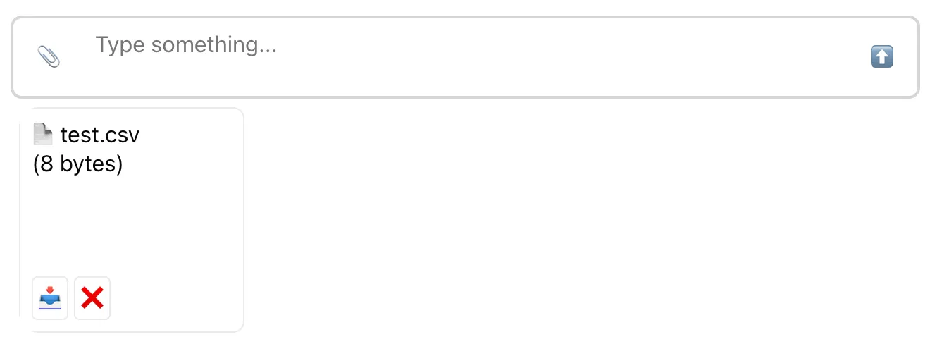
};For non-image file attachments, the file name (attachment.title) and file size (attachment.file_size) can be used to
display a preview:
import type { FileAttachmentPreviewProps } from "stream-chat-react";

export const CustomFileAttachmentPreview = ({
  attachment,
  handleRetry,
  removeAttachments,
}: FileAttachmentPreviewProps) => {
  return (
    <div className="message-input__attachment-preview message-input__attachment-preview_file">
      📄 {attachment.title} <br />({attachment.file_size} bytes)
      <AttachmentActions
        attachment={attachment}
        handleRetry={handleRetry}
        removeAttachments={removeAttachments}
      />
    </div>
  );
};
Note that an attachment can be in three different states:
'uploading'means the attachment is still uploading; you may want to display a spinner in this case.'failed'means that something went wrong while uploading the attachment; you may want to show an option to retry the upload.'finished'means the attachment had been successfully uploaded.
The upload state can be retrieved the localMetadata value as attachment.localMetadata.uploadState.
import { isLocalImageAttachment } from "stream-chat-react";
import type { AttachmentPreviewProps } from "stream-chat-react";

export const AttachmentActions = ({
  attachment,
  handleRetry,
  removeAttachments,
}: AttachmentPreviewProps) => {
  let children = null;
  const { uploadState } = attachment.localMetadata;

  if (uploadState === "uploading") {
    children = (
      <div className="message-input__attachment-action">Loading...</div>
    );
  }

  if (uploadState === "finished") {
    children = (
      <>
        <a
          className="message-input__attachment-action"
          href={
            isLocalImageAttachment(attachment)
              ? attachment.image_url
              : attachment.asset_url
          }
          target="_blank"
          rel="noreferrer"
        >
          📥
        </a>
        <button
          className="message-input__attachment-action"
          onClick={() => removeAttachments([attachment.localMetadata.id])}
        >
          ❌
        </button>
      </>
    );
  }

  if (uploadState === "failed") {
    <button
      className="message-input__attachment-action"
      onClick={() => handleRetry(attachment)}
    >
      Failed. Retry?
    </button>;
  }

  return <div className="message-input__attachment-actions">{children}</div>;
};
To achieve the below look we should add the missing CSS.
.message-input__attachment-preview {
position: relative;
border-radius: 8px;
width: 160px;
height: 160px;
padding: 8px;
border: 1px solid #00000014;
}
.message-input__attachment-preview_image {
background-size: cover;
background-position: center;
background-clip: border-box;
background-repeat: no-repeat;
}
.message-input__attachment-actions {
display: flex;
gap: 4px;
position: absolute;
left: 0;
bottom: 0;
padding: 8px;
}
.message-input__attachment-action {
font: inherit;
border-radius: 4px;
padding: 4px;
background: #fff;
border: 1px solid #00000014;
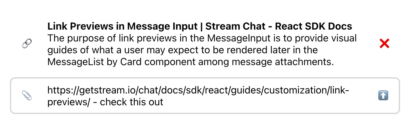
}Displaying Link Previews
If URL enrichment is enabled both in channel settings (enabled by default) and in the
urlEnrichmentConfig
of the MessageInput component (disabled by default), the SDK will automatically detect links in
the message text (as long as it's set properly in the
MessageInputContext) and create previews
for them.
To display link previews, you can use a pre-built
LinkPreviewList component
available in the ComponentContext. Using the
ComponentContext allows you to hook into the component override mechanism used throughout the SDK.
So the rough idea is:
- Grab the
LinkPreviewListfrom theComponentContext(fall back to the default implementation if the component wasn't overridden). - Grab the
linkPreviewsfrom theMessageInputContextand pass them to theLinkPreviewList.
The only thing to note here is that
linkPreviews is a Map with
URLs as keys and enriched data as values. Before passing it to the LinkPreviewList, we should
convert it to an array:
import {
  useMessageInputContext,
  useComponentContext,
  AttachmentPreviewList as DefaultAttachmentPreviewList,
  LinkPreviewList as DefaultLinkPreviewList,
} from "stream-chat-react";

const CustomMessageInput = () => {
  const { text, linkPreviews, handleChange, handleSubmit } =
    useMessageInputContext();
  const {
    LinkPreviewList = DefaultLinkPreviewList,
    AttachmentPreviewList = DefaultAttachmentPreviewList,
  } = useComponentContext();

  return (
    <div className="message-input">
      <LinkPreviewList linkPreviews={Array.from(linkPreviews.values())} />
      <div className="message-input__composer">
        <AttachmentUploadButton />
        <textarea
          className="message-input__input"
          value={text}
          onChange={handleChange}
        />
        <button
          type="button"
          className="message-input__button"
          onClick={handleSubmit}
        >
          ⬆️
        </button>
      </div>
      <AttachmentPreviewList />
    </div>
  );
};
As always, if you need deeper customization, you can implement the link preview component from
scratch. Since all the necessary data can be found in the
linkPreviews value of the
MessageInputContext, the implementation itself is quite simple.
The link preview itself goes through several lifecycle states:
'queued'means that the URL enrichment process hasn't started yet. This process is debounced, so to avoid flashing UI we should ignore queued previews.'loading'means that URL enrichment is in progress. Depending on the desired UX, you can either ignore loading previews, or show a spinner or other loading state.'loaded'means that the preview is ready.'dismissed'means the preview has been dismissed by the user.
So the only bit of interactivity we need to add is an option to dismiss a link preview:
import { useMessageInputContext } from "stream-chat-react";

const CustomLinkPreviewList = () => {
  const { linkPreviews: linkPreviewMap, dismissLinkPreview } =
    useMessageInputContext();
  const linkPreviews = Array.from(linkPreviewMap.values());

  if (linkPreviews.length === 0) {
    return null;
  }

  return (
    <ul className="message-input__link-previews">
      {linkPreviews.map(
        (preview) =>
          preview.state === "loaded" && (
            <li
              key={preview.og_scrape_url}
              className="message-input__link-preview"
            >
              <span className="message-input__link-preview-icon">🔗</span>
              <div className="message-input__link-preview-og">
                <strong>{preview.title}</strong>
                <br />
                {preview.text}
              </div>
              <button
                type="button"
                className="message-input__button"
                onClick={() => dismissLinkPreview(preview)}
              >
                ❌
              </button>
            </li>
          ),
      )}
    </ul>
  );
};
.message-input__link-previews {
list-style: none;
padding: 0;
}
.message-input__link-preview {
display: flex;
align-items: center;
}
.message-input__link-preview-icon {
margin: 0 25px 0 19px;
}
.message-input__link-preview-og {
flex-grow: 1;
}
Handling Replies
When composing a reply, the
quotedMessage property
is available in the ChannelStateContext. You can rely on the value of this property to render a custom
quoted message preview - or use the default QuotedMessagePreview component instead.
import {
  useChannelStateContext,
  useMessageInputContext,
  QuotedMessagePreview,
} from "stream-chat-react";

const CustomMessageInput = () => {
  const { parent } = useMessageInputContext();
  const { quotedMessage } = useChannelStateContext();

  const shouldShowQuotedMessage =
    /* prevent answering to one thread in another thread */
    Boolean(quotedMessage) && quotedMessage.parent_id === parent?.id;

  return (
    <>
      {shouldShowQuotedMessage && (
        <QuotedMessagePreview quotedMessage={quotedMessage} />
      )}
      {/* ... */}
    </>
  );
};
Handling Slow Mode
If the Slow Mode is configured for the current channel, we should prevent messages from being sent before the cooldown period has passed.
The first thing we should do is disable or hide the "send" button while the cooldown period is in
effect. We can use the
cooldownRemaining value
from the MessageInputContext: it's guaranteed to have a non-zero numeric value while the user is
within a cooldown period, and to reset to a falsy value when the cooldown period ends. Note that to
avoid excessive rendering, the value itself does not "tick down" every second.
To provide visual feedback with a countdown, we can use the
CooldownTimer component from the
ComponentContext:
import {
  useMessageInputContext,
  useComponentContext,
  AttachmentPreviewList as DefaultAttachmentPreviewList,
  CooldownTimer as DefaultCooldownTimer,
} from "stream-chat-react";

const CustomMessageInput = () => {
  const {
    text,
    cooldownRemaining,
    setCooldownRemaining,
    cooldownInterval,
    handleChange,
    handleSubmit,
  } = useMessageInputContext();
  const {
    CooldownTimer = DefaultCooldownTimer,
    AttachmentPreviewList = DefaultAttachmentPreviewList,
  } = useComponentContext();

  return (
    <div className="message-input">
      <div className="message-input__composer">
        <AttachmentUploadButton />
        <textarea
          className="message-input__input"
          value={text}
          onChange={handleChange}
        />
        <button
          type="button"
          className="message-input__button"
          disabled={!!cooldownRemaining}
          onClick={handleSubmit}
        >
          {cooldownRemaining ? (
            <>
              ⏳{" "}
              <CooldownTimer
                cooldownInterval={cooldownInterval}
                setCooldownRemaining={setCooldownRemaining}
              />
            </>
          ) : (
            <>⬆️</>
          )}
        </button>
      </div>
      <AttachmentPreviewList />
    </div>
  );
};
The component itself is very simple, it's just a single <div> with a timer that counts down
seconds. Most customizations can be done with CSS, but if you need to implement the whole component
from scratch, the only trick is to add a timer that counts down from the
cooldownInterval:
const CustomCooldownTimer = () => {
  const { cooldownRemaining, cooldownInterval } = useMessageInputContext();
  const enabled = !!cooldownRemaining;
  const [secondsPassed, setSecondsPassed] = useState(0);

  useEffect(() => {
    const startedAt = Date.now();
    const interval = setInterval(() => {
      setSecondsPassed(Math.floor((Date.now() - startedAt) / 1000));
    }, 500);
    return () => clearInterval(interval);
  }, [enabled]);

  return <strong>⏳ {cooldownInterval - secondsPassed}</strong>;
};