Message UI
Message UI is one of the main building blocks of the chat application. Designing proper message UI is no easy feat and that's why our SDK comes with a pre-built component (MessageSimple) which is packed with functionality and is easy to customize through our CSS variables or component overrides (ComponentContext).
In this guide, we'll build a simplified custom message UI component combining pre-built and other completely custom components.
Message Text and Avatars
Let's begin with the simplest form the message UI can take: rendering the raw message text.
import { useMessageContext, Channel } from 'stream-chat-react';

const CustomMessageUi = () => {
  const { message } = useMessageContext();

  return <div data-message-id={message.id}>{message.text}</div>;
};
Message UI and all of its children can access MessageContext in which it's wrapped and therefore can call the useMessageContext hook accessing all of the message-related information and functions alike.
To see our changes we'll need to pass this component down to either Channel or MessageList (VirtualizedMessageList) components as a Message prop.
<Channel Message={CustomMessageUi}>...</Channel>

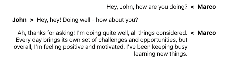
You can see that all of the messages are now on one side and we have no idea who's the message coming from, let's adjust that with the help of some CSS, and to render the name of the sender we'll need to access user property of the message object.
Our message will be on the right and the message of the other senders will be on the left side of the screen.
- React
- CSS
import { useMessageContext, Channel } from 'stream-chat-react';

const CustomMessageUi = () => {
  const { isMyMessage, message } = useMessageContext();

  const messageUiClassNames = ['custom-message-ui'];

  if (isMyMessage()) {
    messageUiClassNames.push('custom-message-ui--mine');
  } else {
    messageUiClassNames.push('custom-message-ui--other');
  }

  return (
    <div className={messageUiClassNames.join(' ')} data-message-id={message.id}>
      <strong className='custom-message-ui__name'>{message.user?.name || message.user?.id}</strong>
      <span>{message.text}</span>
    </div>
  );
};
.custom-message-ui {
  --cmui-gap-size: 0.5rem;
  --cmui-inline-spacing: 2rem;
  --cmui-block-spacing: 0.5rem;

  display: flex;
  gap: var(--cmui-gap-size);
  padding-inline: var(--cmui-inline-spacing);
  padding-block: var(--cmui-block-spacing);
}

.custom-message-ui__name {
  display: flex;
  gap: var(--cmui-gap-size);
}

.custom-message-ui--mine .custom-message-ui__name::before {
  content: '<';
}

.custom-message-ui--other .custom-message-ui__name::after {
  content: '>';
}

.custom-message-ui--mine {
  flex-direction: row-reverse;
  text-align: right;
}
Now this already looks way better than the initial version but we can do better - let's switch from names to avatars using a pre-built Avatar component to make the UI slightly friendlier.
- React
- CSS
import { Avatar, useMessageContext, Channel } from 'stream-chat-react';

const CustomMessageUi = () => {
  const { isMyMessage, message } = useMessageContext();

  const messageUiClassNames = ['custom-message-ui'];

  if (isMyMessage()) {
    messageUiClassNames.push('custom-message-ui--mine');
  } else {
    messageUiClassNames.push('custom-message-ui--other');
  }

  return (
    <div className={messageUiClassNames.join(' ')} data-message-id={message.id}>
      <Avatar image={message.user?.image} name={message.user?.name || message.user?.id} />
      <span className='custom-message-ui__text'>{message.text}</span>
    </div>
  );
};
.custom-message-ui {
  --cmui-gap-size: 0.5rem;
  --cmui-inline-spacing: 2rem;
  --cmui-block-spacing: 0.5rem;

  display: flex;
  gap: var(--cmui-gap-size);
  padding-inline: var(--cmui-inline-spacing);
  padding-block: var(--cmui-block-spacing);
}

.custom-message-ui__text {
  display: flex;
  flex-direction: column;
  align-self: center;
}

.custom-message-ui--mine {
  flex-direction: row-reverse;
  text-align: right;
}

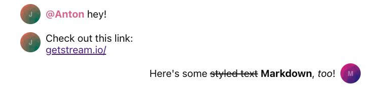
Our message UI looks pretty good now but what if the text of a message becomes more complex? Let's say someone sends a link to a site or mentions some other user. In the current state, our UI would display this in plaintext and none of it would be interactive.
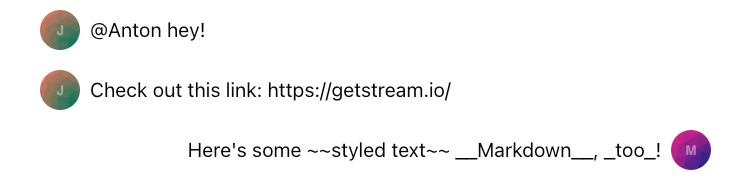
Let's enhance this behavior by using pre-built MessageText which uses renderText internally and that'll transform all of our links, mention, and certain Markdown syntax to interactive and neat-looking elements.
- React
- css
import { Avatar, MessageText, useMessageContext, Channel } from 'stream-chat-react';

const CustomMessageUi = () => {
  const { isMyMessage, message } = useMessageContext();

  const messageUiClassNames = ['custom-message-ui'];

  if (isMyMessage()) {
    messageUiClassNames.push('custom-message-ui--mine');
  } else {
    messageUiClassNames.push('custom-message-ui--other');
  }

  return (
    <div className={messageUiClassNames.join(' ')} data-message-id={message.id}>
      <Avatar image={message.user?.image} name={message.user?.name || message.user?.id} />
      <MessageText />
    </div>
  );
};
.custom-message-ui {
  --cmui-gap-size: 0.5rem;
  --cmui-inline-spacing: 2rem;
  --cmui-block-spacing: 0.5rem;

  display: flex;
  gap: var(--cmui-gap-size);
  padding-inline: var(--cmui-inline-spacing);
  padding-block: var(--cmui-block-spacing);
}

.custom-message-ui--mine {
  flex-direction: row-reverse;
  text-align: right;
}

.custom-message-ui .str-chat__message-text p {
  all: unset;
}

.custom-message-ui .str-chat__message-text {
  display: flex;
  flex-direction: column;
  align-self: center;
}

.custom-message-ui .str-chat__message-mention {
  font-weight: bold;
  color: palevioletred;
  cursor: pointer;
}
While the mentioned user is being highlighted there's no default pointer event attached to the highlighted element, see the Mentions Actions guide for more information.
Metadata
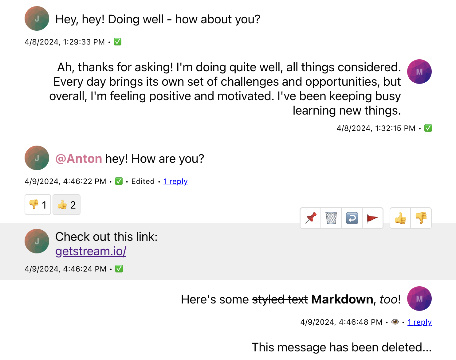
So far we've covered avatars and proper text rendering but the UI still feels a bit empty. Each message has a lot of extra information which can be beneficial to the end users. Let's add the creation date, "edited" flag, and delivery/read status information to our message UI.
- React
- css
import { Avatar, MessageText, useMessageContext, useChatContext, Channel } from 'stream-chat-react';

const statusIconMap = {
  received: '✅',
  receivedAndRead: '👁️',
  sending: '🛫',
  unknown: '❓',
};

const CustomMessageUiMetadata = () => {
  const {
    message: {
      created_at: createdAt,
      message_text_updated_at: messageTextUpdatedAt,
      status = 'unknown',
    },
    readBy = [],
  } = useMessageContext();
  const { client } = useChatContext();

  const [firstUser] = readBy;

  const receivedAndRead = readBy.length > 1 || (firstUser && firstUser.id !== client.user?.id);

  return (
    <div className='custom-message-ui__metadata'>
      <div className='custom-message-ui__metadata-created-at'>{createdAt?.toLocaleString()}</div>
      <div className='custom-message-ui__metadata-read-status'>
        {receivedAndRead
          ? statusIconMap.receivedAndRead
          : statusIconMap[status as keyof typeof statusIconMap] ?? statusIconMap.unknown}
      </div>
      {messageTextUpdatedAt && (
        <div className='custom-message-ui__metadata-edited-status' title={messageTextUpdatedAt}>
          Edited
        </div>
      )}
    </div>
  );
};

const CustomMessageUi = () => {
  const { isMyMessage, message } = useMessageContext();

  const messageUiClassNames = ['custom-message-ui'];

  if (isMyMessage()) {
    messageUiClassNames.push('custom-message-ui--mine');
  } else {
    messageUiClassNames.push('custom-message-ui--other');
  }

  return (
    <div className={messageUiClassNames.join(' ')} data-message-id={message.id}>
      <div className='custom-message-ui__body'>
        <Avatar image={message.user?.image} name={message.user?.name || message.user?.id} />
        <MessageText />
      </div>
      <CustomMessageUiMetadata />
    </div>
  );
};
.custom-message-ui {
  --cmui-gap-size-md: 0.5rem;
  --cmui-gap-size-sm: 0.2rem;
  --cmui-inline-spacing: 2rem;
  --cmui-block-spacing: 0.5rem;

  display: flex;
  flex-direction: column;
  gap: var(--cmui-gap-size-md);
  padding-inline: var(--cmui-inline-spacing);
  padding-block: var(--cmui-block-spacing);
}

.custom-message-ui__body {
  gap: var(--cmui-gap-size-md);
  display: flex;
}

.custom-message-ui--mine .custom-message-ui__body {
  flex-direction: row-reverse;
  text-align: right;
}

.custom-message-ui__metadata {
  display: flex;
  font-size: x-small;
  align-items: baseline;
}

.custom-message-ui__metadata > *:nth-child(even)::after,
.custom-message-ui__metadata > *:nth-child(even)::before {
  content: '•';
  padding-inline: var(--cmui-gap-size-sm);
}

.custom-message-ui__metadata > *:last-child::after {
  display: none;
}

.custom-message-ui--mine .custom-message-ui__metadata {
  align-self: flex-end;
}

.custom-message-ui .str-chat__message-text p {
  all: unset;
}

.custom-message-ui .str-chat__message-text {
  display: flex;
  flex-direction: column;
  align-self: center;
}

.custom-message-ui .str-chat__message-mention {
  font-weight: bold;
  color: palevioletred;
  cursor: pointer;
}

Message grouping is being managed automatically by the SDK and each parent element (which holds our message UI) receives an appropriate class name based on which we can adjust our rules to display metadata elements only when it's appropriate to make our UI look less busy.
{/ TODO: link to grouping logic (maybe how to adjust it if needed) /}
.custom-message-ui__metadata {
  /* removed-line */
  display: flex;
  /* added-line */
  display: none;
  font-size: x-small;
  align-items: baseline;
}

/* added-block-start */
.str-chat__li--bottom .custom-message-ui__metadata,
.str-chat__li--single .custom-message-ui__metadata {
  display: flex;
}
/* added-block-end */
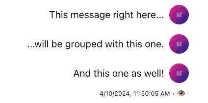
You can utilize MessageContext properties firstOfGroup, endOfGroup, and groupedByUser if you use VirtualizedMessageList for conditional metadata rendering. These properties are not available in regular MessageList.
The SDK also comes with MessageStatus and MessageTimestamp components which you can use to replace our custom-made ones. These components come with some extra logic but essentially provide an almost identical amount of utility for the end users so we won't be covering the replacement in this guide.
Message Actions
Up to this point we've covered mostly the presentational part of our message UI and apart from the mentions and links, there's not much the end users can interact with. Obviously - the SDK offers so much more so in this section of the guide we'll explain how to add and enable message actions (deleting, replies, pinning, etc.) and reactions.
At the very beginning of this guide, we've mentioned that MessageContext provides information and functions related to a specific message. So to implement a subset of message actions we'll need to access handleDelete, handlePin, handleFlag, and handleThread functions which we can attach to the action buttons of our CustomMessageUiActions component.
- React
- CSS
const statusIconMap = {
  received: '✅',
  receivedAndRead: '👁️',
  sending: '🛫',
  unknown: '❓',
};

const CustomMessageUiActions = () => {
  const {
    handleDelete,
    handleFlag,
    handleOpenThread,
    handlePin,
    message,
    threadList,
  } = useMessageContext();

  if (threadList) return null;

  return (
    <div className='custom-message-ui__actions'>
      <div className='custom-message-ui__actions-group'>
        <button onClick={handlePin} title={message.pinned ? 'Unpin' : 'Pin'}>
          {message.pinned ? '📍' : '📌'}
        </button>
        <button onClick={handleDelete} title='Delete'>
          🗑️
        </button>
        <button onClick={handleOpenThread} title='Open thread'>
          ↩️
        </button>
        <button onClick={handleFlag} title='Flag message'>
          🚩
        </button>
      </div>
    </div>
  );
};

const CustomMessageUiMetadata = () => {
  const {
    message: {
      created_at: createdAt,
      message_text_updated_at: messageTextUpdatedAt,
      status = 'unknown',
    },
    readBy = [],
  } = useMessageContext();
  const { client } = useChatContext();

  const [firstUser] = readBy;

  const receivedAndRead = readBy.length > 1 || (firstUser && firstUser.id !== client.user?.id);

  return (
    <div className='custom-message-ui__metadata'>
      <div className='custom-message-ui__metadata-created-at'>{createdAt?.toLocaleString()}</div>
      <div className='custom-message-ui__metadata-read-status'>
        {receivedAndRead
          ? statusIconMap.receivedAndRead
          : statusIconMap[status as keyof typeof statusIconMap] ?? statusIconMap.unknown}
      </div>
      {messageTextUpdatedAt && (
        <div className='custom-message-ui__metadata-edited-status' title={messageTextUpdatedAt}>
          Edited
        </div>
      )}
    </div>
  );
};

const CustomMessageUi = () => {
  const { isMyMessage, message } = useMessageContext();

  const messageUiClassNames = ['custom-message-ui'];

  if (isMyMessage()) {
    messageUiClassNames.push('custom-message-ui--mine');
  } else {
    messageUiClassNames.push('custom-message-ui--other');
  }

  return (
    <div className={messageUiClassNames.join(' ')} data-message-id={message.id}>
      <div className='custom-message-ui__body'>
        <Avatar image={message.user?.image} name={message.user?.name || message.user?.id} />
        <MessageText />
      </div>
      <CustomMessageUiMetadata />
      <CustomMessageUiActions />
    </div>
  );
};
.custom-message-ui {
  --cmui-gap-size-md: 0.5rem;
  --cmui-gap-size-sm: 0.2rem;
  --cmui-inline-spacing: 2rem;
  --cmui-block-spacing: 0.5rem;
  --cmui-bg-color: #efefef;
  --cmui-border-color: #ddd;
  --cmui-border-radius: 0.2rem;

  position: relative;
  display: flex;
  flex-direction: column;
  gap: var(--cmui-gap-size-md);
  padding-inline: var(--cmui-inline-spacing);
  padding-block: var(--cmui-block-spacing);
}

.custom-message-ui:hover,
.custom-message-ui:has(.str-chat__message-text:focus) {
  background: var(--cmui-bg-color);
}

.custom-message-ui__body {
  gap: var(--cmui-gap-size-md);
  display: flex;
}

.custom-message-ui--mine .custom-message-ui__body {
  flex-direction: row-reverse;
  text-align: right;
}

.custom-message-ui__actions {
  display: none;
  position: absolute;
  gap: var(--cmui-gap-size-md);
  top: -20px;
}

.custom-message-ui:hover .custom-message-ui__actions {
  display: flex;
}

.custom-message-ui__actions-group {
  display: flex;
  background-color: var(--cmui-border-color);
  border-radius: var(--cmui-border-radius);
  gap: 1px;
  padding: 1px;
}

.custom-message-ui__actions-group button {
  all: unset;
  background: white;
  justify-content: center;
  align-items: center;
  cursor: pointer;
  padding: 5px;
  line-height: 1rem;
}

.custom-message-ui__actions-group button:first-child {
  border-bottom-left-radius: calc(var(--cmui-border-radius) - 1px);
  border-top-left-radius: calc(var(--cmui-border-radius) - 1px);
}

.custom-message-ui__actions-group button:last-child {
  border-bottom-right-radius: calc(var(--cmui-border-radius) - 1px);
  border-top-right-radius: calc(var(--cmui-border-radius) - 1px);
}

.custom-message-ui__actions-group button:hover {
  background: var(--cmui-bg-color);
}

.custom-message-ui__metadata {
  display: none;
  font-size: x-small;
  align-items: baseline;
}

.str-chat__li--bottom .custom-message-ui__metadata,
.str-chat__li--single .custom-message-ui__metadata {
  display: flex;
}

.custom-message-ui__metadata > *:nth-child(even)::after,
.custom-message-ui__metadata > *:nth-child(even)::before {
  content: '•';
  padding-inline: var(--cmui-gap-size-sm);
}

.custom-message-ui__metadata > *:last-child::after {
  display: none;
}

.custom-message-ui--mine .custom-message-ui__metadata {
  align-self: flex-end;
}

.custom-message-ui--mine .custom-message-ui__actions {
  left: var(--cmui-inline-spacing);
}

.custom-message-ui--other .custom-message-ui__actions {
  right: var(--cmui-inline-spacing);
}

.custom-message-ui .str-chat__message-text p {
  all: unset;
}

.custom-message-ui .str-chat__message-text {
  display: flex;
  flex-direction: column;
  align-self: center;
}

.custom-message-ui .str-chat__message-mention {
  font-weight: bold;
  color: palevioletred;
  cursor: pointer;
}
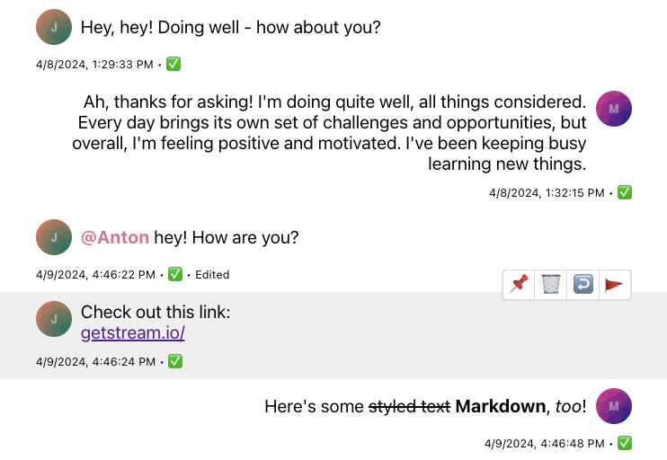
Now that we've enabled some actions we'll also need to cover certain UI parts that should reflect the latest message state which weren't relevant before. You can see that we've already covered the message's "pinned" state by accessing the pinned property of the message object and rendering the appropriate icon when this property is set to true. See the Pin Indicator guide for more customization options. Let's explore other customizations needed for a complete message UI.
The following code samples contain only the code related to the appropriate components, if you're following along you can copy and add the following examples to whatever you have created up until now. The whole example is at the bottom of this guide.
Thread and Reply Count
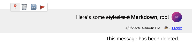
First - upon opening a thread and replying to a message, the message's property reply_count changes; let's add the count indicator button beside the rest of the metadata elements so the end users can access the thread from two places.
- React
- CSS
const CustomMessageUiMetadata = () => {
  const {
    message: {
      created_at: createdAt,
      message_text_updated_at: messageTextUpdatedAt,
      // added-line
      reply_count: replyCount = 0,
      status = 'unknown',
    },
    readBy = [],
    handleOpenThread,
  } = useMessageContext();
  const { client } = useChatContext();

  const [firstUser] = readBy;

  const receivedAndRead = readBy.length > 1 || (firstUser && firstUser.id !== client.user?.id);

  return (
    <div className='custom-message-ui__metadata'>
      <div className='custom-message-ui__metadata-created-at'>{createdAt?.toLocaleString()}</div>
      <div className='custom-message-ui__metadata-read-status'>
        {receivedAndRead
          ? statusIconMap.receivedAndRead
          : statusIconMap[status as keyof typeof statusIconMap] ?? statusIconMap.unknown}
      </div>
      {messageTextUpdatedAt && (
        <div className='custom-message-ui__metadata-edited-status' title={messageTextUpdatedAt}>
          Edited
        </div>
      )}
      // added-block-start
      {replyCount > 0 && (
        <button className='custom-message-ui__metadata-reply-count' onClick={handleOpenThread}>
          <span>
            {replyCount} {replyCount > 1 ? 'replies' : 'reply'}
          </span>
        </button>
      )}
      // added-block-end
    </div>
  );
};
.custom-message-ui__metadata-reply-count {
  all: unset;
}

.custom-message-ui__metadata-reply-count > span {
  color: blue;
  text-decoration: underline;
  cursor: pointer;
}
Deleted Message
Since now we're also able to soft delete our own messages we'll need to render a slightly different UI to handle such a case. Let's add a condition where we check whether the deleted_at property of the message object exists and if it does we'll simply fall back to "message deleted" text.
const CustomMessageUi = () => {
  const { isMyMessage, message } = useMessageContext();

  const messageUiClassNames = ['custom-message-ui'];

  if (isMyMessage()) {
    messageUiClassNames.push('custom-message-ui--mine');
  } else {
    messageUiClassNames.push('custom-message-ui--other');
  }

  return (
    <div className={messageUiClassNames.join(' ')} data-message-id={message.id}>
      // added-block-start
      {message.deleted_at && (
        <div className='custom-message-ui__body'>This message has been deleted...</div>
      )}
      {!message.deleted_at && (
        <>
          <div className='custom-message-ui__body'>
            <Avatar image={message.user?.image} name={message.user?.name || message.user?.id} />
            <MessageText />
          </div>
          <CustomMessageUiMetadata />
          <CustomMessageUiActions />
        </>
      )}
      // added-block-end
    </div>
  );
};
Reactions
With message actions in place we've made our message UI slightly more interactive but there's still a place for improvement. In this section of the guide we'll create a simple selector consisting of two reactions (thumbs up and down) and to display them we'll reuse and slightly modify the ReactionsList component provided by the SDK. Let's begin by defining customReactionOptions (see more in the Reactions Customization guide) and by passing them down to a reactionOptions prop of a Channel component.
const customReactionOptions = [
  { name: 'Thumbs up', type: '+1', Component: () => <>👍</> },
  { name: 'Thumbs down', type: '-1', Component: () => <>👎</> },
];

<Channel Message={CustomMessageUi} reactionOptions={customReactionOptions}>
  ...
</Channel>;
And now that's done we can continue by extending our CustomMessageUiActions component using these newly defined options.
const CustomMessageUiActions = () => {
  const {
    handleDelete,
    handleFlag,
    handleOpenThread,
    handlePin,
    // added-line
    handleReaction,
    message,
    threadList,
  } = useMessageContext();

  // added-line
  const { reactionOptions } = useComponentContext();

  if (threadList) return null;

  return (
    <div className='custom-message-ui__actions'>
      <div className='custom-message-ui__actions-group'>
        <button onClick={handlePin} title={message.pinned ? 'Unpin' : 'Pin'}>
          {message.pinned ? '📍' : '📌'}
        </button>
        <button onClick={handleDelete} title='Delete'>
          🗑️
        </button>
        <button onClick={handleOpenThread} title='Open thread'>
          ↩️
        </button>
        <button onClick={handleFlag} title='Flag message'>
          🚩
        </button>
      </div>
      // added-block-start
      <div className='custom-message-ui__actions-group'>
        {reactionOptions.map(({ Component, name, type }) => (
          <button key={type} onClick={(e) => handleReaction(type, e)} title={`React with: ${name}`}>
            <Component />
          </button>
        ))}
      </div>
      // added-block-end
    </div>
  );
};
Finally, we can add the ReactionsList component to our CustomMessageUi component and adjust the styles accordingly.
Complete Example
- React
- CSS
import {
  Avatar,
  MessageText,
  ReactionsList,
  useMessageContext,
  useChatContext,
  Channel,
} from 'stream-chat-react';

const customReactionOptions = [
  { name: 'Thumbs up', type: '+1', Component: () => <>👍</> },
  { name: 'Thumbs down', type: '-1', Component: () => <>👎</> },
];

const statusIconMap = {
  received: '✅',
  receivedAndRead: '👁️',
  sending: '🛫',
  unknown: '❓',
};

const CustomMessageUiActions = () => {
  const {
    handleDelete,
    handleFlag,
    handleOpenThread,
    handlePin,
    handleReaction,
    message,
    threadList,
  } = useMessageContext();

  const { reactionOptions } = useComponentContext();

  if (threadList) return null;

  return (
    <div className='custom-message-ui__actions'>
      <div className='custom-message-ui__actions-group'>
        <button onClick={handlePin} title={message.pinned ? 'Unpin' : 'Pin'}>
          {message.pinned ? '📍' : '📌'}
        </button>
        <button onClick={handleDelete} title='Delete'>
          🗑️
        </button>
        <button onClick={handleOpenThread} title='Open thread'>
          ↩️
        </button>
        <button onClick={handleFlag} title='Flag message'>
          🚩
        </button>
      </div>
      <div className='custom-message-ui__actions-group'>
        {reactionOptions.map(({ Component, name, type }) => (
          <button key={type} onClick={(e) => handleReaction(type, e)} title={`React with: ${name}`}>
            <Component />
          </button>
        ))}
      </div>
    </div>
  );
};

const CustomMessageUiMetadata = () => {
  const {
    message: {
      created_at: createdAt,
      message_text_updated_at: messageTextUpdatedAt,
      reply_count: replyCount = 0,
      status = 'unknown',
    },
    readBy = [],
    handleOpenThread,
  } = useMessageContext();
  const { client } = useChatContext();

  const [firstUser] = readBy;

  const receivedAndRead = readBy.length > 1 || (firstUser && firstUser.id !== client.user?.id);

  return (
    <div className='custom-message-ui__metadata'>
      <div className='custom-message-ui__metadata-created-at'>{createdAt?.toLocaleString()}</div>
      <div className='custom-message-ui__metadata-read-status'>
        {receivedAndRead
          ? statusIconMap.receivedAndRead
          : statusIconMap[status as keyof typeof statusIconMap] ?? statusIconMap.unknown}
      </div>
      {messageTextUpdatedAt && (
        <div className='custom-message-ui__metadata-edited-status' title={messageTextUpdatedAt}>
          Edited
        </div>
      )}
      {replyCount > 0 && (
        <button className='custom-message-ui__metadata-reply-count' onClick={handleOpenThread}>
          <span>
            {replyCount} {replyCount > 1 ? 'replies' : 'reply'}
          </span>
        </button>
      )}
    </div>
  );
};

const CustomMessageUi = () => {
  const { isMyMessage, message } = useMessageContext();

  const messageUiClassNames = ['custom-message-ui'];

  if (isMyMessage()) {
    messageUiClassNames.push('custom-message-ui--mine');
  } else {
    messageUiClassNames.push('custom-message-ui--other');
  }

  return (
    <div className={messageUiClassNames.join(' ')} data-message-id={message.id}>
      {message.deleted_at && (
        <div className='custom-message-ui__body'>This message has been deleted...</div>
      )}
      {!message.deleted_at && (
        <>
          <div className='custom-message-ui__body'>
            <Avatar image={message.user?.image} name={message.user?.name || message.user?.id} />
            <MessageText />
          </div>
          <CustomMessageUiMetadata />
          <CustomMessageUiActions />
          // added-line
          <ReactionsList />
        </>
      )}
    </div>
  );
};
.custom-message-ui {
  --cmui-gap-size-md: 0.5rem;
  --cmui-gap-size-sm: 0.2rem;
  --cmui-inline-spacing: 2rem;
  --cmui-block-spacing: 0.5rem;
  --cmui-bg-color: #efefef;
  --cmui-border-color: #ddd;
  --cmui-border-radius: 0.2rem;
  --str-chat__own-message-reaction-background-color: var(--cmui-bg-color);
  --str-chat__message-reaction-background-color: white;
  --str-chat__message-reaction-border-radius: var(--cmui-border-radius);

  position: relative;
  display: flex;
  flex-direction: column;
  gap: var(--cmui-gap-size-md);
  padding-inline: var(--cmui-inline-spacing);
  padding-block: var(--cmui-block-spacing);
}

.custom-message-ui:hover,
.custom-message-ui:has(.str-chat__message-text:focus) {
  background: var(--cmui-bg-color);
}

.custom-message-ui__body {
  gap: var(--cmui-gap-size-md);
  display: flex;
}

.custom-message-ui--mine .custom-message-ui__body {
  flex-direction: row-reverse;
  text-align: right;
}

.custom-message-ui__actions {
  display: none;
  position: absolute;
  gap: var(--cmui-gap-size-md);
  top: -20px;
}

.custom-message-ui:hover .custom-message-ui__actions {
  display: flex;
}

.custom-message-ui__actions-group {
  display: flex;
  background-color: var(--cmui-border-color);
  border-radius: var(--cmui-border-radius);
  gap: 1px;
  padding: 1px;
}

.custom-message-ui__actions-group button {
  all: unset;
  background: white;
  justify-content: center;
  align-items: center;
  cursor: pointer;
  padding: 5px;
  line-height: 1rem;
}

.custom-message-ui__actions-group button:first-child {
  border-bottom-left-radius: calc(var(--cmui-border-radius) - 1px);
  border-top-left-radius: calc(var(--cmui-border-radius) - 1px);
}

.custom-message-ui__actions-group button:last-child {
  border-bottom-right-radius: calc(var(--cmui-border-radius) - 1px);
  border-top-right-radius: calc(var(--cmui-border-radius) - 1px);
}

.custom-message-ui__actions-group button:hover {
  background: var(--cmui-bg-color);
}

.custom-message-ui__metadata {
  display: none;
  font-size: x-small;
  align-items: baseline;
}

.str-chat__li--bottom .custom-message-ui__metadata,
.str-chat__li--single .custom-message-ui__metadata {
  display: flex;
}

.custom-message-ui__metadata > *:nth-child(even)::after,
.custom-message-ui__metadata > *:nth-child(even)::before {
  content: '•';
  padding-inline: var(--cmui-gap-size-sm);
}

.custom-message-ui__metadata > *:last-child::after {
  display: none;
}

.custom-message-ui__metadata-reply-count {
  all: unset;
}

.custom-message-ui__metadata-reply-count > span {
  color: blue;
  text-decoration: underline;
  cursor: pointer;
}

.custom-message-ui--mine .str-chat__reaction-list {
  align-self: flex-end;
}

.custom-message-ui--mine .custom-message-ui__metadata {
  align-self: flex-end;
}

.custom-message-ui--mine .custom-message-ui__actions {
  left: var(--cmui-inline-spacing);
}

.custom-message-ui--other .custom-message-ui__actions {
  right: var(--cmui-inline-spacing);
}

.custom-message-ui .str-chat__message-text p {
  all: unset;
}

.custom-message-ui .str-chat__message-text {
  display: flex;
  flex-direction: column;
  align-self: center;
}

.custom-message-ui .str-chat__message-mention {
  font-weight: bold;
  color: palevioletred;
  cursor: pointer;
}

.custom-message-ui .str-chat__message-reaction {
  border: 1px solid var(--cmui-border-color);
  padding: 5px;
}
Attachments
The topic of attachments is pretty substantial by itself, so we won't be covering it in this guide. Please, refer to the source code of our default MessageSimple for details on implementation and see the Custom Attachment guide for more customization options.
Read More
Functionalities relevant to the Message UI that are also not covered in this guide:
- Edit Message functionality
- Message Bounced functionality
- Permissions of the message actions