# Notifications UI
The notifications UI consists of the components that show notifications: one `` for each part of the screen (panel) rendering `` for each registered notification in `client.notifications`. Use this page to know what users see: what a notification looks like, which part of the screen shows it, and in which order a list shows its notifications. It also covers how to change where they show and how they look. Who publishes notifications and what they contain is on [Publishing notifications](https://getstream.io/chat/docs/sdk/react/state/publishing-notifications/). The props of ``, `` and `` are in the [Notifications reference](https://getstream.io/chat/docs/sdk/react/component-reference/utilities/notifications/).
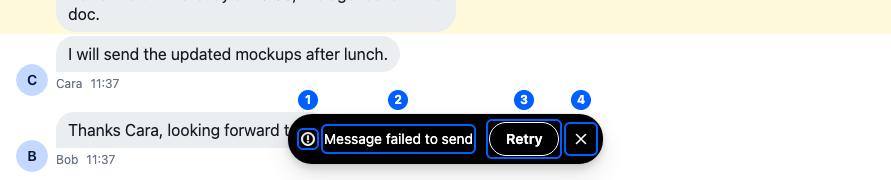
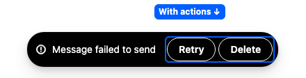
This is a persistent error notification with an action, at the bottom of a channel. Its parts:
| Part | What it shows | Explained in |
| ---------------- | ------------------------------------------------------------------------------------------------------------------------------------------ | ---------------------------------------------------------------------------------------------------------------------- |
| 1. Severity icon | An icon per severity: success, error, warning and loading. An info notification has none. | [Severity, actions and durations](https://getstream.io/chat/docs/sdk/react/state/publishing-notifications/#severity-actions-and-durations) |
| 2. Message | The notification's text, translated. A message wider than the panel wraps, unless the notification has actions, which keep it on one line. | [Notifications text](https://getstream.io/chat/docs/sdk/react/features/notifications/notifications-text/) |
| 3. Action button | One button per action the notification carries, such as "Retry" | [Severity, actions and durations](https://getstream.io/chat/docs/sdk/react/state/publishing-notifications/#severity-actions-and-durations) |
| 4. Close button | Shown on a persistent notification, one that stays until it's closed | [Notification lists and panels](#notification-lists-and-panels) |
Notifications look different by severity, by whether they stay, and by their actions:


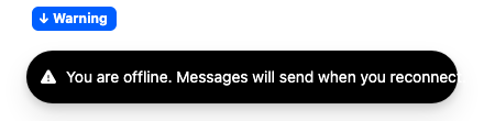

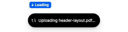
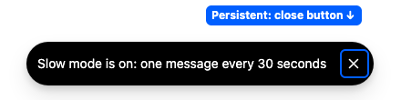
>
> **Info:** **Example**
>
> The user flags a message in a thread:
>
> 1. "Message has been successfully flagged" slides in at the bottom of the thread, with a success icon.
> 2. Three seconds after it appears, it slides out.
> 3. A screen reader reads "Success notification: Message has been successfully flagged".
>
> If the flag fails, an error notification appears in the same place: the server's error message, or "Error adding flag" when there is none. A screen reader reads it at once, interrupting what it was saying.
>
## Notification lists and panels
A panel is a part of the screen with its own notification list. The SDK renders one list per panel:
| Panel | Rendered by |
| -------------- | ---------------------------------------------------------------------- |
| `channel` | `` and `` inside a `` |
| `thread` | `` and `` inside a `` |
| `channel-list` | ``, below its channel lists |
| `thread-list` | `` |
| `modal` | each open modal (``) |
Each panel's list shows its notifications at the bottom of that panel:
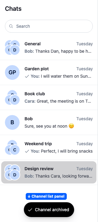
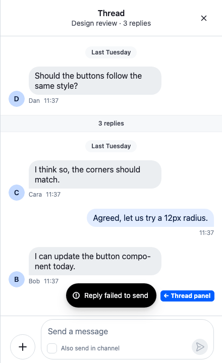
A list shows one notification at a time and queues the rest:
- **A persistent notification goes first.** A notification that stays, usually one published with `duration: 0` because it carries an action such as "Retry", jumps the queue. It stays until it's dismissed or a newer persistent one arrives. [Severity, actions and durations](https://getstream.io/chat/docs/sdk/react/state/publishing-notifications/#severity-actions-and-durations) lists when a notification stays.
- **A repeat replaces its original.** When a notification of the same `type` arrives while one with a duration is showing, the new one takes its place at once.
- **Otherwise the oldest goes next.** A notification stays on screen for at least `minDisplayMs` (1000 ms by default) before a queued one replaces it.
- **The countdown starts when it's seen.** A notification's auto-dismiss timer starts when it becomes visible in a list, so one waiting in a queue doesn't expire unseen.
- **It stays three seconds by default.** A notification published with `duration: 0` stays until the user closes it, and shows a close button.
To change which queued notification shows next, pass `` a `pickNext` function. Factory `createDefaultPickNext(pickNewest)` exported by the SDK, builds one that keeps these queue rules but shows the newest queued notification instead of the oldest. [Replacing the list or a notification](#replacing-the-list-or-a-notification) uses it.
## Where a notification shows
### Publishing a notification
Publish with `addNotification` from `useNotificationApi()` in a child component of ``. Here is a `CopyLinkButton` component that confirms a copied link:
```tsx
import { useNotificationApi } from "stream-chat-react";
export const CopyLinkButton = ({ link }: { link: string }) => {
const { addNotification } = useNotificationApi();
const copy = async () => {
await navigator.clipboard.writeText(link);
addNotification({
emitter: "CopyLinkButton",
message: "Link copied",
severity: "success",
type: "app:link:copy:success",
});
};
return (
);
};
```
Outside ``, publish with `client.notifications.add()`, as in [Publishing a notification](https://getstream.io/chat/docs/sdk/react/state/publishing-notifications/#publishing-a-notification).
### Where it appears by default
`addNotification` shows the notification in the parent panel of the publishing component. It takes the first row that applies:
| The publishing component | The notification shows in |
| ---------------------------------------------------------------------------------- | ------------------------- |
| Is inside a `` | The thread |
| Is inside a `` | The channel |
| Is anywhere else while `` shows its threads view | The thread list |
| Is inside ``. A `` rendered on its own doesn't count. | The channel list |
| Is anywhere else | The channel |
While a modal is open, the notification shows in the modal instead of behind it.
### Showing it somewhere else
Pass `targetPanels` to `addNotification`. For example, `targetPanels: ["channel-list"]` shows the notification in the channel list, independent of where the component that publishes it sits.
The SDK's lists publish their query errors this way. `` targets the `channel-list` panel, and `` the `thread-list` panel. A `` rendered without `` renders no `` for the `channel-list` panel, so its query errors don't show, unless you render a `` yourself. [When the first page fails](https://getstream.io/chat/docs/sdk/react/ui/components/list-states-ui/#when-the-first-page-fails) explains what the list shows instead.
### Notifications from stream-chat
A notification that `stream-chat` publishes, such as a failed upload, follows the composer it came from. Publishing from a thread's composer targets the thread panel, a channel's targets the channel panel. Any other shows in the channel.
### How it works
`addNotification` tags a notification with `target:` for each panel it should show in, and each list shows the notifications tagged for its own panel. A notification without a panel tag goes to the list's `fallbackPanel`, which is `channel` by default.
## Hiding notifications in lists
To keep some notifications out of the lists, pass `` a `notificationDisplayFilter`. It gets each notification and the `panel` of the list about to show it, and returns `false` to hide it there. Here is an `App` component whose channel list shows no success confirmations:
```tsx
import { Chat } from "stream-chat-react";
import type { NotificationDisplayFilter } from "stream-chat-react";
import type { PropsWithChildren } from "react";
// Keep success confirmations out of the channel list. Every other notification shows.
const notificationDisplayFilter: NotificationDisplayFilter = ({
notification,
panel,
}) => !(panel === "channel-list" && notification.severity === "success");
export const App = ({ children }: PropsWithChildren) => (
{children}
);
```
>
> **Warning:** A filter you pass replaces the default one, which handles modals:
>
> - While a modal is open, notifications show only in the modal's list. Notifications for other panels are held back until the modal closes.
> - A notification tagged for a modal that has already closed shows in its other panel instead, so a confirmation sent as a dialog closes isn't lost.
>
> The default filter isn't exported, so your filter can't add to it: with your own filter, notifications no longer wait for an open modal to close.
>
### Where the filter applies
Where you put a filter decides how far it reaches. The examples hide success notifications.
#### Everywhere
Give the filter to `` as `notificationDisplayFilter`, as in the `App` component in [Hiding notifications in lists](#hiding-notifications-in-lists). Every list in the app checks it.
#### In one area of the app
`` holds the display filter for the components inside it. `` renders one with its `notificationDisplayFilter`, and every list reads the filter from the nearest one. Render your own around an area, such as a support section, and the lists inside it use its `displayFilter` instead of the one from ``. Like a filter on ``, it replaces the default modal handling for those lists:
```tsx
import type { PropsWithChildren } from "react";
import { NotificationConfigurationProvider } from "stream-chat-react";
import type { NotificationDisplayFilter } from "stream-chat-react";
const hideSuccess: NotificationDisplayFilter = ({ notification }) =>
notification.severity !== "success";
// Lists inside this section show no success notifications. The rest of the app keeps the filter from Chat.
export const SupportSection = ({ children }: PropsWithChildren) => (
{children}
);
```
#### In one list
The SDK renders its lists itself, so give one of them a `filter` by replacing the `NotificationList` key with a component that adds the filter for that list's panel. The filter runs after the display filter. Declare it outside the component: a new function on every render resubscribes the list.
```tsx
import type { PropsWithChildren } from "react";
import type { Notification } from "stream-chat";
import { NotificationList, WithComponents } from "stream-chat-react";
import type { NotificationListProps } from "stream-chat-react";
const isNotSuccess = (notification: Notification) =>
notification.severity !== "success";
// The channel list's list hides success notifications. Every other list stays as it is.
const FilteredNotificationList = (props: NotificationListProps) => (
);
const overrides = { NotificationList: FilteredNotificationList };
export const WithQuietChannelList = ({ children }: PropsWithChildren) => (
{children}
);
```
#### In a list of your own
`useNotifications` returns the notifications for a panel, and you render them as you like. It ignores the display filter unless you pass `applyDisplayFilter: true`, and it returns system notifications too, so leave those out. A notification you show this way only disappears on its own once you start its countdown with `ensureNotificationTimeout(id)`, as `` does when a notification becomes visible.
Here is a `ChannelStatusLine` component, rendered inside a ``, that shows the channel's latest notification as a line of text:
```tsx
import { useEffect } from "react";
import type { Notification } from "stream-chat";
import {
hasSystemNotificationTag,
useNotificationApi,
useNotifications,
} from "stream-chat-react";
const isNotSystem = (notification: Notification) =>
!hasSystemNotificationTag(notification);
export const ChannelStatusLine = () => {
const notifications = useNotifications({
applyDisplayFilter: true,
filter: isNotSystem,
panel: "channel",
});
const latest = notifications[notifications.length - 1];
const { ensureNotificationTimeout } = useNotificationApi();
// Starts the countdown once the notification is on screen.
useEffect(() => {
if (latest) ensureNotificationTimeout(latest.id);
}, [latest, ensureNotificationTimeout]);
if (!latest) return null;
return
{latest.message}
;
};
```
The channel's own notification list, which the SDK renders in the message list, still shows the same notifications. To show them only in yours, hide them from the SDK's list with a filter, as in [In one list](#in-one-list).
### Hiding all of them
Return `false` for every notification. Screen readers still hear them: [``](https://getstream.io/chat/docs/sdk/react/features/notifications/accessibility/#notification-announcements) reads every notification, shown or not. To silence it, replace it with a component that renders nothing. `` reads it from the components above it, so `` wraps ``:
```tsx
import type { PropsWithChildren } from "react";
import { Chat, WithComponents } from "stream-chat-react";
import type { NotificationDisplayFilter } from "stream-chat-react";
// No list shows a notification.
const hideAllNotifications: NotificationDisplayFilter = () => false;
// Screen readers hear none either.
const SilentAnnouncer = () => null;
const overrides = { NotificationAnnouncer: SilentAnnouncer };
export const App = ({ children }: PropsWithChildren) => (
{children}
);
```
## Customizing
### Replacing the list or a notification
Both are keys in `ComponentContext`. `NotificationList` replaces every list, the modal's included, and `Notification` replaces how each notification renders:
```tsx
import { forwardRef } from "react";
import type { PropsWithChildren } from "react";
import {
createDefaultPickNext,
Notification,
NotificationList,
pickNewest,
WithComponents,
} from "stream-chat-react";
import type {
NotificationListProps,
NotificationProps,
} from "stream-chat-react";
const pickNewestFirst = createDefaultPickNext(pickNewest);
// Every list slides in from the top and shows the newest queued notification first.
const TopNotificationList = (props: NotificationListProps) => (
);
// The list starts a notification's countdown once its element is visible,
// so the component forwards its ref.
const BorderedNotification = forwardRef(
(props, ref) => (
),
);
const notificationOverrides = {
Notification: BorderedNotification,
NotificationList: TopNotificationList,
};
export const WithTopNotifications = ({ children }: PropsWithChildren) => (
{children}
);
```
A replacement receives the props `` passes to ``, the animation props included, and should pass them on, as `BorderedNotification` does. The props are in the [Notifications reference](https://getstream.io/chat/docs/sdk/react/component-reference/utilities/notifications/#notification).
To render notifications your own way, see [In a list of your own](#in-a-list-of-your-own).
### Styling
Three CSS variables style a notification: `--str-chat__notification-background`, `--str-chat__notification-color` and `--str-chat__notification-border-radius`. Each notification has the class `str-chat__notification--`, for example `str-chat__notification--error`, and each list the class `str-chat__notification-list--`:
```css
.str-chat__notification--error {
--str-chat__notification-background: #b91c1c;
--str-chat__notification-color: #fff;
}
.str-chat__notification-list--channel-list .str-chat__notification {
max-width: 250px;
}
```
## System notifications
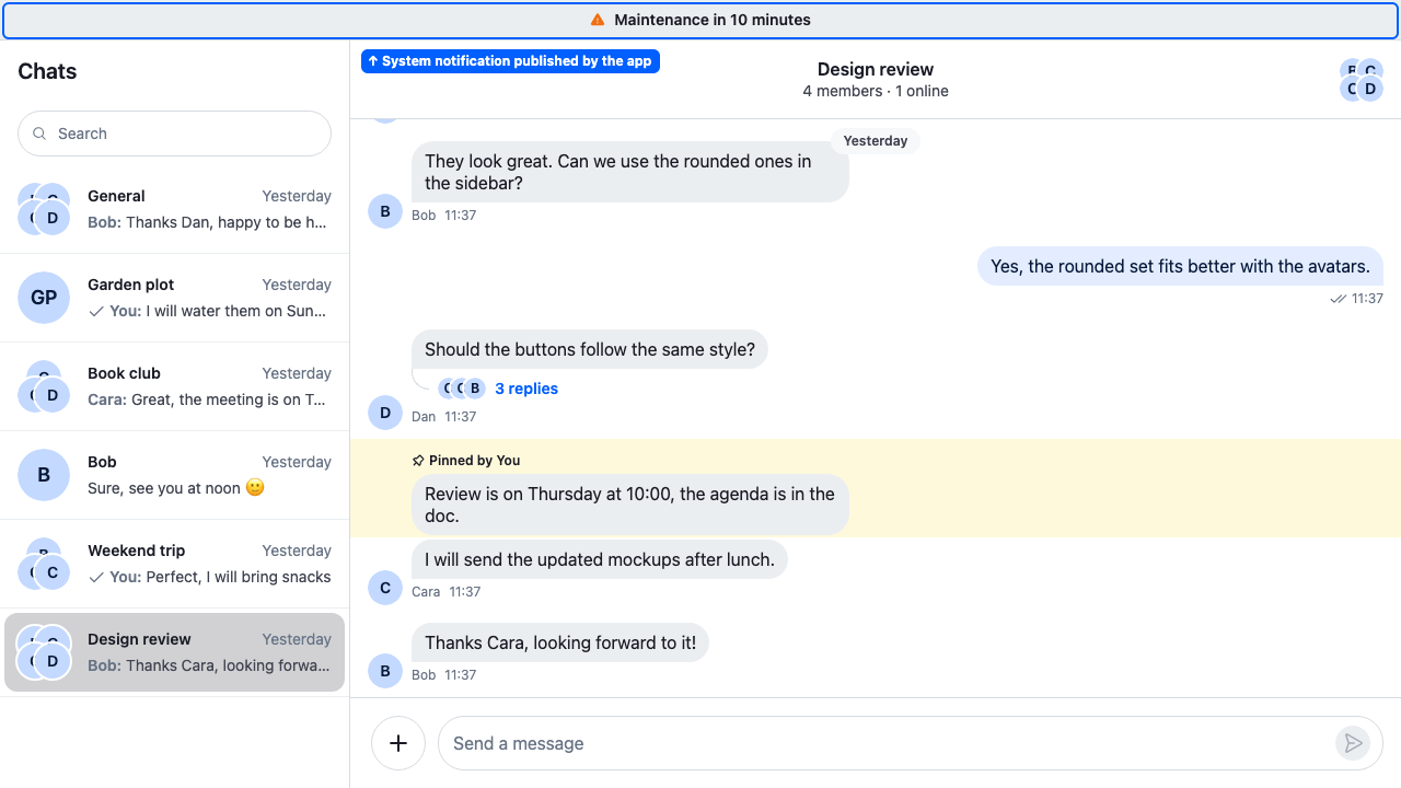
A system notification is about the whole app, not one part of the screen. It carries the `system` tag and no `target:` tags, so no `` shows it. [``](https://getstream.io/chat/docs/sdk/react/features/notifications/accessibility/#notification-announcements) still reads it to screen readers.
`` publishes one while the client can't reach Stream:
| Text | When |
| ---------------------- | ----------------------------------------------------------------------------------------------------------------------------------------- |
| "Waiting for network…" | As soon as the device reports it has no network |
| "Reconnecting…" | When the socket has been down for `client.wsConnection.config.offlineNotificationDisplayDelayMs`. A drop shorter than that shows nothing. |
Both have the type `system:network:connection:lost` and the severity `loading`, stay until the connection is back, and then disappear. The text is already translated: `` publishes it with `t()`.
### A banner for system notifications
The SDK exports no banner component for system notifications, so without one of your own users see nothing on screen. Build it with `useSystemNotifications`, which returns the system notifications in `client.notifications`, and render it inside ``.
Here is an `App` component with a `SystemNotificationBanner` across the top of the app:
```tsx
import type { PropsWithChildren } from "react";
import { Chat, useSystemNotifications } from "stream-chat-react";
const SystemNotificationBanner = () => {
const [notification] = useSystemNotifications();
if (!notification) return null;
return
{notification.message}
;
};
// Inside Chat, above the rest of the app.
export const App = ({ children }: PropsWithChildren) => (
{children}
);
```
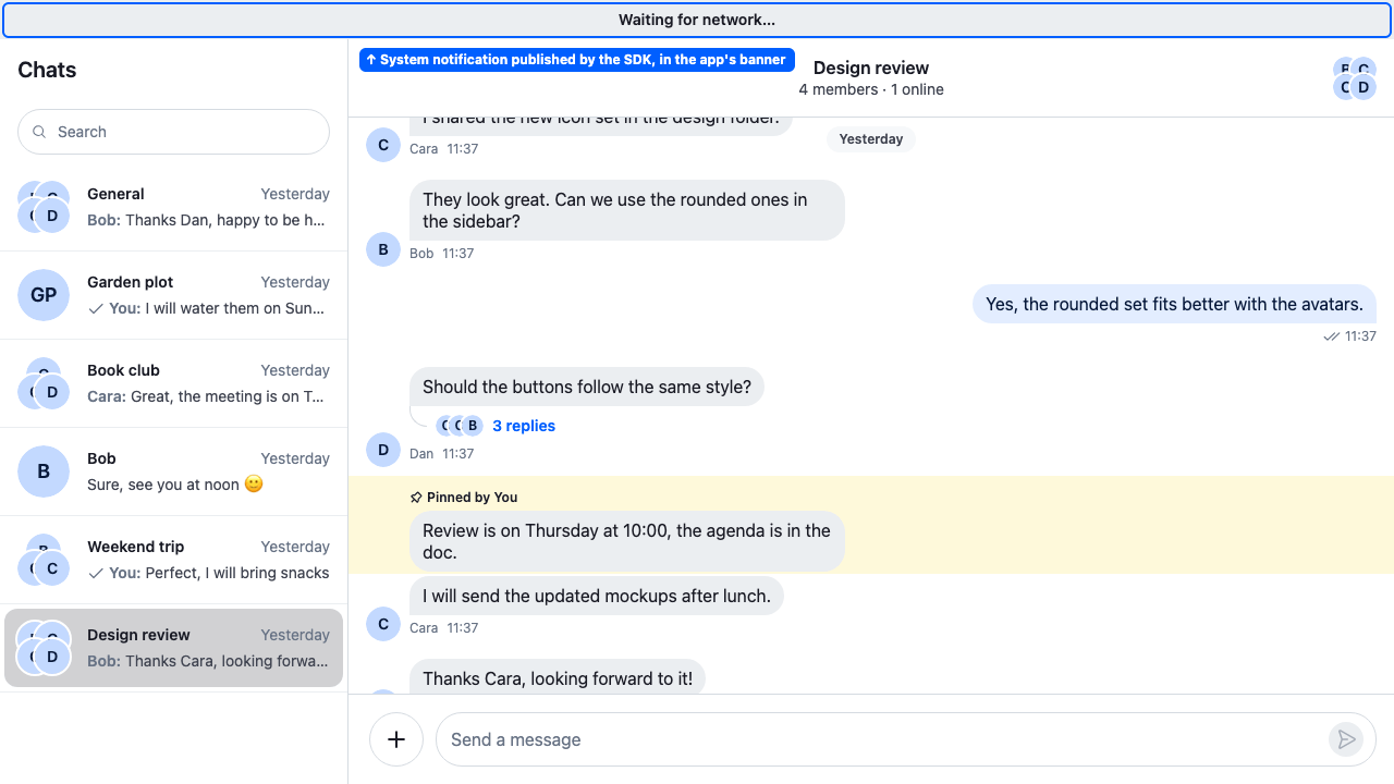
The banner needs no `role="status"` or other live region: `` already reads system notifications, so a live region would announce them twice. The [System notification banner](https://getstream.io/chat/docs/sdk/react/ui-cookbooks/notifications/system-notification-banner/) recipe builds a complete banner, with an icon per severity, action buttons, styles and an animation.
### Choosing which ones show
The display filter doesn't affect system notifications: the banner shows what `useSystemNotifications` returns. To leave some out, pass the hook a memoized `filter` function (so the subscription stays stable). Here is a `SystemNotificationBanner` component for an app with a connection indicator of its own. It shows every system notification except the lost connection:
```tsx
import { useCallback } from "react";
import type { Notification } from "stream-chat";
import { useSystemNotifications } from "stream-chat-react";
export const SystemNotificationBanner = () => {
// Memoized, so the subscription stays the same across renders.
const isNotConnectionLost = useCallback(
(notification: Notification) =>
notification.type !== "system:network:connection:lost",
[],
);
const [notification] = useSystemNotifications({
filter: isNotConnectionLost,
});
if (!notification) return null;
return
{notification.message}
;
};
```
Render it inside ``, as in [A banner for system notifications](#a-banner-for-system-notifications).
To show no system notifications, render no banner. To keep screen readers quiet about them too, replace the announcer, as in [Hiding all of them](#hiding-all-of-them).
### Publishing a system notification
Publish one of your own with `addSystemNotification` from `useNotificationApi()`. It returns the notification's id: remove it with `removeNotification` when the condition is over. Here is a `MaintenanceNotice` component that shows a notice while it's mounted:
```tsx
import { useEffect } from "react";
import { useNotificationApi } from "stream-chat-react";
export const MaintenanceNotice = () => {
const { addSystemNotification, removeNotification } = useNotificationApi();
useEffect(() => {
const id = addSystemNotification({
// Stays until it's removed.
duration: 0,
emitter: "MaintenanceNotice",
message: "Maintenance in 10 minutes",
severity: "warning",
});
return () => removeNotification(id);
}, [addSystemNotification, removeNotification]);
return null;
};
```
## Used in
- [Notifications text](https://getstream.io/chat/docs/sdk/react/features/notifications/notifications-text/) and [Notifications accessibility](https://getstream.io/chat/docs/sdk/react/features/notifications/accessibility/)
- [Connection status](https://getstream.io/chat/docs/sdk/react/features/app-experience/connection-status/)
- [Localization](https://getstream.io/chat/docs/sdk/react/features/app-experience/localization/)
- [Message actions](https://getstream.io/chat/docs/sdk/react/features/messaging/message-actions/)
- [Reminders and save for later](https://getstream.io/chat/docs/sdk/react/features/messaging/reminders-and-save-for-later/)
- [System notification banner](https://getstream.io/chat/docs/sdk/react/ui-cookbooks/notifications/system-notification-banner/), [Custom snackbars](https://getstream.io/chat/docs/sdk/react/ui-cookbooks/notifications/custom-snackbars/) and [Starting a conversation](https://getstream.io/chat/docs/sdk/react/ui-cookbooks/channel-list/starting-a-conversation/)
---
For the most recent version of this documentation, visit [https://getstream.io/chat/docs/sdk/react/ui/components/notifications-ui/](https://getstream.io/chat/docs/sdk/react/ui/components/notifications-ui/).