# Message UI
Each message in a message list is rendered in two steps: `` prepares the message and what can be done with it, and a message UI component shows it. Use this page to see how a message is put together, change how its text renders, and replace parts of a message or the whole message UI. The props are in the [Message](https://getstream.io/chat/docs/sdk/react/component-reference/message/message/) and [MessageUI](https://getstream.io/chat/docs/sdk/react/component-reference/message/message-ui/) references.
## How a message is rendered
For each message, the list renders ``, which:
1. creates the message's handlers: react, delete, flag, mark unread, mute, pin, open the thread, and retry a failed send;
2. puts them, with the message, in `MessageContext`;
3. renders the message UI: the component registered under the `MessageUI` key, by default the SDK's ``.
The message UI gets **no props**. It reads the message and its handlers with `useMessageContext()`, and so does any component it renders.
## Parts of the default message UI
The default `` is made of parts:
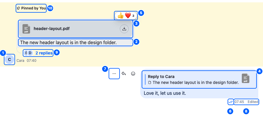
Cara's message is pinned, and has a file attachment, reactions and replies. The user's own message below it quotes Cara's, was edited and has been read, and its actions show because the pointer is over it. Each numbered part can be replaced on its own, through its `` key:
| Part | Component to override (`` key) |
| --------------------------------------------------------------- | ---------------------------------------------------------------------------------------------------------- |
| 1. The sender's avatar | `Avatar` |
| 2. The text | `MessageText`, which renders the text with [`renderText`](#rendertext) |
| 3. Attachments, including a shared location | `Attachment` |
| 4. A quoted message | `QuotedMessage` |
| 5. Reactions | `MessageReactions` |
| 6. Status: sending, sent, delivered or read | `MessageStatus` |
| 7. The actions menu | `MessageActions` |
| 8. The timestamp and the edited mark | `MessageTimestamp`, `MessageEditedIndicator` |
| 9. The replies button, in a channel | `MessageRepliesCountButton` |
| 10. Pinned, reminder, translated and also-sent-in-channel marks | `PinIndicator`, `ReminderNotification`, `MessageTranslationIndicator`, `MessageAlsoSentInChannelIndicator` |
| A deleted or blocked message | `MessageDeleted` (no default), `MessageDeletedBubble`, `MessageBlocked` |
A deleted or blocked message replaces the message UI's content:
- **A deleted message** shows "Message deleted" in place of its bubble, without actions: `MessageDeletedBubble`. A message counts as deleted when it has `deleted_at`, its `type` is `'deleted'`, or the user deleted it only for themselves (`deleted_for_me`). A `MessageDeleted` component of your own replaces the whole message instead; it has no default.
- **A blocked message** shows "Message was blocked by moderation policies", with no avatar, time or status: `MessageBlocked`. A message is blocked when it's `shadowed`, or when its `type` is `'error'` and moderation removed it (`moderation.action` is `'remove'`).
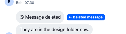
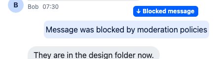
Some messages render differently:
- **A poll** renders inside the message's bubble, with the message's text and attachments, as in [Bubble content](#bubble-content).
- **A system message**, such as "Cleo joined the channel", renders the `MessageSystem` component instead of a message UI.
- **An AI-generated message**, as ``'s `isMessageAIGenerated` decides, renders its text with ``, which shows the text as it streams in.
## Bubble content
The bubble shows ``, which renders `defaultMessageBubbleContentSet`. Each item shows only when the message object has the corresponding property, in this order:
| Item (`type`) | Shows when | Renders |
| --------------- | ------------------------------------------------------------------------ | ----------------------------------------------------------------------------------- |
| `quotedMessage` | The message quotes another one: `message.quoted_message` | The `QuotedMessage` key |
| `poll` | The message has a poll: `message.poll_id` | `` |
| `attachments` | The message has attachments or a shared location | The `Attachment` key, with the shared location at the top. |
| `text` | The message has text, or `isMessageAIGenerated` marks it as AI generated | The `MessageText` key, or the `StreamedMessageText` key for an AI-generated message |
The default `` renders the text it has streamed so far through the `MessageText` key, so a `MessageText` override also applies to an AI-generated message.
A poll message also shows its text and attachments. While a message has a poll, its root element has the `str-chat__message--has-poll` class. A single photo without text normally fills the bubble edge to edge, through the `str-chat__message--has-single-attachment` class. With a poll in the bubble, that class isn't added, so the photo keeps the bubble's padding, like the poll.
[MessageBubbleContent props](https://getstream.io/chat/docs/sdk/react/component-reference/message/message-ui-components/#messagebubblecontent-props) lists the fields of an item.
To reorder, remove or add content, register a component under the `MessageBubbleContent` key that renders ``. Here is a `TextFirstMessages` component whose messages show their text above the poll and attachments:
```tsx title="src/TextFirstMessages.tsx"
import {
defaultMessageBubbleContentSet,
MessageBubbleContent,
MessageList,
WithComponents,
} from "stream-chat-react";
import type { MessageBubbleContentSetItem } from "stream-chat-react";
const order = ["quotedMessage", "text", "poll", "attachments"];
// Built once, so every message gets the same set.
const textFirstContentSet: MessageBubbleContentSetItem[] = order.flatMap(
(type) => defaultMessageBubbleContentSet.filter((item) => item.type === type),
);
const TextFirstBubbleContent = () => (
);
const overrides = { MessageBubbleContent: TextFirstBubbleContent };
export const TextFirstMessages = () => (
);
```
## renderText
`renderText` turns a message's text into what the message UI shows. The default renders Markdown with `react-markdown`, and adds mentions and emoji. To change how text renders, pass your own function to the list as its `renderText` prop; both `` and `` take it.
It's called as `renderText(text, options)`. The mentions come in `options.messageMentionEntities`.
Here is a `renderTextWithoutHeadings` function that keeps the default and renders Markdown headings as bold text:
```tsx title="src/ChannelMessages.tsx"
import type { RenderTextFunction } from "stream-chat-react";
import { MessageList, renderText } from "stream-chat-react";
const renderTextWithoutHeadings: RenderTextFunction = (text, options) =>
renderText(text, {
...options,
customMarkDownRenderers: {
...options?.customMarkDownRenderers,
h1: ({ children }) => {children},
h2: ({ children }) => {children},
},
});
export const ChannelMessages = () => (
);
```
Keep the `options` the list passes in: they carry the mentions to render. The options are in the [renderText reference](https://getstream.io/chat/docs/sdk/react/component-reference/message/rendertext-function/).
## Replacing parts
Register replacements with ``. [Overriding components](https://getstream.io/chat/docs/sdk/react/ui/components/overriding-components/) explains how overrides apply.
| Component to override (`` key) | Replaces |
| ------------------------------------------------------------------------------- | -------------------------------------------------------------------------------------- |
| `MessageUI` | A whole message. Gets no props; reads `useMessageContext()`. |
| `VirtualMessage` | A whole message in ``. Without it, the list uses `MessageUI`. |
| The keys in [Parts of the default message UI](#parts-of-the-default-message-ui) | One part of a message |
| `MessageSystem` | A system message |
| `MessageBubbleContent` | What a message's bubble holds, as in [Bubble content](#bubble-content) |
Here is a `CompactMessages` component that shows each message as one compact line:
```tsx title="src/CompactMessages.tsx"
import {
MessageList,
MessageText,
MessageTimestamp,
useMessageContext,
WithComponents,
} from "stream-chat-react";
const CompactMessage = () => {
const { message } = useMessageContext();
return (
{message.user?.name ?? message.user?.id}
);
};
const overrides = { MessageUI: CompactMessage };
export const CompactMessages = () => (
);
```
`` and `` read the message from `MessageContext` too, so they need no props. The [Custom message recipe](https://getstream.io/chat/docs/sdk/react/ui-cookbooks/message-list/custom-message/) builds a complete message UI.
## Used in
- [Sending, editing and deleting](https://getstream.io/chat/docs/sdk/react/features/messaging/sending-editing-and-deleting/)
- [Reactions](https://getstream.io/chat/docs/sdk/react/features/messaging/reactions/)
- [Quoted replies](https://getstream.io/chat/docs/sdk/react/features/messaging/quoted-replies/)
- [Mentions](https://getstream.io/chat/docs/sdk/react/features/messaging/mentions/)
- [Custom message](https://getstream.io/chat/docs/sdk/react/ui-cookbooks/message-list/custom-message/)
---
For the most recent version of this documentation, visit [https://getstream.io/chat/docs/sdk/react/ui/components/message-ui/](https://getstream.io/chat/docs/sdk/react/ui/components/message-ui/).