# Channel UI
An open channel is a panel with stacked components, such as a header, a message list and a composer. `` provides one channel to every component inside it, and you choose which components to render. Use this page to set up a channel view, change its header and show who is typing. Channel details are on [Channel details UI](https://getstream.io/chat/docs/sdk/react/ui/components/channel-details-ui/). The props are in the [Channel](https://getstream.io/chat/docs/sdk/react/component-reference/channel/channel/) and [ChannelHeader](https://getstream.io/chat/docs/sdk/react/component-reference/channel/channelheader/) references.
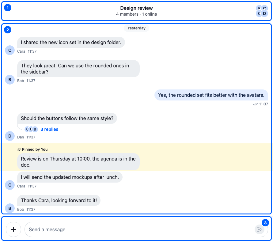
This is the Design review channel. Its three parts, from top to bottom:
| Part | Component | Explained in |
| ----------------------- | -------------------- | ------------------------------------------------------------------------------ |
| 1. The header | `` | [The header](#the-header) |
| 2. The message list | `` | [Message list UI](https://getstream.io/chat/docs/sdk/react/ui/components/message-list-ui/) |
| 3. The message composer | `` | [Message composer UI](https://getstream.io/chat/docs/sdk/react/ui/components/message-composer-ui/) |
## The Channel component
`` binds a channel to its children:
| `` | What it means for you |
| -------------------------------------------------------------------------- | --------------------------------------------------------------------------------------------------------------------------------------------------------------- |
| provides the channel to the components inside | They retrieve it with `useChannel()`. `` renders `channel.messagePaginator`, and `` writes into `channel.messageComposer`. |
| activates the channel while it's mounted | The client knows the channel is in use. [Entity lifecycle](https://getstream.io/chat/docs/sdk/react/state/state-and-entities/entity-lifecycle/) explains what that keeps in memory. |
| renders the channel's container, `.str-chat__channel`, around the children | Style the channel column through that class. |
| provides its own audio players, for voice recordings and audio attachments | When `` unmounts or gets another channel, they stop, so audio from the channel the user left doesn't keep playing. |
`` doesn't load the channel. Pass a channel that's already watched, for example with `Channel.watch()`, as in [Show one channel](https://getstream.io/chat/docs/sdk/react/getting-started/quick-start/#show-one-channel). With ``, `` renders `` for the channel in its slot.
`` renders the same container with no channel, for the space a channel fills while none is selected. Here is a `ChannelPanel` component that renders a channel, or the placeholder while none is selected:
```tsx title="src/ChannelPanel.tsx"
import type { Channel as StreamChannel } from "stream-chat";
import {
Channel,
ChannelHeader,
ChannelPlaceholder,
MessageComposer,
MessageList,
} from "stream-chat-react";
export const ChannelPanel = ({ channel }: { channel?: StreamChannel }) => {
if (!channel) {
return (
Pick a channel to start chatting.
);
}
return (
);
};
```
[Providers and context hooks](https://getstream.io/chat/docs/sdk/react/ui/providers-and-context-hooks/) explains the contexts `` provides.
## The header
`` shows the channel it gets from `useChannel()`:

This is the header of a channel opened over another one in a panel that can be closed, so both its back and close buttons show. It has five areas, numbered from start to end. The table lists what each shows by default, and the `` prop that replaces it:
| Area | Shows by default | Prop that replaces it |
| ----------- | ------------------------------------------------------------------------------------------------------------------------------------------------------------------------------------------------------ | ---------------------------------------------------------------- |
| 1. Start | The back button, ``. It shows only when the channel is stacked over other content in its panel, and goes back to what's beneath. | `StartContent` |
| 2. Title | The channel's name, from `channel.state`: `data.name`. A channel without a name shows the other member's name in a direct message, and two other members' names in a group. | `title` replaces the text, `Title` the component that renders it |
| 3. Subtitle | Who is typing, from `channel.state`: `typing`. Otherwise "Online" or "Offline" in a direct message, and "12 members · 3 online" in a group, from `channel.state`: `memberCount` and `watcherCount`. | `Subtitle` |
| 4. Avatar | The channel image, or its members' avatars, drawn by ``. It doesn't open channel details by default; see [Channel details UI](https://getstream.io/chat/docs/sdk/react/ui/components/channel-details-ui/). | `image` replaces the image, `Avatar` the whole avatar component |
| 5. End | The close button, ``. It shows only when the channel's panel can be closed, which the main channel's panel can't. | `EndContent` |
Both buttons come from the layout. Without one, neither renders. [Moving between channels, threads and messages](https://getstream.io/chat/docs/sdk/react/ui/layout/moving-between-channels-threads-and-messages/) explains back and close.
A component passed as `StartContent` or `EndContent` replaces the button. To add something and keep the button, render the button yourself. Here is a `ChannelHeaderWithCall` component that adds a Call button before the close button:
```tsx title="src/ChannelHeaderWithCall.tsx"
import {
ChannelHeader,
useChannel,
WorkspaceNavigationCloseButton,
} from "stream-chat-react";
const HeaderEnd = () => {
const channel = useChannel();
return (
<>
);
};
export const ChannelHeaderWithCall = () => (
);
```
`Title` and `Subtitle` replace the title and the subtitle and keep the rest of the header. `Title` receives the channel and `displayTitle`, the title the header would show, including a `title` you pass. Here is a `ChannelHeaderWithTitleButton` component whose title is a button:
```tsx title="src/ChannelHeaderWithTitleButton.tsx"
import type { ChannelHeaderTitleProps } from "stream-chat-react";
import { ChannelHeader } from "stream-chat-react";
const TitleButton = ({ channel, displayTitle }: ChannelHeaderTitleProps) => (
);
export const ChannelHeaderWithTitleButton = () => (
);
```
The `str-chat__channel-header__data__title` class keeps the title's look. The [Channel details](https://getstream.io/chat/docs/sdk/react/ui-cookbooks/panels/channel-details/#make-the-channels-title-open-the-panel) recipe uses such a title to open channel details.
A `Subtitle` component replaces the typing indicator too. To keep it, render `` in your subtitle, or render the default `` inside it. `` renders nothing while nobody is typing, so your subtitle shows its own text next to it. `useChannelHeaderOnlineStatus()` returns the default subtitle's text: "Online" or "Offline" in a direct message, and "12 members · 3 online" in a group.
## Typing indicator
Two components show who is typing:
| Component | Where | Shows |
| -------------------------- | ----------------------------------------------------------------------------------------------------------------------------- | ------------------------------------------------------------------------------------------------------------------------------------------------------------- |
| `` | at the bottom of ``; `` renders it only when you register a `TypingIndicator` override | the avatars of the people typing and animated dots, only while the list is scrolled to the latest message. It also announces who is typing to screen readers. |
| `` | in place of the header's subtitle | the "Cleo is typing" text |
Both read `channel.state.typing`, which holds the latest typing event of each user in the channel. A typing event from a thread carries the thread's id, so the indicators can tell typing in the channel from typing in a thread. They leave out the current user, and keep showing for two seconds after typing stops, so they don't flicker.
What they show depends on where they're rendered:
| Rendered inside | `` shows | `` shows |
| --------------- | ----------------------------------------------------------------------------------------------------- | ---------------------------------------------------------------------------------------------------------------------------------------------------- |
| a `` | the people typing a message in the channel. People typing a reply in one of its threads aren't shown. | the same as `` |
| a `` | the people typing a reply in that thread | by default, the people typing in the channel, like in a ``. Pass it `threadList` to show the people typing a reply in that thread instead. |
>
> **Info:** **Example**
>
> Bob is typing a reply in the thread of the user's message "Lunch?", and Cleo is typing a new message in the channel:
>
> 1. The channel's message list shows that Cleo is typing. Bob isn't shown there.
> 2. The thread's message list shows that Bob is typing.
> 3. A header with `` shows Cleo, unless it has `threadList` and is inside the thread: then it shows Bob.
>
They render nothing when typing events are turned off, with `typingEvents.enabled` under `channel` in `client.config`.
[Typing indicators](https://getstream.io/chat/docs/sdk/react/features/messaging/typing-indicators/) covers the feature end to end: sending typing events and building your own indicator.
## Replacing parts
`` renders only its children, so you replace a part of the channel by rendering a different component in its place. A header of your own can retrieve the channel with `useChannel()`; see the [Channel header recipe](https://getstream.io/chat/docs/sdk/react/ui-cookbooks/headers/channel-header/).
`` has no `` key. Change it through its props:
| Prop | Replaces |
| -------------- | -------------------------------------------- |
| `StartContent` | The back button |
| `EndContent` | The close button |
| `Avatar` | The avatar component |
| `Title` | The component that renders the title |
| `Subtitle` | The subtitle, including the typing indicator |
| `title` | The title's text, a string |
| `image` | The avatar image |
The typing indicator in the message lists is the one part on this page you replace through ``, with the `TypingIndicator` key.
The message list and the composer have keys of their own, listed on [Message list UI](https://getstream.io/chat/docs/sdk/react/ui/components/message-list-ui/#replacing-parts) and [Message composer UI](https://getstream.io/chat/docs/sdk/react/ui/components/message-composer-ui/#replacing-parts). [Overriding components](https://getstream.io/chat/docs/sdk/react/ui/components/overriding-components/) explains how overrides apply.
## Used in
- [Typing indicators](https://getstream.io/chat/docs/sdk/react/features/messaging/typing-indicators/)
- [Channel header](https://getstream.io/chat/docs/sdk/react/ui-cookbooks/headers/channel-header/)
---
For the most recent version of this documentation, visit [https://getstream.io/chat/docs/sdk/react/ui/components/channel-ui/](https://getstream.io/chat/docs/sdk/react/ui/components/channel-ui/).