# Channel details UI
Channel details is a panel with the channel's info, members, pinned messages, photos and videos, and files. It lives in its own entry point, `stream-chat-react/channel-detail`, with its own stylesheet. Use this page to open channel details from the channel header, choose its sections, or show it in a panel of your own. The props are in the [Channel Detail reference](https://getstream.io/chat/docs/sdk/react/component-reference/channel-detail/channel-detail/).
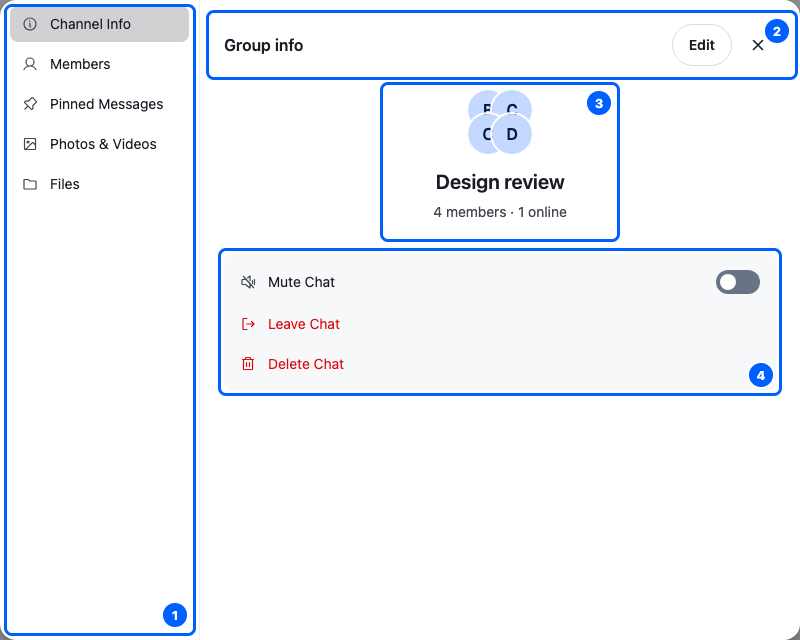
This is the Design review channel's details, with the Channel info section open:
| Area | Shows | Explained in |
| ------------------------ | ---------------------------------------------------------------- | --------------------- |
| 1. The list of sections | Channel info, Members, Pinned messages, Photos and videos, Files | [Sections](#sections) |
| 2. The section's header | the section's title, an Edit button and the close button | [Sections](#sections) |
| 3. The channel | its avatar, name, and member and online counts | [Sections](#sections) |
| 4. The channel's actions | mute, leave and delete | [Actions](#actions) |
## Opening channel details
The header's avatar opens it, once you wire it in: `` doesn't by default. `` renders the channel avatar as a button, and clicking it opens `` in a modal. Here is a `ChannelWithDetails` component that passes it to the header as its avatar:
```tsx title="src/ChannelWithDetails.tsx"
import type { Channel as StreamChannel } from "stream-chat";
import {
Channel,
ChannelHeader,
MessageComposer,
MessageList,
} from "stream-chat-react";
import { AvatarWithChannelDetail } from "stream-chat-react/channel-detail";
import "stream-chat-react/dist/css/index.css";
import "stream-chat-react/dist/css/channel-detail.css";
export const ChannelWithDetails = ({ channel }: { channel: StreamChannel }) => (
);
```
To open channel details from the title instead, pass the header a `Title` button. The [Channel details](https://getstream.io/chat/docs/sdk/react/ui-cookbooks/panels/channel-details/#make-the-channels-title-open-the-panel) recipe builds one that opens them in a side panel.
The button is disabled until the channel exists on the server, because the details are loaded from there. The modal is the `Modal` override, by default the SDK's ``.
## Sections
`` is a section navigator. Its `sections` prop chooses and orders the sections, and `defaultChannelDetailSections` is the default list:
| Section | Shows |
| ----------------- | --------------------------------------------------------------------------------------------------------------- |
| Channel info | the channel's image, name, and member and online counts, an Edit button, and the mute, leave and delete actions |
| Members | the channel's members |
| Pinned messages | the messages pinned in the channel |
| Photos and videos | the images and videos sent in the channel |
| Files | the files sent in the channel |
Here is a header avatar that opens channel details without the Files section:
```tsx
import type { ChannelAvatarProps } from "stream-chat-react";
import type { ChannelDetailProps } from "stream-chat-react/channel-detail";
import {
AvatarWithChannelDetail,
ChannelDetail,
defaultChannelDetailSections,
} from "stream-chat-react/channel-detail";
// The default sections, without Files.
const sections = defaultChannelDetailSections.filter(
({ id }) => id !== "channel-files",
);
const ChannelDetailWithoutFiles = (props: ChannelDetailProps) => (
);
// Use it as the header's avatar:
export const AvatarWithoutFiles = (props: ChannelAvatarProps) => (
);
```
## Layouts
The navigator picks one of two layouts from the width it has.
### Tabs layout, at 640px and wider
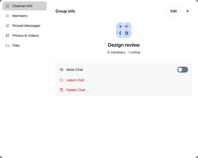
The list of sections sits on the left, and the open section on the right. The user switches sections with one click in the list, and the open section stays highlighted.
### Inline layout, narrower than 640px
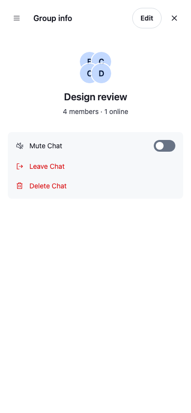
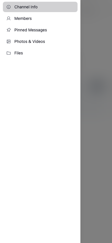
One section fills the panel. The menu button at the start of its header opens the list of sections as a drawer, shown in the second image.
A view inside a section, such as one member's details, opens on top of the section and shows a back button.
## Showing channel details in a panel of your own
To show details in a panel of your own instead of a modal, render `` there:
- Pass it the `channel`, and give it a channel context for the same channel, as [Recommended patterns](https://getstream.io/chat/docs/sdk/react/component-reference/channel-detail/channel-detail/#recommended-patterns) explains.
- Pass `onClose`, a function that closes your panel. [Render it in a side panel](https://getstream.io/chat/docs/sdk/react/component-reference/channel-detail/channel-detail/#render-it-in-a-side-panel) lists what calls it.
[Channel details](https://getstream.io/chat/docs/sdk/react/ui-cookbooks/panels/channel-details/) builds a side panel this way.
## Actions
Each view in channel details lets you customize the set of actions the user can take from it, for example the mute, leave and delete actions in the Channel info section, or the actions in one member's details. [Channel details actions](https://getstream.io/chat/docs/sdk/react/ui/components/actions/#channel-details-actions) covers how.
## Used in
- [Channel details and members](https://getstream.io/chat/docs/sdk/react/features/channels/channel-details-and-members/)
- [Channel details](https://getstream.io/chat/docs/sdk/react/ui-cookbooks/panels/channel-details/)
---
For the most recent version of this documentation, visit [https://getstream.io/chat/docs/sdk/react/ui/components/channel-details-ui/](https://getstream.io/chat/docs/sdk/react/ui/components/channel-details-ui/).