# Unread and scroll controls
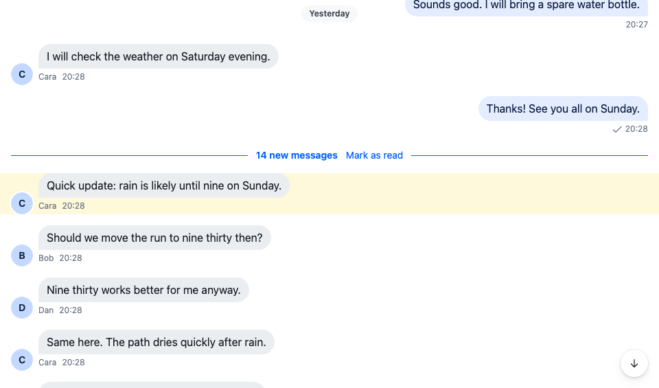
When the user opens a channel with unread messages, the message list shows a separator above the first unread message, a banner that jumps back to it, and a scroll-to-latest button. This recipe restyles these controls and replaces two of them.
>
> **Note:** **What you'll build**
>
> - Unread controls restyled in the accent color
> - A "14 new messages" separator with Mark as read
> - An unread banner that jumps to the first unread message
>
---
**Preview**
---
**Approach:** Restyle and Replace one part. [Choosing where to start](https://getstream.io/chat/docs/sdk/react/ui-cookbooks/overview/#choosing-where-to-start) explains the approaches.
**Starts from:** [the base app](https://getstream.io/chat/docs/sdk/react/ui-cookbooks/overview/#the-base-app). The page shows only what the recipe adds.
## Best practices
- Restyle with CSS when only the look changes. The separator renders `str-chat__unread-messages-separator`, the banner `str-chat__unread-messages-notification`, and the scroll-to-latest button `str-chat__jump-to-latest-message`.
- Replace `UnreadMessagesSeparator` and `UnreadMessagesNotification` when the wording or the actions change. Both render inside the list, so they can read `useMessagePaginator()`. The banner gets `unreadIsBelow`, `true` when the first unread message is below the visible area, to point its arrow the right way. It's `undefined` while no unread separator is rendered; then work out the direction yourself, as the default does from `unreadStateSnapshot.lastReadAt` and the newest loaded message.
- Keep the `str-chat__unread-messages-separator` class on your separator's root. The list watches the element with that class to decide when the banner shows.
- Clear the unread snapshot when your control marks the channel read. The separator and the banner render from it, and marking read doesn't change it.
- Restyle the scroll-to-latest button when only its look changes. To change what it shows, replace it with the `ScrollToLatestMessageButton` override, which gets `onClick`, `isMessageListScrolledToBottom` and `isNotAtLatestMessageSet`.
## Unread and scroll controls
### Default controls
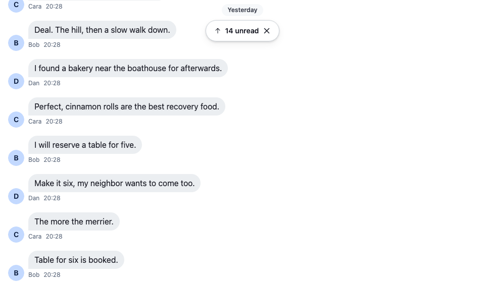
The user opens the channel at its latest message. The separator is above the visible area, so the banner shows the unread count at the top of the list:
---
**The default unread banner**
---
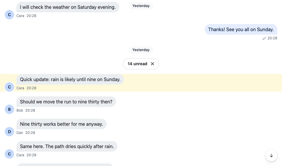
Clicking the banner jumps to the first unread message. The separator comes into view and the banner goes. The list is no longer at the latest message, so the scroll-to-latest button shows:
---
**The default separator**
---
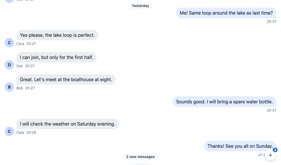
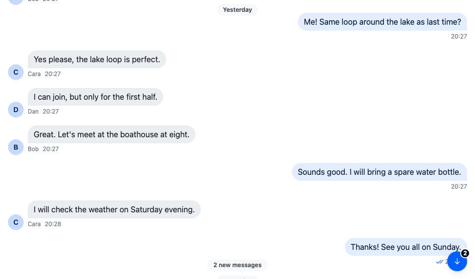
When messages arrive while the user reads older ones, the button's badge counts them, and the new message notification at the bottom of the list says "2 new messages":
---
**The default new message count**
---
The ✕ on the separator or the banner marks the channel read and removes both.
### CSS based solution
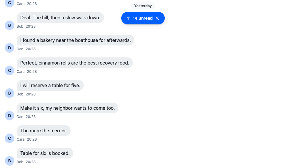
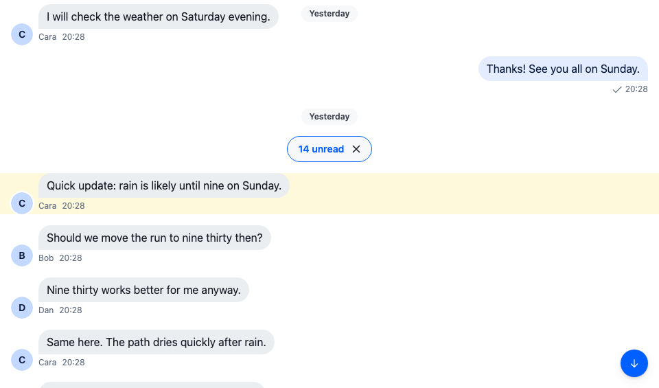
These rules color the separator's chip and border with the accent color, fill the banner and the scroll-to-latest button with it, and put the count on an inverse badge:
```css title="src/unread-and-scroll-controls.css"
@layer stream-overrides {
/* The separator: an accent-colored chip. */
.str-chat__unread-messages-separator-wrapper
.str-chat__unread-messages-separator {
border-color: var(--str-chat__accent-primary);
background: var(--str-chat__background-core-surface-subtle);
color: var(--str-chat__accent-primary);
}
/* The banner: filled with the accent color, with white text and icons. */
.str-chat__unread-messages-notification {
border-color: var(--str-chat__accent-primary);
background: var(--str-chat__accent-primary);
box-shadow: var(--str-chat__box-shadow-2);
}
.str-chat__unread-messages-notification .str-chat__button {
background: none;
color: var(--str-chat__text-on-accent);
}
/* The scroll-to-latest button: accent-colored, with the count on an inverse badge. */
.str-chat__jump-to-latest-message {
background-color: var(--str-chat__accent-primary);
box-shadow: var(--str-chat__box-shadow-2);
}
.str-chat__jump-to-latest-message .str-chat__jump-to-latest-message__button {
color: var(--str-chat__text-on-accent);
}
.str-chat__jump-to-latest-message .str-chat__jump-to-latest__unread-count {
background: var(--str-chat__background-core-inverse);
color: var(--str-chat__text-on-inverse);
}
}
```
---
**The accent banner**
---
**The accent separator**
---
**The accent scroll button**
---
The rules sit in the `stream-overrides` layer, so they win over the SDK's own rules once the SDK's stylesheet is in an earlier layer, as [Theming → CSS layers](https://getstream.io/chat/docs/sdk/react/features/app-experience/theming/#css-layers) sets up. They take their colors from the SDK's tokens, so they follow your theme.
### Component based solution
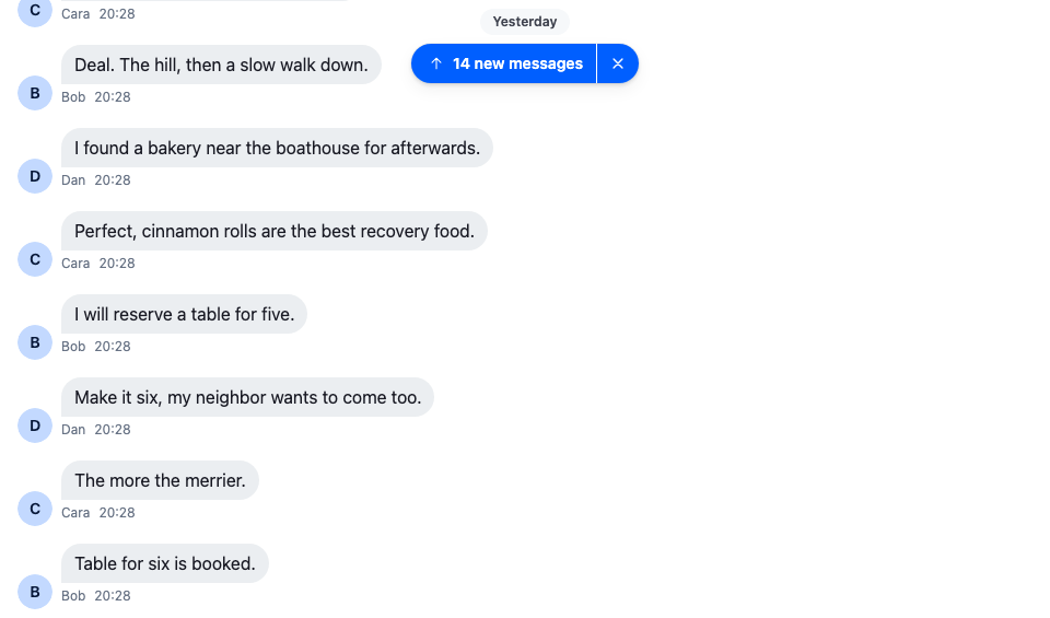
CSS can't change what the controls say or do. This separator is a line across the list with "14 new messages" and a Mark as read link, and the banner is an accent pill that reads "14 new messages" and jumps on click:
```tsx label="React" title="src/UnreadControls.tsx"
import type { PropsWithChildren } from "react";
import type { UnreadSnapshotState } from "stream-chat";
import {
IconArrowUp,
IconXmark,
useChannel,
useMessagePaginator,
useStateStore,
useThreadContext,
WithComponents,
} from "stream-chat-react";
import type {
UnreadMessagesNotificationProps,
UnreadMessagesSeparatorProps,
} from "stream-chat-react";
import "./UnreadControls.css";
const newMessagesLabel = (count?: number) =>
count ? `${count} new message${count === 1 ? "" : "s"}` : "New messages";
// Marks the channel, or the open thread, read and clears the unread snapshot the separator and the
// banner render from, so both go away at once.
const useMarkRead = () => {
const channel = useChannel();
const thread = useThreadContext();
const messagePaginator = useMessagePaginator();
return () => {
const request = thread ? thread.markRead() : channel.markReadViaReporter();
void request.catch((error) => console.error("Marking read failed", error));
messagePaginator.clearUnreadSnapshot();
};
};
const UnreadSeparator = ({ unreadCount }: UnreadMessagesSeparatorProps) => {
const markRead = useMarkRead();
// The root keeps the SDK's class: the list watches that element to show the banner while the
// separator is out of view.
return (
);
};
// Declared once, so WithComponents gets the same object on every render.
const overrides = {
UnreadMessagesNotification: JumpToUnreadBanner,
UnreadMessagesSeparator: UnreadSeparator,
};
export const WithUnreadControls = ({ children }: PropsWithChildren) => (
{children}
);
```
```css label="CSS" title="src/UnreadControls.css"
@layer stream-overrides {
.cookbook-unread-separator {
display: flex;
align-items: center;
gap: var(--str-chat__spacing-sm);
width: 100%;
padding: 0 var(--str-chat__spacing-md);
border: 0;
border-radius: 0;
background: none;
color: var(--str-chat__accent-primary);
font: var(--str-chat__font-caption-emphasis);
}
/* A line on each side of the label. */
.cookbook-unread-separator::before,
.cookbook-unread-separator::after {
flex: 1;
border-top: 1px solid var(--str-chat__accent-primary);
content: "";
}
.cookbook-unread-separator__mark-read {
padding: 0;
border: 0;
background: none;
color: var(--str-chat__text-link);
font: var(--str-chat__font-caption-default);
cursor: pointer;
}
.cookbook-unread-banner {
position: absolute;
top: var(--str-chat__spacing-3xl);
inset-inline: 0;
z-index: 2;
display: flex;
width: fit-content;
margin-inline: auto;
overflow: hidden;
border-radius: var(--str-chat__radius-max);
background: var(--str-chat__accent-primary);
box-shadow: var(--str-chat__box-shadow-2);
color: var(--str-chat__text-on-accent);
font: var(--str-chat__font-caption-emphasis);
}
.cookbook-unread-banner__jump,
.cookbook-unread-banner__dismiss {
display: flex;
align-items: center;
gap: var(--str-chat__spacing-xs);
padding: var(--str-chat__spacing-xs) var(--str-chat__spacing-sm);
border: 0;
background: none;
color: inherit;
font: inherit;
cursor: pointer;
}
.cookbook-unread-banner__jump {
padding-inline-start: var(--str-chat__spacing-md);
}
.cookbook-unread-banner__dismiss {
border-inline-start: 1px solid var(--str-chat__border-core-on-accent);
}
.cookbook-unread-banner__jump:hover,
.cookbook-unread-banner__dismiss:hover {
background: var(--str-chat__background-core-overlay-light);
}
}
```
---
**The custom banner**
---
The screenshot at the top of this page shows the separator after the jump.
Wrap the channel in `WithUnreadControls`. The separator already says where the new messages start, so `hideNewMessageSeparator` turns off the date separator the list adds above them:
```tsx title="src/UnreadChannel.tsx"
import type { Channel as StreamChannel } from "stream-chat";
import { Channel, MessageComposer, MessageList } from "stream-chat-react";
import { WithUnreadControls } from "./UnreadControls";
// The separator already says where the new messages start, so the list adds no date separator
// above them.
export const UnreadChannel = ({ channel }: { channel: StreamChannel }) => (
);
```
## How it works
>
> **Info:** **Example**
>
> The user last read "Running club" at their own "Thanks! See you all on Sunday." Since then the others posted 14 messages. The user opens the channel:
>
> 1. The paginator loads the latest page and takes the unread snapshot, `channel.messagePaginator.unreadStateSnapshot`, from the user's entry in `channel.state.read`: 14 unread, last read "Thanks! See you all on Sunday."
> 2. The list opens at the latest message and marks the channel read, so the user's `unread_messages` in `channel.state.read` drops to 0. Marking read doesn't change the snapshot.
> 3. The list renders `UnreadMessagesSeparator` above "Quick update: rain is likely until nine on Sunday.", with `unreadCount` 14 from the snapshot. The separator is above the visible area, so the list also renders `UnreadMessagesNotification`.
> 4. The user clicks the banner. `MessagePaginator.jumpToTheFirstUnreadMessage()` goes to the first message after the last read one, loading it first if needed, and the list scrolls it into view. The separator is visible, so the banner goes.
> 5. The list isn't at the latest message, so `ScrollToLatestMessageButton` shows. Two messages arrive. The user isn't looking at the latest messages, so they count as unread: `unread_messages` goes to 2, and the button's badge shows it.
> 6. The user clicks Mark as read on the separator. `Channel.markReadViaReporter()` marks the channel read, and `MessagePaginator.clearUnreadSnapshot()` sets the snapshot's count to 0, so the separator and the banner go.
>
The badge is the user's `unread_messages` in `channel.state.read`, so it also counts unread messages the list hasn't marked read, for example after Mark as unread: the lists don't mark the channel read again until the user dismisses the separator or opens the channel again. [Message paginators](https://getstream.io/chat/docs/sdk/react/state/loading-data/message-paginators/#live-view-and-unread) explains the snapshot and when a new message counts as unread.
`Channel.markReadViaReporter()` goes through your `markReadRequest` handler if you registered one. In a thread, the separator calls `Thread.markRead()` instead. Threads show no banner, and their scroll-to-latest badge counts new replies.
The messages that arrive in the screenshots are simulated on the device: the demo app is read-only, so the cookbook dispatches two `message.new` events to its own client, as if the server had sent them, and sends nothing.
## Related
- [Read state, unread and receipts](https://getstream.io/chat/docs/sdk/react/features/messaging/read-state-unread-and-receipts/) explains what the user sees and when the lists mark a channel read.
- [Read state and unread counts](https://getstream.io/chat/docs/sdk/react/state/channels-and-threads/read-state-and-unread-counts/) covers `channel.state.read` and every way to mark read and unread.
- [Message paginators](https://getstream.io/chat/docs/sdk/react/state/loading-data/message-paginators/#live-view-and-unread) covers the unread snapshot and `MessagePaginator.jumpToTheFirstUnreadMessage()`.
- [Message list UI](https://getstream.io/chat/docs/sdk/react/ui/components/message-list-ui/#jumps-on-screen) describes the floating controls and what the list shows after a jump.
- [MessageList](https://getstream.io/chat/docs/sdk/react/component-reference/message-list/messagelist/) lists `hideNewMessageSeparator` and `showUnreadNotificationAlways`.
- [ComponentContext](https://getstream.io/chat/docs/sdk/react/component-reference/channel/componentcontext/) lists the `UnreadMessagesSeparator` and `UnreadMessagesNotification` keys.
---
For the most recent version of this documentation, visit [https://getstream.io/chat/docs/sdk/react/ui-cookbooks/message-list/unread-and-scroll-controls/](https://getstream.io/chat/docs/sdk/react/ui-cookbooks/message-list/unread-and-scroll-controls/).