# Custom message actions
Message actions are the buttons beside a message and the items in its menu. This recipe builds one action set from the SDK's default, step by step.
>
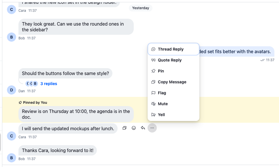
> **Note:** **What you'll build**
>
> - A Yell item that shows the message in capitals
> - A button that copies the message's id
> - A menu without Mark as unread and Block User
>
---
**Preview**
---
**Approach:** Replace one part. [Choosing where to start](https://getstream.io/chat/docs/sdk/react/ui-cookbooks/overview/#choosing-where-to-start) explains the approaches.
**Starts from:** [the base app](https://getstream.io/chat/docs/sdk/react/ui-cookbooks/overview/#the-base-app). The page shows only what the recipe adds.
## Best practices
- Start from `defaultMessageActionSet` and add, remove or replace items. A list written from scratch loses the built-in actions, and the "more" button with them.
- Declare the set once, outside any component. The base filter recomputes whenever it gets a new list.
- Keep the base filter on. It hides the default actions from users who can't take them, and lets your own actions through.
- Check permissions in your own actions. The filter doesn't know their types, so it always shows them.
- Close the menu when a menu action is done, with `closeMenu()` from `useContextMenuContext()`.
- Register the wrapper on the `MessageActions` key with `WithComponents`, so it applies in every message list, in channels and in threads.
- Check the result in a thread too. The filter removes `pin`, `reply` and `markUnread` from thread replies.
## Built-in actions
`defaultMessageActionSet` holds these items, in this order. The order of the list is the order on screen.
| Placement | Types |
| ----------------------- | ------------------------------------------------------------------------------------------------------------------------------------------------------------------------- |
| `quick-dropdown-toggle` | none: the "more" button that opens the menu |
| `quick` | `reply`, `react` |
| `dropdown` | `react`, `reply`, `quote`, `download`, `pin`, `copyMessageText`, `resendMessage`, `edit`, `markUnread`, `remindMe`, `saveForLater`, `flag`, `mute`, `delete`, `blockUser` |
`quick` items render beside the message, and `dropdown` items in the menu. On wide screens the menu's Add reaction item is hidden, because the reaction button beside the message does the same; below 768px it's the other way round. Before rendering, the base filter drops what doesn't apply to the message and the user. For example, `markUnread` shows only on other users' messages, and only with the `read-events` capability. [Message actions](https://getstream.io/chat/docs/sdk/react/features/messaging/message-actions/#how-it-works-across-the-layers) lists when each one shows.
## Add a custom dropdown action
The menu gets a "Yell" item that shows the message's text in capitals. A dropdown item's component renders inside the menu with no props, and reads what it needs from context:
```tsx title="src/CustomMessageActions.tsx"
import type { PropsWithChildren } from "react";
import type { MessageActionSetItem } from "stream-chat-react";
import {
ContextMenuButton,
defaultMessageActionSet,
MessageActions,
useComponentContextIcons,
useContextMenuContext,
useMessageContext,
WithComponents,
} from "stream-chat-react";
const YellAction = () => {
const { IconMegaphone } = useComponentContextIcons();
const { closeMenu } = useContextMenuContext();
const { message } = useMessageContext();
if (!message.text) return null;
return (
{
window.alert(message.text?.toUpperCase());
closeMenu();
}}
>
Yell
);
};
// Declared once: the base filter recomputes whenever it gets a new list.
const messageActionSet: MessageActionSetItem[] = [
...defaultMessageActionSet,
{ Component: YellAction, placement: "dropdown", type: "yell" },
];
const CustomMessageActions = () => (
);
const overrides = { MessageActions: CustomMessageActions };
export const WithCustomMessageActions = ({ children }: PropsWithChildren) => (
{children}
);
```
Wrap the channel, or the whole app, in `WithCustomMessageActions`. Above `ChatView`, it applies in channels and threads alike.
The item goes last in the menu, because it's last in the list. Put it elsewhere in the list to move it. `ContextMenuButton` gives it the look of the other menu items, and `useComponentContextIcons()` gives it an icon that follows [icon overrides](https://getstream.io/chat/docs/sdk/react/ui/components/overriding-components/#icons).
The "more" button is the `quick-dropdown-toggle` item of the default set, so spreading the default set keeps it.
## Add a quick action
A quick action renders beside the message, next to the reply and reaction buttons. This one copies the message's id. It has no menu to close:
```tsx title="src/CustomMessageActions.tsx" add="17"
const CopyIdAction = () => {
const { IconCopy } = useComponentContextIcons();
const { message } = useMessageContext();
return (
void navigator.clipboard.writeText(message.id)}
>
);
};
const messageActionSet: MessageActionSetItem[] = [
...defaultMessageActionSet,
{ Component: CopyIdAction, placement: "quick", type: "copyId" },
{ Component: YellAction, placement: "dropdown", type: "yell" },
];
```
`QuickMessageActionsButton` is the button the default quick actions use. Give it an `aria-label`: the icon is its only content.
## Filter the defaults
To remove default actions, filter them out by type. This set drops Mark as unread and Block User, and keeps the two actions from above. It's the whole file:
```tsx title="src/CustomMessageActions.tsx" add="48,52-56"
import type { PropsWithChildren } from "react";
import type { MessageActionSetItem } from "stream-chat-react";
import {
ContextMenuButton,
defaultMessageActionSet,
MessageActions,
QuickMessageActionsButton,
useComponentContextIcons,
useContextMenuContext,
useMessageContext,
WithComponents,
} from "stream-chat-react";
const YellAction = () => {
const { IconMegaphone } = useComponentContextIcons();
const { closeMenu } = useContextMenuContext();
const { message } = useMessageContext();
if (!message.text) return null;
return (
{
window.alert(message.text?.toUpperCase());
closeMenu();
}}
>
Yell
);
};
const CopyIdAction = () => {
const { IconCopy } = useComponentContextIcons();
const { message } = useMessageContext();
return (
void navigator.clipboard.writeText(message.id)}
>
);
};
const hiddenTypes = new Set(["blockUser", "markUnread"]);
// Declared once: the base filter recomputes whenever it gets a new list.
const messageActionSet: MessageActionSetItem[] = [
// The "more" button has no type, so it's kept explicitly.
...defaultMessageActionSet.filter(
(item) =>
item.placement === "quick-dropdown-toggle" || !hiddenTypes.has(item.type),
),
{ Component: CopyIdAction, placement: "quick", type: "copyId" },
{ Component: YellAction, placement: "dropdown", type: "yell" },
];
const CustomMessageActions = () => (
);
const overrides = { MessageActions: CustomMessageActions };
export const WithCustomMessageActions = ({ children }: PropsWithChildren) => (
{children}
);
```
The base filter still runs on what's left, so the remaining default actions keep following the user's capabilities. Some things to know when you go further:
- **Replacing an action.** Keep its `type` and swap its `Component`. The filter still treats it as that action. [Actions](https://getstream.io/chat/docs/sdk/react/ui/components/actions/#adding-removing-and-replacing-actions) replaces Pin with a version that asks for confirmation. The filter still hides it from users without `pin-message`.
- **Turning the filter off.** `` takes `disableBaseMessageActionSetFilter`, which skips the checks of capabilities, server features and message status. Each item's own `isVisible` still applies. Pass it only when your components check every condition the filter checks.
- **A list from scratch.** Include a `quick-dropdown-toggle` item, or the menu items have no button to open them.
## How it works
>
> **Info:** **Example**
>
> The user opens the menu on Bob's message and picks Yell:
>
> 1. The default `MessageUI` renders the `MessageActions` key on every message that isn't deleted. `CustomMessageActions` renders the SDK's `MessageActions` with the new list.
> 2. The base filter runs on the list. `copyId` and `yell` are types it doesn't know, so the filter lets them through, and `YellAction` itself returns `null` for a message without text.
> 3. Beside Bob's message, the copy-ID button renders with the other quick actions and the "more" button. The user clicks "more", and the menu opens with the default items, without Mark as unread and Block User, and Yell last.
> 4. The user picks Yell. `YellAction` shows the message's text in capitals, then closes the menu with `closeMenu()`.
>
A click on the copy-ID button writes `message.id` to the clipboard. It has no menu to close.
## Related
- [Actions](https://getstream.io/chat/docs/sdk/react/ui/components/actions/): how action sets and the base filter work.
- [Message actions](https://getstream.io/chat/docs/sdk/react/features/messaging/message-actions/): what each default action does, and when it shows.
- [Pinned messages](https://getstream.io/chat/docs/sdk/react/features/messaging/pinned-messages/#turning-it-on-or-off): who may pin, through the `pin-message` capability.
- [Overriding components](https://getstream.io/chat/docs/sdk/react/ui/components/overriding-components/#icons): the icons that `useComponentContextIcons()` returns.
- [Action bar for a custom message](https://getstream.io/chat/docs/sdk/react/ui-cookbooks/message-actions/action-bar/): actions of your own on a custom message UI.
---
For the most recent version of this documentation, visit [https://getstream.io/chat/docs/sdk/react/ui-cookbooks/message-actions/custom-message-actions/](https://getstream.io/chat/docs/sdk/react/ui-cookbooks/message-actions/custom-message-actions/).