# Collapsible sidebar
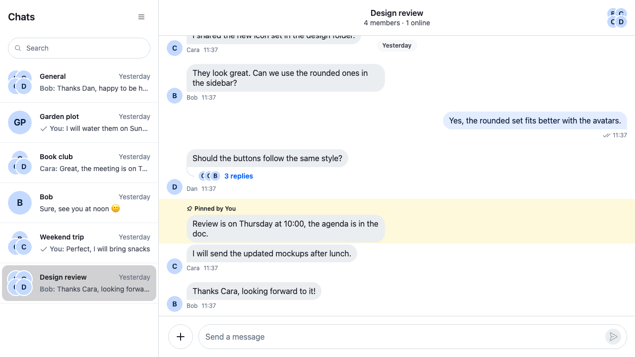
This recipe lets the user collapse the channel list and bring it back.
>
> **Note:** **What you'll build**
>
> - A button that collapses the channel list
> - A button in the channel header to show it again
> - The list as an overlay on a phone
>
---
**Preview**
---
**Approach:** Restyle, Replace one part and Compose. [Choosing where to start](https://getstream.io/chat/docs/sdk/react/ui-cookbooks/overview/#choosing-where-to-start) explains the approaches.
**Starts from:** [the base app](https://getstream.io/chat/docs/sdk/react/ui-cookbooks/overview/#the-base-app). The page shows only what the recipe adds.
The app owns the open or closed state, and CSS does the rest. The SDK gives the buttons a place:
- `EndContent`, a prop of ``, renders at the end of the channel list's header. The recipe registers a header that passes it, under the `ChannelListHeader` key.
- `StartContent`, a prop of ``, renders at its start. It replaces the back button, so the recipe renders that button too.
Below 768px wide, the SDK's stylesheet hides the channel list, and the app shows it, for example as an overlay. That's the mobile part of this recipe. [Responsive layouts](https://getstream.io/chat/docs/sdk/react/ui/layout/responsive-layouts/) covers the rest of a layout on small screens.
## Best practices
- Keep the sidebar state in the app, in a React context, so the buttons and the layout read the same value.
- Use one toggle component in both places. It collapses the list when it's open, and shows it when it's collapsed.
- Drive the layout with a class on an element around `ChatView`. Collapse the list through the SDK's variable for its width, `--str-chat__channel-list-width`. The channel list's root, `.str-chat__channel-list`, already animates its width, opacity and position.
- Hide the collapsed list with `visibility: hidden`, not only `opacity`, so the keyboard skips it.
- Hide the button in the channel header while the list is visible, so only one of the two shows.
- Close the list when the user picks a channel on a phone, where the list covers the channel, including the channel that is already open.
- To keep the user's choice across reloads, save `sidebarOpen` in `localStorage`.
## Create sidebar state
```tsx title="src/SidebarContext.tsx"
import { createContext, useCallback, useContext, useState } from "react";
import type { PropsWithChildren } from "react";
type SidebarContextValue = {
closeSidebar: () => void;
openSidebar: () => void;
sidebarOpen: boolean;
};
const SidebarContext = createContext(
undefined,
);
export const useSidebar = () => {
const value = useContext(SidebarContext);
if (!value)
throw new Error("useSidebar must be used within a SidebarProvider");
return value;
};
export const SidebarProvider = ({
children,
initialOpen = true,
}: PropsWithChildren<{ initialOpen?: boolean }>) => {
const [sidebarOpen, setSidebarOpen] = useState(initialOpen);
const closeSidebar = useCallback(() => setSidebarOpen(false), []);
const openSidebar = useCallback(() => setSidebarOpen(true), []);
return (
{children}
);
};
```
## Create the toggle component
The toggle reads the state and flips it. It's the SDK's `Button` with the SDK's `IconMenu`, so it looks like the header's other buttons:
```tsx title="src/SidebarToggle.tsx"
import { Button, IconMenu } from "stream-chat-react";
import { useSidebar } from "./SidebarContext";
export const SidebarToggle = () => {
const { closeSidebar, openSidebar, sidebarOpen } = useSidebar();
return (
);
};
```
## Wire it into the app
Pass the toggle to `` as its `EndContent`, and register that header under the `ChannelListHeader` key. `EndContent` renders whenever it's set, so a wrapper, `SidebarToggleWhileChannelOpen`, returns `null` while no channel is open: collapsing the list then would leave an empty screen. Pass the toggle to `` too, as part of its `StartContent`, before the back button. ``, around ``, gets the class that says whether the list is collapsed:
```tsx title="src/App.tsx"
import type { PropsWithChildren } from "react";
import {
ChannelHeader,
ChannelListHeader,
ChannelNavigation,
Chat,
MessageComposer,
MessageList,
ThreadHeader,
useWorkspaceNavigation,
WithComponents,
WorkspaceNavigationBackButton,
} from "stream-chat-react";
import {
ChannelSlot,
ChatView,
ThreadSlot,
} from "stream-chat-react/slot-layout";
import type { LayoutDescriptor } from "stream-chat-react/slot-layout";
import { AutoCloseSidebar } from "./AutoCloseSidebar";
import { SidebarProvider, useSidebar } from "./SidebarContext";
import { SidebarToggle } from "./SidebarToggle";
import "./sidebar.css";
const layouts: LayoutDescriptor[] = [
{ id: "channels", slots: ["channel", "thread"] },
];
// The toggle, only while a channel is open beside the list. With nothing open, collapsing the
// sidebar would leave an empty screen.
const SidebarToggleWhileChannelOpen = () => {
const { openChannels } = useWorkspaceNavigation();
return openChannels.length > 0 ? : null;
};
// The default channel list header, with the toggle at its end.
const ChannelListHeaderWithToggle = () => (
);
// Declared once, so WithComponents gets the same object on every render.
const overrides = { ChannelListHeader: ChannelListHeaderWithToggle };
// The toggle, then the back button the header shows by default.
const ChannelHeaderStart = () => (
<>
);
const ChannelsView = () => (
<>
);
// Around ChatView: its class says whether the channel list is collapsed.
const SidebarLayout = ({ children }: PropsWithChildren) => {
const { sidebarOpen } = useSidebar();
return (
{children}
);
};
export const App = () => (
}} />
);
```
`AutoCloseSidebar` is the last part of this page.
## Add CSS for sidebar visibility
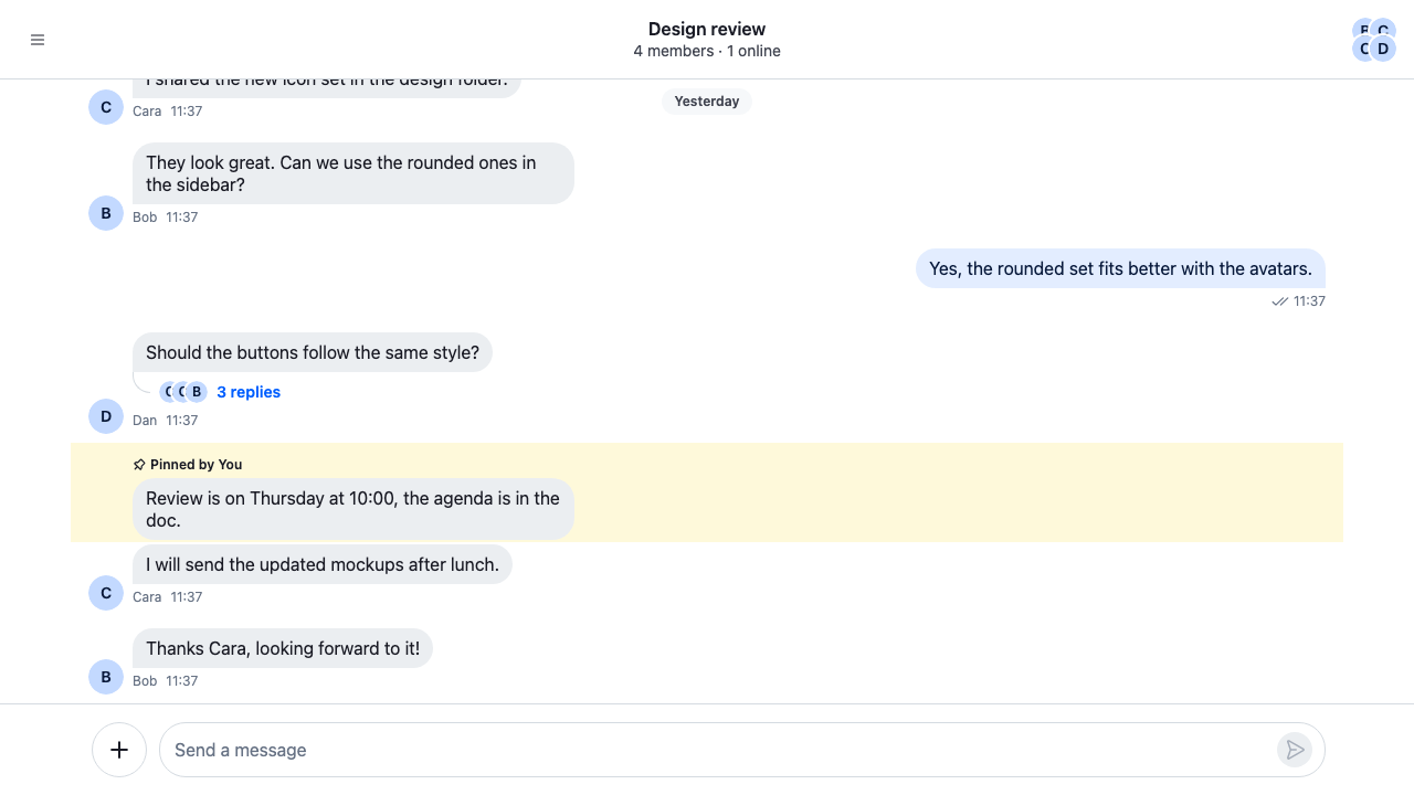
On a wide screen, the collapsed list shrinks to nothing and fades out. Setting `--str-chat__channel-list-width` to `0px` collapses it, and the SDK's stylesheet animates the change. Once it has collapsed, `visibility: hidden` takes its rows out of the tab order, so the keyboard can't reach a list the user can't see. The button in the channel header shows only while the list is collapsed:
```css title="src/sidebar.css"
@layer stream-overrides {
.cookbook-sidebar-layout {
height: 100%;
}
/* Collapsed, the list's width goes to 0 and the SDK's stylesheet animates the change. */
.cookbook-sidebar-layout--collapsed .str-chat {
--str-chat__channel-list-width: 0px;
}
.cookbook-sidebar-layout--collapsed .str-chat__channel-list {
min-width: 0;
overflow: hidden;
border-inline-end: 0;
opacity: 0;
pointer-events: none;
/* Hidden, so its rows leave the tab order; it turns hidden only once it has collapsed. */
visibility: hidden;
transition:
flex-basis var(--str-chat__channel-list-transition-duration)
var(--str-chat__channel-list-transition-easing),
min-width var(--str-chat__channel-list-transition-duration)
var(--str-chat__channel-list-transition-easing),
width var(--str-chat__channel-list-transition-duration)
var(--str-chat__channel-list-transition-easing),
opacity var(--str-chat__channel-list-transition-duration)
var(--str-chat__channel-list-transition-easing),
transform var(--str-chat__channel-list-transition-duration)
var(--str-chat__channel-list-transition-easing),
visibility 0s linear var(--str-chat__channel-list-transition-duration);
}
/* One toggle at a time: the header's shows only while the list is collapsed. */
.cookbook-sidebar-layout:not(.cookbook-sidebar-layout--collapsed)
.str-chat__channel-header
.cookbook-sidebar-toggle {
display: none;
}
@media (max-width: 767px) {
/* Below 768px, the SDK's stylesheet hides the list over the channel
and has no rule that shows it again; this one shows it while it's open. */
.cookbook-sidebar-layout:not(.cookbook-sidebar-layout--collapsed)
.str-chat__channel-list {
pointer-events: auto;
transform: translateX(0);
/* Shows at once; the SDK's rule delays hiding until the list has slid out. */
transition:
transform var(--str-chat__channel-list-transition-duration)
var(--str-chat__channel-list-transition-easing),
visibility 0s;
visibility: visible;
}
}
/* Without animations, the list collapses and shows at once. */
@media (prefers-reduced-motion: reduce) {
.cookbook-sidebar-layout .str-chat__chat-view .str-chat__channel-list {
transition: none;
}
}
}
```
The rules sit in the `stream-overrides` layer, so they win over the SDK's own rules once the SDK's stylesheet is in an earlier layer, as [Theming → CSS layers](https://getstream.io/chat/docs/sdk/react/features/app-experience/theming/#css-layers) sets up. The SDK sets a minimum width on the list, so the collapsed rule also sets `min-width` to `0`. The collapsed rule repeats the SDK's transitions and adds `visibility` with a delay, so the list turns hidden only after it has collapsed, and shows at once when it opens. With reduced motion on, the last rule drops the animation, as the SDK's own stylesheet does.
---
**The collapsed channel list**
---
## Responsive behavior
Below 768px, the SDK's stylesheet hides the channel list and places it over the channel. The `max-width: 767px` media query in `sidebar.css` shows it while the sidebar is open.
While the list is open on a phone, it covers the channel, and its header shows the toggle that closes it. Once it's closed, the channel header shows the toggle that opens it again.
Close the list when the user picks a channel on a phone, so the user sees the channel. `AutoCloseSidebar` wraps `ChannelNavigation` in a `WorkspaceNavigationProvider` whose `openChannel` opens the channel through the layout's navigation and then closes the list. A row, or a search result, calls `openChannel` on every click, so picking the channel that is already open closes the list too:
```tsx title="src/AutoCloseSidebar.tsx"
import { useMemo } from "react";
import type { PropsWithChildren } from "react";
import type { WorkspaceNavigation } from "stream-chat-react";
import {
useWorkspaceNavigation,
WorkspaceNavigationProvider,
} from "stream-chat-react";
import { useSidebar } from "./SidebarContext";
/**
* Closes the sidebar when the user picks a channel in it on a phone, where the list covers the
* channel. Picking the channel that is already open closes it too.
*/
export const AutoCloseSidebar = ({ children }: PropsWithChildren) => {
const navigation = useWorkspaceNavigation();
const { closeSidebar } = useSidebar();
const value = useMemo(
() => ({
...navigation,
openChannel: (channel, options) => {
navigation.openChannel(channel, options);
if (window.matchMedia("(max-width: 767px)").matches) closeSidebar();
},
}),
[navigation, closeSidebar],
);
return (
{children}
);
};
```
`AutoCloseSidebar` renders inside the channels view, because `useWorkspaceNavigation()` returns the layout's navigation only below `ChatView`. Only the channel list sees its `openChannel`; the rest of the layout keeps the layout's own. [Navigation](https://getstream.io/chat/docs/sdk/react/ui/layout/navigation/) explains `useWorkspaceNavigation()`.
`` takes the same `EndContent` prop. Register a header that passes it under the `ThreadListHeader` key. To collapse the thread list too, add a `threads` view with `ThreadList`, wrap `ThreadList` in a provider that does the same for `openThread`, and apply the same CSS to the thread list's root, `.str-chat__thread-list-container`, with its width variable, `--str-chat__thread-list-width`.
## How it works
>
> **Info:** **Example**
>
> The user collapses the channel list on a wide screen, then shows it again:
>
> 1. The user clicks the toggle in the channel list's header, which `ChannelListHeaderWithToggle` passes to `` as `EndContent`. It calls `closeSidebar()`, and `sidebarOpen` becomes `false`.
> 2. `SidebarLayout` adds `cookbook-sidebar-layout--collapsed` to its class. The CSS sets `--str-chat__channel-list-width` to `0px`, so the list shrinks and fades out, and then turns hidden.
> 3. With the list collapsed, the toggle at the start of the channel header shows. The user clicks it, `openSidebar()` sets `sidebarOpen` to `true`, and the list comes back.
>
On a phone, the open list covers the channel. When the user picks a channel in it, `AutoCloseSidebar` opens the channel and calls `closeSidebar()`, so the channel shows.
## Related
- [Responsive layouts](https://getstream.io/chat/docs/sdk/react/ui/layout/responsive-layouts/): the rest of a layout on small screens.
- [Navigation](https://getstream.io/chat/docs/sdk/react/ui/layout/navigation/): `useWorkspaceNavigation()` and its provider.
- [Overriding components](https://getstream.io/chat/docs/sdk/react/ui/components/overriding-components/): how overrides registered with `WithComponents` apply.
- [Channel UI](https://getstream.io/chat/docs/sdk/react/ui/components/channel-ui/#the-header): the channel header and its `StartContent` prop.
- [Theming](https://getstream.io/chat/docs/sdk/react/features/app-experience/theming/#css-layers): the CSS layers the rules sit in.
- [Single-pane mobile with back button](https://getstream.io/chat/docs/sdk/react/ui-cookbooks/layout/single-pane-mobile-with-back-button/): one panel at a time on a phone.
---
For the most recent version of this documentation, visit [https://getstream.io/chat/docs/sdk/react/ui-cookbooks/layout/collapsible-sidebar/](https://getstream.io/chat/docs/sdk/react/ui-cookbooks/layout/collapsible-sidebar/).