# Theming
The SDK's look comes from one stylesheet and a set of CSS variables, its design tokens. Setting one token changes everything that reads it: `--str-chat__accent-primary` alone recolors the primary buttons, the read receipts, the badges, and the selected checkboxes and switches. Replace a component through `WithComponents` when you need different markup; for colors, shapes, spacing and fonts, change the tokens.
## Importing the stylesheet
Import the default stylesheet once, at your app's entry point:
```tsx
import "stream-chat-react/dist/css/index.css";
```
`index.css` styles the components and the layout from `stream-chat-react/slot-layout`. The optional parts, such as channel details, the emoji picker and the AI components, have stylesheets of their own, imported after it. [Entry points and CSS files](https://getstream.io/chat/docs/sdk/react/reference/entry-points-and-css-files/) lists them.
Imported this way, your own CSS competes with the SDK's on specificity. To make your rules win without matching the SDK's selectors, load the stylesheet into a cascade layer instead.
## CSS layers
A [cascade layer](https://developer.mozilla.org/en-US/docs/Web/CSS/@layer) is a named group of CSS rules. Layers declared earlier lose to layers declared later, and any rule outside a layer beats every rule inside one, whatever the selectors' specificity.
Put the SDK's styles in a layer, and your overrides in a later one. This has to happen in a CSS file, because a JavaScript `import` of a stylesheet can't name a layer:
```css title="src/chat.css"
@layer stream, stream-overrides;
@import "stream-chat-react/dist/css/index.css" layer(stream);
@import "stream-chat-react/dist/css/channel-detail.css" layer(stream);
@layer stream-overrides {
.str-chat {
--str-chat__accent-primary: #047857;
}
}
```
```tsx title="src/main.tsx"
import "./chat.css";
```
1. `@layer stream, stream-overrides;` declares the order: `stream` first, so `stream-overrides` wins over it.
2. Each `@import` puts a stylesheet into the `stream` layer. An `@import` has to come before any other rule in the file, apart from `@layer` statements.
3. Rules in `stream-overrides` win over the SDK's rules, even when the SDK's selector is more specific.
Your other app styles can stay outside any layer. They beat both layers.
The examples on the rest of this page put their rules in `stream-overrides`.
## Design tokens
The tokens are CSS variables named `--str-chat__*`. The stylesheet declares them on every element with the class `str-chat`: the root of `ChatView`, the root of `Channel`, the channel list's theme scope outside `ChatView`, and the overlay of each modal. Override them on `.str-chat` too.
The channel list's theme scope gives it the tokens when no `ChatView` is around it. Outside `ChatView`, the root of `ChannelNavigation` gets the `str-chat` and `theme` classes, and a `ChannelList` rendered on its own is wrapped in a `div` with those classes and `str-chat__theme-scope`, which has `display: contents` so it doesn't change the layout. Inside `ChatView`, the list adds no `str-chat` element of its own, so the tokens you set on `ChatView`'s root reach it.
They come in tiers, and each tier is built from the one above it:
1. **Palette.** Raw colors such as `--str-chat__blue-500` and `--str-chat__slate-100`, and the two ramps the rest is built from: `--str-chat__brand-50` to `--str-chat__brand-900`, built from the blues, and `--str-chat__chrome-0` to `--str-chat__chrome-1000`, built from the grays.
2. **Semantic tokens.** What a value is for: `--str-chat__accent-primary`, `--str-chat__text-primary`, `--str-chat__background-core-app`, `--str-chat__border-core-default`. The scales for radius, spacing and type are in this tier too, such as `--str-chat__radius-max` and `--str-chat__spacing-md`.
3. **Component tokens.** One part of one kind of component: `--str-chat__chat-bg-outgoing` for the background of the user's own message bubbles, `--str-chat__avatar-bg-default`, `--str-chat__button-primary-bg`.
4. **Component variables.** Declared in a component's own stylesheet, mostly sizes: `--str-chat__message-max-width`, `--str-chat__channel-list-width`.
For example, in the light theme `--str-chat__accent-primary` is `var(--str-chat__brand-500)`, and `--str-chat__button-primary-bg` is `var(--str-chat__accent-primary)`. Override the tier whose reach you want: the accent changes everything that uses the accent, and the button token changes only the button.
To change the brand color everywhere, including the tints of message bubbles and links, give `--str-chat__blue-50` to `--str-chat__blue-900` your brand's shades. Both themes build the brand ramp from them, the dark theme in the opposite direction, so one set of values recolors both. The first of the avatar colors uses them too.
Every token is listed in the reference: [Palette variables](https://getstream.io/chat/docs/sdk/react/reference/theming-variables/palette-variables/), [Global variables](https://getstream.io/chat/docs/sdk/react/reference/theming-variables/global-variables/) and [Component variables](https://getstream.io/chat/docs/sdk/react/reference/theming-variables/component-variables/).
### Changing colors and shapes
Here is the default UI:
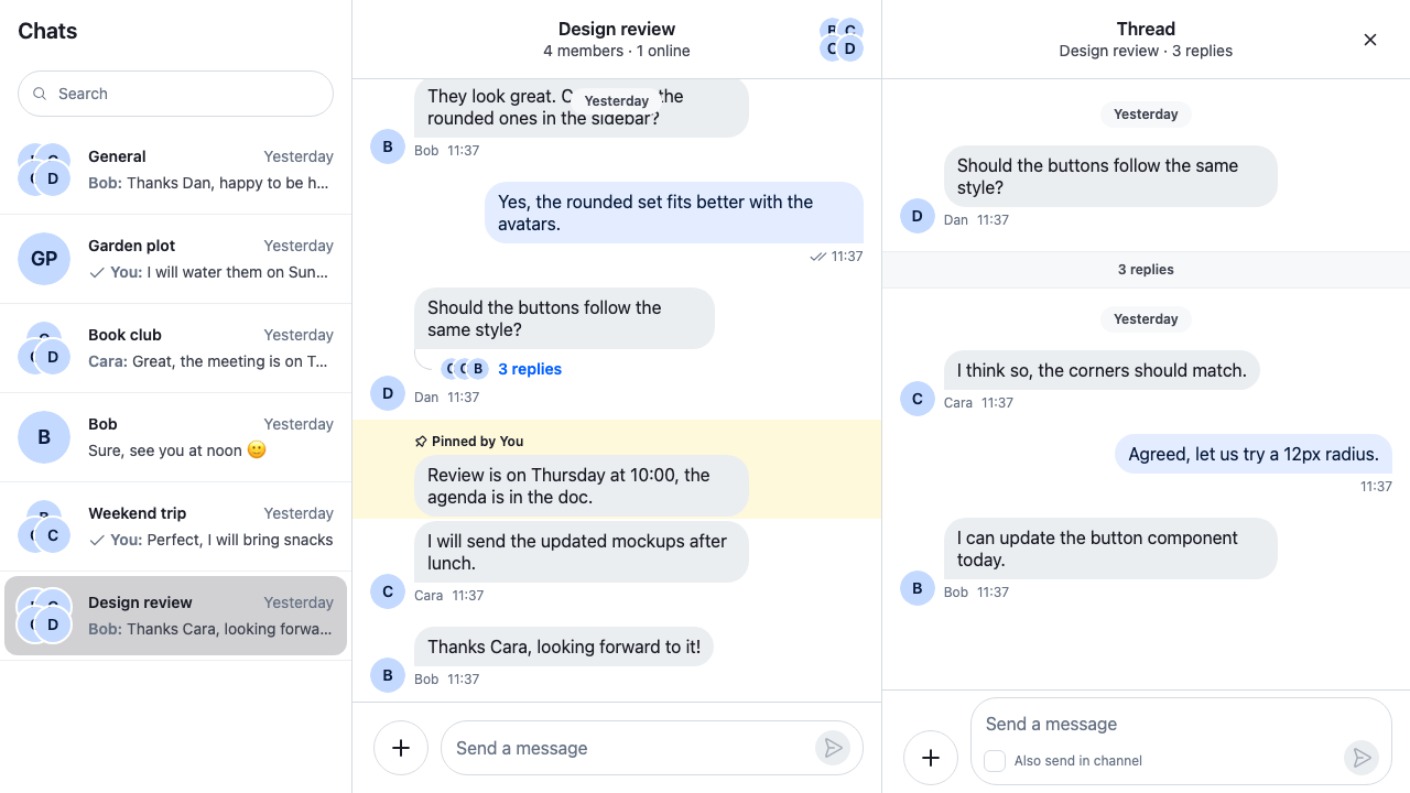
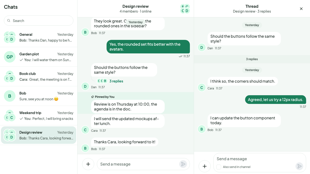
The rest of the docs, the UI Cookbooks included, show the SDK's default theme. This page builds a theme of its own on top of it: a green brand on green-tinted surfaces, solid green bubbles for the user's own messages, rounder bubbles, a different font and softer shadows. It's nothing but tokens:
```css
@layer stream-overrides {
/* Light theme, and the shape, type and shadow tokens both themes share. */
.str-chat {
/* Brand: a green ramp in place of the SDK's blues. Both themes build the brand ramp from it. */
--str-chat__blue-50: #ecfdf5;
--str-chat__blue-100: #d1fae5;
--str-chat__blue-150: #bcf5da;
--str-chat__blue-200: #a7f3d0;
--str-chat__blue-300: #6ee7b7;
--str-chat__blue-400: #34d399;
--str-chat__blue-500: #10b981;
--str-chat__blue-600: #059669;
--str-chat__blue-700: #047857;
--str-chat__blue-800: #065f46;
--str-chat__blue-900: #064e3b;
/* The accent is a deeper step than the ramp's middle, so white text on a button reads. */
--str-chat__accent-primary: #047857;
/* Surfaces: a green-tinted page, white panels and incoming bubbles. */
--str-chat__background-core-app: #f3f8f5;
--str-chat__background-core-elevation-1: #ffffff;
--str-chat__background-core-highlight: #e6f6ee;
--str-chat__background-core-surface-subtle: #ecf4ef;
/* Interaction states are overlays painted on top of a control, so they stay translucent. */
--str-chat__background-utility-hover: rgb(4 120 87 / 0.06);
--str-chat__background-utility-pressed: rgb(4 120 87 / 0.1);
--str-chat__background-utility-selected: rgb(4 120 87 / 0.12);
--str-chat__border-core-default: #e0eae4;
--str-chat__border-core-subtle: #ecf2ee;
--str-chat__text-primary: #16231d;
--str-chat__text-secondary: #4d5c55;
--str-chat__text-tertiary: #5c6b63;
/* All three text levels, links, and the timestamps and names under messages read at 4.5:1 on
the page, the panels and a selected channel. */
--str-chat__text-link: #047857;
--str-chat__chat-text-timestamp: #4d5c55;
/* Bubbles: a solid green with white text for the user's own, white with a hairline for
everyone else's. Attachment cards inside the user's bubble, such as link previews,
locations and the Giphy preview, sit one step darker, so the card stands out from the
bubble around it. The bubble's border matches its fill. */
--str-chat__chat-bg-outgoing: #1a7f5a;
--str-chat__chat-bg-attachment-outgoing: #136c4c;
--str-chat__chat-border-outgoing: #1a7f5a;
--str-chat__chat-text-outgoing: #ffffff;
--str-chat__chat-reply-indicator-outgoing: #a7f3d0;
/* Borders on the user's own bubble, such as the poll's buttons and checkboxes: white. */
--str-chat__chat-border-on-chat-outgoing: #ffffff;
/* Poll vote bars on the user's own bubble: a white fill in a near-black green track. */
--str-chat__chat-poll-progress-fill-outgoing: #ffffff;
--str-chat__chat-poll-progress-track-outgoing: #021f18;
--str-chat__chat-bg-incoming: #ffffff;
--str-chat__chat-border-incoming: #e0eae4;
--str-chat__chat-text-incoming: #16231d;
--str-chat__avatar-bg-default: #d1fae5;
--str-chat__avatar-text-default: #047857;
/* Shape: softer, rounder bubbles and cards; buttons and inputs stay pill-shaped. */
--str-chat__message-bubble-radius-group-top: 20px;
--str-chat__message-bubble-radius-group-middle: 20px;
--str-chat__message-bubble-radius-group-bottom: 20px;
--str-chat__message-bubble-radius-tail: 6px;
--str-chat__radius-lg: 16px;
--str-chat__radius-xl: 20px;
/* Type: Plus Jakarta Sans, loaded from Google Fonts, with the system font as fallback. */
--str-chat__font-family:
"Plus Jakarta Sans", system-ui, -apple-system, "Segoe UI", sans-serif;
/* Shadows: soft and diffuse, tinted with the brand instead of black. */
--str-chat__light-elevation-1:
0 0 0 1px rgb(6 78 59 / 0.04), 0 1px 2px rgb(6 78 59 / 0.06),
0 4px 12px rgb(6 78 59 / 0.06);
--str-chat__light-elevation-2:
0 0 0 1px rgb(6 78 59 / 0.04), 0 2px 6px rgb(6 78 59 / 0.08),
0 10px 24px rgb(6 78 59 / 0.08);
--str-chat__light-elevation-3:
0 0 0 1px rgb(6 78 59 / 0.05), 0 4px 10px rgb(6 78 59 / 0.1),
0 16px 32px rgb(6 78 59 / 0.1);
}
/* Polls on the user's own bubble: white buttons, and white voter avatars with deep green
initials. A ticked checkbox has no border and keeps the SDK's white tick, so it fills with
#021f18, a green below the brand ramp that stands out from both the tick and the bubble.
Both themes share the bubble, so one rule serves both. */
.str-chat__message--me .str-chat__poll {
--str-chat__button-secondary-text: #ffffff;
--str-chat__avatar-bg-default: #ffffff;
--str-chat__avatar-text-default: #065f46;
--str-chat__control-radio-check-bg-selected: #021f18;
}
/* Action buttons on an attachment in the user's own bubble, such as the Giphy preview's Send,
Shuffle and Cancel: white, like the bubble's text. */
.str-chat__message--me .str-chat__message-attachment-actions {
--str-chat__accent-primary: #ffffff;
--str-chat__button-primary-text: #ffffff;
--str-chat__button-secondary-text: #ffffff;
}
/* Mentions and links in the user's own text: white, since the brand greens don't read on the
bubble. Mentions stay bold, and links get an underline so they differ from the text around
them. */
.str-chat__message--me .str-chat__message-text {
--str-chat__accent-primary: #ffffff;
--str-chat__chat-text-link: #ffffff;
}
.str-chat__message--me .str-chat__message-text a {
text-decoration: underline;
}
}
```
What each group of tokens does:
- **Brand.** `--str-chat__blue-50` to `--str-chat__blue-900` are the ramp the brand colors are built from, so replacing them recolors links, badges, read receipts and the thread replies link at once. `--str-chat__accent-primary` sets the primary buttons and the selected controls; the theme picks a deeper green than the ramp's middle, so the white text on a primary button reads at 4.5:1.
- **Surfaces.** `--str-chat__background-core-app` is the message list's background, and `--str-chat__background-core-elevation-1` the panels: the channel list, the headers and the composer. `--str-chat__background-core-highlight` marks a pinned or highlighted message, and the text tokens set the three levels of text. The theme keeps all three at 4.5:1 or more on the page, the panels and a selected channel.
- **Interaction states.** `--str-chat__background-utility-hover`, `-pressed` and `-selected` are painted as an overlay on top of a control, including over a button's label. Keep them translucent, as the SDK's own are; a solid color hides what's under it.
- **Bubbles.** The `--str-chat__chat-*` tokens set the user's own bubbles (`-outgoing`) and everyone else's (`-incoming`), with their text and borders. The theme's own bubble is a solid green that carries white text at 4.5:1. `--str-chat__chat-bg-attachment-outgoing` is the card an attachment sits on inside the user's own bubble, such as a link preview, a location or the Giphy preview; the theme makes it a shade darker than `--str-chat__chat-bg-outgoing`, so the card shows against the bubble.
- **Inside the user's own bubble.** Some parts of a bubble take their colors from general tokens, which suit a light bubble but not a solid green one. The rules after the `.str-chat` block set those tokens again, only inside the user's bubble and in both themes: the poll's buttons and voter avatars turn white, a ticked checkbox gets a near-black green fill behind its white tick, the action buttons on an attachment, such as the Giphy preview's Send, Shuffle and Cancel, turn white, and mentions and links turn white, with an underline on links. `--str-chat__chat-border-on-chat-outgoing` makes the poll's button and checkbox borders white, and the vote bars get a white fill in a near-black green track.
- **Links and timestamps.** `--str-chat__text-link` colors links and the thread replies link; the brand ramp's default shade for it is too light on the tinted page, so the theme picks a deeper green. `--str-chat__chat-text-timestamp` sets the time and name under each message; the theme uses its secondary text there, which reads better than the tertiary one.
- **Shape.** The `--str-chat__message-bubble-radius-*` tokens round the bubbles, with a smaller corner on the side of the tail. `--str-chat__radius-lg` and `-xl` round cards, popovers and dialogs.
- **Shadows.** `--str-chat__light-elevation-1` to `-3` are the shadows of raised parts, such as menus and the suggestion list. Tinting them with the brand keeps them soft on a colored page.
Here is the result:
### Changing one component
A component token changes one kind of component and nothing else. These two set the avatar colors:
```css
@layer stream-overrides {
.str-chat {
--str-chat__avatar-bg-default: #d1fae5;
--str-chat__avatar-text-default: #047857;
}
}
```
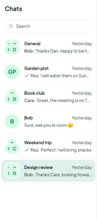
They give the avatars a light green background with green initials, as in the theme above:
Component variables work the same way. This one lets message bubbles grow wider than the default 400px:
```css
@layer stream-overrides {
.str-chat {
--str-chat__message-max-width: 560px;
}
}
```
The text color of a message bubble, and of the link previews inside it, comes from `--str-chat__chat-text-outgoing` for the user's own messages and `--str-chat__chat-text-incoming` for everyone else's.
### Fonts
The SDK's font is `--str-chat__font-family`: Geist, followed by the system fonts. The stylesheet doesn't load Geist, so unless your page loads it, the UI renders in the first system font available. To use your app's font, load it and set the token. The theme above uses Plus Jakarta Sans from Google Fonts:
```html
```
```css
@layer stream-overrides {
.str-chat {
--str-chat__font-family:
"Plus Jakarta Sans", system-ui, -apple-system, "Segoe UI", sans-serif;
}
}
```
Load the weights the stylesheet uses, 400 to 700, and keep the system fonts after it, so text still renders while the font loads.
## Dark theme
The stylesheet has a dark theme, set by the class `str-chat__theme-dark`. Pass it to `Chat` as `theme`:
```tsx
import { Chat } from "stream-chat-react";
export const App = () => (
{/* the rest of the app */}
);
```
The `theme` classes are added next to `str-chat`, on the same elements: the roots of `ChatView` and `Channel`, the channel list's theme scope, and every modal's overlay. The default, `messaging light`, has no rules in the stylesheet, so it renders the light theme.
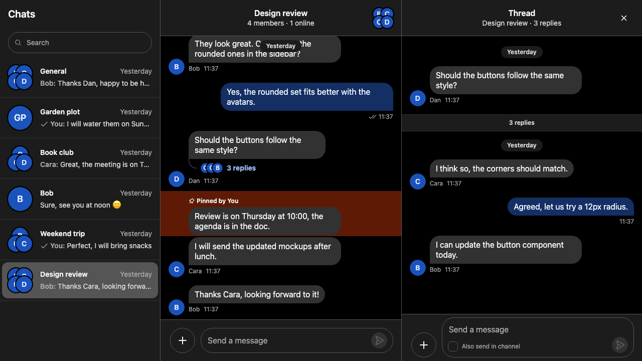
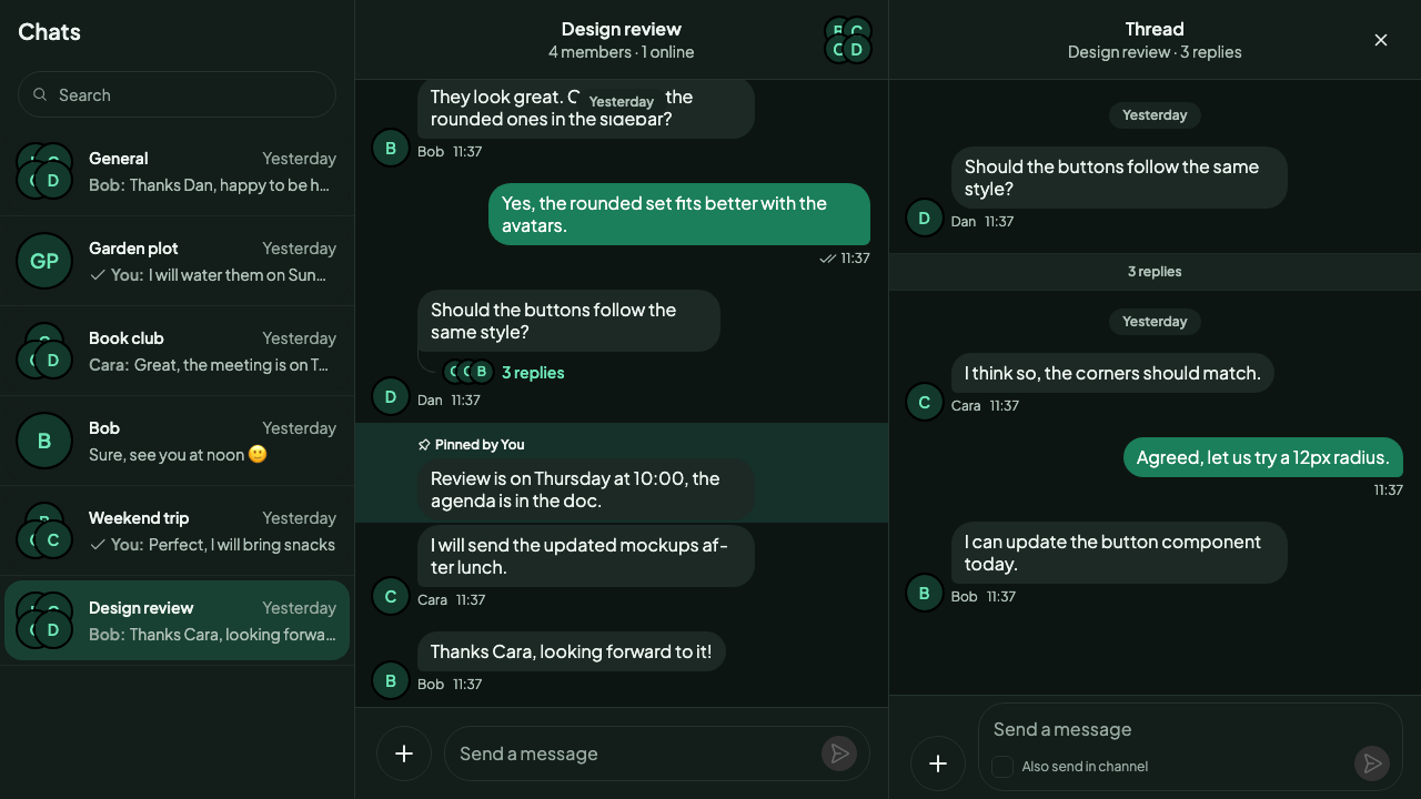
Here is the dark theme:
`theme` can change while the app runs. This app follows the system setting:
```tsx
import { useEffect, useState } from "react";
import { Chat } from "stream-chat-react";
const darkQuery = "(prefers-color-scheme: dark)";
const usePrefersDark = () => {
const [prefersDark, setPrefersDark] = useState(
() => window.matchMedia(darkQuery).matches,
);
useEffect(() => {
const query = window.matchMedia(darkQuery);
const onChange = (event: MediaQueryListEvent) =>
setPrefersDark(event.matches);
query.addEventListener("change", onChange);
return () => query.removeEventListener("change", onChange);
}, []);
return prefersDark;
};
export const App = () => {
const prefersDark = usePrefersDark();
return (
{/* the rest of the app */}
);
};
```
### Customizing both themes
The light tokens are declared on `.str-chat`, and the dark theme declares its own on `.str-chat__theme-dark`. Do the same in your overrides: put the light values and anything shared on `.str-chat`, then the dark values on `.str-chat__theme-dark`, after it.
This is the dark half of the theme above. It goes after the `.str-chat` block, in the same layer:
```css
@layer stream-overrides {
/* Dark theme: the same brand, on a deep green-black instead of grey. */
.str-chat__theme-dark {
--str-chat__accent-primary: #34d399;
--str-chat__background-core-app: #0d1512;
--str-chat__background-core-elevation-1: #131d19;
--str-chat__background-core-highlight: #16302a;
--str-chat__background-core-surface-subtle: #18241f;
--str-chat__background-utility-hover: rgb(52 211 153 / 0.1);
--str-chat__background-utility-pressed: rgb(52 211 153 / 0.16);
--str-chat__background-utility-selected: rgb(52 211 153 / 0.2);
--str-chat__border-core-default: #24332d;
--str-chat__border-core-subtle: #1c2924;
--str-chat__text-primary: #eef5f1;
--str-chat__text-secondary: #b0c2b9;
--str-chat__text-tertiary: #97aaa1;
--str-chat__text-link: #6ee7b7;
--str-chat__chat-text-timestamp: #b0c2b9;
--str-chat__chat-bg-outgoing: #1a7f5a;
--str-chat__chat-bg-attachment-outgoing: #136c4c;
--str-chat__chat-border-outgoing: #1a7f5a;
--str-chat__chat-text-outgoing: #ffffff;
--str-chat__chat-border-on-chat-outgoing: #ffffff;
--str-chat__chat-poll-progress-fill-outgoing: #ffffff;
--str-chat__chat-poll-progress-track-outgoing: #021f18;
--str-chat__chat-bg-incoming: #1c2924;
--str-chat__chat-border-incoming: #24332d;
--str-chat__chat-text-incoming: #eef5f1;
--str-chat__avatar-bg-default: #12392c;
--str-chat__avatar-text-default: #6ee7b7;
}
}
```
Every token set on `.str-chat` also applies in the dark theme unless the dark block sets it again, because your layer wins over the SDK's dark values. Here the brand ramp, the shapes, the font, the shadows and the rules inside the user's own bubble carry over, and only the colors that have to be darker are set again. The dark accent is a light green, and the SDK's dark theme already puts dark text on primary buttons, so it reads on the light accent. The interaction states stay translucent, now as light green on a dark surface. Here is the result:
### A dark channel in a light app
To make only the channel dark, add the class to the channel's root through `Chat`'s `customClasses`. A custom class replaces the default one, so keep `str-chat__channel`:
```tsx
import { Chat } from "stream-chat-react";
export const App = () => (
{/* the rest of the app */}
);
```
## Your own themes
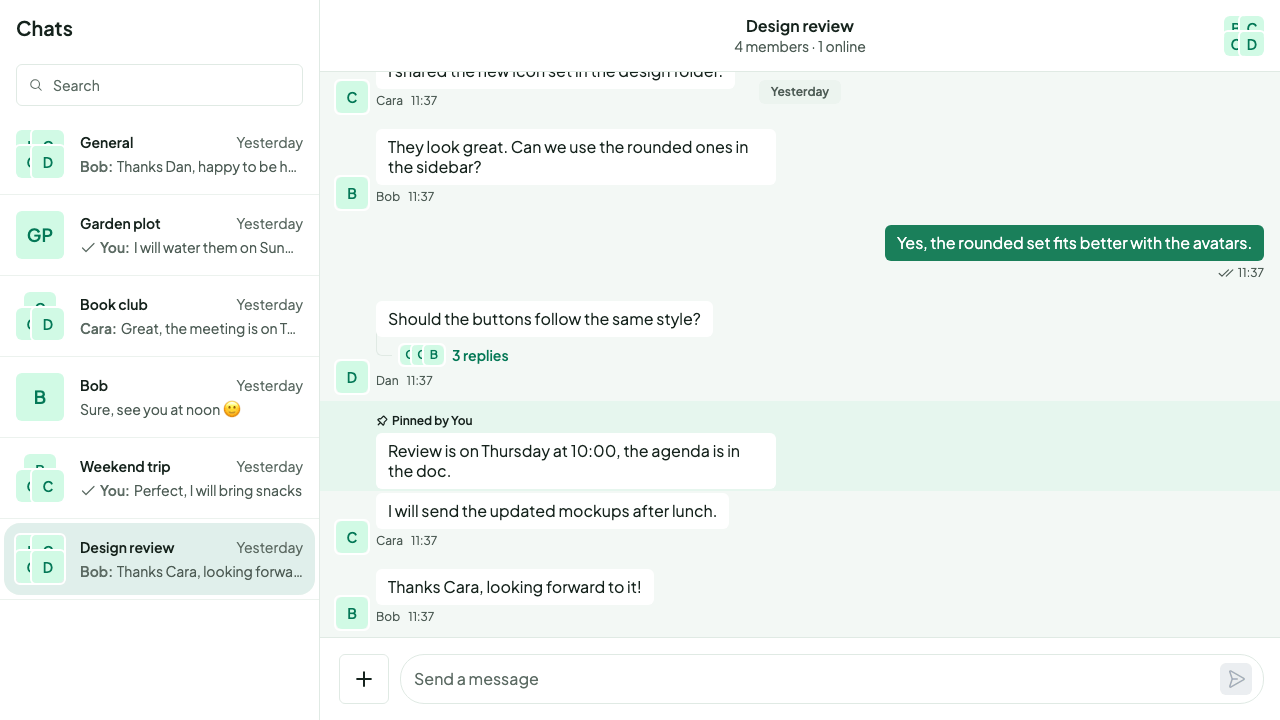
A theme is a class that sets tokens. Define one in your overrides and pass it as `theme`. These two themes change the corner radius:
```css
@layer stream-overrides {
/* Two themes of your own, set through Chat's `theme`: rounder or squarer corners. */
.str-chat__theme-round {
--str-chat__radius-max: 9999px;
--str-chat__button-radius-full: 9999px;
}
.str-chat__theme-square {
--str-chat__radius-max: 6px;
--str-chat__button-radius-full: 6px;
--str-chat__message-bubble-radius-group-top: 6px;
--str-chat__message-bubble-radius-group-middle: 6px;
--str-chat__message-bubble-radius-group-bottom: 6px;
}
}
```
```tsx
import { Chat } from "stream-chat-react";
export const App = () => (
{/* the rest of the app */}
);
```
`theme` takes several classes, so a theme of your own combines with the default classes and with the dark theme: `theme="str-chat__theme-dark str-chat__theme-square"`. Here is the square theme on top of the theme above:
## Right-to-left layouts
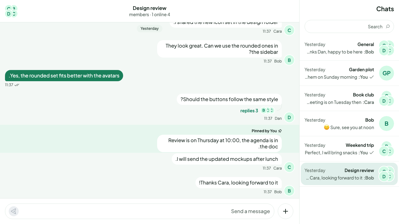
The stylesheet supports right-to-left languages. Set `dir` on your page, or on any element around the chat:
```html
```
The layout mirrors, and so do the icons that point in a direction.
## Used in
- [Quick start](https://getstream.io/chat/docs/sdk/react/getting-started/quick-start/), which imports the default stylesheet.
- [Recipes](https://getstream.io/chat/docs/sdk/react/ui-cookbooks/overview/): when tokens aren't enough, a recipe replaces the component.
- [AI integrations overview](https://getstream.io/chat/docs/sdk/react/features/ai/ai-integrations-overview/), whose stylesheet goes into a layer like the rest.
## Pitfalls
- **Overriding tokens on a container class.** `Channel`'s root has the class `str-chat` too, and declares every token again, as does the channel list's theme scope outside `ChatView`. A token you set on `.str-chat__chat-view` or on your own wrapper is reset to the default inside the channel, and inside a channel list rendered outside `ChatView`. Set tokens on `.str-chat`, or in a theme class passed as `theme`.
- **Overriding a lower tier on an inner element.** A token built from another one is resolved where it's declared, on `.str-chat`. Setting `--str-chat__brand-500` on `.str-chat__channel-list-item-container` doesn't change `--str-chat__accent-primary` there. Override the token the component reads, or override the palette on `.str-chat`.
- **The dark class on ``.** The light tokens are declared on `.str-chat` itself, so they win over a dark class on an ancestor. Pass `str-chat__theme-dark` as `theme`.
- **Replacing `str-chat` through `customClasses.chat`.** That key replaces the `str-chat` class on `Channel`'s root and on the channel list's theme scope, and the tokens with it. Keep `str-chat` in the value.
- **Mixing layered and unlayered imports.** If the SDK's stylesheet is also imported somewhere without a layer, for example from a component file, that copy beats your layered overrides. Import it in one place.
---
For the most recent version of this documentation, visit [https://getstream.io/chat/docs/sdk/react/features/app-experience/theming/](https://getstream.io/chat/docs/sdk/react/features/app-experience/theming/).