# Custom Message UI

## Overview

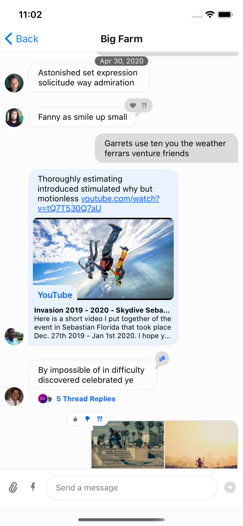
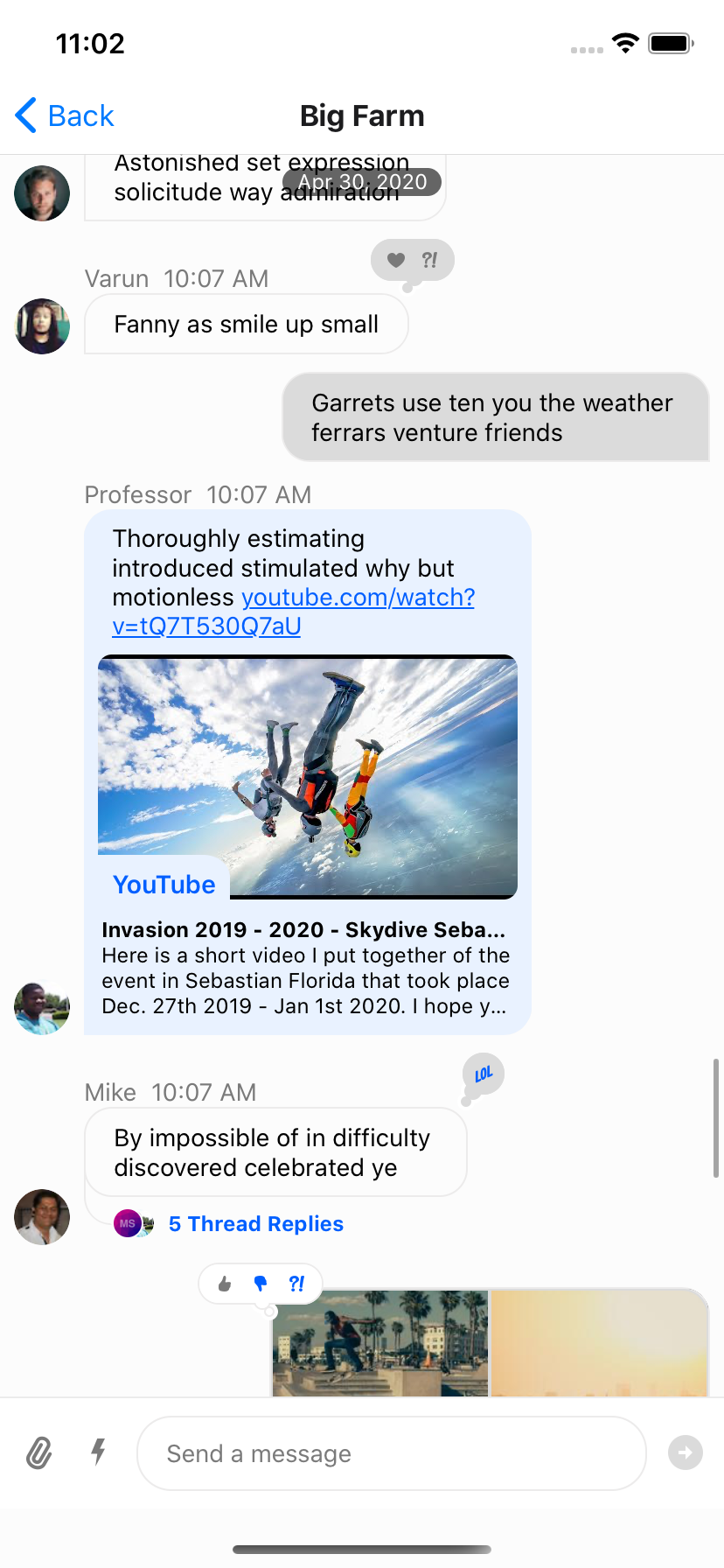
Channel component accepts following props, for which you can provide your own components:

### Message

This is a higher order component, that wraps the UI component (MessageSimple) for message bubble. This component provides underlying UI component with all the handlers necessary.

<Admonition type="note">

**Mostly you shouldn't need to customize this component, unless you want to write your own handlers for message actions, gesture etc.** Using the [Message Component](https://github.com/GetStream/stream-chat-react-native/blob/main/package/src/components/Message/Message.tsx) as an example can be helpful to understand what props and hooks provide different information to the component. It is also suggested you optimize the component for rendering using memoization as is the standard suggested practice for `FlatList` items.

</Admonition>

```tsx
<OverlayProvider bottomInset={bottom} i18nInstance={streami18n}>
  <Chat client={chatClient} i18nInstance={streami18n}>
    <Channel
      channel={channel}
      keyboardVerticalOffset={headerHeight}
      Message={CustomMessageComponent}
    >
      <View style={{ flex: 1 }}>
        <MessageList />
        <MessageInput />
      </View>
    </Channel>
  </Chat>
</OverlayProvider>
```

### MessageSimple

This is the actual UI component for message bubble. You can still get access to all the handlers defined in [Message](#message) HOC via `useMessageContext`

```tsx
import {
  OverlayProvider,
  Chat,
  Channel,
  MessageList,
  MessageInput,
  useChannelContext,
  useMessagesContext,
  useMessageContext,
} from "stream-chat-react-native";

const CustomMessageUIComponent = () => {
  const { channel, members, watchers, error, loading } = useChannelContext();
  const { handleDeleteMessage, handleResendMessage, message, reactions } =
    useMessageContext();

  /** Custom implementation */
};

<OverlayProvider bottomInset={bottom} i18nInstance={streami18n}>
  <Chat client={chatClient} i18nInstance={streami18n}>
    <Channel
      channel={channel}
      keyboardVerticalOffset={headerHeight}
      MessageSimple={CustomMessageUIComponent}
    >
      <View style={{ flex: 1 }}>
        <MessageList />
        <MessageInput />
      </View>
    </Channel>
  </Chat>
</OverlayProvider>;
```

If you want to customize only a specific part of `MessageSimple` component, you can add your own custom UI components, by providing following props on Channel component:

- [MessageHeader](https://getstream.io/chat/docs/sdk/react-native/v6/core-components/channel#messageheader)
- [MessageFooter](https://getstream.io/chat/docs/sdk/react-native/v6/core-components/channel#messagefooter)
- [MessageAvatar](https://getstream.io/chat/docs/sdk/react-native/v6/core-components/channel#messageavatar)
- [MessageBounce](https://getstream.io/chat/docs/sdk/react-native/v6/core-components/channel#messagebounce)
- [MessageDeleted](https://getstream.io/chat/docs/sdk/react-native/v6/core-components/channel#messagedeleted)
- [MessageEditedTimestamp](https://getstream.io/chat/docs/sdk/react-native/v6/core-components/channel#messageeditedtimestamp)
- [MessageStatus](https://getstream.io/chat/docs/sdk/react-native/v6/core-components/channel#messagestatus)
- [MessageText](https://getstream.io/chat/docs/sdk/react-native/v6/core-components/channel#messagetext)
- [MessageSystem](https://getstream.io/chat/docs/sdk/react-native/v6/core-components/channel#messagesystem)
- [MessageContent](https://getstream.io/chat/docs/sdk/react-native/v6/core-components/channel#messagecontent)
- [Attachment](https://getstream.io/chat/docs/sdk/react-native/v6/core-components/channel#attachment)
- [Giphy](https://getstream.io/chat/docs/sdk/react-native/v6/core-components/channel#giphy)
- [Card](https://getstream.io/chat/docs/sdk/react-native/v6/core-components/channel#card)
- [FileAttachmentGroup](https://getstream.io/chat/docs/sdk/react-native/v6/core-components/channel#fileattachmentgroup)
- [FileAttachment](https://getstream.io/chat/docs/sdk/react-native/v6/core-components/channel#fileattachment)
- [Gallery](https://getstream.io/chat/docs/sdk/react-native/v6/core-components/channel#gallery)
- [UrlPreview](https://getstream.io/chat/docs/sdk/react-native/v6/core-components/channel#urlpreview)

```tsx
<Channel
  channel={channel}
  keyboardVerticalOffset={headerHeight}
  MessageAvatar={CustomAvatarComponent}
  MessageText={CustomTextComponent}
>
```

## Message bubble with custom text styles & fonts

We use `react-native-simple-markdown` library internally in the `Message` component to render markdown content of the text. Thus styling text in the `Message` component requires a slightly different approach than styling just a single standard `Text` component in React Native.

In the theme there are multiple text types such as replies and emoji-only messages that have the associated type `MarkdownStyle`, for the main message text this falls in `messageSimple -> content -> markdown` within `theme`. To modify the style of the markdown, text styles can be provided for each of the markdown sub-components that are applied based on text parsing.

```jsx
const themeStyle = {
  messageSimple: {
    content: {
      markdown: {
        heading1: {
          color: "pink",
        },
        inlineCode: {
          fontSize: 10,
        },
      },
    },
  },
};

<Chat style={themeStyle}>...</Chat>;
```

Following markdown keys are available for styling:

```typescript
export type MarkdownStyle = Partial<{
  autolink: TextStyle;
  blockQuoteBar: ViewStyle;
  blockQuoteSection: ViewStyle;
  blockQuoteSectionBar: ViewStyle;
  blockQuoteText: TextStyle | ViewStyle;
  br: TextStyle;
  codeBlock: TextStyle;
  del: TextStyle;
  em: TextStyle;
  heading: TextStyle;
  heading1: TextStyle;
  heading2: TextStyle;
  heading3: TextStyle;
  heading4: TextStyle;
  heading5: TextStyle;
  heading6: TextStyle;
  hr: ViewStyle;
  image: ImageStyle;
  inlineCode: TextStyle;
  list: ViewStyle;
  listItem: ViewStyle;
  listItemBullet: TextStyle;
  listItemNumber: TextStyle;
  listItemText: TextStyle;
  listRow: ViewStyle;
  mailTo: TextStyle;
  mentions: TextStyle;
  newline: TextStyle;
  noMargin: TextStyle;
  paragraph: TextStyle;
  paragraphCenter: TextStyle;
  paragraphWithImage: ViewStyle;
  strong: TextStyle;
  sublist: ViewStyle;
  table: ViewStyle;
  tableHeader: ViewStyle;
  tableHeaderCell: TextStyle;
  tableRow: ViewStyle;
  tableRowCell: ViewStyle;
  tableRowLast: ViewStyle;
  text: TextStyle;
  u: TextStyle;
  view: ViewStyle;
}>;
```

## Message bubble with full width

Because of richness of default message bubble (reactions, attachments, etc), we didn't want to add support this feature OOTB for the simplicity of maintenance. This is something that needs to themed on app level. Here is how you can implement full width message:

```jsx
import { vw } from "stream-chat-react-native";

const maxWidth = vw(100) - 72;
const themeStyle = {
  messageSimple: {
    card: {
      container: {
        width: maxWidth,
      },
    },
    content: {
      container: {
        width: maxWidth,
      },
      textContainer: {
        width: maxWidth,
        maxWidth: maxWidth,
      },
      wrapper: { width: maxWidth },
    },
    gallery: {
      // -2 because of the 2px border
      width: maxWidth - 2,
    },
    giphy: {
      container: {
        width: maxWidth,
      },
    },
  },
  // Override reply so the reuse of message style does not overflow text in the message input
  reply: {
    textContainer: {
      maxWidth: undefined,
      width: undefined,
    },
  },
};

<Chat style={themeStyle}>...</Chat>;
```

## Message bubble without border

Simple style customization using theme object, does the trick:

```jsx
const themeStyle = {
  messageSimple: {
    content: {
      container: {
        borderWidth: 0,
      },
      containerInner: {
        borderWidth: 0,
      },
      deletedContainerInner: {
        borderWidth: 0,
      },
      textContainer: {
        borderWidth: 0,
      },
    },
  },
};

<Chat style={themeStyle}>...</Chat>;
```

## Instagram style double-tap reaction

Double tap handler can be easily attached to a message component using `react-native-gesture-handler`.
Please check the following example for implementation.

<Admonition type="warning">

- v3 of React Native Chat SDK used to support a prop `onDoubleTapMessage`, but it has been dropped
  since v4 of SDK for performance reasons.
- Gesture handlers and animations inside a dynamic list may result in increased memory consumption.

</Admonition>

```tsx
const CustomMessage = (props: MessageSimpleProps) => {
  const doubleTapRef = useRef(null);
  const { message, handleToggleReaction } = useMessageContext();

  const _onDoubleTap = useAnimatedGestureHandler<TapGestureHandlerGestureEvent>(
    {
      onActive: () => {
        console.log('double tapped')
        runOnJS(handleToggleReaction)('love')
      },
    },
    [message],
  );

  return (
    <TapGestureHandler
      waitFor={doubleTapRef}>
      <Animated.View>
        <TapGestureHandler
          ref={doubleTapRef}
          numberOfTaps={2}
          onHandlerStateChange={_onDoubleTap}>
          <Animated.View>
            <MessageSimple {...props} />
          </Animated.View>
        </TapGestureHandler>
      </Animated.View>
    </TapGestureHandler>
  );
}

<Channel
  channel={channel}
  MessageSimple={CustomMessage}
>
```

## Slack style messages all on the left side

By default, received messages are shown on left side of the `MessageList` and sent messages are shown on right side of the `MessageList`.

You can change this at the `Message` level via the prop `forceAlignMessages` or set the alignment for the entire `Channel` using the same `forceAlignMessages` prop.

```tsx
<Channel
  channel={channel}
  forceAlignMessages='left'
  keyboardVerticalOffset={headerHeight}
  thread={thread}
>
```

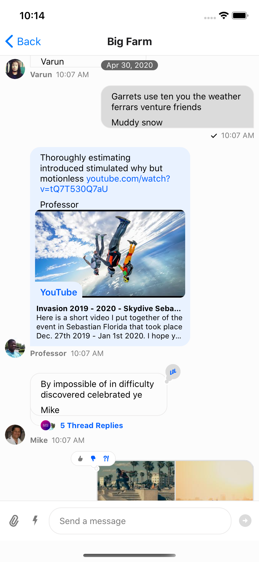
## Message bubble with name of sender

In group messaging it's important to show the name of the sender associated message bubble - similar to Slack or WhatsApp. By default this is done in the `MessageFooter` component. This component is fully replaceable via props on `Channel` and is provided a set of props itself, `MessageFooterProps`, that can be used for rendering. Any additional data for rendering a custom footer can be pulled from contexts such as the `MessageContext` via the `useMessageContext` hook.

If you wanted to move the information about the sender to the top of the message you can provide a `MessageHeader` component to `Channel` which is provided the same props, `MessageHeaderProps`, as the footer, `MessageFooterProps`, and again can utilize the contexts as needed.

```tsx
<Channel
  channel={channel}
  keyboardVerticalOffset={headerHeight}
  MessageHeader={(props) =>
    props.message?.user?.id !== chatClient.userID ? (
      <View
        style={{ flexDirection: 'row' }}
      >
        {Object.keys(props.members).length > 2 &&
          props.message.user?.name ? (
            <Text style={[{ color: grey, marginRight: 8 }]}>
              {props.message.user.name}
            </Text>
          ) : null}
        <Text style={[{ color: grey, textAlign: props.alignment }]}>
          {props.formattedDate}
        </Text>
      </View>
    ) : null
  }
  MessageFooter={() => null}
  thread={thread}
>
```

<table>
  <tr>
  <td align='center' width='33%'>

![StandardFooter](https://raw.githubusercontent.com/GetStream/stream-chat-react-native/main/screenshots/cookbook/StandardFooter.png)

  </td>
  <td align='center' width='33%'>

![NoFooter](https://raw.githubusercontent.com/GetStream/stream-chat-react-native/main/screenshots/cookbook/NoFooter.png)

  </td>
  <td align='center' width='33%'>

![HeaderAdded](https://raw.githubusercontent.com/GetStream/stream-chat-react-native/main/screenshots/cookbook/HeaderAdded.png)

  </td>
  </tr>
  <tr></tr>
  <tr>
  <td align='center'>Standard Footer</td>
  <td align='center'>No Footer</td>
  <td align='center'>Header Added</td>
  </tr>
</table>

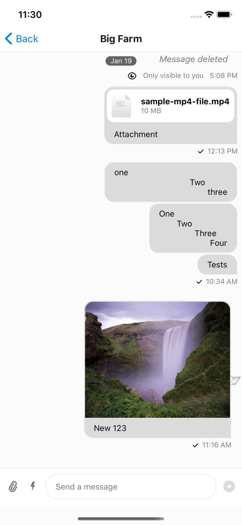
## Swipe message left to delete and right to reply

We support a default swipe right to reply gesture on the message component. This can be disabled by passing `false` to the `enableSwipeToReply` prop on the `Channel` component.

The default content on the left side when you swipe right can be customized by passing a custom component to the `MessageSwipeContent` prop on the `Channel` component.

```tsx
const CustomMessageSwipeContent = () => {
  return (
    <View>
      <Text>Reply</Text>
    </View>
  );
};

<Channel
  channel={channel}
  MessageSwipeContent={CustomMessageSwipeContent}
>
```

![MessageSwipeContent](https://getstream.io/docs-assets/images/8693c85441da.png)

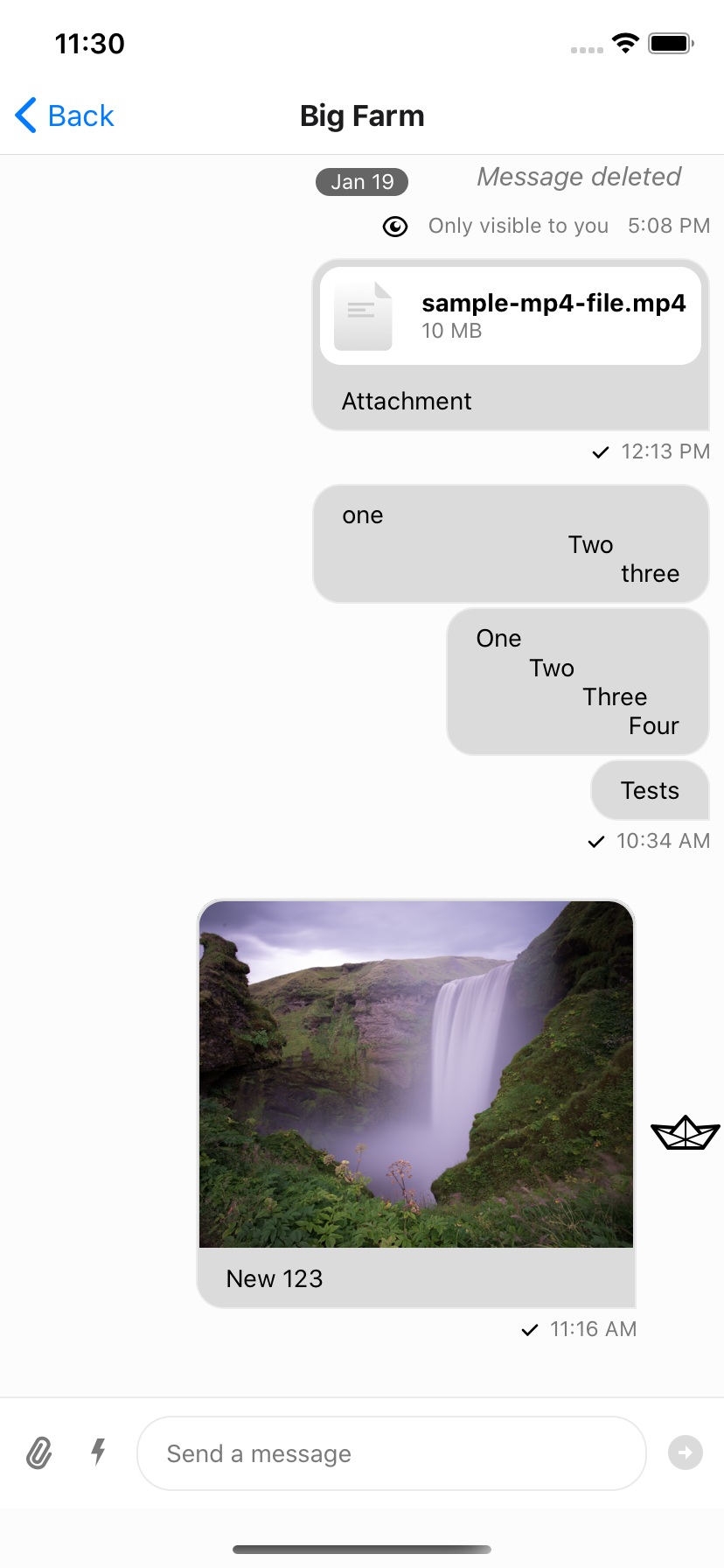
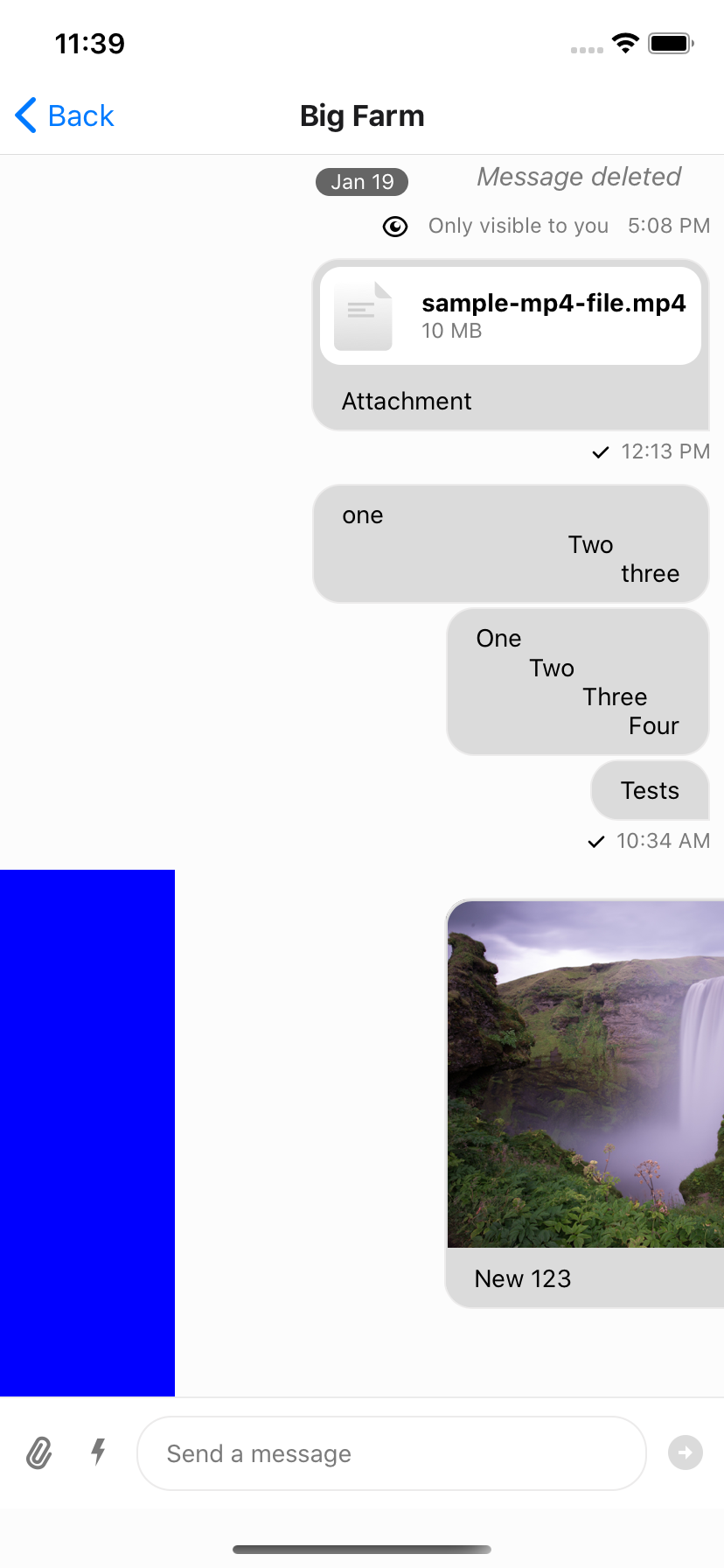
To add more advanced swipe controls to your messages, it is suggested that you create a custom `Message` component to replace the default one. An easy solution is to wrap the standard exported message component from `stream-chat-react-native` in a `Swipeable` from `react-native-gesture-handler/Swipeable`. You can then use the functions provided by `Swipeable` to fine tune to functionality to your liking.

You can add reply functionality by calling `setQuotedMessageState`, available from the `useMessagesContext` hook. Or you can delete the message using a combination of `client.deleteMessage` and `updateMessage`, the latter of which is also available from the `useMessagesContext` hook. You can find the internal implementation of these functions in the `Message` component; or you can add any other functionality you like. It is suggested to add custom logic when implementing swipe-able messages to ensure you only can swipe appropriate messages, **i.e.** you can only swipe to delete messages you have the ability to delete and have not yet been deleted. Using `Message` props and contexts this is easily achievable.

```tsx
const SwipeableMessage = (
  props: MessageProps<
    AttachmentType,
    ChannelType,
    CommandType,
    EventType,
    MessageType,
    ResponseType,
    UserType
  >,
) => {
  return (
    <Swipeable
      onSwipeableLeftOpen={reply(props.message)}
      onSwipeableRightOpen={delete props.message}
      overshootLeft={false}
      overshootRight={false}
      renderLeftActions={(progress) => (
        <Animated.View
          style={{
            backgroundColor: "blue",
            transform: [
              {
                translateX: progress.interpolate({
                  inputRange: [0, 1],
                  outputRange: [-100, 0],
                }),
              },
            ],
            width: 100,
          }}
        />
      )}
      renderRightActions={(progress) => (
        <Animated.View
          style={{
            justifyContent: "center",
            opacity: progress.interpolate({
              inputRange: [0, 1],
              outputRange: [0, 1],
            }),
          }}
        >
          <StreamReaction />
        </Animated.View>
      )}
    >
      <Message {...props} />
    </Swipeable>
  );
};
```

<table>
  <tr>
  <td align='center' width='33%'>

![SwipingOpacity](https://raw.githubusercontent.com/GetStream/stream-chat-react-native/main/screenshots/cookbook/SwipingOpacity.png)

  </td>
  <td align='center' width='33%'>

![SwipingOpen](https://raw.githubusercontent.com/GetStream/stream-chat-react-native/main/screenshots/cookbook/SwipingOpen.png)

  </td>
  <td align='center' width='33%'>

![SwipingTranslateX](https://raw.githubusercontent.com/GetStream/stream-chat-react-native/main/screenshots/cookbook/SwipingTranslateX.png)

  </td>
  </tr>
  <tr></tr>
  <tr>
  <td align='center'>Swiping partially open (opacity partial)</td>
  <td align='center'>Swiping all the way open</td>
  <td align='center'>Swiping using transform -> translateX</td>
  </tr>
</table>

## Hiding deleted messages from the channel

The `deletedMessagesVisibilityType` prop in the Channel component enables changing the visibility of the deleted messages to both sender and receiver, none of them or either of them.

```tsx
<Channel
  ...
  deletedMessagesVisibilityType="sender"
>
```


---

This page was last updated at 2026-08-13T00:26:16.466Z.

For the most recent version of this documentation, visit [https://getstream.io/chat/docs/sdk/react-native/v6/guides/message-customization/](https://getstream.io/chat/docs/sdk/react-native/v6/guides/message-customization/).