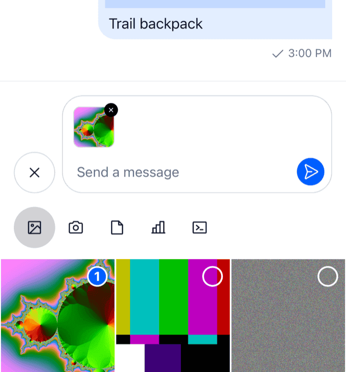
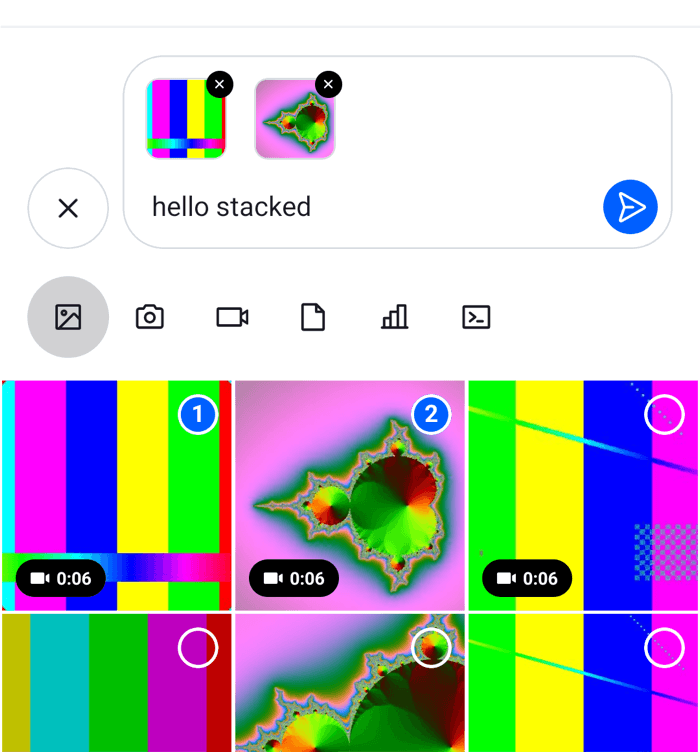
# Attachment previews

The composer shows what a message will carry above the input: each attachment with its upload state, voice recordings and link previews. This UI cookbook replaces those previews, one kind at a time: images and videos as small square thumbnails, the upload progress as a percentage, and voice recordings as a compact row. How attachments are added and uploaded is explained in [Attachments and uploads](https://getstream.io/chat/docs/sdk/react-native/features/rich-content/attachments-and-uploads/#in-the-composer), and where the previews sit in [Message composer UI](https://getstream.io/chat/docs/sdk/react-native/ui/components/message-composer-ui/#previews).

>
> **Note:** **What you'll build**
>
> - Square thumbnails for images and videos
> - Upload progress as a percentage
> - A compact voice recording preview
>

---

**Approach:** Replace one part. [Choosing where to start](https://getstream.io/chat/docs/sdk/react-native/ui-cookbooks/overview/#choosing-where-to-start) explains the approaches.

## Best practices

- Replace one kind of preview through its own override key, such as `ImageAttachmentUploadPreview`. `AttachmentUploadPreviewList` keeps laying out the previews, and the other kinds keep their defaults.
- Replace `VideoAttachmentUploadPreview` together with `ImageAttachmentUploadPreview` when videos should look like images. The default video preview renders the SDK's image preview, not your override.
- To change only how the upload progress looks, override `CircularProgressIndicator`. It draws the progress in every preview and on message attachments that are still uploading.
- Keep the remove and retry buttons working in a preview of your own: call `removeAttachments` and `handleRetry`, which every preview receives.
- Show the upload state only while `usePendingUploadsEnabled()` is `false`, as the default previews do. With pending uploads on, the message is sent while its files upload, and the message list shows the progress.
- To keep the default for some attachments, render the SDK's exported component for them, not the one from `useComponentsContext()`, which returns your override.
- Keep previews small. Images, videos and files share one row that scrolls sideways.

## Default attachment previews

`AttachmentUploadPreviewList` renders one preview per attachment in the composer, picked by the attachment's type. Each preview is an override key:

| Attachment                            | Override key                   | Default                                                                                                  |
| ------------------------------------- | ------------------------------ | -------------------------------------------------------------------------------------------------------- |
| An image                              | `ImageAttachmentUploadPreview` | A 72 by 72 thumbnail, with the upload progress over it and a remove button in the corner                 |
| A video                               | `VideoAttachmentUploadPreview` | The image preview of the video's thumbnail, with the video's duration                                    |
| Any other file                        | `FileAttachmentUploadPreview`  | A row with the file's icon, name, and size or upload progress                                            |
| An audio file                         | `AudioAttachmentUploadPreview` | A player, when an audio package is installed. Without one, the file preview.                             |
| A voice recording                     | `AudioAttachmentUploadPreview` | A player. None with `audioRecordingSendOnComplete`, which sends the recording at once.                   |
| An attachment of a type your app adds | none                           | Nothing. The list has no preview for types it doesn't know; see [Your own types](#your-own-types) below. |

Voice recordings, and audio files when an audio package is installed, are stacked above the others, each in a row of its own. Images, videos and files share one row that scrolls sideways.

Every preview receives the same three props:

- `attachment` is the attachment, with its `localMetadata`: `id`, `file`, `previewUri` (the local file's URI) and `uploadState`, which is `pending`, `uploading`, `finished`, `failed` or `blocked`. An attachment that comes back with a draft or a message being edited has no local file, so its `localMetadata.file` is `undefined`: read the URL from the attachment itself, such as `asset_url` or `image_url`, when the file is missing.
- `removeAttachments(ids)` removes attachments from the composer by their `localMetadata.id`. Removing one that is still uploading cancels its upload.
- `handleRetry(attachment)` uploads a failed attachment again. It does nothing while the composer can't take uploads, for example when uploads are turned off or the attachment limit is reached.

Two more previews are rendered outside the list, by `MessageInputHeaderView`:

- Link previews, as a card for the first link in the text. They have no override key; see [Link previews](#link-previews) below.
- The message being edited or quoted, by `Reply`.

`LocationComposer.setData()` puts a location on the message being written, but the composer shows no preview of it. See [Location sharing](https://getstream.io/chat/docs/sdk/react-native/features/rich-content/location-sharing/#sharing-a-location).

## Square image and video previews

A replacement renders the whole preview. These show images and videos as 48 by 48 thumbnails. They read the SDK's upload state parts from `useComponentsContext()`, so overrides of those parts apply here too:

```tsx title="src/SquareMediaPreviews.tsx"
import { Pressable, StyleSheet, View } from "react-native";
import type { LocalImageAttachment, LocalVideoAttachment } from "stream-chat";
import {
  useComponentsContext,
  usePendingUploadsEnabled,
  useTheme,
} from "stream-chat-react-native";
import type {
  ImageAttachmentUploadPreviewProps,
  UploadAttachmentPreviewProps,
} from "stream-chat-react-native";

type SquarePreviewProps = UploadAttachmentPreviewProps<
  LocalImageAttachment | LocalVideoAttachment
> & {
  isVideo?: boolean;
  uri: string;
};

const SquarePreview = ({
  attachment,
  handleRetry,
  isVideo,
  removeAttachments,
  uri,
}: SquarePreviewProps) => {
  const {
    icons,
    ImageComponent,
    ImageUploadInProgressIndicator,
    ImageUploadNotSupportedIndicator,
    ImageUploadRetryIndicator,
  } = useComponentsContext();
  const pendingUploadsEnabled = usePendingUploadsEnabled();
  const {
    theme: { semantics },
  } = useTheme();
  const { id, previewUri, uploadState } = attachment.localMetadata;

  return (
    <View style={styles.container}>
      <View
        style={[styles.thumbnail, { borderColor: semantics.borderCoreDefault }]}
      >
        <ImageComponent source={{ uri }} style={StyleSheet.absoluteFill} />
        {isVideo ? (
          <icons.Play
            height={16}
            pathFill={semantics.textOnInverse}
            width={16}
          />
        ) : null}
        {!pendingUploadsEnabled && uploadState === "uploading" ? (
          <ImageUploadInProgressIndicator localId={id} sourceUrl={previewUri} />
        ) : null}
        {!pendingUploadsEnabled && uploadState === "failed" ? (
          <ImageUploadRetryIndicator
            onRetryHandler={() => handleRetry(attachment)}
          />
        ) : null}
        {uploadState === "blocked" ? (
          <ImageUploadNotSupportedIndicator />
        ) : null}
      </View>
      <Pressable
        accessibilityLabel="Remove attachment"
        accessibilityRole="button"
        hitSlop={12}
        onPress={() => removeAttachments([id])}
        style={[
          styles.remove,
          { backgroundColor: semantics.controlRemoveControlBg },
        ]}
      >
        <icons.NewClose
          height={12}
          stroke={semantics.controlRemoveControlIcon}
          width={12}
        />
      </Pressable>
    </View>
  );
};

export const SquareImagePreview = (
  props: ImageAttachmentUploadPreviewProps,
) => {
  const { attachment } = props;
  // The local file, or the uploaded image when the composer was restored from a draft or an edit.
  const uri = attachment.localMetadata.previewUri ?? attachment.image_url;

  return uri ? <SquarePreview {...props} uri={uri} /> : null;
};

export const SquareVideoPreview = (
  props: UploadAttachmentPreviewProps<LocalVideoAttachment>,
) => {
  const { FileAttachmentUploadPreview } = useComponentsContext();
  const { thumb_url } = props.attachment;

  // A video without a thumbnail from its picker shows as a file row.
  return thumb_url ? (
    <SquarePreview {...props} isVideo uri={thumb_url} />
  ) : (
    <FileAttachmentUploadPreview {...props} />
  );
};

const styles = StyleSheet.create({
  container: { padding: 4 },
  remove: {
    borderRadius: 10,
    padding: 2,
    position: "absolute",
    right: 0,
    top: 0,
  },
  thumbnail: {
    alignItems: "center",
    borderRadius: 8,
    borderWidth: 1,
    height: 48,
    justifyContent: "center",
    overflow: "hidden",
    width: 48,
  },
});
```

<table>
  <tr>
  <td align='center' width='50%'>

![A composer with a small square thumbnail and a remove button above the attachment picker on iOS](https://getstream.io/docs-assets/images/70145d34794a.png)

  </td>
  <td align='center' width='50%'>

![A composer with a small square thumbnail and a remove button above the attachment picker on Android](https://getstream.io/docs-assets/images/ce086ed8e134.png)

  </td>
  </tr>
</table>

Here is what each part does:

- `ImageUploadInProgressIndicator` covers the thumbnail with the upload progress. It reads the upload from `client.uploadManager` by the attachment's `localMetadata.id`, and renders only while that upload runs and `sourceUrl` is a local file.
- `ImageUploadRetryIndicator` shows after a failed upload, and calls `handleRetry`. `ImageUploadNotSupportedIndicator` marks a file the app's upload settings refused. The SDK removes such a file from the composer right after.
- The video preview uses the thumbnail the picker generated, `thumb_url`. A video without one renders `FileAttachmentUploadPreview`, which is your override when you register one.

`ImageAttachmentUploadPreviewProps`, `FileAttachmentUploadPreviewProps` and `AudioAttachmentUploadPreviewProps` are exported. The video preview's props type and its default component aren't, so the video preview is typed with `UploadAttachmentPreviewProps<LocalVideoAttachment>`, and a video can't fall back to the default video preview. The [Composer UI components reference](https://getstream.io/chat/docs/sdk/react-native/component-reference/message-composer/composer-ui-components/#upload-preview-props) lists the props.

## Upload progress

The previews build their upload state from smaller parts, each an override key. From the most specific to the most general:

| Override key                                                                                      | Shows                                                                                                                                          |
| ------------------------------------------------------------------------------------------------- | ---------------------------------------------------------------------------------------------------------------------------------------------- |
| `CircularProgressIndicator`                                                                       | The progress ring, from `progress`, 0 to 100. Used wherever a progress is known.                                                               |
| `MediaUploadProgressOverlay`                                                                      | The cover over an image or video thumbnail while it uploads: the ring, or a spinner while the progress is unknown                              |
| `AttachmentUploadIndicator`                                                                       | The overlay over thumbnails, and the ring or a spinner on file rows. Renders only while `client.uploadManager` has the upload of a local file. |
| `ImageUploadInProgressIndicator`, `ImageUploadRetryIndicator`, `ImageUploadNotSupportedIndicator` | The upload states of the composer's image and video previews                                                                                   |
| `FileUploadInProgressIndicator`, `FileUploadRetryIndicator`, `FileUploadNotSupportedIndicator`    | The upload states of the composer's file previews. The in-progress part adds "1.2 MB / 3.0 MB" next to the ring.                               |

The first three also show the progress on message attachments when [sending with pending uploads](https://getstream.io/chat/docs/sdk/react-native/features/messaging/sending-with-pending-uploads/#progress-in-the-ui) is on, so an attachment looks the same before and after the user sends it. Pending uploads are off by default, and `Chat` turns them on with `enableOfflineSupport`. While they're on, the composer's previews show no progress and no retry button.

This ring shows the progress as a percentage:

```tsx title="src/UploadPercentRing.tsx"
import { StyleSheet, Text, View } from "react-native";
import type { CircularProgressIndicatorProps } from "stream-chat-react-native";

export const UploadPercentRing = ({
  filledColor,
  progress,
  size = 16,
  style,
  testID,
}: CircularProgressIndicatorProps) => (
  <View
    style={[styles.container, { minHeight: size, minWidth: size }, style]}
    testID={testID}
  >
    <Text style={[styles.percent, { color: filledColor }]}>
      {Math.round(progress)}%
    </Text>
  </View>
);

const styles = StyleSheet.create({
  container: { alignItems: "center", justifyContent: "center" },
  percent: { fontSize: 11, fontVariant: ["tabular-nums"], fontWeight: "600" },
});
```

`size` is 16 on file rows and 28 over thumbnails. While the progress is unknown, the SDK shows a spinner instead of the ring. To replace that too, override `AttachmentUploadIndicator`, as [Sending with pending uploads](https://getstream.io/chat/docs/sdk/react-native/features/messaging/sending-with-pending-uploads/#replacing-the-progress-ui) shows.

The audio and voice recording previews render the SDK's own `File...` indicators, not the ones registered under their keys. A `CircularProgressIndicator` or `AttachmentUploadIndicator` override still reaches them.

## Compact voice recording previews

A voice recording waiting to be sent shows in `AudioAttachmentUploadPreview`, the same key as audio files. This preview shows recordings as a row with their duration, and renders the SDK's player for audio files:

```tsx title="src/CompactVoiceRecordingPreview.tsx"
import { Pressable, StyleSheet, Text, View } from "react-native";
import { isLocalVoiceRecordingAttachment } from "stream-chat";
import {
  AudioAttachmentUploadPreview,
  useComponentsContext,
  usePendingUploadsEnabled,
  useTheme,
} from "stream-chat-react-native";
import type { AudioAttachmentUploadPreviewProps } from "stream-chat-react-native";

const formatDuration = (seconds = 0) => {
  const total = Math.round(seconds);
  return `${Math.floor(total / 60)}:${String(total % 60).padStart(2, "0")}`;
};

export const CompactVoiceRecordingPreview = (
  props: AudioAttachmentUploadPreviewProps,
) => {
  const { attachment, handleRetry, removeAttachments } = props;
  const { icons } = useComponentsContext();
  const pendingUploadsEnabled = usePendingUploadsEnabled();
  const {
    theme: { semantics },
  } = useTheme();

  // Audio files keep the SDK's player.
  if (!isLocalVoiceRecordingAttachment(attachment)) {
    return <AudioAttachmentUploadPreview {...props} />;
  }

  const { id, uploadState } = attachment.localMetadata;

  return (
    <View style={[styles.row, { borderColor: semantics.borderCoreDefault }]}>
      <icons.Mic height={16} stroke={semantics.textSecondary} width={16} />
      <Text style={[styles.label, { color: semantics.textPrimary }]}>
        Voice message, {formatDuration(attachment.custom.duration)}
      </Text>
      {!pendingUploadsEnabled && uploadState === "failed" ? (
        <Pressable
          accessibilityRole="button"
          onPress={() => handleRetry(attachment)}
        >
          <Text style={{ color: semantics.textLink }}>Retry</Text>
        </Pressable>
      ) : null}
      <Pressable
        accessibilityLabel="Remove voice message"
        accessibilityRole="button"
        hitSlop={12}
        onPress={() => removeAttachments([id])}
      >
        <icons.NewClose
          height={16}
          stroke={semantics.textSecondary}
          width={16}
        />
      </Pressable>
    </View>
  );
};

const styles = StyleSheet.create({
  label: { flex: 1 },
  row: {
    alignItems: "center",
    borderRadius: 12,
    borderWidth: 1,
    flexDirection: "row",
    gap: 8,
    marginVertical: 4,
    padding: 8,
  },
});
```

The recording's duration is in seconds, in `attachment.custom.duration`. The row has no player, so the user can't listen to the recording before sending it. Voice recording is off until `Channel` and `Thread` get `audioRecordingEnabled`. [Voice recordings and audio playback](https://getstream.io/chat/docs/sdk/react-native/features/rich-content/voice-recordings-and-audio-playback/) covers recording and the players.

## Link previews

The composer's link previews have no override key, and the list that renders them isn't exported. `MessageInputHeaderView` renders them after the attachment previews, so a replacement of it renders the quoted or edited message and `AttachmentUploadPreviewList` too. [Link previews](https://getstream.io/chat/docs/sdk/react-native/features/rich-content/link-previews/#replace-the-previews-in-the-composer) has a complete header that reads the previews from `linkPreviewsManager.state`.

## Your own types

`AttachmentUploadPreviewList` renders nothing for an attachment whose type it doesn't know, so an attachment of your own in `messageComposer.attachmentManager` has no preview there. The attachment manager does send it: an attachment with nothing to upload, which has `localMetadata: { id }` and no `file` or `uploadState`, goes into the message with the other attachments, and the composer counts it as content. [Adding and removing attachments](https://getstream.io/chat/docs/sdk/react-native/state/writing-messages/attachments/#adding-and-removing-attachments) explains it. So a preview of your own reads the attachment from `useAttachmentManagerState()` and renders it above the input, in a replacement of `MessageInputHeaderView`, as the [Custom attachments UI cookbook](https://getstream.io/chat/docs/sdk/react-native/ui-cookbooks/custom-attachments/product-card/#keeping-the-product-in-the-attachment-manager) does for its product, and the [GIF picker UI cookbook](https://getstream.io/chat/docs/sdk/react-native/ui-cookbooks/composer/gif-picker/#the-gif-above-the-input) for a GIF.

## Register the previews

Register the previews and the ring with `WithComponents`, declared once at module scope:

```tsx title="src/ChannelScreen.tsx"
import type { Channel as StreamChannel } from "stream-chat";
import {
  Channel,
  MessageComposer,
  MessageList,
  WithComponents,
} from "stream-chat-react-native";
import type { ComponentOverrides } from "stream-chat-react-native";
import { CompactVoiceRecordingPreview } from "./CompactVoiceRecordingPreview";
import { SquareImagePreview, SquareVideoPreview } from "./SquareMediaPreviews";
import { UploadPercentRing } from "./UploadPercentRing";

const overrides: ComponentOverrides = {
  AudioAttachmentUploadPreview: CompactVoiceRecordingPreview,
  CircularProgressIndicator: UploadPercentRing,
  ImageAttachmentUploadPreview: SquareImagePreview,
  VideoAttachmentUploadPreview: SquareVideoPreview,
};

export const ChannelScreen = ({ channel }: { channel: StreamChannel }) => (
  <WithComponents overrides={overrides}>
    <Channel audioRecordingEnabled channel={channel}>
      <MessageList />
      <MessageComposer />
    </Channel>
  </WithComponents>
);
```

The list and the previews read the composer from `useMessageComposer()`, so they work in a channel, in a thread and while a message is being edited. Wrap the thread screen in the same `WithComponents`, or register the overrides once around your navigator. [Overriding components](https://getstream.io/chat/docs/sdk/react-native/ui/components/overriding-components/) explains how overrides apply.

## Related

- To change the whole composer row around the previews, see the [Custom composer UI cookbook](https://getstream.io/chat/docs/sdk/react-native/ui-cookbooks/composer/custom-composer/).
- To compress files before they upload, see the [File compression UI cookbook](https://getstream.io/chat/docs/sdk/react-native/ui-cookbooks/composer/file-compression/).
- To render an attachment type of your own in the message list, see the [Custom attachments UI cookbook](https://getstream.io/chat/docs/sdk/react-native/ui-cookbooks/custom-attachments/product-card/).

---

For the most recent version of this documentation, visit [https://getstream.io/chat/docs/sdk/react-native/ui-cookbooks/composer/attachment-previews/](https://getstream.io/chat/docs/sdk/react-native/ui-cookbooks/composer/attachment-previews/).