# Custom Message UI

## Overview

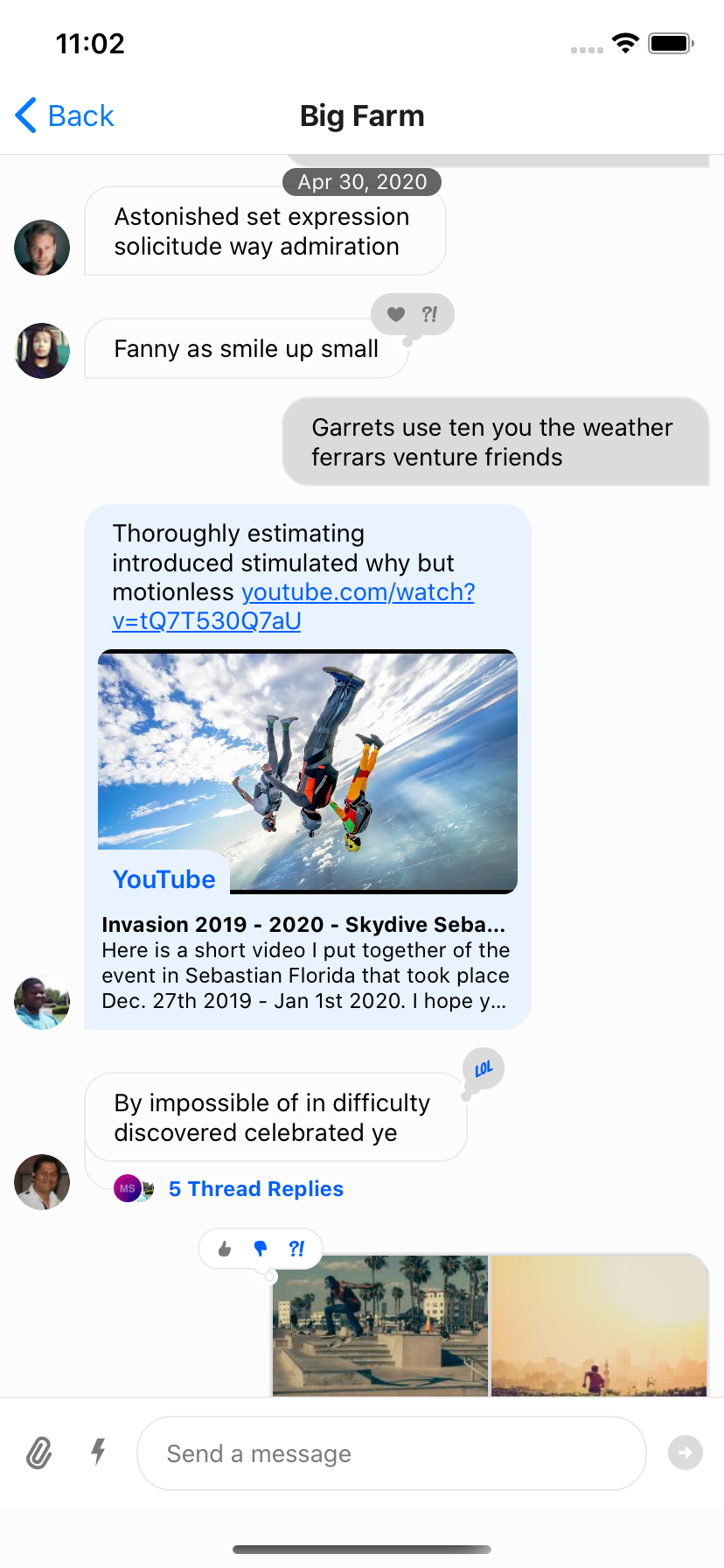
You can override message components using the `WithComponents` wrapper. It accepts an `overrides` prop — an object mapping component names to your custom implementations. `WithComponents` can wrap any part of the tree (including `Channel`) and supports nesting — inner overrides merge over outer ones (closest wins).

## Best Practices

- Prefer theming or subcomponent overrides before replacing `MessageItemView`.
- Keep custom message components memoized to protect `FlatList` performance.
- Use `useMessageContext` for per-message data and handlers instead of prop drilling.
- Override only the pieces you need (e.g., `MessageText`, `MessageAuthor`) to reduce surface area.
- Test with reactions, attachments, and threads to confirm layout consistency.

### Message

This higher-order component wraps the UI component (`MessageItemView`) and provides handlers.

<Admonition type="note">

**You usually don't need to customize this unless you want custom handlers for actions/gestures.** Use the [Message component](https://github.com/GetStream/stream-chat-react-native/blob/main/package/src/components/Message/Message.tsx) as a reference, and memoize for `FlatList` performance.

</Admonition>

```tsx
import { WithComponents } from "stream-chat-react-native";

<OverlayProvider i18nInstance={streami18n}>
  <Chat client={chatClient} i18nInstance={streami18n}>
    <WithComponents overrides={{ Message: CustomMessageComponent }}>
      <Channel
        bottomInset={bottom}
        channel={channel}
        keyboardVerticalOffset={headerHeight}
        topInset={headerHeight}
      >
        <View style={{ flex: 1 }}>
          <MessageList />
          <MessageComposer />
        </View>
      </Channel>
    </WithComponents>
  </Chat>
</OverlayProvider>;
```

### MessageItemView

This is the actual message row UI. You can access handlers from the [Message](#message) higher-order component via `useMessageContext`.

```tsx
import {
  OverlayProvider,
  Chat,
  Channel,
  MessageList,
  MessageComposer,
  WithComponents,
  useChannelContext,
  useMessagesContext,
  useMessageContext,
} from "stream-chat-react-native";

const CustomMessageUIComponent = () => {
  const { channel, members, watchers, error, loading } = useChannelContext();
  const { handleDelete, handleRetry } = useMessagesContext();
  const { message, reactions } = useMessageContext();

  /** Custom implementation */
};

<OverlayProvider i18nInstance={streami18n}>
  <Chat client={chatClient} i18nInstance={streami18n}>
    <WithComponents overrides={{ MessageItemView: CustomMessageUIComponent }}>
      <Channel
        bottomInset={bottom}
        channel={channel}
        keyboardVerticalOffset={headerHeight}
        topInset={headerHeight}
      >
        <View style={{ flex: 1 }}>
          <MessageList />
          <MessageComposer />
        </View>
      </Channel>
    </WithComponents>
  </Chat>
</OverlayProvider>;
```

If your custom row changes the bubble structure and still uses the built-in long-press overlay, read `contextMenuAnchorRef` from `useMessageContext()` and attach it to the subview that should anchor the context menu's top and bottom overlay items.

To customize specific parts of `MessageItemView`, pass the corresponding overrides via `WithComponents`:

- [MessageHeader](https://getstream.io/chat/docs/sdk/react-native/ui-components/message-header/)
- [MessageFooter](https://getstream.io/chat/docs/sdk/react-native/ui-components/message-footer/)
- [MessageAuthor](https://getstream.io/chat/docs/sdk/react-native/ui-components/message-author/)
- [MessageBounce](https://getstream.io/chat/docs/sdk/react-native/ui-components/message-bounce/)
- [MessageDeleted](https://getstream.io/chat/docs/sdk/react-native/ui-components/message-deleted/)
- [MessageStatus](https://getstream.io/chat/docs/sdk/react-native/ui-components/message-status/)
- [MessageText](https://getstream.io/chat/docs/sdk/react-native/core-components/channel/)
- [MessageSystem](https://getstream.io/chat/docs/sdk/react-native/ui-components/message-system/)
- [MessageContent](https://getstream.io/chat/docs/sdk/react-native/ui-components/message-content/)
- [MessageContentTopView](https://getstream.io/chat/docs/sdk/react-native/ui-components/message-content-top-view/)
- [MessageContentBottomView](https://getstream.io/chat/docs/sdk/react-native/ui-components/message-content-bottom-view/)
- [MessageContentLeadingView](https://getstream.io/chat/docs/sdk/react-native/ui-components/message-content-leading-view/)
- [MessageContentTrailingView](https://getstream.io/chat/docs/sdk/react-native/ui-components/message-content-trailing-view/)
- [Attachment](https://getstream.io/chat/docs/sdk/react-native/ui-components/attachment/)
- [Giphy](https://getstream.io/chat/docs/sdk/react-native/ui-components/giphy/)
- [FileAttachmentGroup](https://getstream.io/chat/docs/sdk/react-native/ui-components/file-attachment-group/)
- [FileAttachment](https://getstream.io/chat/docs/sdk/react-native/ui-components/file-attachment/)
- [Gallery](https://getstream.io/chat/docs/sdk/react-native/ui-components/gallery/)
- [MessageSpacer](https://getstream.io/chat/docs/sdk/react-native/ui-components/message-spacer/)
- [UrlPreview](https://getstream.io/chat/docs/sdk/react-native/ui-components/url-preview/)

```tsx
<WithComponents
  overrides={{
    MessageAuthor: CustomAuthorComponent,
    MessageText: CustomTextComponent,
  }}
>
  <Channel
    channel={channel}
    keyboardVerticalOffset={headerHeight}
    topInset={headerHeight}
  >
    {/** MessageList and MessageComposer components */}
  </Channel>
</WithComponents>
```

## Lightweight row spacing with MessageSpacer

If you only need layout space around the message row, prefer `MessageSpacer` over replacing the full `MessageItemView`.

`MessageSpacer` is prop-less and renders nothing by default. If your custom spacer needs message state such as alignment, use `useMessageContext()`.

```tsx
import { WithComponents, useMessageContext } from "stream-chat-react-native";
import { View } from "react-native";

const CustomMessageSpacer = () => {
  const { alignment } = useMessageContext();

  return <View style={{ flex: alignment === "left" ? 1 : 0.25 }} />;
};

<WithComponents overrides={{ MessageSpacer: CustomMessageSpacer }}>
  <Channel channel={channel}>
    {/** MessageList and MessageComposer components */}
  </Channel>
</WithComponents>;
```

## Lightweight decoration around MessageContent

If you only need UI around the existing message body, prefer `MessageContentTopView`, `MessageContentBottomView`, `MessageContentLeadingView`, and `MessageContentTrailingView` over replacing `MessageContent` or the full `MessageItemView`.

These slots are prop-less and render nothing unless you provide them. If you need message state such as `alignment`, `message`, or `isMyMessage`, use `useMessageContext()` inside the component. `Leading` and `Trailing` only add the horizontal wrapper when at least one of those overrides is set.

```tsx
import { WithComponents, useMessageContext } from "stream-chat-react-native";
import { Text, View } from "react-native";

const CustomContentTopView = () => {
  const { isMyMessage } = useMessageContext();

  return isMyMessage ? null : <Text>Incoming</Text>;
};

const CustomContentBottomView = () => {
  const { message } = useMessageContext();

  return message.pinned ? <Text>Pinned</Text> : null;
};

const CustomContentLeadingView = () => {
  const { alignment } = useMessageContext();

  return <View style={{ width: alignment === "left" ? 8 : 0 }} />;
};

const CustomContentTrailingView = () => {
  const { alignment } = useMessageContext();

  return <View style={{ width: alignment === "right" ? 8 : 0 }} />;
};

<WithComponents
  overrides={{
    MessageContentTopView: CustomContentTopView,
    MessageContentBottomView: CustomContentBottomView,
    MessageContentLeadingView: CustomContentLeadingView,
    MessageContentTrailingView: CustomContentTrailingView,
  }}
>
  <Channel channel={channel}>
    {/** MessageList and MessageComposer components */}
  </Channel>
</WithComponents>;
```

## Message bubble with custom text styles & fonts

We use `react-native-markdown-package` in `Message` to render markdown, so styling differs from a plain `Text` component.

Theme styles for markdown live under `messageItemView -> content -> markdown`. You can override individual markdown sub-component styles.

```tsx
const themeStyle = {
  messageItemView: {
    content: {
      markdown: {
        heading1: {
          color: "pink",
        },
        inlineCode: {
          fontSize: 10,
        },
      },
    },
  },
};

<Chat style={themeStyle}>...</Chat>;
```

Markdown keys available for styling:

```typescript
export type MarkdownStyle = Partial<{
  autolink: TextStyle;
  blockQuoteBar: ViewStyle;
  blockQuoteSection: ViewStyle;
  blockQuoteSectionBar: ViewStyle;
  blockQuoteText: TextStyle | ViewStyle;
  br: TextStyle;
  codeBlock: TextStyle;
  del: TextStyle;
  em: TextStyle;
  heading: TextStyle;
  heading1: TextStyle;
  heading2: TextStyle;
  heading3: TextStyle;
  heading4: TextStyle;
  heading5: TextStyle;
  heading6: TextStyle;
  hr: ViewStyle;
  image: ImageStyle;
  inlineCode: TextStyle;
  list: ViewStyle;
  listItem: ViewStyle;
  listItemBullet: TextStyle;
  listItemNumber: TextStyle;
  listItemText: TextStyle;
  listRow: ViewStyle;
  mailTo: TextStyle;
  mentions: TextStyle; // base style for all rendered mention tokens; see note below for per-type colors
  newline: TextStyle;
  noMargin: TextStyle;
  paragraph: TextStyle;
  paragraphCenter: TextStyle;
  paragraphWithImage: ViewStyle;
  strong: TextStyle;
  sublist: ViewStyle;
  table: ViewStyle;
  tableHeader: ViewStyle;
  tableHeaderCell: TextStyle;
  tableRow: ViewStyle;
  tableRowCell: ViewStyle;
  tableRowLast: ViewStyle;
  text: TextStyle;
  u: TextStyle;
  view: ViewStyle;
}>;
```

The `mentions` markdown style covers every mention type with a single set of properties. To color `@channel` / `@here`, role, and group mentions independently, override the per-type semantic color tokens (`chatTextMentionUser`, `chatTextMentionBroadcast`, `chatTextMentionRole`, `chatTextMentionGroup`). See [Theming rendered mention text](https://getstream.io/chat/docs/sdk/react-native/guides/customize-autocomplete-suggestion-list/#theming-rendered-mention-text) in the autocomplete-suggestions cookbook for the full token list.

## Message bubble with full width

Because the default bubble is complex (reactions, attachments, etc.), full-width bubbles are not supported out of the box. You can theme them at the app level:

```tsx
import { useViewport } from "stream-chat-react-native";

const FullWidthBubbleProvider = ({ children }) => {
  const { vw } = useViewport();
  const maxWidth = vw(100) - 72;

  const themeStyle = {
    messageItemView: {
      card: {
        container: {
          width: maxWidth,
        },
      },
      content: {
        container: {
          width: maxWidth,
        },
        textContainer: {
          width: maxWidth,
          maxWidth: maxWidth,
        },
        wrapper: { width: maxWidth },
      },
      gallery: {
        // -2 because of the 2px border
        width: maxWidth - 2,
      },
      giphy: {
        container: {
          width: maxWidth,
        },
      },
    },
    // Override reply so the reuse of message style does not overflow text in the message input
    reply: {
      textContainer: {
        maxWidth: undefined,
        width: undefined,
      },
    },
  };

  return <Chat style={themeStyle}>{children}</Chat>;
};
```

## Message bubble without border

Simple style customization using theme object, does the trick:

```tsx
const themeStyle = {
  messageItemView: {
    content: {
      container: {
        borderWidth: 0,
      },
      containerInner: {
        borderWidth: 0,
      },
      deletedContainerInner: {
        borderWidth: 0,
      },
      textContainer: {
        borderWidth: 0,
      },
    },
  },
};

<Chat style={themeStyle}>...</Chat>;
```

## Instagram style double-tap reaction

Double tap handler can be easily attached to a message component using `react-native-gesture-handler`.
Please check the following example for implementation.

```tsx
import { useMemo } from "react";
import { Gesture, GestureDetector } from "react-native-gesture-handler";
import { runOnJS } from "react-native-reanimated";
import {
  MessageItemView,
  type MessageItemViewProps,
  WithComponents,
  useMessageContext,
} from "stream-chat-react-native";

const CustomMessage = (props: MessageItemViewProps) => {
  const { handleToggleReaction } = useMessageContext();

  const doubleTap = useMemo(
    () =>
      Gesture.Tap()
        .numberOfTaps(2)
        .maxDistance(8)
        .onEnd((_event, success) => {
          if (!success) return;
          runOnJS(handleToggleReaction)("love");
        }),
    [handleToggleReaction],
  );

  return (
    <GestureDetector gesture={doubleTap}>
      <MessageItemView {...props} />
    </GestureDetector>
  );
};

<WithComponents overrides={{ MessageItemView: CustomMessage }}>
  <Channel channel={channel}>
    {/** MessageList and MessageComposer components */}
  </Channel>
</WithComponents>;
```

## Slack style messages all on the left side

By default, received messages are shown on left side of the `MessageList` and sent messages are shown on right side of the `MessageList`.

You can change this at the `Message` level via the prop `forceAlignMessages` or set the alignment for the entire `Channel` using the same `forceAlignMessages` prop.

```tsx
<Channel
  channel={channel}
  forceAlignMessages="left"
  keyboardVerticalOffset={headerHeight}
  topInset={headerHeight}
  thread={thread}
>
  {/** MessageList and MessageComposer components */}
</Channel>
```

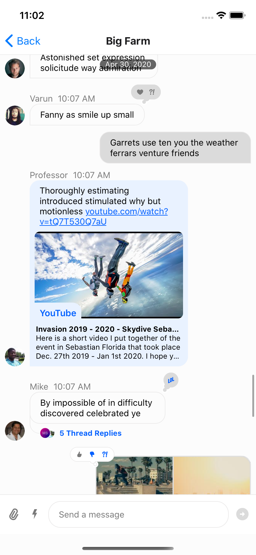
## Message bubble with name of sender

In group messaging it's important to show the name of the sender associated message bubble - similar to Slack or WhatsApp. By default this is done in the `MessageFooter` component. This component is fully replaceable via `WithComponents` and is provided a set of props itself, `MessageFooterProps`, that can be used for rendering. Any additional data for rendering a custom footer can be pulled from contexts such as the `MessageContext` via the `useMessageContext` hook.

If you wanted to move the information about the sender to the top of the message you can provide a `MessageHeader` override via `WithComponents`. In v9, `MessageHeader` no longer receives the old footer-style prop bag from `MessageItemView`, so custom headers should read the data they need from `useMessageContext()` and `useComponentsContext()`.

```tsx
import {
  WithComponents,
  useChatContext,
  useComponentsContext,
  useMessageContext,
} from "stream-chat-react-native";
import { Text, View } from "react-native";

const metaTextColor = "#6B7280";

const SenderNameHeader = () => {
  const { client } = useChatContext();
  const { alignment, members, message } = useMessageContext();
  const { MessageTimestamp } = useComponentsContext();

  if (message?.user?.id === client.userID) {
    return null;
  }

  return (
    <View
      style={{
        flexDirection: "row",
        alignItems: "center",
        alignSelf: alignment === "left" ? "flex-start" : "flex-end",
      }}
    >
      {Object.keys(members).length > 2 && message?.user?.name ? (
        <Text style={[{ color: metaTextColor, marginRight: 8 }]}>
          {message.user.name}
        </Text>
      ) : null}
      <MessageTimestamp timestamp={message?.created_at} />
    </View>
  );
};

<WithComponents
  overrides={{
    MessageHeader: SenderNameHeader,
    MessageFooter: () => null,
  }}
>
  <Channel
    channel={channel}
    keyboardVerticalOffset={headerHeight}
    topInset={headerHeight}
    thread={thread}
  >
    {/** MessageList and MessageComposer components */}
  </Channel>
</WithComponents>;
```

<table>
  <tr>
  <td align='center' width='33%'>

![StandardFooter](https://getstream.io/docs-assets/images/72fcc43e2e7f.png)

  </td>
  <td align='center' width='33%'>

![NoFooter](https://getstream.io/docs-assets/images/0768109347d1.png)

  </td>
  <td align='center' width='33%'>

![HeaderAdded](https://getstream.io/docs-assets/images/ea8145032805.png)

  </td>
  </tr>
  <tr></tr>
  <tr>
  <td align='center'>Standard Footer</td>
  <td align='center'>No Footer</td>
  <td align='center'>Header Added</td>
  </tr>
</table>

## Swipe message left to delete and right to reply

We support a default swipe right to reply gesture on the full message row rendered by `MessageItemView`. This can be disabled by passing `false` to the `enableSwipeToReply` prop on the `Channel` component.

The default content on the left side when you swipe right can be customized by providing a `MessageSwipeContent` override via `WithComponents`.

```tsx
const CustomMessageSwipeContent = () => {
  return (
    <View>
      <Text>Reply</Text>
    </View>
  );
};

<WithComponents overrides={{ MessageSwipeContent: CustomMessageSwipeContent }}>
  <Channel channel={channel}>
    {/** MessageList and MessageComposer components */}
  </Channel>
</WithComponents>;
```

![MessageSwipeContent](https://getstream.io/docs-assets/images/2822e416207f.png)

If you were previously customizing `MessageContent` or `MessageBubble` and referencing `messageContentWidth` or `setMessageContentWidth`, remove that logic. Those width-tracking props are no longer part of the message rendering stack.

To add more advanced swipe controls to your messages, it is suggested that you create a custom `Message` component to replace the default one. An easy solution is to wrap the standard exported message component from `stream-chat-react-native` in `ReanimatedSwipeable` from `react-native-gesture-handler/ReanimatedSwipeable`. Its action renderers receive Reanimated shared values, which you can use to drive custom swipe animations.

You can add reply functionality by calling `setQuotedMessage`, available from the `useMessageComposerAPIContext` hook. Or you can delete the message using `client.deleteMessage`. You can find the internal implementation of these functions in the `Message` component; or you can add any other functionality you like. It is suggested to add custom logic when implementing swipeable messages to ensure you only can swipe appropriate messages, **i.e.** you can only swipe to delete messages you have the ability to delete and have not yet been deleted. Using `Message` props and contexts this is easily achievable.

```tsx
import { useCallback } from "react";
import { Text } from "react-native";
import { Pressable } from "react-native-gesture-handler";
import ReanimatedSwipeable from "react-native-gesture-handler/ReanimatedSwipeable";
import Animated, {
  Extrapolation,
  SharedValue,
  interpolate,
  useAnimatedStyle,
} from "react-native-reanimated";
import {
  Message,
  MessageProps,
  useChatContext,
  useMessageComposerAPIContext,
} from "stream-chat-react-native";

const ReplyAction = ({
  onPress,
  translation,
}: {
  onPress: () => void;
  translation: SharedValue<number>;
}) => {
  const animatedStyle = useAnimatedStyle(() => ({
    justifyContent: "center",
    transform: [
      {
        translateX: interpolate(
          translation.value,
          [0, 100],
          [-100, 0],
          Extrapolation.CLAMP,
        ),
      },
    ],
    width: 100,
  }));

  return (
    <Animated.View style={animatedStyle}>
      <Pressable onPress={onPress}>
        <Text>Reply</Text>
      </Pressable>
    </Animated.View>
  );
};

const DeleteAction = ({
  onPress,
  translation,
}: {
  onPress: () => Promise<void>;
  translation: SharedValue<number>;
}) => {
  const animatedStyle = useAnimatedStyle(() => ({
    justifyContent: "center",
    opacity: interpolate(
      -translation.value,
      [0, 100],
      [0, 1],
      Extrapolation.CLAMP,
    ),
    width: 100,
  }));

  return (
    <Animated.View style={animatedStyle}>
      <Pressable
        onPress={() => {
          void onPress();
        }}
      >
        <Text>Delete</Text>
      </Pressable>
    </Animated.View>
  );
};

const SwipeableMessage = (props: MessageProps) => {
  const { client } = useChatContext();
  const { setQuotedMessage } = useMessageComposerAPIContext();

  const handleReply = useCallback(() => {
    setQuotedMessage(props.message);
  }, [props.message, setQuotedMessage]);

  const handleDelete = useCallback(async () => {
    if (!props.message.id) return;
    await client.deleteMessage(props.message.id);
  }, [client, props.message.id]);

  const renderLeftActions = useCallback(
    (_progress: SharedValue<number>, translation: SharedValue<number>) => (
      <ReplyAction onPress={handleReply} translation={translation} />
    ),
    [handleReply],
  );

  const renderRightActions = useCallback(
    (_progress: SharedValue<number>, translation: SharedValue<number>) => (
      <DeleteAction onPress={handleDelete} translation={translation} />
    ),
    [handleDelete],
  );

  return (
    <ReanimatedSwipeable
      overshootLeft={false}
      overshootRight={false}
      renderLeftActions={renderLeftActions}
      renderRightActions={renderRightActions}
    >
      <Message {...props} />
    </ReanimatedSwipeable>
  );
};
```

## Deleted messages

Deleted messages are always included in the message list. The SDK renders them using the [`MessageDeleted`](https://getstream.io/chat/docs/sdk/react-native/ui-components/message-deleted/) component, which you can override via `WithComponents`.


---

This page was last updated at 2026-08-11T17:19:14.307Z.

For the most recent version of this documentation, visit [https://getstream.io/chat/docs/sdk/react-native/guides/message-customization/](https://getstream.io/chat/docs/sdk/react-native/guides/message-customization/).