Android Chat Messaging Tutorial
How to build Android In-App Chat with Jetpack Compose


This tutorial teaches you how to build in-app chat or messaging with Jetpack Compose & Stream's edge network.
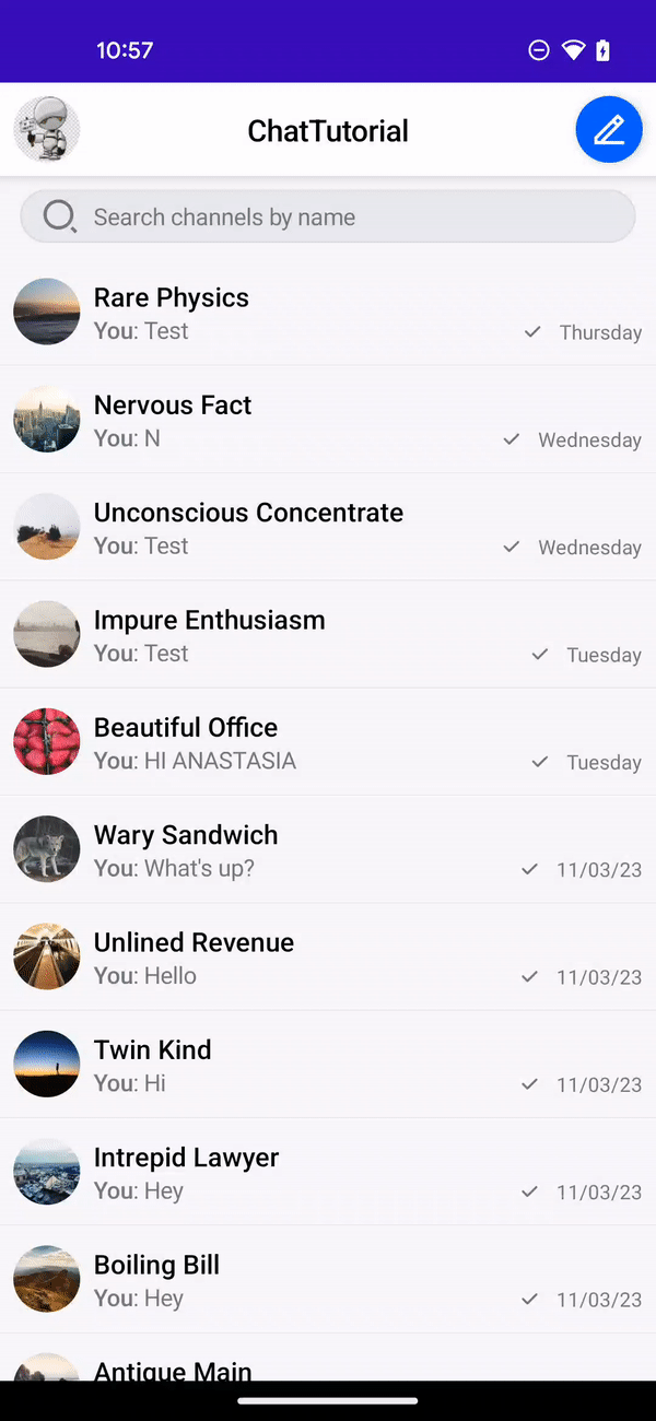
On the right you see a GIF of how the end result will look, a sample app is also available on our repo.
This chat tutorial uses Stream's edge network for optimal performance. For hobby projects and small companies we provide a free maker plan.
In case you can't use Compose yet in your app, there's also an XML Android chat tutorial available Let's get started with the tutorial and see how quickly you can build chat for your app.
Main Features
Confused about "Main Features"?
Let us know how we can improve our documentation:
These are the main features that our chat app will have:
- Channel List: Browse channels and perform actions such as search and swipe-to-delete.
- Message Composer: Customizable and expandable with bespoke implementation.
- Message Reactions: Ready-made and easily configurable.
- Offline Support: Browse channels and send messages while offline
- Customizable Components: Build quickly with customizable and swappable building blocks
Installation
Confused about "Installation"?
Let us know how we can improve our documentation:
Create a New Android Studio Project
To get started with the Jetpack Compose version of the Android Chat SDK, open Android Studio (Giraffe or newer) and create a new project.
- Select the
Empty Activitytemplate - Name the project
ChatTutorial - Set the package name to
com.example.chattutorial

Once you create and load the project, you need to add appropriate dependencies for Jetpack Compose. Our SDKs are available from MavenCentral.
Let's add the Stream Chat Compose SDK to the project's dependencies.
For the tutorial we will add offline support by adding the stream-chat-android-offline plugin dependency.
You'll also add a dependency on material-icons-extended, as you'll use an icon provided there for customization in later steps.
Open up the app module's build.gradle.kts (or build.gradle if you are using older style Groovy DSL) file and add the following three dependencies:
The Compose Chat SDK requires compileSdk version to be set to 34 or higher. Android Studio version Hedgehog or newer will set 34+ automatically for new projects. You can verify the compileSdk version in build.graddle in your project folder (usually named app):
To simplify the process of trying out the sample code you can also copy the following imports into your MainActivity.kt:
You now have an empty project for your chat app with the Stream Jetpack Compose Chat SDK as a dependency. Let's get started by creating the chat client.
Client setup
Confused about "Client setup"?
Let us know how we can improve our documentation:
Step 1: Setup the ChatClient
First, we need to setup the ChatClient. For this, go to the created MainActivity.kt file and add the following code inside the onCreate() function:
- You create a
StreamOfflinePluginFactoryto provide offline support. The OfflinePlugin class employs a new caching mechanism powered by side-effects we applied to ChatClient functions. - You create a connection to Stream by initializing the
ChatClientusing an API key. This key points to a tutorial environment, but you can sign up for a free Chat trial to get your own later. - Next, we add the
offlinePluginFactoryto theChatClientwithwithPluginmethod for providing offline storage capabilities. For a production app, we recommend initializing thisChatClientin yourApplicationclass.
Step 2: Connect the User
As a next step we're going to connect a user to the chat. The following example will demonstrate the authentication of a user using a JWT token. It's also possible to have anonymous or guest users. For a comprehensive understanding of connecting and authenticating users, refer to the auth & connect docs. In this instance, a harcoded JWT token is employed. In a production application, the JWT token is generally supplied as part of your backend's login and registration endpoints.
Here's our connectUser implementation that authenticates the user. You should call this method right after the setup of the client instance.
- You create a
Userinstance and pass it to theChatClient'sconnectUsermethod, along with a pre-generated user token, in order to authenticate the user. In a real-world application, your authentication backend would generate such a token at login / signup and hand it over to the mobile app. For more information, see the Tokens & Authentication page. - The
connectUser.enqueue()is an asychronous function with a result callback, in Kotlin you can also take advantage of suspending function by usingawait()instead. It is also possible to execute the function synchronously withexecute(). This is explained in more detail in our Calls section.
Presenting a channel list
Confused about "Presenting a channel list"?
Let us know how we can improve our documentation:
There are 2 ways you can build the UI for the channel list
- Stream's low level API. You can build custom UI on top of this state layer
- Or you can use some of our pre-made UI components. Most customers end up mixing and matching between these 2 approaches to meet their design requirements
Let's try how the ChannelsScreen can be easily implemented by adding the following
- You observe the Chat SDK initialisation state (
client.clientState.initializationStateStateFlow) to make sure that the SDK is correctly initialised and the user has been set. Note that this doesn't mean that the SDK is online and connected - for that you can observe theclient.clientState.connectionState. - You call the
ChannelsScreencomposable function to render the entireChannelsScreen, and wrap it in our theme which provides styling options. You also pass in the app name as the screen's title, and an onBackPressed listener.
Here is the full code so far:
Composable UI Components rely on a ChatTheme being present somewhere above them in the UI hierarchy. Make sure you add this wrapper whenever you're using the components of the Chat SDK. Learn more in the ChatTheme documentation.
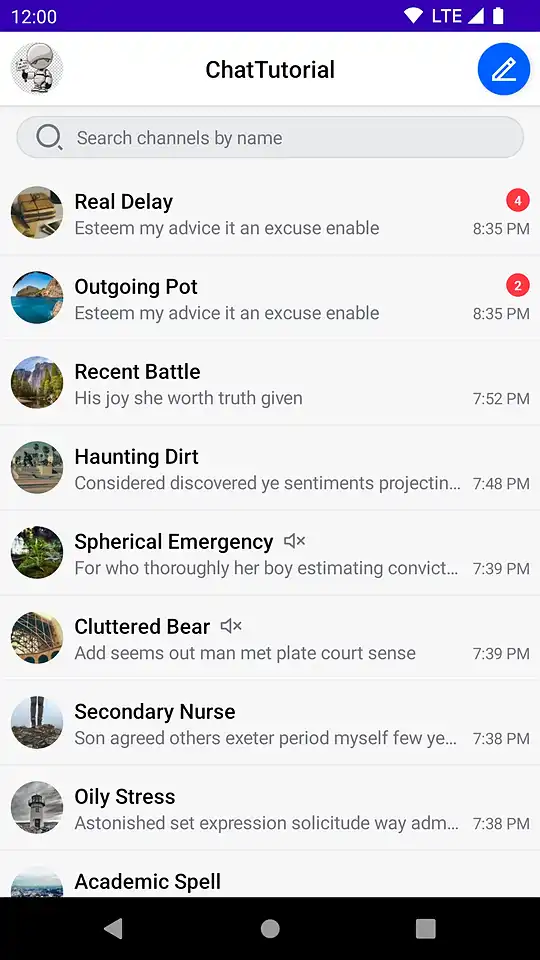
Build and run your application - you should see the channel screen interface shown on the right. Notice how easy it was to build a fully-functional screen with Compose!
Internally, the ChannelsScreen uses these smaller components:
- ChannelListHeader: Displays information about the user, app and exposes a header action.
- SearchInput: Displays an input field, to query items. Exposes value change handlers, to query new items from the API.
- ChannelList: Displays a list of
Channelitems in a paginated list and exposes single and long tap actions on items.
If you want to customize what this screen looks like, or how it behaves, you can build it from these individual components. See the Component Architecture page of the documentation for more details.
Now that you can display channels, let's open up one of them and start chatting!
Presenting a channel
Confused about "Presenting a channel"?
Let us know how we can improve our documentation:
To start chatting, you need to build another screen - the Channel Screen.
Create a new Empty Activity (New -> Compose -> Empty Activity) and name it ChannelActivity.
Make sure that ChannelActivity is added to your manifest. Android Studio does this automatically if you use the wizard to create the Activity, but you'll need to add it yourself if you manually created the Activity class.
After creating the Activity, add the following attribute to the ChannelActivity entry in your AndroidManifest.xml:
This will make sure the Activity adjusts properly when you focus the input field.
Next, replace the code in ChannelActivity with the following:
Let's review what's going on in this snippet:
- You load the
channelIdfrom the Intent extras. If there is no channel ID, you can't show messages, so you finish theActivityand return. Otherwise, you can proceed to render the UI. - Similar to the ChannelsScreen, the
MessagesScreencomponent sets up everything for you to show a list of messages and build a Chat experience. Note how this screen's composable should also wrapped inChatTheme. TheMessagesScreensrequires aMessagesViewModelFactoryinstance - you can learn more about it in our documentation. - Set up a helper function to build an
Intentfor thisActivity, that populates the arguments with the channel ID.
Lastly, you want to launch ChannelActivity when you tap a channel in the channel list. Open MainActivity and replace the TODO() within onItemClick with the following:
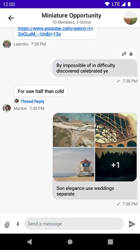
Run the application and tap on a channel: you'll now see the chat interface shown on the right.
The MessagesScreen component is the second screen component in the SDK, out of the box it provides you with the following features:
- Header: Displays a back button, the name of the channel or thread and a channel avatar.
- Messages: Shows a paginated list of messages if the data is available, otherwise displays the correct empty or loading state. Sets up action handlers and displays a button for quick scroll to bottom action.
- Message composer: Handles message input, attachments and message actions like editing, replying and more.
- Attachment picker: Allows the user to select images, files and media capture.
- Message options: Shown when the user selects the message by long tapping. Allows the user to react to messages and perform different actions such as deleting, editing, replying, starting a thread and more.
- Reactions menu: Shown when the user taps on a reaction to a message. Displays all of the reactions left on the message along with the option to add or change yours.
You can explore all of these components individually, combine them to your requirements, and explore the Compose UI Components documentation to see how they behave and how you can customize them.
More complex code samples can be also found in our GitHub sample repository:
- MessagesActivity3 - uses bound and stateless components to build the chat screen, with further customization
- MessagesActivity4 - uses a custom message composer component for extended customization
With our Android Chat SDK, the possibilities customisation possibilities are limitless. Customize your user experience effortlessly through theming, build unique components from scratch, or mix and match existing elements to suit your app's personality and functionality.
Theming
Confused about "Theming"?
Let us know how we can improve our documentation:
To change the theming of all the components wrapped by ChatTheme, all you have to do is override its default parameters. Let's do that, with the shapes parameter.
Change the setContent() code in ChannelActivity.kt to the following:
With this small change, you can override the default shapes used in our Compose UI Components.
You made the following changes:
- You made the
inputFieldrectangular, instead of having rounded corners. - The owned and other people's messages will be rounded on all corners, regardless of their position in a message group
- Avatars and attachments have rounded corners, of
8dpand16dp, respectively.
Notice how you changed the theme shapes using copy(). For ease of use, you can fetch the default theme values and use copy() on the data class to change just the properties you want to customize.
If you build the app now and open the messages screen, you'll see how the messages are all rounded, the input is rectangular and the avatars are now a squircle! That was easy!

Combining components
Confused about "Combining components"?
Let us know how we can improve our documentation:
The next step of customization is combining our bound and stateless components instead of using the screen components. This gives you more control over which components you use and render and what the behavior is when tapping on items, selecting messages and more.
You can inspect how the ChannelActivity can be customised in our GitHub sample here.
In this example we replace the high-level component MessagesScreen with a custom UI build from our UI components instead.
Video / audio room integration
Confused about "Video / audio room integration"?
Let us know how we can improve our documentation:
For a complete social experience, Stream provides a Video & Audio calling Android SDK, that works seamlessly with our chat products. If you want to learn more on how to integrate video into your apps, please check our docs and our tutorials about video calling and livestreaming.
Additionally, we provide a guide on seamlessly integrating video with chat.
Final Thoughts
We've guided you through crafting a feature-rich, in-app chat experience with Android Jetpack Compose — complete with reactions, threads, typing indicators, offline storage, URL previews, user presence, and more. It's astonishing how APIs and Compose components empower you to bring a chat to life in just hours. Beyond that, you've learned how effortlessly you can add your personal touch with custom themes and fully tailor key components.
Our chat app leverages Stream's edge network, ensuring optimal performance and scalability, supporting thousands of apps and over a billion end users. For development, there's a free plan, and for hobby projects and small apps, we offer a more extensive free maker plan. Check the available price tiers.
Both the Chat SDK for Compose and the API boast a plethora of additional features for advanced use-cases, including push notifications, content moderation, rich messages, and more. Furthermore, we've demonstrated how to tap into our low-level state from the chat client for those inclined to craft their own custom messaging experiences.
Give us Feedback!
Did you find this tutorial helpful in getting you up and running with Compose for adding chat to your project? Either good or bad, we’re looking for your honest feedback so we can improve.

We’ve been going at lightspeed to build more communication functionality into Kiddom. The only way to achieve this in four months was to do a chat integration with Stream because we needed to do it reliably and at scale.

Nick Chen
Head of Product, Kiddom
 Activity Feeds
 Enterprise