
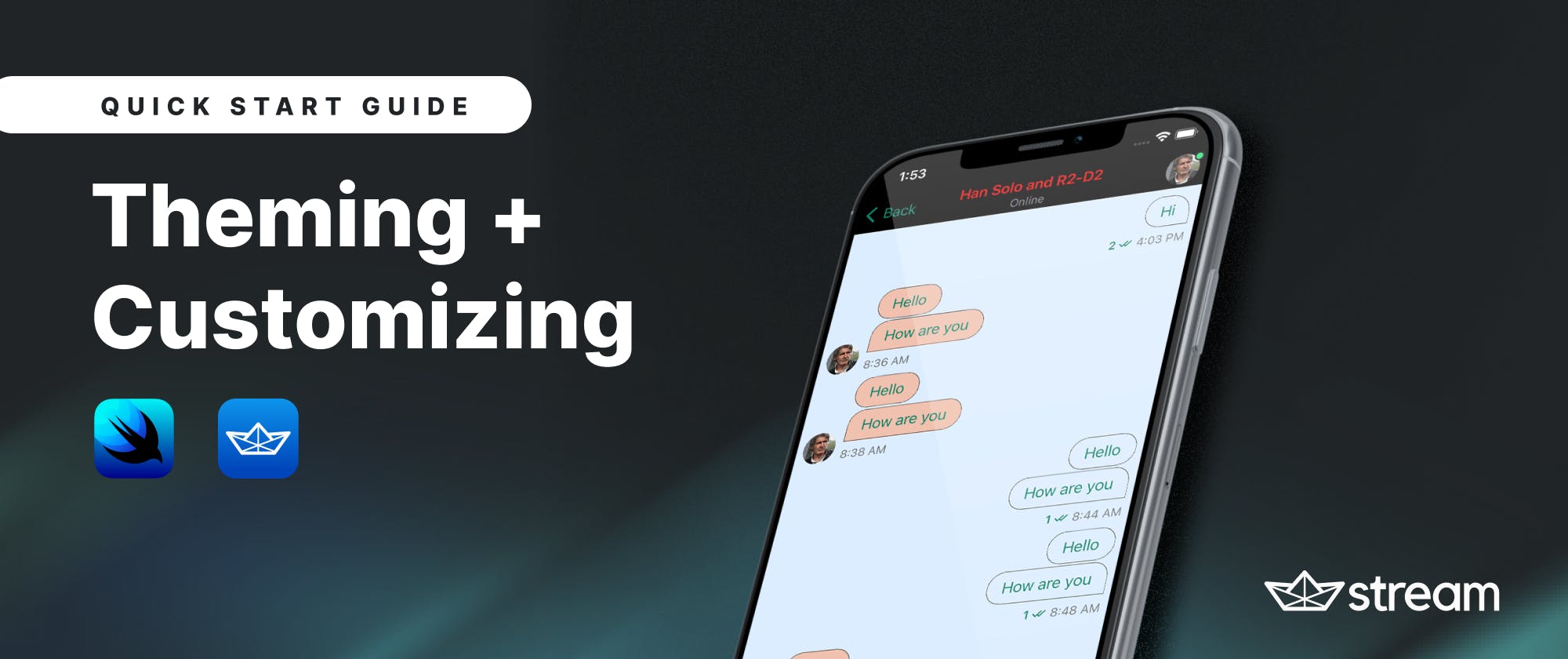
This tutorial describes how to perform configuration-based theming and customization of your Stream Chat SwiftUI app. It focuses mainly on the basics of theming the default look and feel of user interface elements. The example and code snippets provided should give you a vivid understanding of how to get started with changing the visual appearance of any SwiftUI chat messaging app powered by Stream’s SwiftUI SDK.
Highlights:
- Resources
- How to integrate a SwiftUI app with Stream chat
- Introduction to theming the appearance properties of the chat app
- Leverage your brand name and color
- Override the default accent color
- Changing background colors
- Getting and customizing fonts
- Changing images and icons
- Extra: Add your own app icon
- Where do you go from here?
Resources
Download the finished Xcode project to explore all the various theming and basic customization implementations. To connect the SwiftUI SDK to the Xcode app, you need to fetch it as a dependency using Swift Package Manager. To go beyond the simple appearance customizations of your Stream Chat SwiftUI app, you can check the theming section in the official components documentation.
Note: If you download the finished project, it will not run using the Xcode preview. You should run it with any of the built-in iOS simulators in Xcode, for example, iPhone 13 Pro.
How to Integrate a SwiftUI App With Stream Chat
This tutorial requires you to create a blank SwiftUI app in Xcode and integrate it with the Stream Chat SwiftUI SDK, but those steps are not covered here. If you’re looking to learn more about the integration processes involved, the following tutorials give all the essential information to help achieve your goal:
- Build a SwiftUI Chat Messaging App (blog post)
- How to Add Real-Time Chat Messaging to Your SwiftUI App (YouTube video)
Introduction to Theming the Appearance Properties of the Chat App

You can modify colors, images, and fonts in the app using the class Appearance. This class consists of all the visual configurations of the entire application and has the following three main objects:
- Color Palette: The
ColorPalette()object is a struct that provides access to all the colors used throughout the chat application. - Images: The
Images()class makes it possible to swap images and icons (SF Symbols) used in the SDK with custom assets. - Fonts: The
Fonts()struct gives access to all the typographic styles used in the SDK.
Leverage Your Brand Name and Color
The SwiftUI SDK provides you with simple and easy ways to tailor the default visual appearance of the chat application you build to match your brand’s style guide. In this section, you will discover how to add a custom app name and change the color of the text.
Change the channel list header title

When you run the app, the home screen that appears is the channel list. You can change its title in the Swift file that contains the app structure. From the project navigator, find the file SwiftUIChatDemoApp.swift. The view that displays the channels is ChatChannelListView(). By default, it has the title “Stream Chat” as shown below.
import SwiftUI
import StreamChat
import StreamChatSwiftUI

@main
struct SwiftUIChatDemoApp: App {

    @UIApplicationDelegateAdaptor(AppDelegate.self) var appDelegate

    var body: some Scene {
        WindowGroup {
            // Display the home screen
            ChatChannelListView()
        }
    }
}
To change the default header title, replace ChatChannelListView() with ChatChannelListScreen(title: "Nordea Chat") and pass the title parameter to set your custom title. The sample code becomes:
import SwiftUI
import StreamChat
import StreamChatSwiftUI

@main
struct SwiftUIChatDemoApp: App {

    @UIApplicationDelegateAdaptor(AppDelegate.self) var appDelegate

    var body: some Scene {
        WindowGroup {
            // Customizing the Channel List Header
            ChatChannelListScreen(title: "Nordea Chat")
        }
    }
}
Overriding the Title Colors: Channel List Header and Chat Area

The example below uses SwiftUI’s color literal to set the color of the channel list header title (inline navigation title). This color override will also affect the header title color of the chat area and the scroll-to-bottom button.
import SwiftUI
import StreamChat
import StreamChatSwiftUI

@main
struct SwiftUIChatDemoApp: App {

    @UIApplicationDelegateAdaptor(AppDelegate.self) var appDelegate
    let nordeaDarkRed = Color( colorLiteral(red: 0.9058823529, green:
        0.01568627451, blue: 0.01568627451, alpha: 1))
    var body: some Scene {
        WindowGroup {
            // Customizing the Channel List Header title
            ChatChannelListScreen(title: "Nordea Chat")
            // Overriding the color of titles: Channel list header and chat
               area
                .foregroundColor(nordeaDarkRed)
        }
    }
}
In this example, you should define the constant nordeaDarkRed as a color literal and pass it as a parameter of the foreground color modifier .foregroundColor(nordeaDarkRed).
Override the Default Accent Color

The accent color is a system-wide theme color applied to interface elements and controls such as the navigation icon, text for chat bubbles and context menu, thread reply, read indicator, and text in the compose area. You can override the above by using the tint color method. Almost all the basic theming settings are performed in the AppDelegate.swift file. This file is used to set up the SDK and its content is used to manage life-cycle events that happen throughout the life cycle of the application. You should use it to do the following modifications:
To set a custom accent color in the application, look for the function application in the Swift file AppDelegate.swift. In the closure of this function:
- Create an instance of the color palette object with
var colors = ColorPalette() - Define the application-wide accent color as a color literal so that you can easily use Xcode’s color picker to change it later
let nordeaAccentColor = Color( colorLiteral(red: 0.05098039216, green: 0.5098039216, blue: 0.4078431373, alpha: 1)). In Xcode, the declaration above will be shown as - Now, you can use the color variable
colorsyou just declared to set the tint color ascolors.tintColor = nordeaAccentColor. - To use the local variable
colorsalready defined, you specify the constantappearanceusing the appearance class aslet appearance = Appearance(colors: colors).- Finally, you need to make the SDK aware of the changes. To do this, you should pass the appearance declaration to the Stream Chat instance
streamChat = StreamChat(chatClient: chatClient, appearance: appearance).
- Finally, you need to make the SDK aware of the changes. To do this, you should pass the appearance declaration to the Stream Chat instance
Changing Background Colors
The backgrounds of the application are the views that are placed behind other views such as the channel list, chat area, compose area, chat bubbles, and text. The following are the various types of general backgrounds you can override in the application. To modify a particular background, you should find the interface elements it is applied to and swap it with your own custom color.

Change the Background Color: Channel List, Chat Area, Instant Commands, and Compose Area

By default, the background color of the channel list, chat area, instant commands, and compose area uses white color with the name .streamWhiteSnow. To override this color, you should use the background variable to set it. In this example, you should specify the color you want to use as the background as
let cloudBlue = Color( colorLiteral(red: 0.862745098, green: 0.9294117647, blue: 1, alpha: 1)). Then, set it to replace the default background as colors.background = UIColor(cloudBlue).
Change the Background Color: Outgoing Message Bubbles and Reactions

For chat bubbles and reactions, the background can be changed in the same way as described above. The background for outgoing messages can be overridden using the background6 variable while the incoming messages, context menu, and reactions backgrounds can be changed with the background8 variable as shown below:
colors.background6 = UIColor(cloudBlue)
colors.background8 = UIColor(darkPink)
Getting and Customizing Fonts
The SDK provides support for Apple’s standard and system fonts you can use to customize text views in the SwiftUI messaging application. These fonts provide automatic dynamic type support. Although there are several font options, using custom fonts is not part of this tutorial. It will be covered in another blog post. To tailor the style of text views to your need, you should modify the fonts used in the SDK through the Fonts() structure using the following dynamic standard types.

To style your text, follow the steps below:
- Create an instance of the
Fonts()structurevar fonts = Fonts(). - To adjust the body font, for example, you should use the defined variable
fontsinstance to reset it. This code snippet increases the body text (text for chat bubbles) size using the standard large title fontfonts.body = .largeTitle. - You can also append font styles to the standard Apple fonts the SDK provides. For example, to make the text views of the message bubbles and instant commands bold and italic, the above code snippet becomes
fonts.body = .largeTitle.bold().italic(). - Since the
Fonts()object is part of theAppearanceclass, to see the changes you have done so far, you should pass thefontsvariable as a parameter of theappearanceinitializer aslet appearance = Appearance(colors: colors, fonts: fonts).

Changing Images and Icons
In this section, you will discover how to swap the icons provided by the SDK with SF Symbols and Google Material Symbols. The Appearance configuration must be used to replace symbols for buttons and other interface elements. The image below shows both general and reaction symbols you can override with the ones that are more appropriate for your brand.
Replacing Icons With SF Symbols

To change icons and images, you need to:
- Create an instance of the
Image()usinglet images = Images(). - Locate the icons you want to replace. You can find the names of all symbols used in the SDK through the full images reference webpage. For example, you can change the reactions’ heart icon to a heart icon with a bolt sign inside it as
images.reactionLoveBig = UIImage(systemName: "bolt.heart.fill")!. The exclamation mark (!) at the end of the code snippet indicates that the image is optional, which means it can be there or not. - Add the image instance you defined as a parameter of the appearance constant in the same way you did for the colors and fonts,
let appearance = Appearance(colors: colors, images: images, fonts: fonts).
Using Google Material Symbols

If you don’t want to use SF Symbols for the iconography of the chat app, an excellent alternative is to use Google Material Symbols. This allows you to pick from a huge collection of consistent icons for your apps. The steps involved in substituting the SDK-provided glyphs with Material Symbols are the same as using SF Symbols to swap the icons as described above. To use the Material Symbols, you should export them as scalable vector graphics (SVG) and add them to the assets library of the Xcode project. In this way, all the various symbol sizes and variants will be retained when exported.
Since Material Symbols are not considered system icons, you should reference them differently. For example, you can replace the heart icon for reactions using the code snippet, images.reactionLoveBig = UIImage(named: "heart_broke")!. The icon name heart_broke is an SVG Google Material Symbol.
Extra: Add Your Own App Icon
Now, you are ready to apply an app icon for the application you have themed. This part of the tutorial will help you to customize the default app icon of the Xcode project with your own app icon. You can design app icons using design tools such as Sketch or Figma, and manually create and set the various versions required by Xcode. Since it is tedious to create the various required versions of the app icon manually, you can use an app icon generator to get various icon sizes for different device resolutions and models. To use this tool, you are required to upload an image of size 1024px x 1024px to get all icon sizes required for all Apple platforms.
Once you unzip the downloaded file, you will find the folder AppIcon.appiconset. Its content contains all the icon sizes you will need.

Follow the steps below to add the app icon to the project:
- In the assets folder, select Appicon and click the minus - button on the bottom-left to delete it.

- Drag the AppIcon.appiconset folder to the assets folder. The content of this folder will automatically fill all the required icon sizes. Note: These variations of the app icon are required if you are using Xcode 13 or any of its older versions. In Xcode 14, you no longer need an app generator for creating the variations. It allows you to drag and drop a single image into the assets catalog and use it as the app icon.

- Run the app to see the changes. Congratulations! You have now added a custom app icon successfully to the project.

Where Do You Go From Here?
In this tutorial, you learned about how to apply basic theming and customization to your Stream Chat SwiftUI application. You now know how to change colors, fonts, and images to enhance and match your brand guidelines.
To learn more about the advanced customization options the SDK offers, you can check Build a SwiftUI Chat Messaging App.
